Calculate Population Density from Census Boundaries
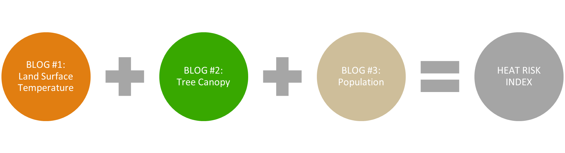
Part 1 & Part 2 of this series explored how to prepare the first two inputs to a heat risk index (HRI). First, we derived high average summer temperature using the Multispectral Landsat image service from ArcGIS Living Atlas of the World. Next, we calculated lack of tree canopy using the European Space Agency (ESA) WorldCover 2020 Land Cover image service. For the final input, we will calculate population density using Living Atlas census polygons for the area of interest around Seville, Spain.
This final blog will close out the series by walking through how to combine the three inputs into an HRI and mapping it to highlight areas that are hotter, have fewer trees to protect against extreme heat, and have more people. Local communities can use the resulting intervention-focused map as a planning tool to prioritize census tracts for tree planting as one mitigation against urban heat islands.
Refresh your memory of Part 1 & Part 2 before continuing the workflow below.
Add Data from the Living Atlas of the World
The final input to the heat risk index is population density. You will, once again, use data from ArcGIS Living Atlas of the World to calculate this input using total population and polygon area. If you have been following the series, you should already have the Seville Census Sections in your project for the next step. If not, review the section titled, “Filter the Service by Location” in blog #1 for the steps to add and filter the census polygons.
The census sections feature layer contains attributes for both total population and area in square kilometers.

Calculate Population Density
The formula for calculating population density is “total population / area of the census polygon”. Both of the inputs are present in the feature class you created. You will calculate population density using attributes in the polygon feature class and then transfer the other two attributes to this table using the Join Field geoprocessing tool.
First, use the Calculate Field tool in the Attribute table to calculate population density. You have to give the new attribute a name and data type in the tool. The formula should look something like this “TOTPOP_CY / AREA_1”.

Combine Inputs into HRI
The three derived inputs are now ready to be combined into the heat risk index and symbolized on a map. Begin by transferring the ‘PCT_Lacking’ attribute from blog #2 into the polygon feature class using Join Field.
Run Join Field to transfer ‘PCT_Lacking’ from “Count_of_Tree_Pixels” to “Seville_Census_Sections” feature class. Repeat the Join Field workflow to transfer the “High Average Surface Temperature (C)” attribute from blog #1 to this feature class. This results in all three inputs being in the same table for ease of processing.

Before you can combine these three inputs with disparate units, they need to be standardized onto the same scale. The Standardize Field geoprocessing tool makes this possible. Having previously combined all the inputs into a single table, this step is even easier. Run Standardize Field with the following input parameters.

Now that all three inputs are standardized on a scale of 1 to 5, they are ready to be combined into the HRI.
Map the Results
The HRI value and polygon color are derived with an Arcade Expression using the Sum function with the standardized inputs. This gives you flexibility to adjust the variable weighting if appropriate. On the Symbology pane for the census polygon layer, use the expression below in the Expression Builder.

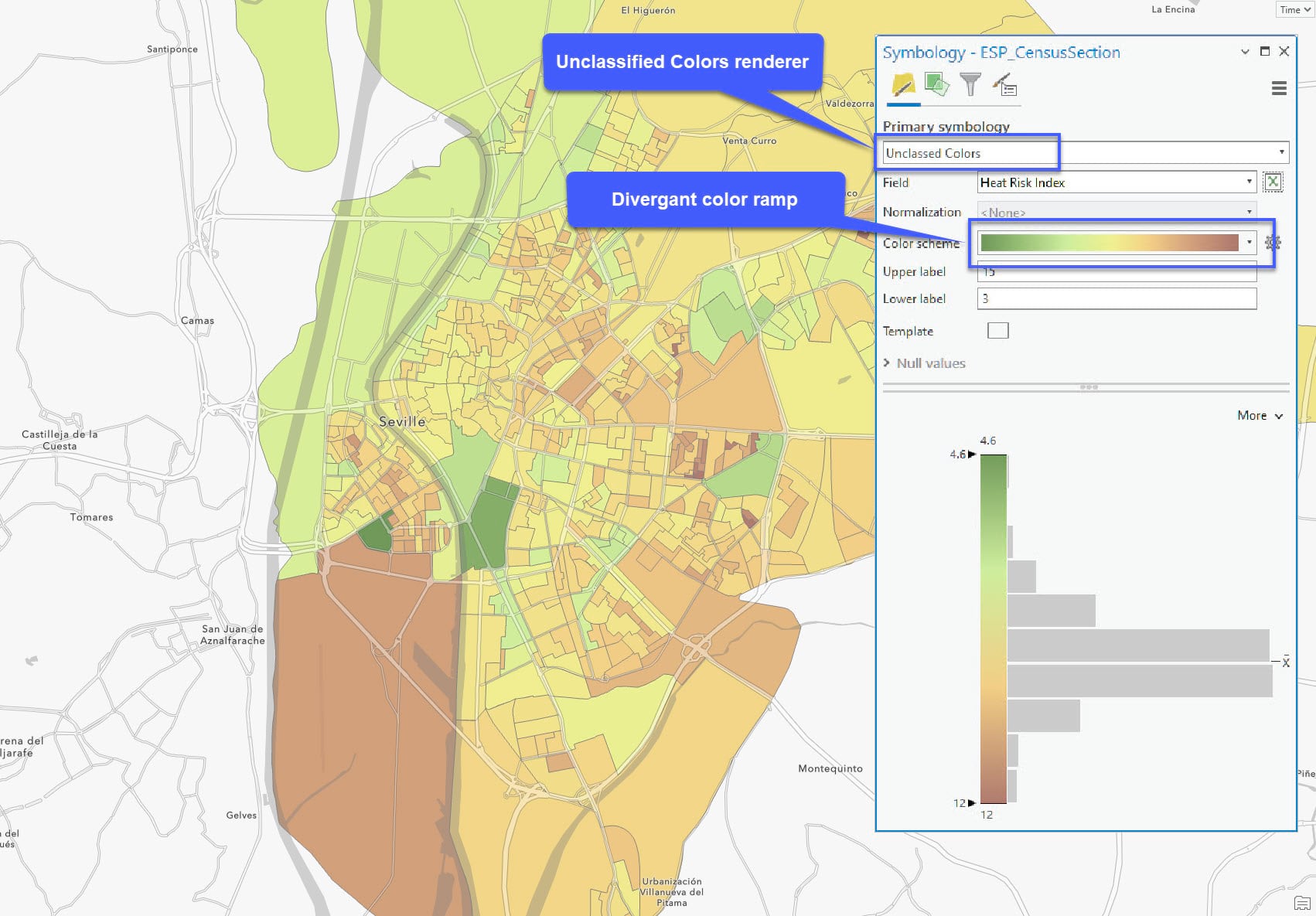
On the Symbology pane, specify the Unclassified Colors renderer and a divergent color ramp of your choice. Experiment with the parameters to get the result you desire. Don’t forget to customize the popup.
The legend belows shows that sections with a higher HRI value are colored in brown and would benefit more from planting more trees. Sections with lower HRI values and in green would benefit the least.
Conclusion
This completes the third and final input to the HRI as well as the calculation and symbology of the map. After calculating the population density for each census section, you combined it with the other inputs. Next, you calculated the HRI using an Arcade expression and symbolized the polygons on a map. The map is now ready for sharing with stakeholders to prioritize census sections that would benefit most from tree planting as one mitigation of urban heat islands.
For additional information about how to customize a climate risk index, take a look at this tutorial.
I hope this blog series was helpful in explaining how disparate inputs can be standardized and combined to form a composite index. While this use case was for climate resilience planning, imagine all the other ways you could use this workflow for creating a composite index. If you have questions about the workflow or comments about how to improve it, feel free to leave them below in the comments sections.

Article Discussion: