What are cartographic conventions and do you need to follow them?
Recently I finished this map, which offers a good example of cartographic conventions:

I started this map a few years ago in ArcGIS Pro, but I was never fully satisfied with the result. Recently I returned to it and made changes which I think finally bring the project to completion. In this article, I’ll use it as an example to talk about cartographic conventions: why you shouldn’t ignore them, why you can sometimes set them aside, and why you don’t need to memorize them in a list.
Follow cartographic conventions
Cartographic conventions are common and typical ways that things are depicted on maps. For example, in this map, I chose to make the forested areas green because that’s how forested areas are most often depicted on other maps. It’s easy to see why this is a convention: trees are usually green, so it’s an intuitive color choice for forests.

Another convention I followed is to depict linear features that ‘aren’t really there’ with dashed lines. I used dashed lines for the county border and intermittent rivers. Borders are almost never physical features – they only exist on maps. Intermittent rivers are only sometimes flowing.

Borders and intermittent rivers aren’t always depicted with dashed lines. This isn’t a rule, it’s just a convention. So why worry about it?
The dashed line convention is something that few map readers have heard of, but that doesn’t matter. They’re still used to seeing borders depicted with dashed lines. Whether they’ve noticed this pattern or not, chances are high that they’ll interpret a dashed line as a border, thanks to their previous experience with other maps.

In other words, following cartographic conventions can help make your map easier to understand.
There is no definitive list of cartographic conventions. Some have stronger rationales and therefore are often presented as universal rules; for example, including a legend to explain symbols, or normalizing choropleth maps. The rationales for others are weaker and sometimes go in and out of fashion, like depicting swamps with little reed hillock symbols, or highlighting borders with contrasting colors. The good news is you don’t need to memorize a list of cartographic conventions. Instead, take time to study other maps. In particular, look at other maps of the same location or subject matter as your own. What symbols and design techniques do they use in common? It might be in your best interest to imitate them.
Some other cartographic conventions I followed in this map were with its labels. Convention says the following:
- Don’t use more than one font face. (Why? The map can become visually cluttered and confusing otherwise.)
- Use italics for water features. (Why? They look like they are flowing.)
- If you do use two font faces, use a serif one for natural features and a sans serif one for cultural features. (Why? I’m not sure. But this convention is strong enough that it looks weird if you do it backwards.)
- Don’t use any text smaller than 6pt (Why? It will be too small to read.)

I had no good reason to break these conventions in this map, so I didn’t.
Following conventions may sound uncreative, but they exist for good reason. They help you make a map that’s more likely to be understood.
Set aside cartographic conventions
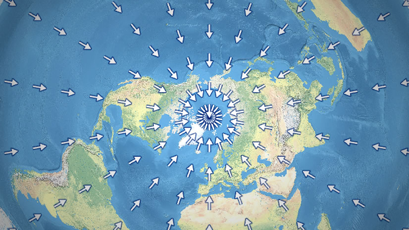
Cartographic conventions are not rules. They help us make maps that are easier to read, but if you have a good reason to stray from their path, you should. For example, in this map, I’ve broken two of the biggest cartographic conventions: water should be blue and north should be at the top.

People expect blue things on the map to be water. I chose to make the ocean, lakes, and rivers black instead because it looks dramatic and because it helped me to limit my color palette. When I made that decision, I had to ask myself a few questions: Will people recognize the black areas as water? Or will it take them a few moments to understand what is going on? Will they give up on the map during those moments of confusion?
I decided for this map, black water was OK for three reasons:
- There are no blue things on the map that might cause confusion.
- The shape of the coastline helps to establish a strong figure-ground image that reads as water versus land.
- The labels make it clear which parts are water and which parts are land.

As for placing north at the top, this is a good example of a convention because it’s both the most common and the most commonly set aside. There’s no good reason to place north at the top of the map aside from the fact that that’s where everyone expects it to be. But this is such a culturally strong and pervasive expectation that it makes for a very good reason after all.
In this case, I rotated this map simply so I could fit the entire coastline into a particular frame that I own. I was making the map for myself, and I wanted it to fit in that frame. Therefore, I had a good enough reason to ignore the north-is-at-the-top convention.
If you do rotate your map, make sure to include a north arrow. I placed mine alongside the locator map (which has the same rotation as the main map).

Some other considerations
The example I’ve used in this article is a static print map. But cartographic conventions apply equally to interactive web maps. For example, including pop-ups for thematic data is a convention, and there are many more conventions about how best to format those pop-ups. I recommend the book Designing Map Interfaces: Patterns for Building Effective Map Apps, by Michael Gaigg, to learn all about specific and useful cartographic conventions for online maps.
I also want to acknowledge that ‘cartographic conventions’ is a slippery term and my definition will differ from others. Some people use this term to apply to a narrower subset of the conventions I’ve described: those that you need a very good reason to break, which are therefore generally portrayed as rules. Others use the term to mean a current set of documented standards defined by a particular mapping agency. These definitions are correct as well, but hopefully what I’ve described in this article will help you think about conventions more broadly and apply them to all aspects of the maps you make.
Conclusion
When making map design decisions, first consider cartographic conventions: how is this feature or location depicted on most other maps that your audience is used to? If you decide to do things differently than most other maps, that’s ok, but first assess how your choice will affect people’s understanding of the map.
In other words, ‘it looks cool’ can be a good enough reason to set aside a cartographic convention, but only if it doesn’t make the map misleading or harder to read.


Article Discussion: