Sometimes the design of a map legend can be just as important as the design of the map’s symbology.
Symbology is at its best when it needs no legend, but this isn’t always possible. If your map needs a legend, that means people are going to need help reading your map. Take the time to help them by making the best legend you can.
Add a legend
1. Download and open GrainElevators.ppkx
This map shows grain elevators in the Canadian prairies. The data is from Agriculture and Agri-Food Canada (Government of Canada), via ArcGIS Living Atlas of the World.
2. In the Contents pane, right-click the GrainElevators layer and click Symbology.
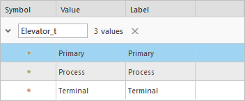
The data is symbolized with color based on the elevator type.
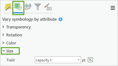
3. At the top of the pane, click the Vary symbology by attribute button and expand the Size section.
This layer is also symbolized by size, based on how much grain each elevator can hold.
You need to make a legend for this map that conveys the meanings of both the color and size of the symbols.
4. Open the layout. On the Insert tab of the ribbon, click Legend. Draw a box next to the map to add a legend.
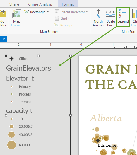
I prefer to add legends next to the map because I know I’ll need to click them a lot to edit them. I don’t want to accidentally click things on the map instead.
Remove unnecessary words
Not everything on the map needs to be in the legend. Only keep those things that aren’t obvious or aren’t already described with labels.
1. In the Contents pane, expand Legend, right-click Cities, and choose Remove.
You also don’t need a title that says “GrainElevators.” That information is already conveyed by the map’s title.
2. In the Contents pane, double-click GrainElevators to open the Format Legend Item pane.
In general, double-clicking something in the Contents pane will open its properties.
3. Under Show, uncheck Layer name.
Rephrase a legend
When I design a legend, I imagine myself showing the map to a friend and explaining it out loud. Here’s what that might sound like:
- Me: Hey Ellen, check out this map I made! The yellow circles are primary elevators, the green ones are process elevators and the red ones are terminal elevators.
- Ellen: Nice! Looks like most of them are primary elevators. But I don’t see any red ones on the map. Where are they?
Now I’m ready to make the legend equivalent of my conversation. First, I want to address Ellen’s concern about the missing terminal elevators.
1. On the Format Legend Item pane, under Feature Display Options, check Only show features visible in the map extent.
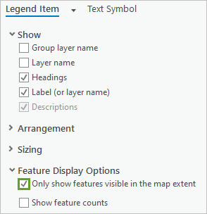
The red symbol disappears from the legend. Ellen was right, the only terminal elevator in the dataset is in Churchill, Manitoba, which is not visible on the map.
Next I want to change the Elevator_t heading. I would never say “Elevator_t” when explaining the map to a friend. I would say “elevator type.” But looking back on my conversation, I didn’t even say that. That means that my legend doesn’t need to either.
2. On the Format Legend Item pane, under Show, uncheck Headings.
3. In the Contents pane, expand Map Frame. Under the GrainElevators layer, click Primary and press F2 on your keyboard to make the text editable. Change the label to Primary elevator. Add the word elevator to the other two types as well.
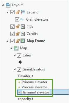
I displaced the “Elevator type” title into the legend labels. This works well when you only have a few items in the legend.
Let’s continue with my imaginary conversation:
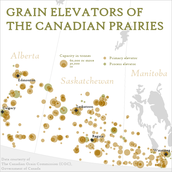
- Me: The size of the circles represents capacity. The largest circles are elevators that can hold 60,000 tonnes or more of grain, while the smallest one holds only 10.
My current legend doesn’t look like that at all.
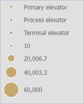
20,006.7 and 40,003.3 would be much easier to read if they were rounded to 20,000 and 40,000. But I didn’t mention those values in my conversation, so maybe they’re not needed. Also, this legend does not indicate that the largest symbol represents a capacity of 60,000 tonnes or more.
In this case, I’ll convert the legend to graphics so I can have full control over its appearance.
Convert a legend to graphics
1. Right-click the legend to Copy and Paste it. Right-click the new legend and choose Convert to graphics.
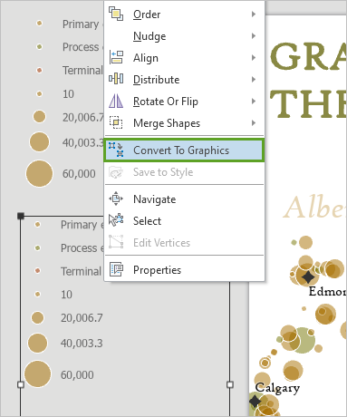
2. Right-click the graphic and choose Ungroup. Delete all of the graphics except for the size circles.
3. Drag the smallest circle and place it on top of the largest one.

I decided that it would be good to have a middle-sized circle as well, even though I hadn’t included that information in my conversation. But I want it to be 30,000 and that value isn’t already represented. So I’ll have to fake it.
Make a fake legend item
I’ll make a new feature with the size I want to serve as a model for my legend graphics.
1. Return to the map. On the ribbon, click the Edit tab and click the Create button.
2. In the Create Features pane, click any of the elevator symbols. Click once somewhere in northern Saskatchewan to add a new feature to the map.
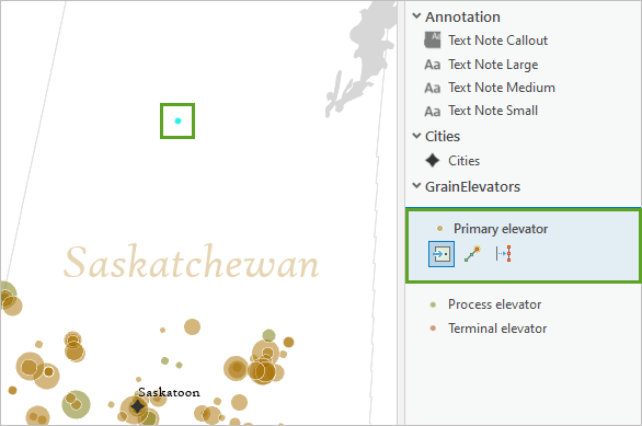
3. On the ribbon, click the Attributes button. In the Attributes pane, change capacity to 30,000 and click Apply. Clear the selection and return to the layout.
4. Drag one of the medium-sized circles from the legend onto the map. Line it up with the new feature and resize it until it matches.
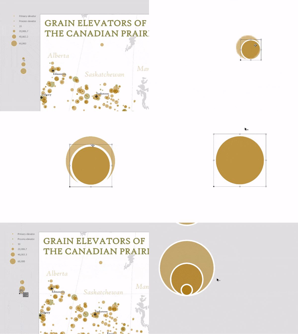
5. Drag the resized circle back to the legend and stack it with the others. Delete the remaining circle.
6. On the ribbon, on the Insert tab, in the Graphics and Text group, click Rectangle text.
7. Draw a box next to the size legend and type the legend labels on three lines (60,000 or more / 30,000 / 10). Add another rectangle text box above that says Capacity in tonnes.
Don’t worry if the text is too big. You’ll fix it later.
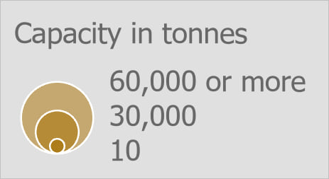
The original legend still has size information, which is now redundant. You also have a fake data point in northern Saskatchewan that you need to get rid of. You’ll go back to the map to make these changes.
8. Return to the map. On the ribbon, click Discard to undo your edits.
9. In the Contents pane, double-click one of the size symbols to open the Symbology pane to the size properties. Uncheck Show legend.
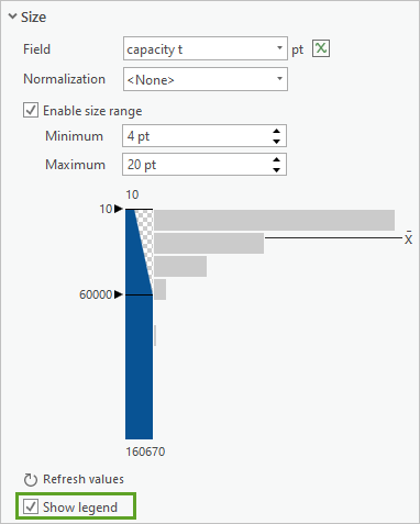
10. Return to the layout.
Change the font
The content of both legends now matches how I would explain the map to a friend. To finish, I want to make sure that the style of the legend matches that of the map. Mostly, this means changing the font.
1. Select and double-click the Capacity in tonnes text. The Format Text pane appears. Click Text Symbol and change the font to High Tower Text with a size of 10 pt.
2. For Color, use the Eyedropper tool to sample from the green color of the map’s title.
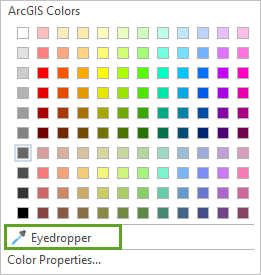
3. Change the legend labels text to use the same properties. Additionally, click the Formatting tab and change Line spacing to -4.
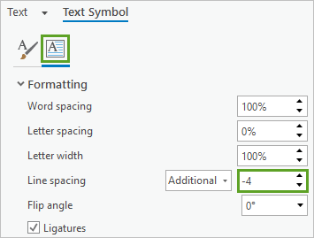
Now your legend labels are more in line with the circles they are labeling.
4. Position the size legend elements until you are happy with them. Then select them all, right-click, and choose Group.
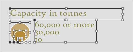
5. Select the legend for elevator types. Double-click the legend to open its properties and click Text Symbol. Change the font to match the other legend.
6. At the top of the pane, click the back arrow and click the Legend Arrangement Options tab. For Fitting Strategy, choose Adjust columns.
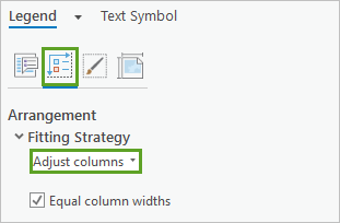
This will prevent the text size from changing when you resize the legend.
7. Expand Spacing and change Patches and text to 0 pt.
Now the labels are a little bit closer to the symbols, so it can look a bit more consistent with the size legend. The symbols are kind of small though, they might be hard for people to see properly.
8. Return to the Options tab and click Show properties.
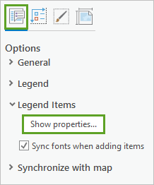
9. Under Sizing, change the Patch height to 7 pt and check Scale to fit patch size.
Finish
1. Drag both legends onto the map and place them wherever you find pleasing.
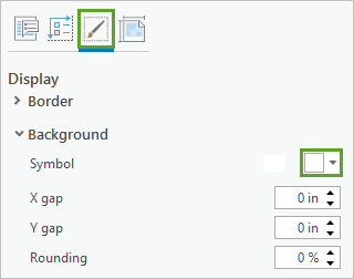
2. If a province border interferes with one of them, double-click the legend to open the Format Legend pane. Click the Display tab and change the Background color to white.
The legend is complete!
Legends are one of many possible elements you can include in your map’s layout. Read the following articles to learn about some others:

Article Discussion: