Most maps are created to answer specific questions. Maps are created by people who know the data but for people who most likely don’t. Titles are the first part of your map that others will read, particularly as it shows up in search results. Web maps stored in the cloud are visible to the entire ArcGIS community. But too often, we copy the title of the dataset right into the title for our map.
Break all the rules and use a question to title your map. Our favorite of those question words here at Esri is, of course, Where? But other question words and phrases are also answered by maps, such as the following:
- How many? How much?
- What percentage or rate?
- What is the most common group? What is the least common group?
- When?
- How has this changed over time?
- What is the relationship between X and Y?
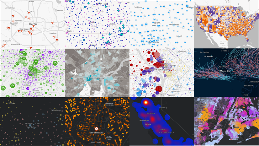
Let’s view a few examples of maps whose titles are the questions the map answers:
Mapping Where?
Where are mobile/manufactured homes?

A simple map of counts or percentages can become a captivating mini-headline. Instead of Count and percent of mobile/manufactured homes by county, it’s Where are these things? Your map’s audience might start to wonder, Are they near me? Are there any in my community? They’ll be more likely to be engaged after reading the title.
Where are those age 65 and over who are working?
.")
Notice this map is not called Labor force participation by age by census tract. That is a great name for the tabular data and even for the layer. Maps are more audience-facing, so the map ought to convey the question that it answers clearly. An economics major will know what labor force participation is, but a decision maker will likely be less familiar with this term. Also, a dataset such as Labor force participation by age by census tract can answer numerous questions. Why not create a focused map for each question you need answered?
Where should we focus on improving life expectancy?

This map was created to highlight areas in need of change. The symbology in this map is inverted so that lower life expectancy – more in need of investment, programs, and so on. The map’s title reinforces this map’s purpose by the phrase, Where should we focus on improving outcomes.
Mapping What percent?
What percent of adult males are veterans? and What percent of housing units are single family detached? are two maps that take the attribute being mapped and pose it as a question. This works well for mapping attributes that are counts, amounts, percentages, or rates. If appropriate, you can increase your audience’s interest-level by personalizing the title further, such as What percentage of adults are veterans in your area?
Mapping What’s typical here?
When mapping averages or medians, it can be helpful to craft a title with a conversational tone. What is the Rent Like? sounds more natural than something along the lines of Median contract rent by tract. Similarly, Is a 40-Hour Work Week Normal? is a more succinct title than Mean hours worked per week in the past 12 months. This information can go in the legend (which comes from your field’s alias), the long field description, the map’s item page, text in a final app, and many more places. Including definitions and details is important, but not necessarily in the title.
Mapping What’s most (or least) common?
Predominance-style maps such as this one display the attribute field with the highest value, or the most common group. Contrasting colors depict the various groups. What is the most common place of birth among those who are foreign-born? is one example of this.

Mapping When?
If your data has multiple date fields, a predominance-style map can also answer the question of when. This predominance map titled When was the housing stock built? shows the most common decade that homes were built in a given area. Because these decades have a natural order to them, the color ramp used in this predominance map also has a natural order to it. This is often referred to as sequential predominance.

Another map that uses sequential predominance for single year categories answers the question, Which year had the worst air quality? It’s mapping the year with highest average annual particulate matter 2.5 (PM 2.5), and that information is clear the in pop-up. This map also uses labels effectively to communicate the year with the worst air – the question that the map was created to answer.

Mapping What’s the relationship?
Relationship-style maps display two attributes together on the same map, and reveal areas that are high in both and low in both, as well as the off-diagonals: high in one attribute but low in the other, and vice versa. Fundamentally, they describe how two things related. For example, Which areas with poor air quality also have higher levels of poverty?
, red areas are high in both (most concerning), and blue areas are high in poverty but low in PM 2.5, and dark yellow areas are high in PM 2.5 but low in poverty.")
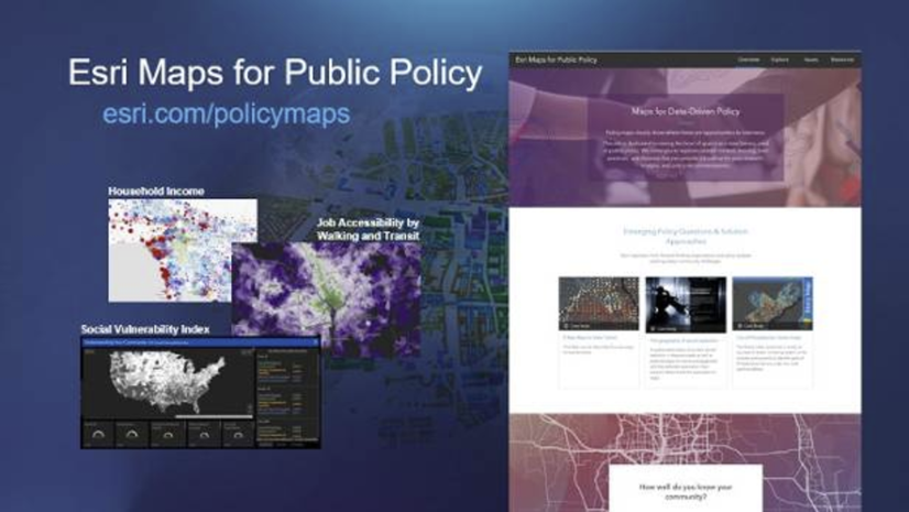
Esri Maps for Public Policy can help to answer Why here?
Why? is often the most difficult question to answer. There are usually many reasons for why a situation is the way it is. We might have hypotheses as to why, and after examining the data, we often see that there’s much more nuance. Scientists and toddlers alike love to respond, Why? to the answer to a previous why question.
Why is also the most cognitively difficult question of all the question words. In improv theatre, actors are actually trained not to ask their scene partners why questions because they take a split-second longer to come up with an answer for. Try this exercise – see how fast you can answer the following questions:
- What did you have for dinner last night? (quesadillas)
- Where did you have dinner last night? (at my home)
- When did you have dinner last night? (around 7 p.m.)
- With whom did you have dinner last night? (my family)
- Why did you have dinner last night (um…so many reasons! It’s cultural…we do it every night…and you know, I was hungry)
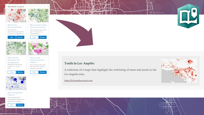
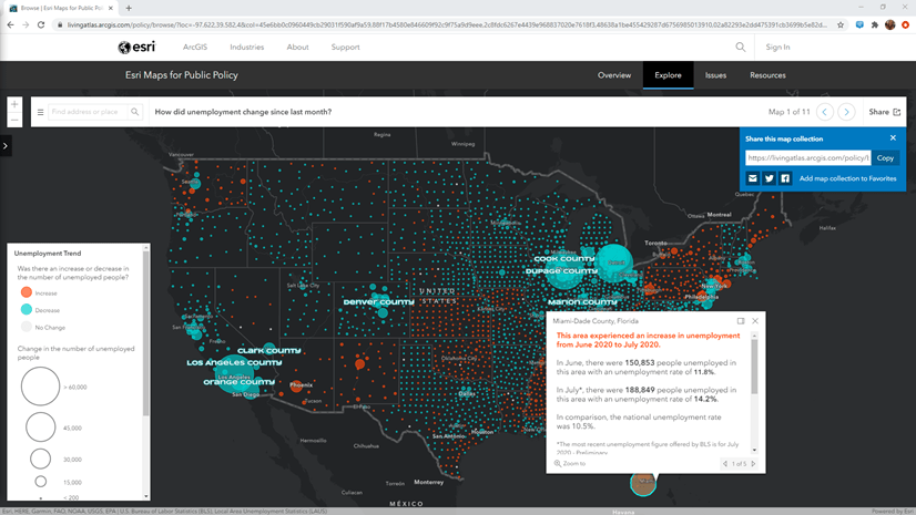
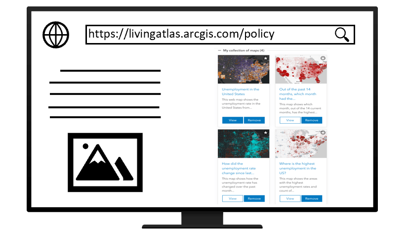
You will most likely need more than one map to answer the question of Why here? Don’t worry, you don’t have to make all these maps yourself. Esri Maps for Public Policy is an ever-growing collection of maps that are policy-relevant, each designed to answer a specific question. There are currently around 800 maps on topics ranging from economic opportunity to transportation and infrastructure. Explore a pre-configured policy map collection on a topic such as housing or veterans, or build one of your own about a topic important to your community.
These policy maps are compatible with the whole ArcGIS system. Embed a collection in a story or hub site. Embed a single map in a dashboard or app. Open maps up in ArcGIS Pro or Insights to perform analysis.
Your map’s title is important
Web maps are often the first information product created for an audience, and can be building blocks for things like dashboards, instant apps, stories, and web experiences. A good title on your web map will pay off later on in your workflow. Many instant apps inherit the map’s title as the app’s title, for example. Ultimately, a good title is the first step in producing a well-documented item in ArcGIS Online.
Good maps answer a specific question. Great maps answer as well as raise questions.

Article Discussion: