Earlier this year I visited Palm Springs, California for the first time to attend the Esri Partner Conference and Developer and Technology Summit. I’ve visited Southern California many times but never made it further east on the 10 than Redlands.
Walking to the convention center each day, I couldn’t believe the extreme elevation change from the city to the peaks above. Various colleagues mentioned the many recreation opportunities in the mountains, and one stuck with me: the Cactus to Clouds trail.

The route starts near the Palm Springs Art Museum and climbs all the way up to San Jacinto Peak, with over 10,000 feet of elevation gain. From the base to the summit is about 14 miles, with an additional 5 miles to hike back down to the Palm Springs Aerial Tramway station to catch a much-deserved ride back down to the city.
Would I love to do this trail someday? Maybe! But until I trained for something like that… I made a map.
Design inspiration
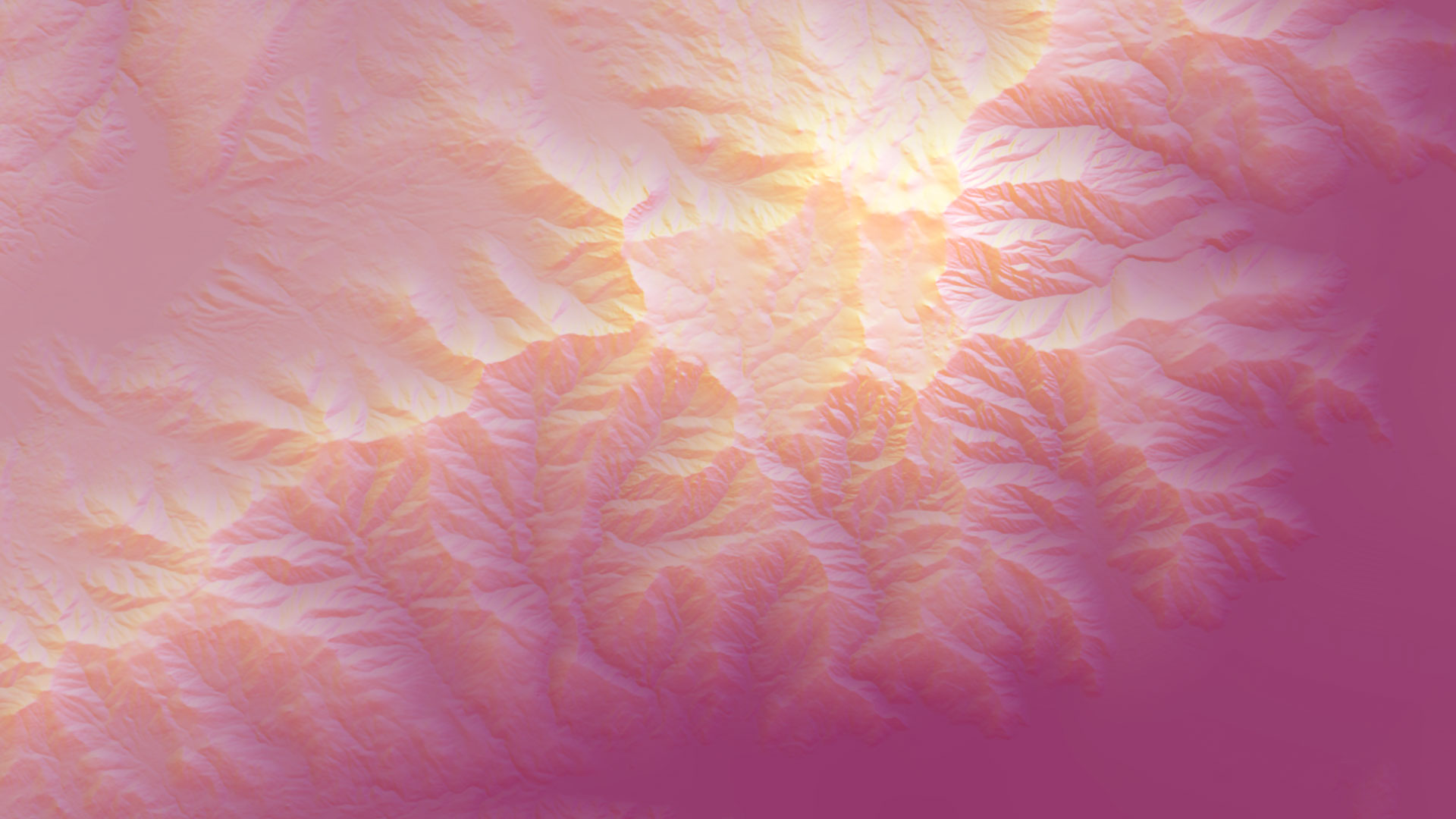
While in Palm Springs, I noticed lots of bright color gradients in signage, conference banners, and desert sunsets. My design goal for this hiking route map was to incorporate these bright color transitions to emphasize the mountain terrain of the region.


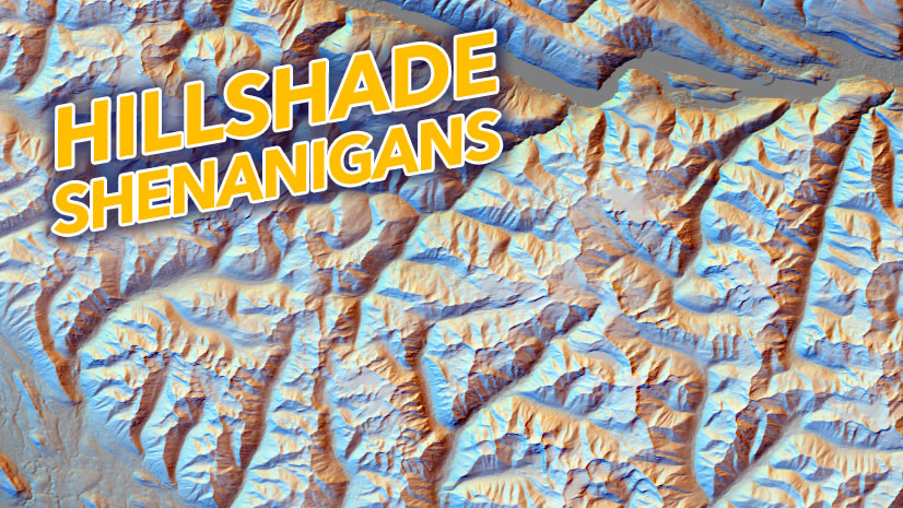
I used this project as an opportunity to experiment with some of John Nelson’s terrain tutorials, specifically his ‘Throwing Shade in Wild Color’ video. Three different reliefs with three different colors, and a DEM to create a ‘magenta haze’ at the lower elevations on the map.

Layout elements
I decided to rotate the map, so the trail was vertical on the page instead of horizontal. A vertical orientation lets this map be tall and narrow. This usually makes for a more legible map on desktop and mobile phones (which is where you all are seeing this map!).
The map is rotated, so I added a north arrow. I also added a locator map with the same rotation. And of course, another important map element… the scale bar.
My toxic trait is that I almost always forget to add a scale bar to my maps. And making a dual scale bar with two units? That used to take up so much time. But now, in ArcGIS Pro 3.5, I can select a Dual Scale Bar as one of the options (one of many Esri Community ideas added to ArcGIS Pro 3.5).


I like my dual scale bars to end in the same numeric value, so I used an ‘Adjust width’ fitting strategy to allow for this. I am a big fan of a minimalistic scale bar (when the map is not being used for serious navigation… please don’t use this map to hike this very difficult trail!).
Making it even easier to add scale bars to my maps in the future, I saved this as a style for future use.

Map labels and line symbology
For labeling my map, I used a mixture of the advanced labeling placement functionalities in ArcGIS Pro and placed some text as graphic elements in my layout.
For labeling Mt. San Jacinto State Park, I used a new feature available in ArcGIS Pro 3.5, which gives the option to stack long labels instead.

The label for the state park had enough space to sit on one line, but I wanted to create more space for my map title, so I checked the option ‘Prefer to stack long labels’. When checked, long labels will stack compactly in areas where it won’t affect placement and require stacking to fit.
For the state park boundary I applied two solid strokes, and for the ‘inner’ stroke I set an offset effect to create an inner boundary. This is a very popular cartographic effect, sometimes referred to as an inner band or inner glow.

The final map
I really enjoyed creating this hiking route map with a sunset desert vibe reflected by the colors I saw in Palm Springs. I hope this inspires you to find your own cool and different inspiration out in the world and bring it into your maps, and maybe even try out some of the new features in ArcGIS Pro 3.5 while you’re at it!

Beautiful way to explain the creation of the map and the new features in ArcGIS Pro!