PART 1 of 2
Behold, a clanking steaming hissing whirring mechanistic look at the closeness and turnout for the 2016 US presidential election. Why? I’ll get to that later. For now, I invite you to immerse yourself into the steampunk anachronism and suspend all impulses of pesky modern and post-modern decorum and restraint. Just go ahead and fall into the Victorian alt-past-future world of brass, leather, gears, and glass pneumatic instrumentation.

This map was assembled and given data-life in ArcGIS Pro (help yourself to the project package if you’d like to hack as you go), using visual assets made in Photoshop (well, I mean, I used Fireworks but I’m too embarrassed to admit that).
In this first of two posts, we’ll use picture symbols, symbol layer offsets, styles, and sneaky labeling. Ready to lace up your tall Victorian boots and wade in?
Data
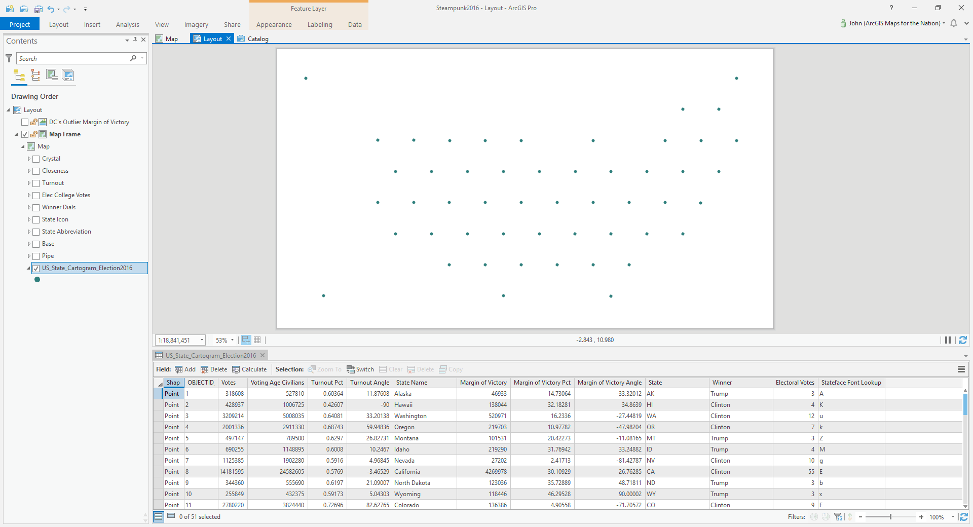
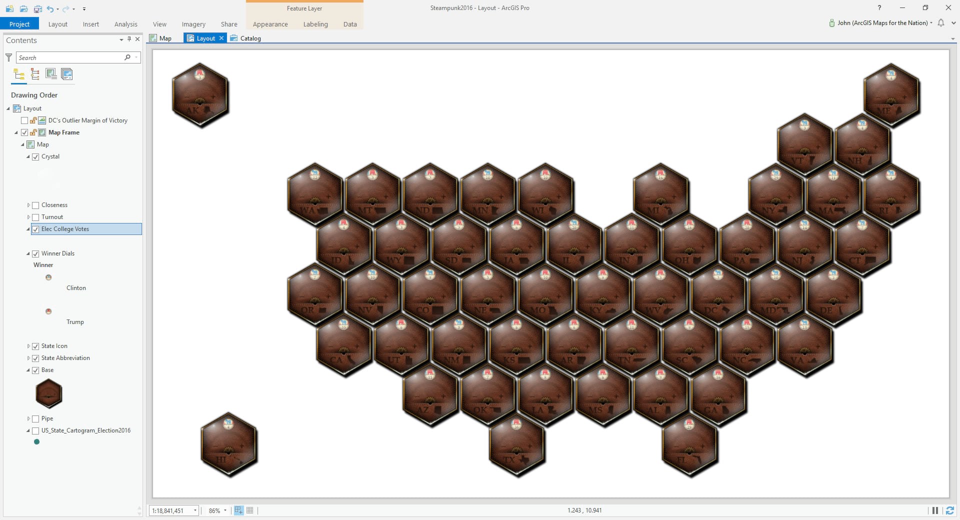
This point layer is the only data layer I’ll be using in this map. You can download it here, if you’d like. It’s a hexagonally arranged collection of 51 points, one for each US state and the District of Columbia. Each has 2016 election data (voter turnout, margin of victory, winner, electoral college votes, and state name) that we’ll use to drive the sneaky creaky squeaky symbology.
By the way, this point layer was converted from a hexagonal polygon tessellation project, which you might find familiar.
Design Assets
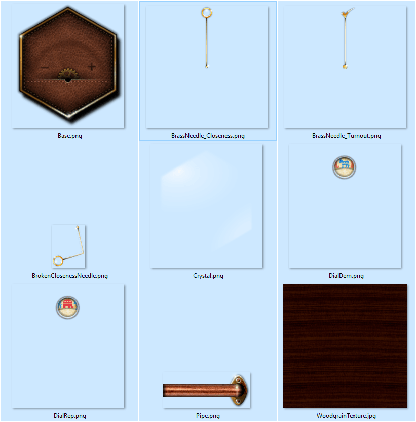
I’ve cobbled together some graphic assets that we’ll use as point symbology. By making a bunch of copies of the layer in ArcGIS Pro, then giving each a specific graphic, we’ll build up a little analog-looking display that will make you want to lean in closer and tap your screen almost expecting a little ting of glass.
You can download all these graphics here, if you feel like following along (or, should you ascribe to a more reverse-engineering persuasion, you can always just grab that Pro project).
Assembly
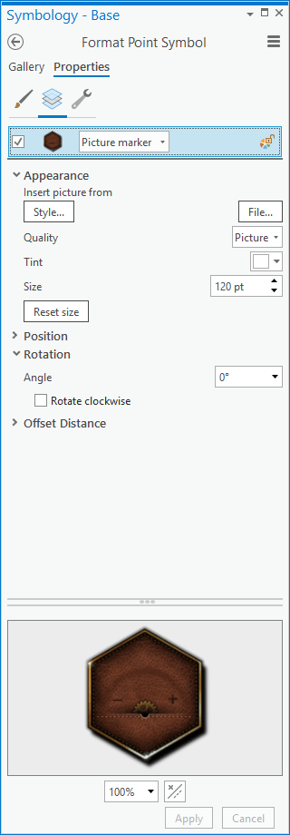
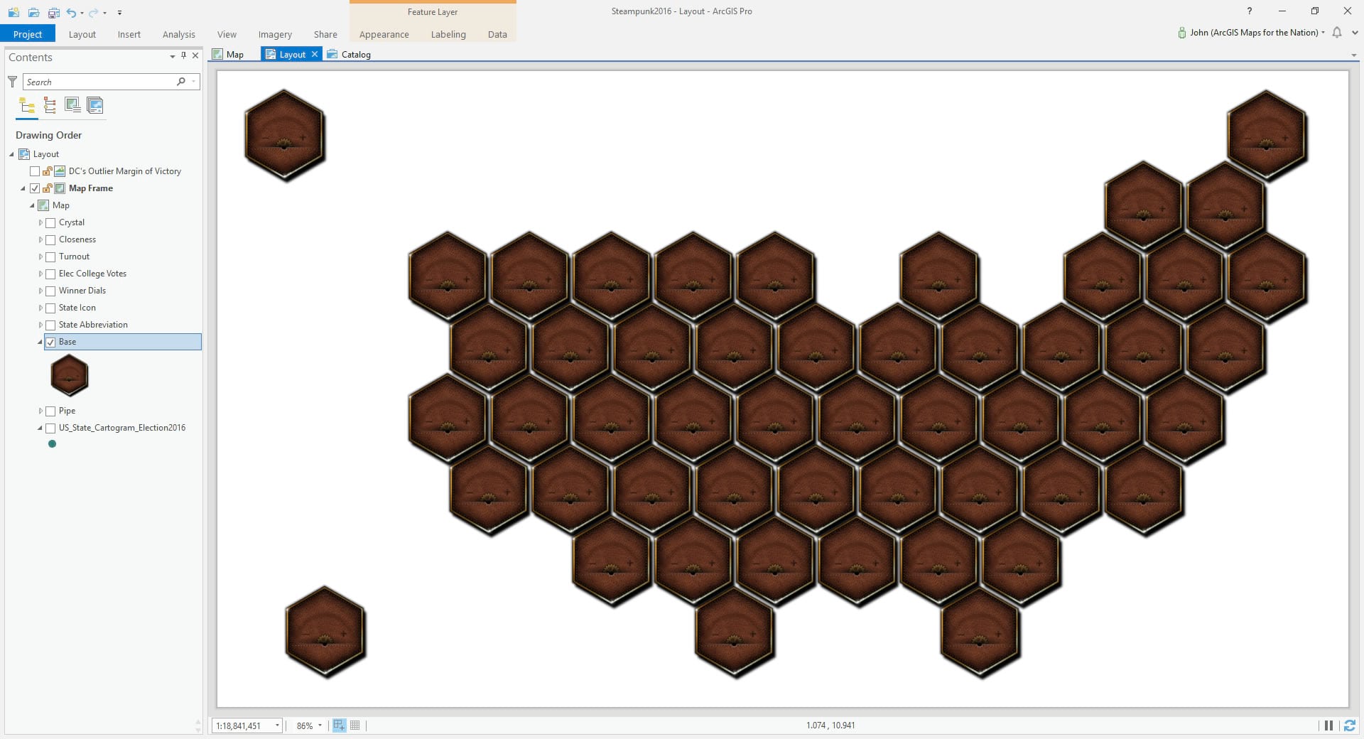
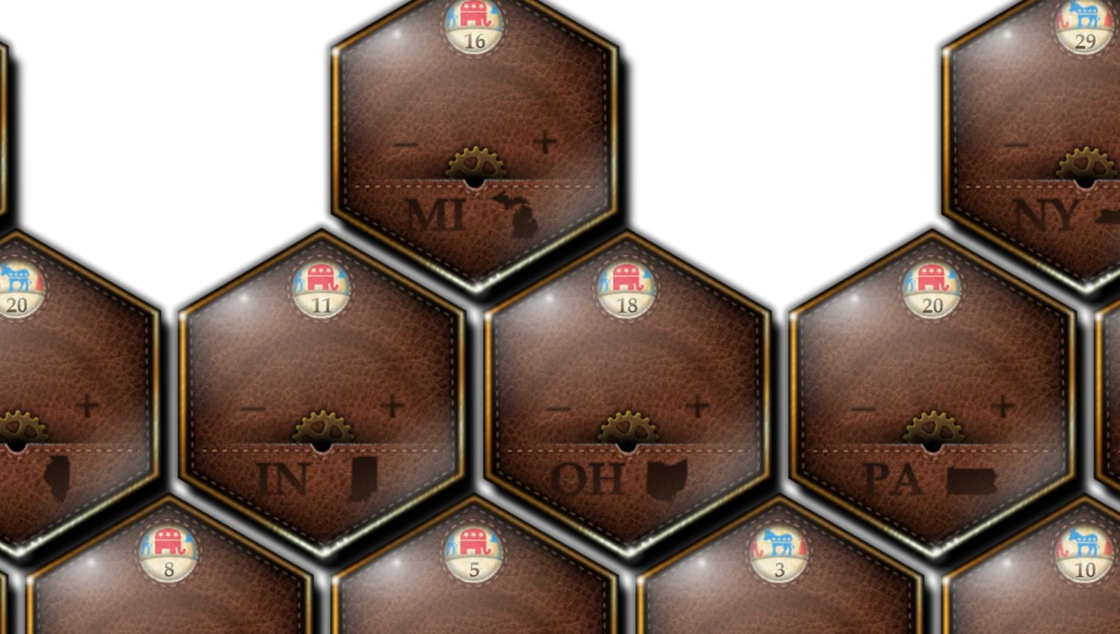
First of all, rather than the drab sad little default point symbol, let’s instead choose a Picture symbol and grab that intriguing hexagonal leather-backed brass-rimmed watch face.
Which looks like this…
Here’s a closer look…
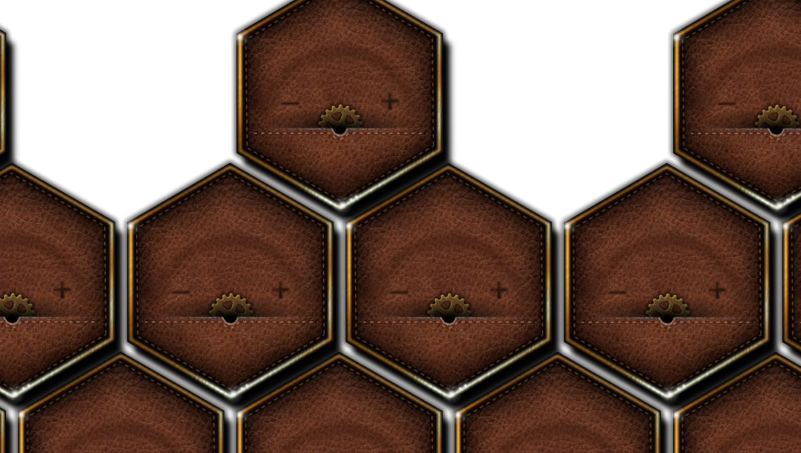
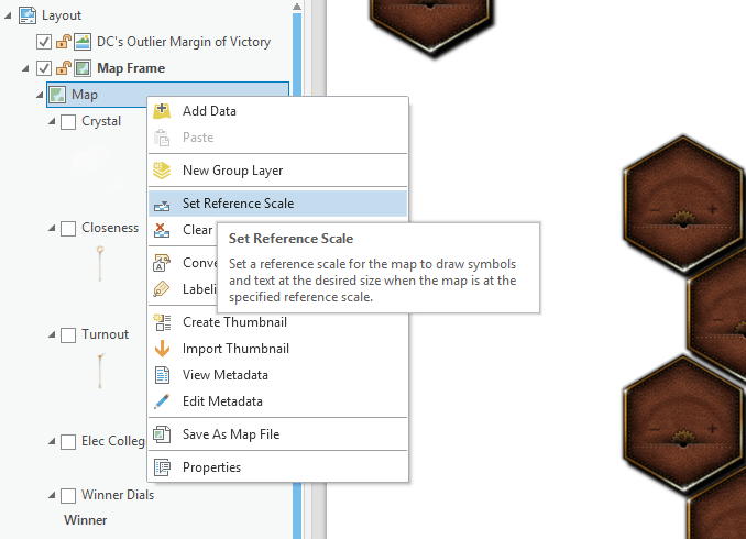
A word about sizing. I am working within a map frame that has been added to a layout. I find that, if you are making a static map, when you are done with your analysis and data management then it’s a good idea to add your map to a layout and work in that environment. So I just adjusted the picture size in the symbology panel until the watch faces were spaced how I wanted them. Then, to lock them down, I set the map’s reference scale (so their relative size/arrangement doesn’t change if I zoom in or out of the active map).
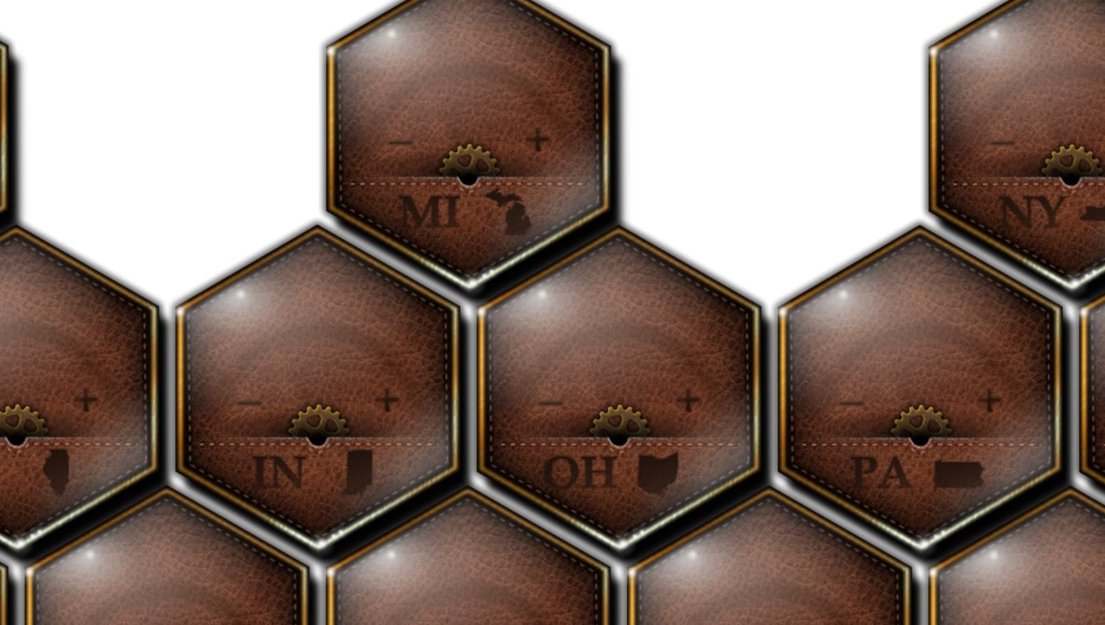
Now it’s time to bring in the watch face’s crystal covering. Glossy reflective embellishments like this are what really sells this sort of stuff. The more layers of sneaky light-play you can introduce to the skeuomorphic environment, the more skeuomorphic-y it gets. And when it comes to skeuomorphism, might as skeuomorph it to…11.
Burning in Some Labels!
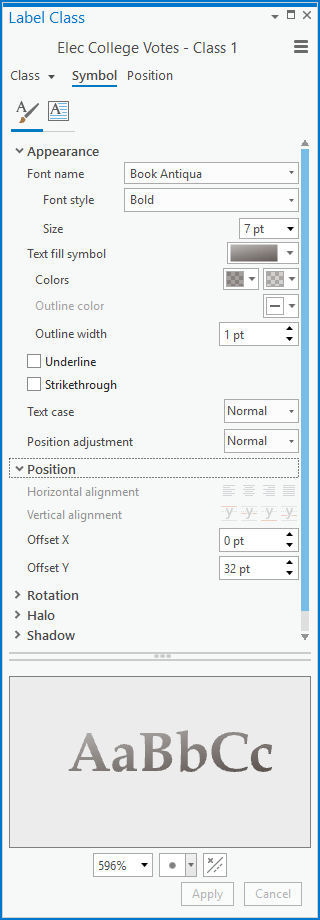
Each watch face has the state’s abbreviation and shape branded into the leather backing. These are just text labels. With two separate copies of the map layer, I leave the layer checked in the table of contents but then uncheck its symbol in the symbology panel (so we can see the labels, with no symbol). For both the abbreviation and shape icon labels I used a polygon style. And so can you! It’s just a simple little ArcGIS Pro style that looks slightly edge-blurred deep brown with varied darkness (download this style here). Yes, you can and should totally use polygon styles on text (exhibit A, exhibit B).
For each of the two layers, I set their properties to be centered directly over the point, and to “never remove” labels.
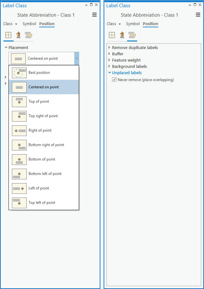
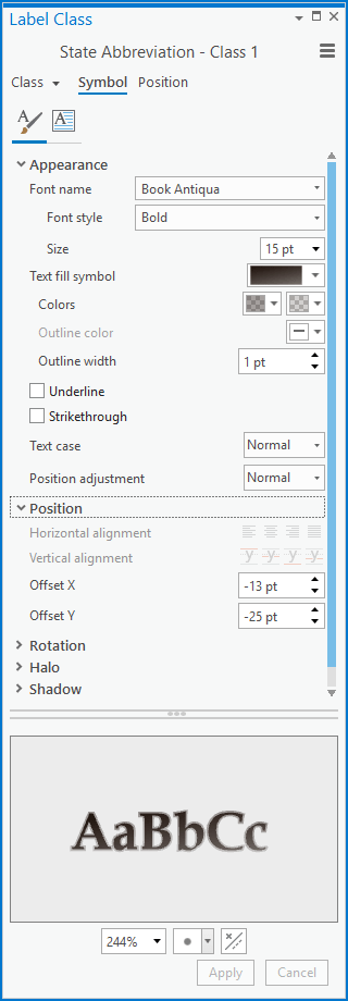
For the state abbreviation labels I used Book Antiqua and nudged its position down and to the left.
For the state shapes I installed the fantastic StateFace font (generously provided by ProPublica) and nudged them down and to the right. Because the StateFace font uses a letter for each state shape I first created a new field in the attribute table and typed in the right letter from the StateFace lookup table. It was a surprisingly challenging exercise for my brain to transcribe a letter associated with each state.
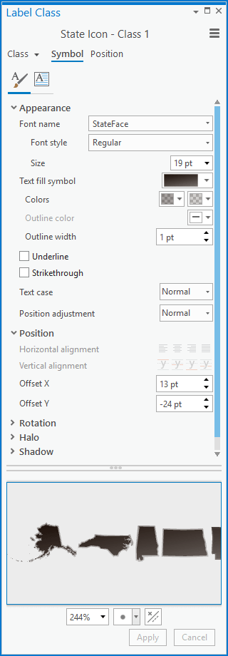
Looks plausibly seared on!
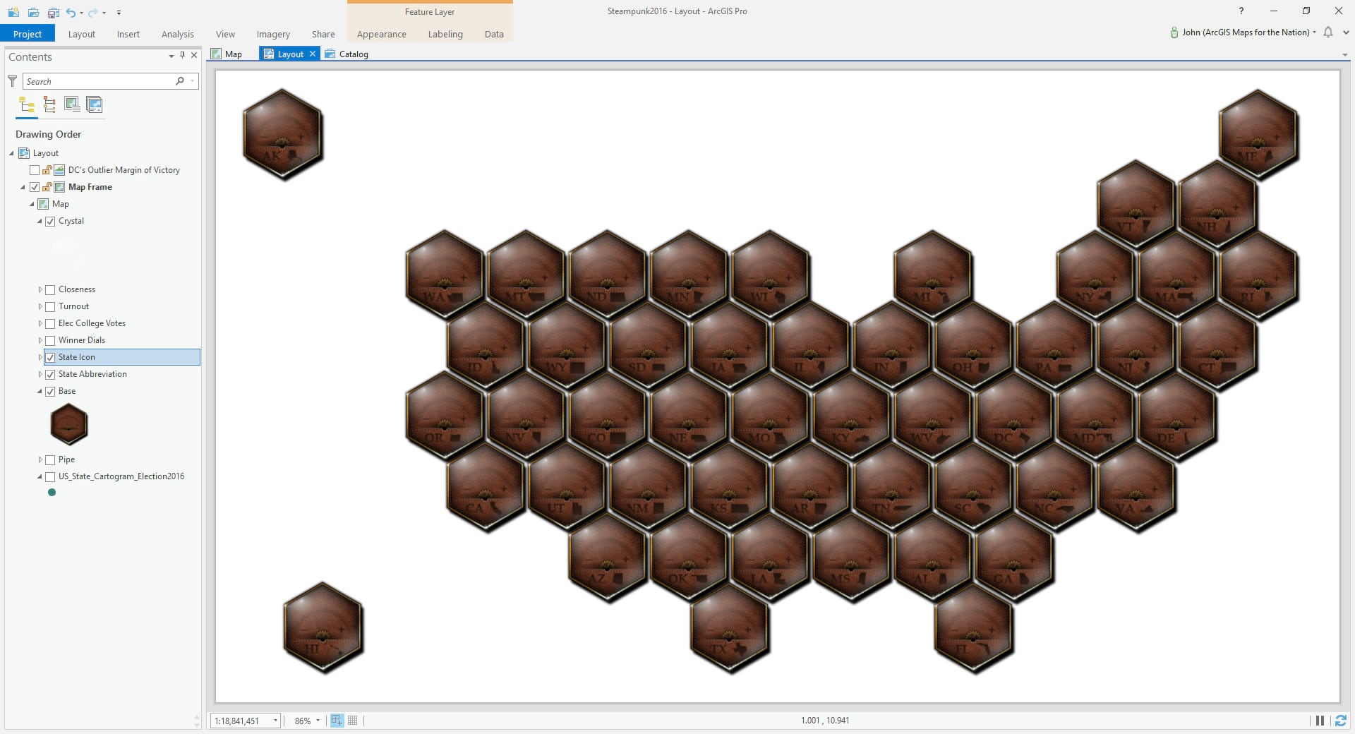
Winner Window Display
Each state has a small window display meant to appear like a rotating inner picture dial, like a watch face’s date window, showing the state’s election winner and its number of electoral college votes. This was done using yet another copy of our trusty point layer, this time with the symbology set to unique values and pointing to the winner attribute. There are two possible values.
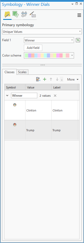
Each value was given a corresponding picture symbol.
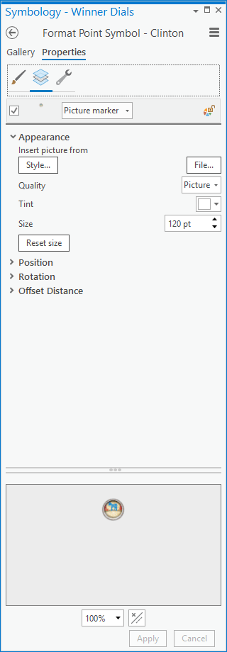
Then I added a label, gave it the “Branded Text Fine” polygon symbol (once again, from this style) and, like the other labels, centered it over the point and set it to “never remove” labels. I nudged its Y offset up to position it over the electoral window.
Looks like this…
But oh my goodness, how do we possible add those little dials and rotate them according to the election data? That, my mappy friends, is the cliff upon which I will hang this post.
But not too cliff-hangery because here is Part 2 of the Steampunk Election Cartogram, where we get all mathy and stuff and wrap up this crazy absurd, but somehow somewhat intriguing, map adventure!
Happy Mapping My Cartographic Compatriots! John

Commenting is not enabled for this article.