PART 2 of 2
In part one we assembled a somewhat photo-realistic steampunk-looking cartogram thing using just one data source copied into a bunch of layers with picture symbols (grab the images here) and a style to get blurry/inky/scorched labels. Here in part two we are going to use a formula to get our rotating dial graphics pointing the right (or left) way, and add (even more) tasteless flourishes in the layout. Then I’ll peer into the existential void and ask why I would do this sort of cartography in the first place.
Rotating Dials!
Ok, this is where it gets more technical. But not too bad. I mean, technical techniques are a technology tenet of our trade. Sorry, I just passed out. Where was I?
In order to get a dial graphic to rotate according to our election data, we have to translate our numeric values to a new range of -90 (pointed all the way left) to +90 (pointed all the way right). But how? A quick googling for a “rescale formula” led me to this little gem…
(((OldValue – OldMin) * (NewMax – NewMin)) / (OldMax – OldMin)) + NewMin
I created a new field for both turnout angle and closeness angle, and used the Calculate Field thingy, and this formula, to populate them. In both cases “NewMin” was -90 (needle points fully to the left for the smallest value, like a speedometer) and “NewMax” was 90 (needle is floored to the right). The “OldMin” and “OldMax” values were just the lowest and highest state values for turnout or closeness (except for DC’s closeness value, a massive outlier—more on that later). And it worked like a charm!
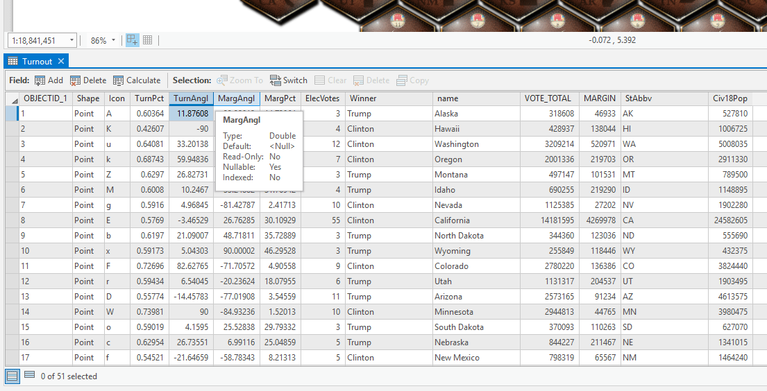
So now that we have nice viable values to symbolize by, lets bring on the needles…
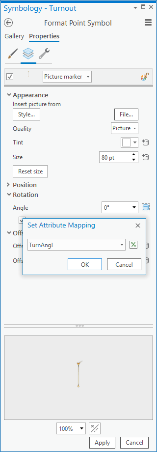
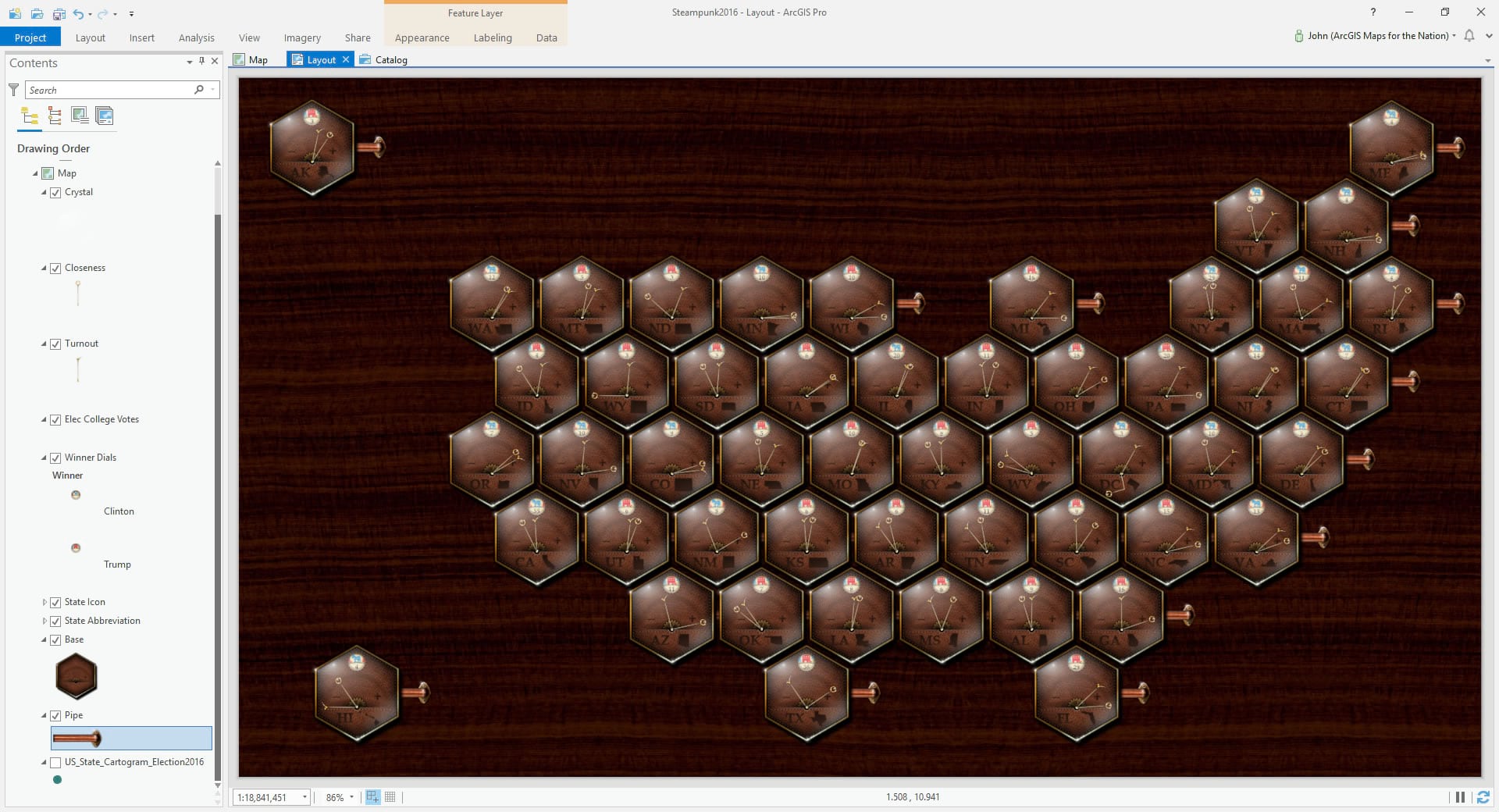
Here is the symbology panel for a copy of the layer where I set the symbol to be the check-mark looking needle (you know, like a vote), which will represent turnout (the proportion of voting-age citizens who actually voted). I sized the picture symbol so it fit well over the background and nudged it down a bit so its hinge appeared in the right spot.
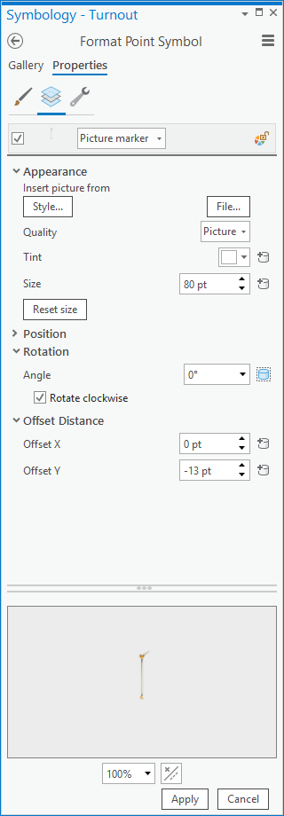
Here’s the diabolically fun part. See that little database can icon next to the symbol layer’s rotation section? You can point this to an attribute. Can you imagine a world where I had just calculated a -90 to +90 degree attribute for voter turnout?
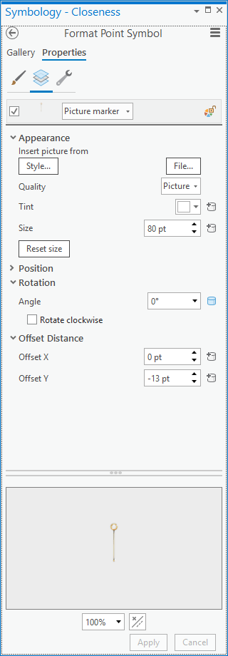
I did the same thing for election closeness using a cool magnifying glass sort of thing because we’re seeing how close it was…
And wham! We have some bivariate needles/dials/whatevz showing us a comparative look at voter turnout and closeness…
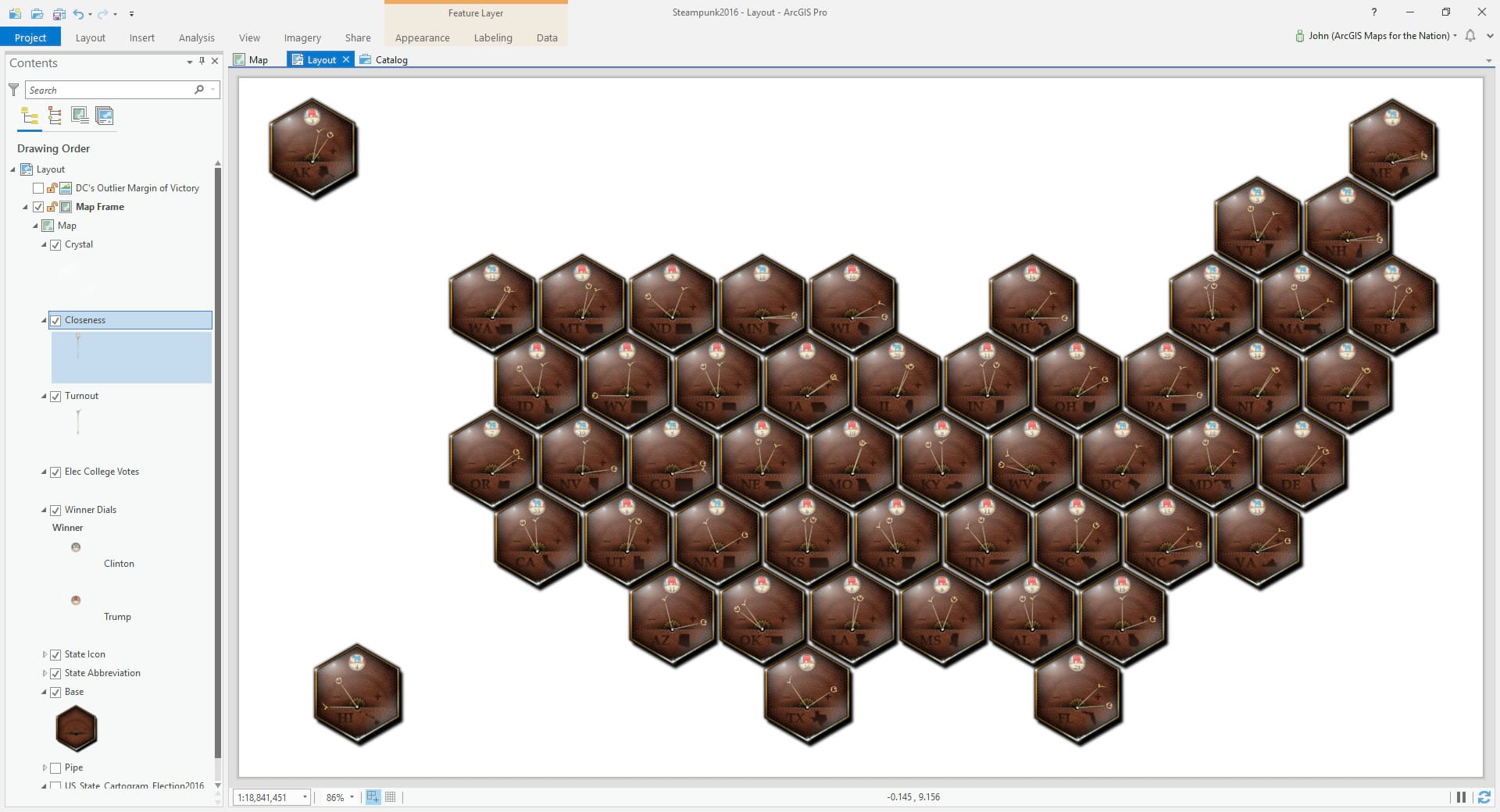
What a time to be alive. Can you imagine rotating each of these manually in photoshop? I have done that, and I won’t go back. You can’t make me.
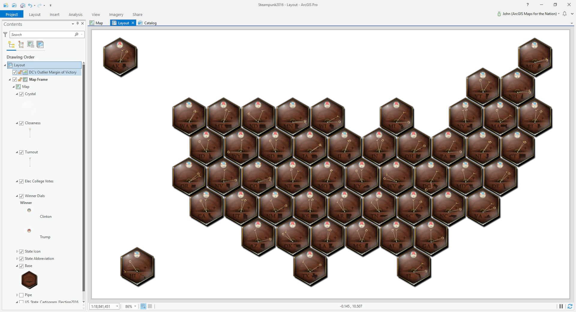
Outlier
You may have noticed that there is no magnifying glass closeness needle for Washington DC (you do now, anyway). That’s because DC is a mega outlier when it comes to partisan voting; it’s a special case. It is a city, and cities tend to vote overwhelmingly for the Democratic candidate (while rural areas tend to prefer Republican candidates). Without a rural population to balance this trend, DC favored the Democratic candidate by a margin of 86%. The next most partisan result was Wyoming, which favored the Republican candidate by a margin of 46%. To calculate a closeness angle for all the states that included DC, they would all be jammed over to the close direction and we’d lose most of the visual nuance of closeness. So I used second-most-partisan Wyoming as my “OldMin” value when re-scaling the closeness data to the angle range. But as a result the DC closeness needle overclocked to the left (not close) so hard that it fell outside of the little -90 to +90 speedometer range. Outliers are interesting puzzles.
I created a definition query (layer properties > definition query) to hide the actual DC closeness needle and added in to the layout (insert > picture) a graphic that I hand-made. It shows the DC closeness needle where it would point, if it could, just bent as though it hit the edge of the watch-face and crimped the needle. Cheating. But a well meaning and fun sort of cheating.
Accoutrement
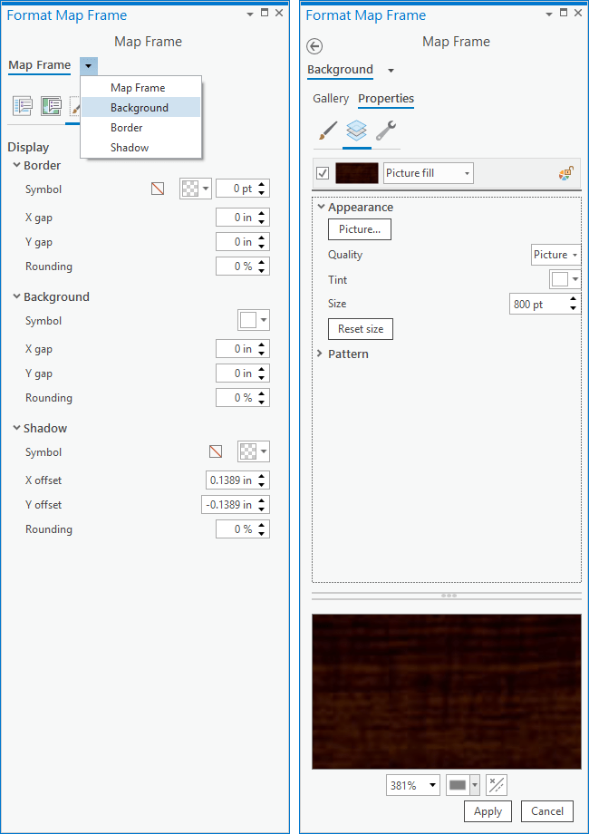
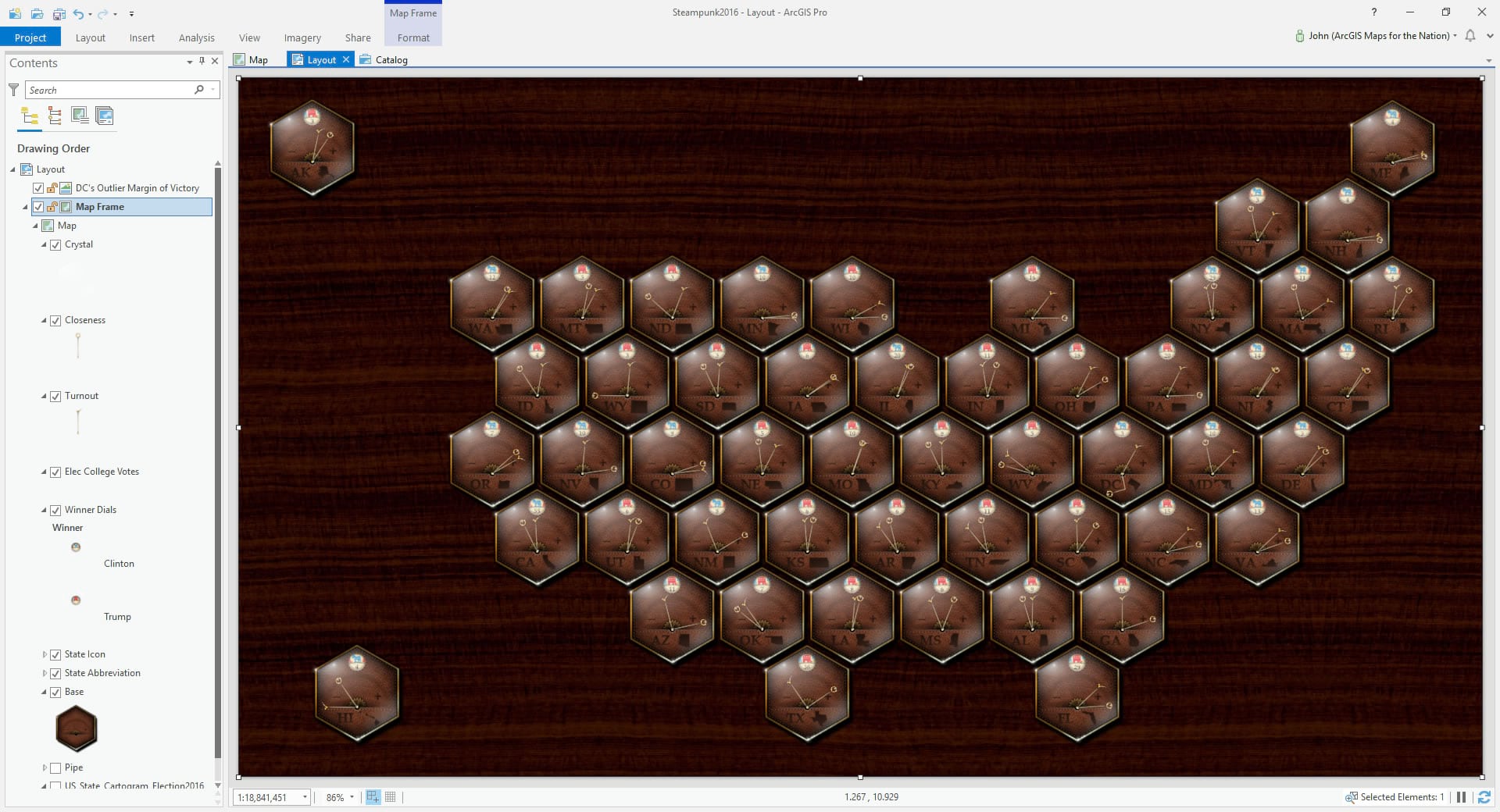
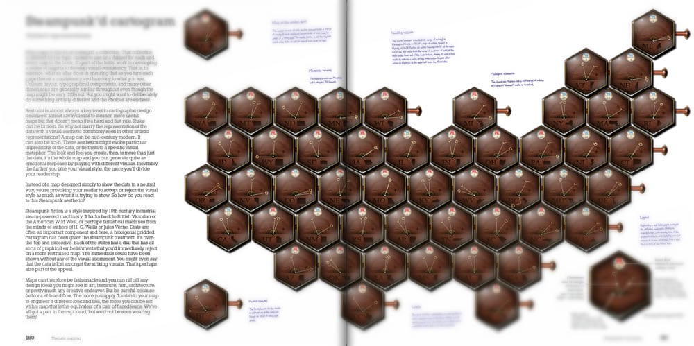
So we have all these plausibly-realistic steampunk watch-face gauges showing us election data in an analog fashion but they are floating in white space. Let’s give these little mechanistic doodads a nice deep walnut base. You can play with the background and outline properties of a Layout’s Map Frame (double-click the map frame). I have a nice stock image of walnut (or maybe rich mahogany?) that I’ve made (included in the pack of images, and even the style, if you are following along).
Here are our electo-hexo-gauges arranged upon their fine grained highly polished baseplate…
But what’s powering this artifice? Certainly a steampunk cartogram is nothing without steam. Here are a series of copper pneumatic tubes, delivering lifegiving coal-fired steam pressure to these gauges, and, by extension, our understanding of the complex interplay of electoral participation and motivation.
And lastly I photoshopped a legend to describe the needles and provide some for-instance archetypes. Let’s take a look.

Looking
It’s interesting to me how varied the states’ voting behavior is. I would have expected that partisanship and turnout would be inversely correlated—blowout states where the winner was assured having a demotivating effect on turnout, while nail-biter states would turn out voters in droves. But not really. You get an interesting mix of behaviors when it comes to this relationship, made visible by a bivariate visualization.
Some states behaved according to my expectation of similar needle orientation (Maine, Minnesota, New Hampshire, Colorado, Oregon, West Virginia, etc.). But some states really surprised me, where the needles diverge. Like, what’s going on in Texas? Pretty tight race, but a deflated turnout. Same with Arizona, Nevada, New Mexico, Georgia, and even my home state of Michigan. Conversely, many states show a curious sense of civic duty, voters turning out in droves despite a pre-ordained outcome (Wyoming, North Dakota, Vermont, Massachusetts, DC). Are there underlying dynamics of engagement and demography that this sheds light on? Sure! Bivariate visualizations help us make connections between two values and illuminate paths of better, or new, question-asking about that relationship.
Pondering
Ok ok, so we know that you can make a map that looks like this…but why? Ah, why…
Sure, this map could look any number of ways and lie anywhere along the gradient of minimalist to extravagant. Generally I’d lean in a significantly more moderate direction but sometimes it’s exciting to just dive into the deep end in one direction or another. The joy of making leads us to all sorts of unexpected or surprising waters. Impractical waters? Maybe. But practicality has a lot of dimensions to it. Is it practical to expect my pre-teen kids to engage in a minimalist election map efficiently and dryly plotting the turnout and partisan margin of victory? Not really. Are you reading this blog post (or thinking of someone who might enjoy this map) because it caught your eye? I hope so! Are you thinking of turnout and preference in more a literal sense now that you are seeing them represented as somewhat-tangible paired brassy dials? Maybe!
A version of this map will appear as one of the many many election maps possible with the same underlying data in a follow-up to Ken Field’s book, Cartography., coming out this summer. So stay tuned for that and enjoy the variability and viability of visualization.
In the meantime, happy (and adventurous) mapping! John

Commenting is not enabled for this article.