So you use, make, or install a custom style for your map and it looks great. But then your labels and title sort of look…out of place. Bummer, right? No way, not a bummer! You can totally apply a polygon style to your fonts in ArcGIS Pro!
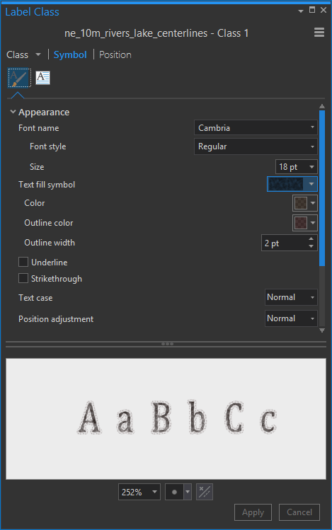
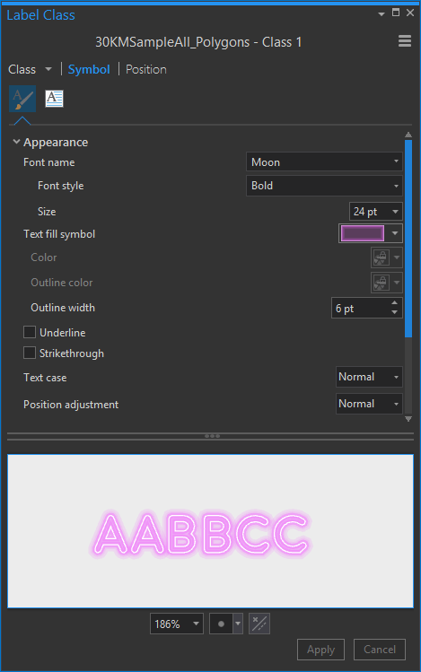
For any label class, or layout text item, you can point to a symbol gallery. In the properties dialog, expand the Text fill symbol droplist and choose More polygon symbols…
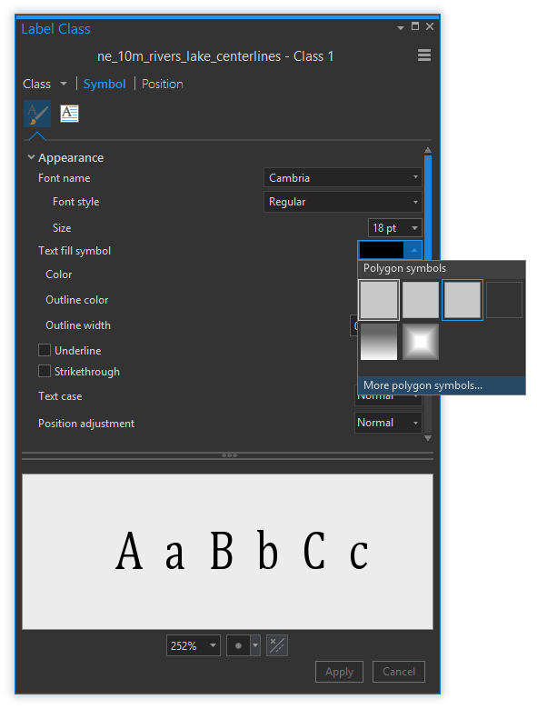
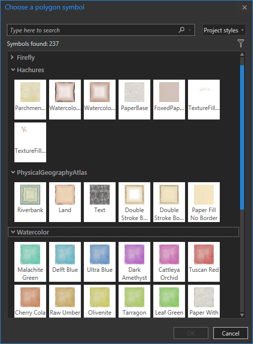
You’ll be whisked away to the unspeakable pleasures of the styles gallery, where all of your polygon styles await your orders. (if you are new to custom styles in ArcGIS Pro, get ready to live)
For example, here is a map of the Mediterranean using the custom Watercolor style. Boy that too-perfect crisp font really busts up the effect though.

But not to worry. In the properties for this text item, I expand the Text fill symbol droplist, choose the More polygon symbols button, and pick a nice watercolory polygon style…
Now that text looks like it belongs!

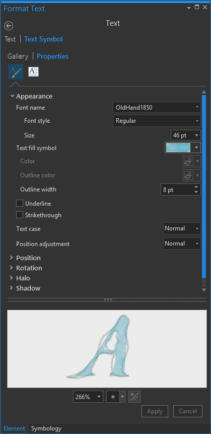
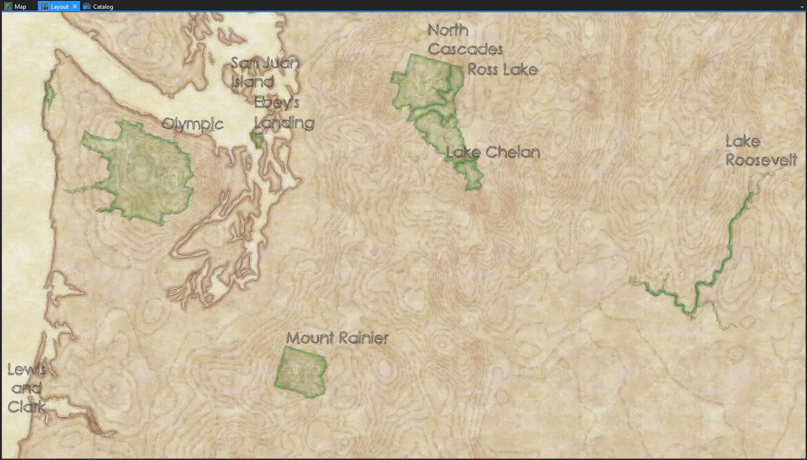
Here’s a map I’ve got rolling using the custom Hachures style. Pretty cool, but those labels are obviously offending the vintage ink-on-parchment aesthetic this map has going.

But if I point the Text fill symbol to a nice sketchy polygon symbol in the Hachures style…
…then my labels get the same sort of visual treatment as the rest of the map. Now I can sleep at night.
Here is a map of Canadian rivers that generations of explorers would have killed for. The river labels and title are too crisp to really look like a vintage hand-tinted plate ripped from the binding of a musty atlas (grab this style here).

But if I point to a polygon symbol in the Physical Geography Atlas style, the text gets a mottled inky effect with some edge bleeding.
And just looks better.

Wait, do all these styles have to look like they came from the past? No way, they can look current too. Or they can look like they came from the future! Here is a hexagonal mesh in the Firefly style, labeled with drought data.

But you can just as easily give labels the same Firefly glow…
Hmmm interesting! Don’t know if it’s definitely the way to go, but hey, it’s good to have options…

Anyway, there you have it! Go ahead and explore applying polygon styles to the text in your maps. You may find something that does just the thing your map’s text needs. Or not. But at least you can say that you tried.
Happy Text Stylifying! John

Commenting is not enabled for this article.