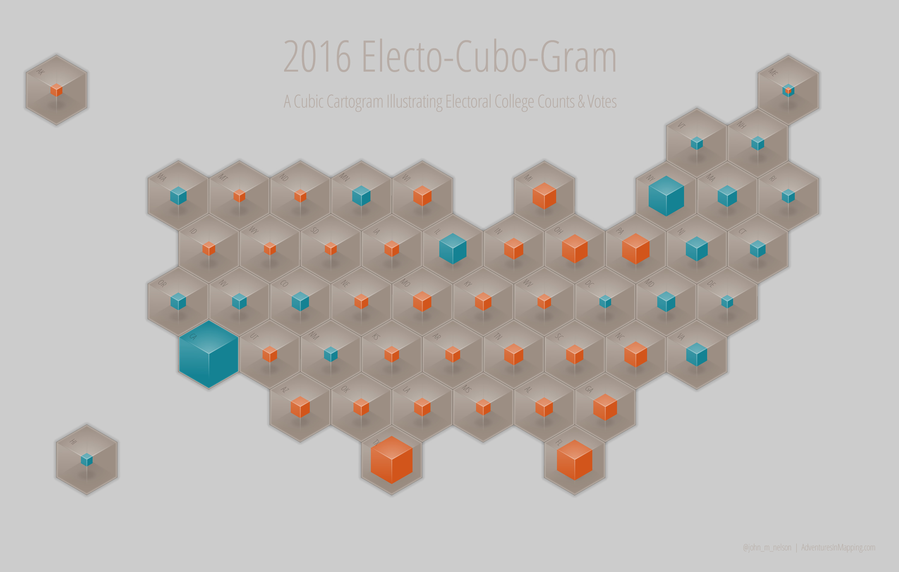
Here is a cartogram showing the comparative number of Electoral College votes per state, and how they voted in the 2016 US Presidential Election.
This cartogram was created entirely in ArcGIS Pro. Let’s peel back the covers and take it step by step…
Tessellation
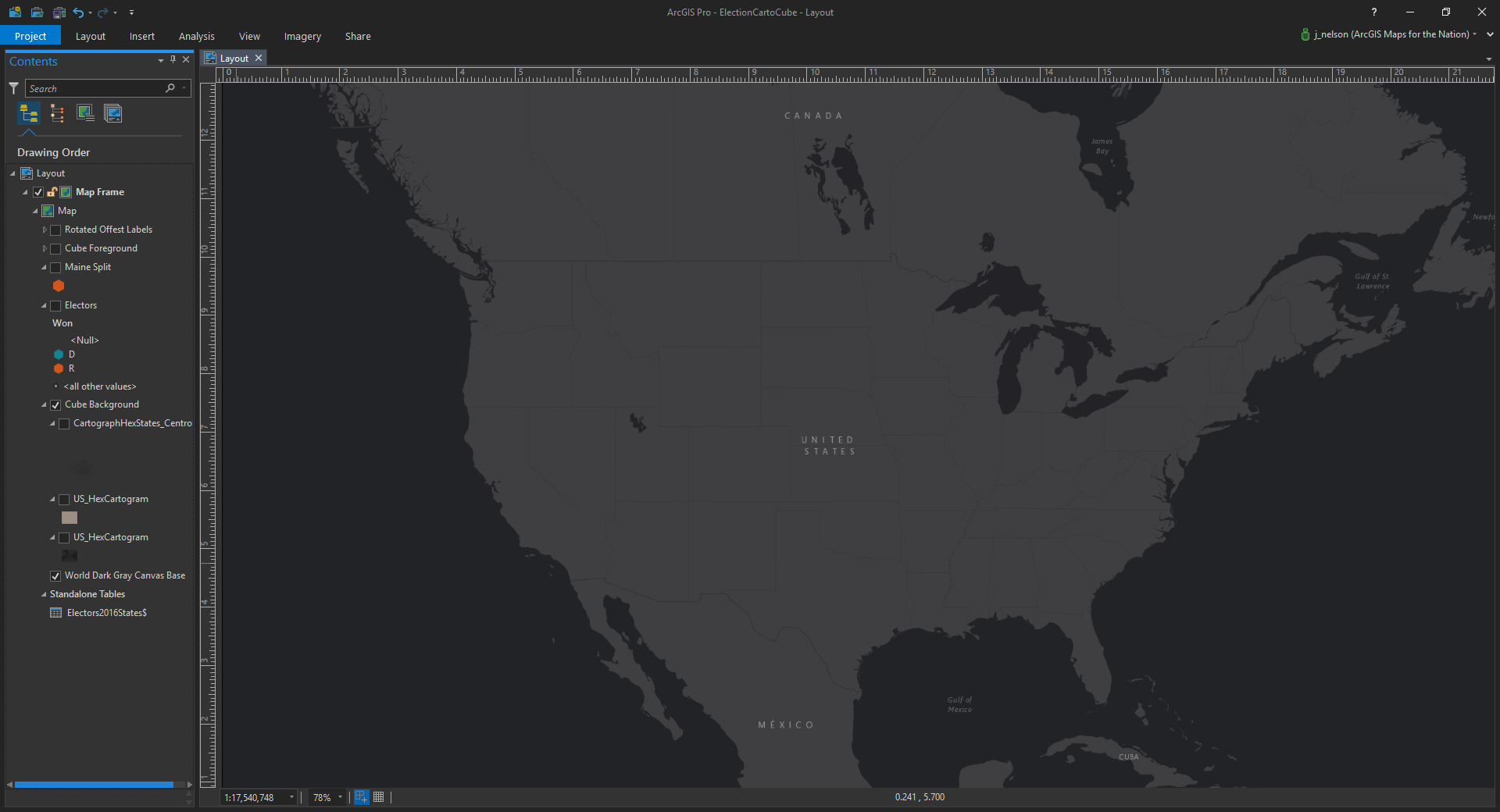
Here is a map in ArcGIS Pro roughly showing the extent of the Untied States (excluding Alaska and Hawaii, but don’t worry -we won’t those bastions of beauty).
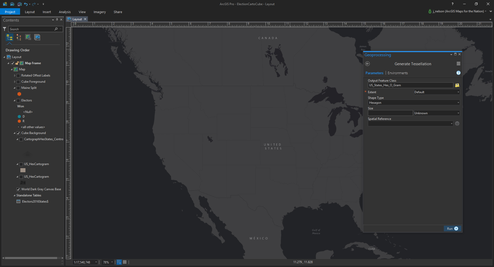
Next, run the “Generate Tessellation” tool. Choose a cell size so that 50 or so hexagons will fit roughly over the US.
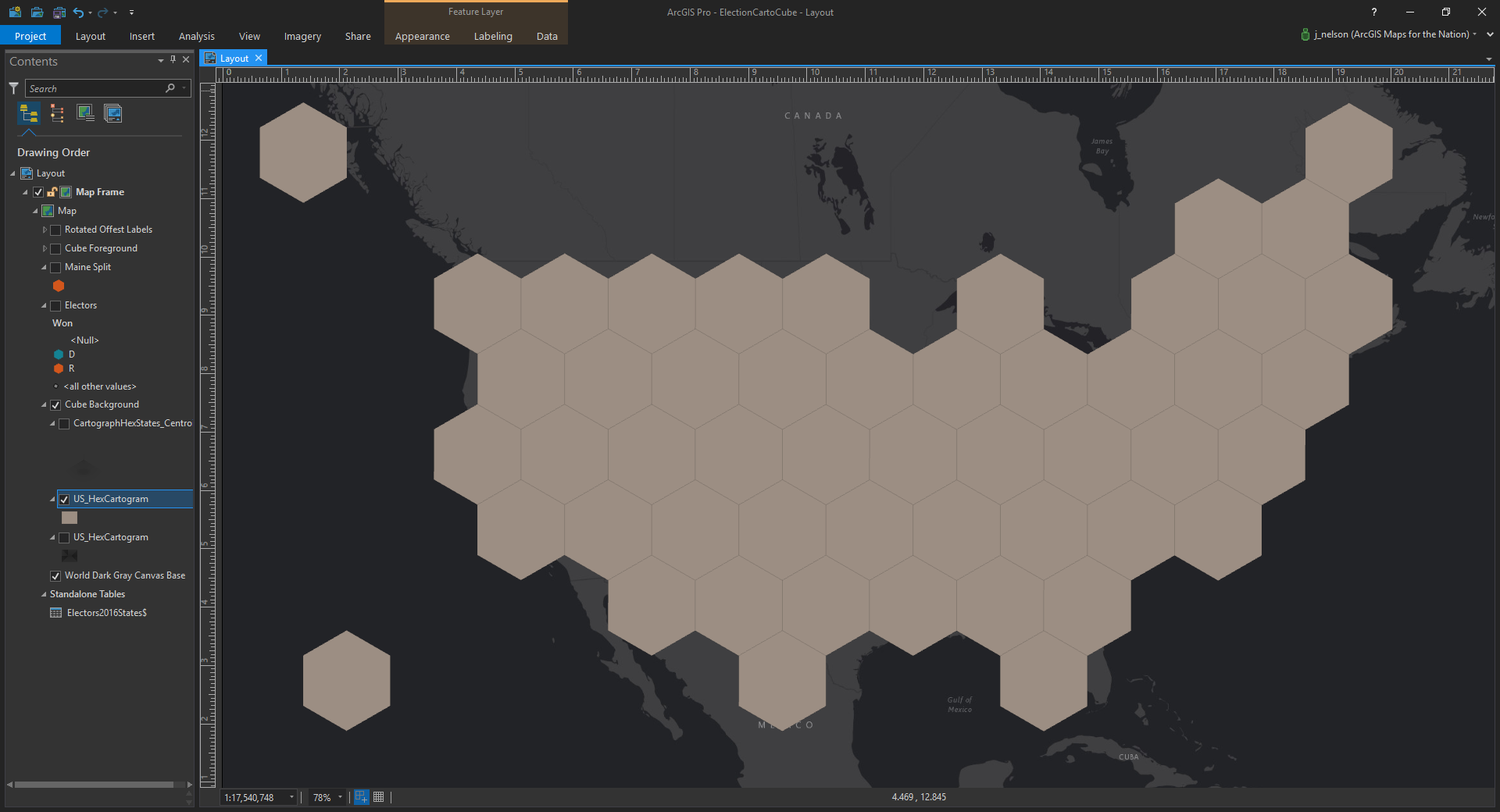
The default orientation of the hexagon tessellation is horizontal (pointy bits go sideways). But they look cooler in a vertical orientation (pointy bits point up and down), so I rotated the layer 90 degrees via the draw tools.
Next, pare back unwanted hexagons so that you only have hexagons that logically correspond to the general location of states. This is some manual work and represents a fair bit of whiteboarding and puzzling. But have fun with it. I used the NPR data team’s tessellation as a starting point and made a couple tweaks, as I recall.
Then, assign a unique state key (I chose the two-letter state abbreviation) and attach election attributes to your new “states” via the “join by attribute” tool. It’s ALIVE!!
You can download this starter hex cartogram as a shapefile here.
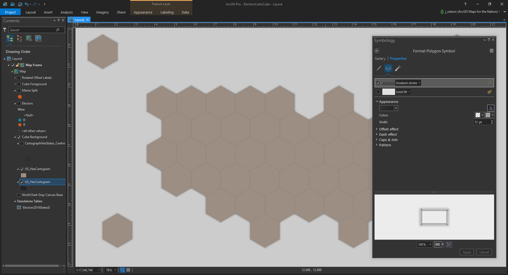
We can dispense with the now-distracting basemap. But I’d like these hexagons to pop off the background a little bit, with a drop-shadow effect. This can be done using a Gradient Stroke for a copy of the hexagons layer, dragged beneath everything. With a really thick stroke, give it a starting color of opaque black which transitions to fully transparent black. Presto! A shadow.
It’s important to do this stuff in a Layout tab rather than a Map tab from here on out, so that the graphic sizes fit into a consistent size (rather than re-sizing if you zoom in and out).
Proportional Symbols
Now that the hexagonal base is in place, it’s time to start wielding some GIS magic on these states. To represent the number of each state’s electoral college votes, I converted the hexagon polygons into centroids, using the Feature to Point tool. Point symbols will be easier to style. Assigning a hexagon point symbol is a clever trick to make your hexagons appear scaled.
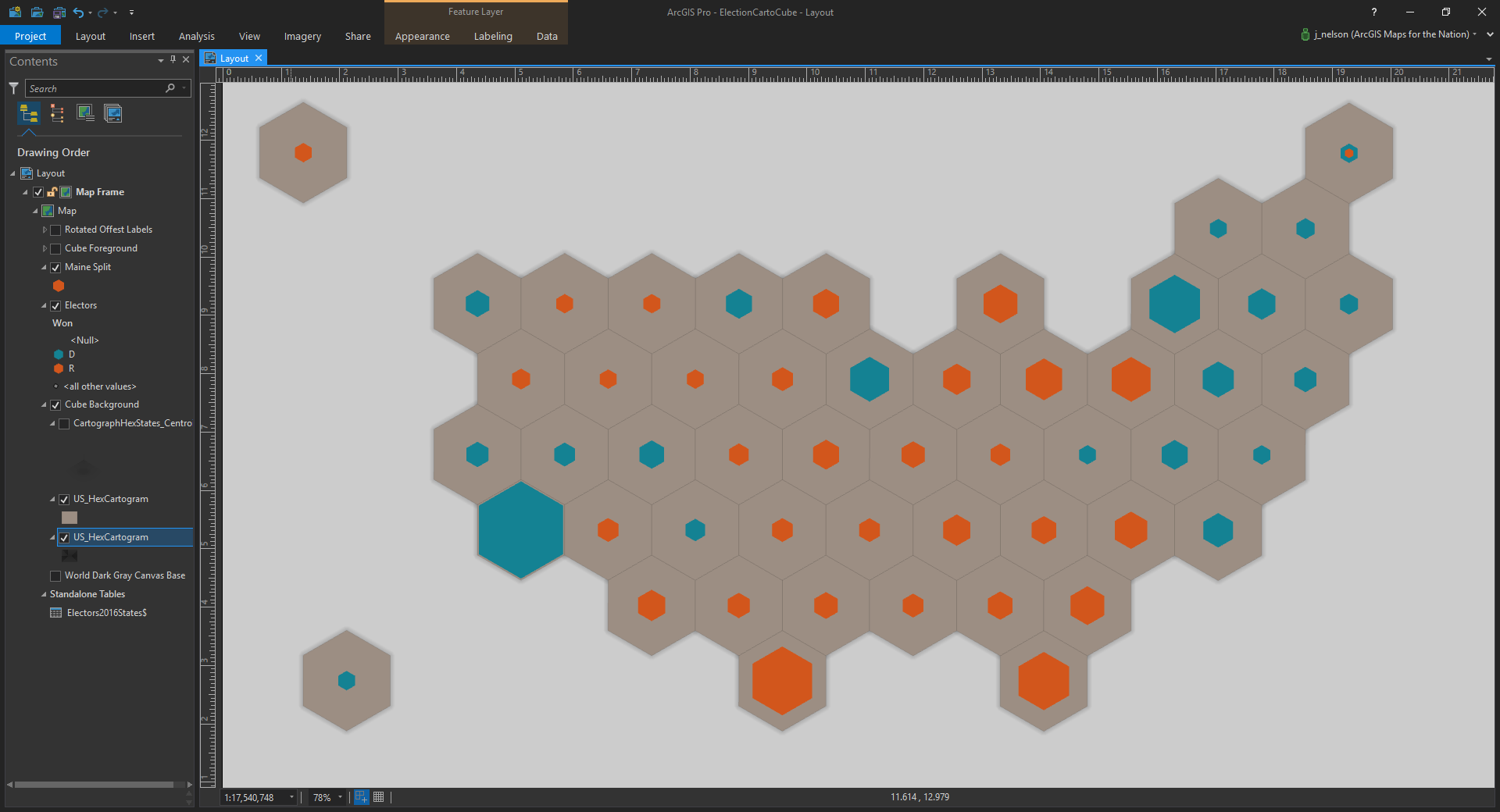
How to symbolize them this way? I choose a Unique Value method of symbolizing these points, Democrat-winning states I assign a blue color and Republican-winning states I assign a red color.
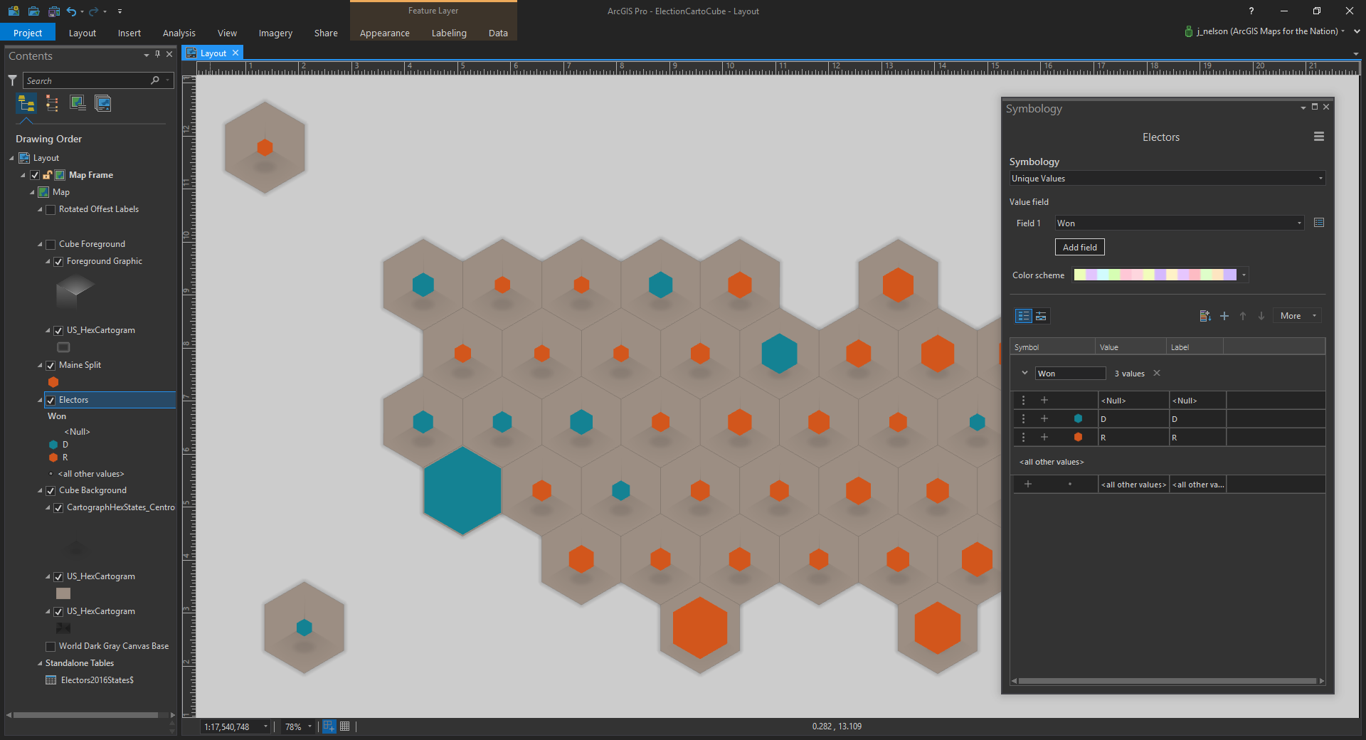
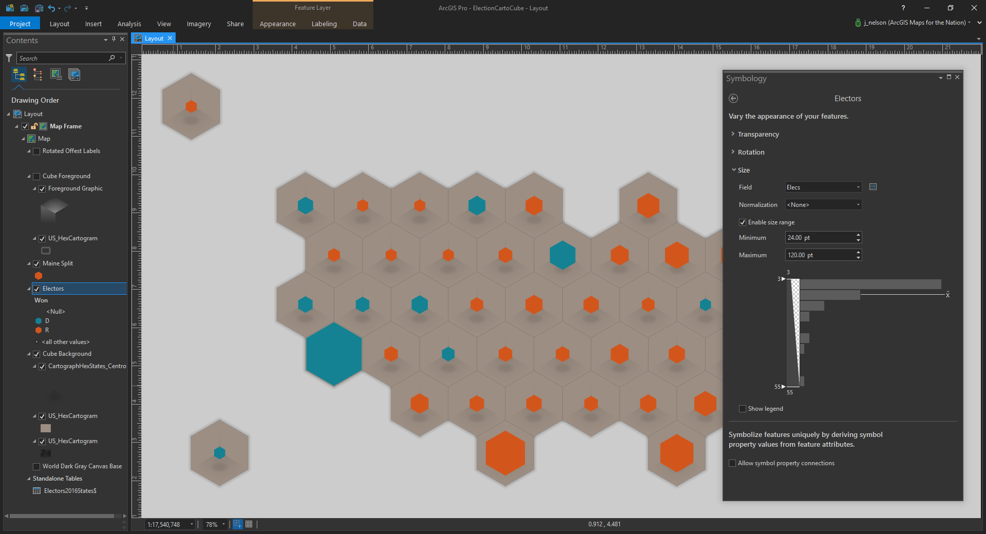
Then, via the little hamburger menu at the top of the Symbology panel, I chose Vary Symbology by Attribute, to tie the size of these colored point symbols by yet another data dimension: Electoral College votes.
The result is a bivariate symbol. Bivariate means the features are symbolized by two data attributes at the same time. Color denotes the winning party, size denotes the number of Electoral College votes. “Who and How Much.” In one go. Nice.
Graphical Shenanigans
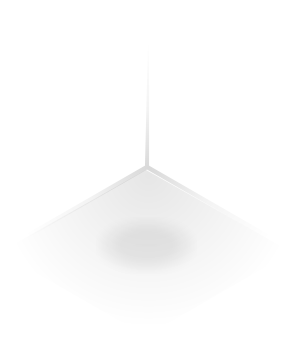
But what is a hexagon but just a cube viewed from a certain angle? To sauce this cartogram up a bit, and push it from just another hexagonal cartogram into a…cubic cartogram…I drew a little reflective angle graphic and used it as a Picture Symbol for a copy of the hexagon centerpoints that I dragged to the top of the layers. Here is the cube foreground (you can right-click this and save it for yourself it you like)…

And I copied the layer again and gave it a graphic to look like the subtle shading of a glassy cube and put it underneath the bivariate layer. Like a graphic sandwich. Here it is…
That layer sandwich really helps cubify this thing…
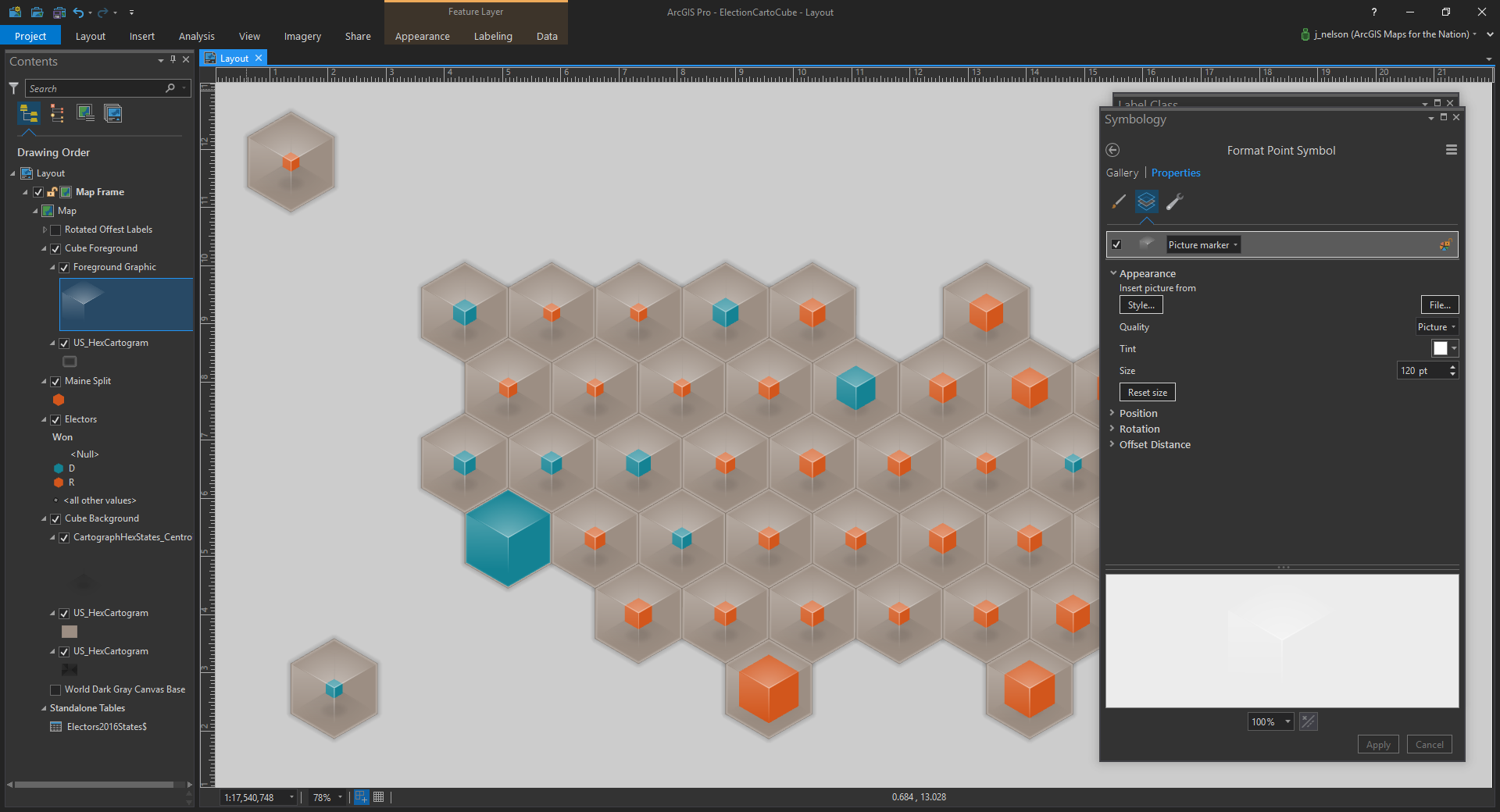
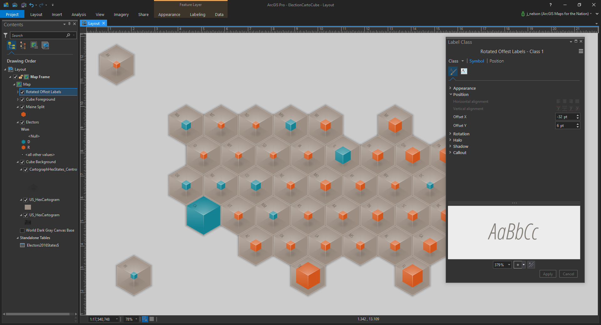
Up next is to add a label to the cubes. I used a small italics font and tweaked with the offset distances so that it pushed the label over to the corner of the “box.” I also played with the rotation so they looked somewhat 3-dimensional. Not perfect but plenty good.
Fin
And that’s that! Sneaky uses of picture symbols can add a fun sense of dimensionality to a point symbol. I hope you give it a try!
Some infrequently asked questions…
Is there a cognitive consideration when crating a map of scaled hexagons that then appear as volumetric cubes rather than area-scaled 2-dimensional symbols? Absolutely. You got me there. I suppose I should have used the “square root” of electoral college votes as my scaling attribute since the result is intended to look area-scaled.
Why make these proportional hexagon symbols look 3D? Because it is pretty. And when I show it to people they immediately go from yawns to fawns when the 3D graphics come into play. Eye-catching design is the hard-to-come-by currency that purchases a second, closer, look.
Can the graphical hack of foreground/background layer sandwiches be used for shapes other than hexagons? Yes, but why?
Happy cube mapping! John
**UPDATE**
A couple cartographers recently used this method to create their own awesome maps!
@pokateo shared this cubo-gram of commuter proportions and their commute duration.
Jonah Adkins made this beautiful rainfall cubo-gram, which is probably the best phenomenon I can think of for this aesthetic.


Article Discussion: