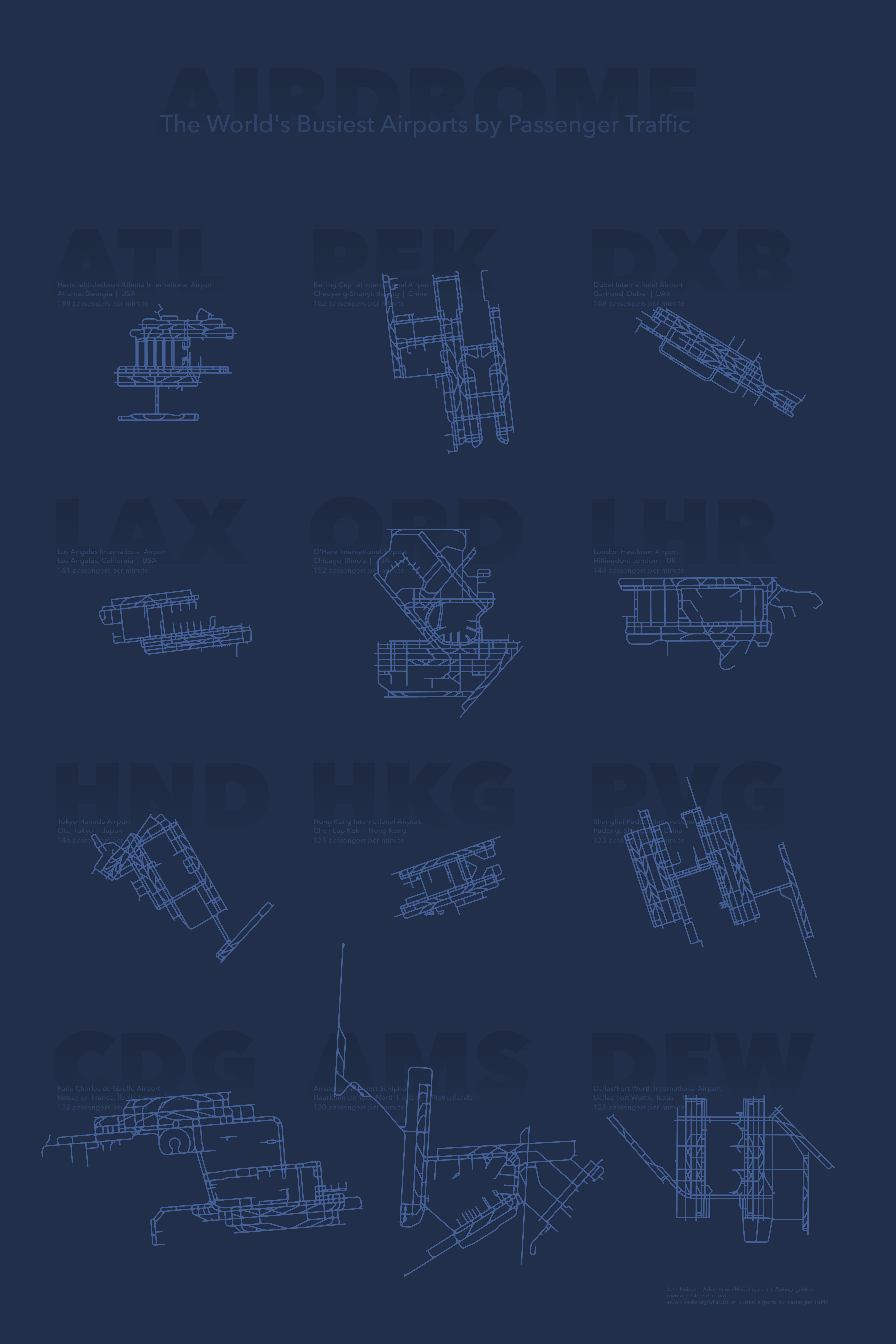
Here is a small multiple showing the 12 busiest airports by passenger traffic.
Small Multiple
A small multiple is a layout structure that presents several minimalist instances of a data graphic, each showing a different aspect of a phenomenon (like time, magnitude, category, whatevs) for the reader to compare. Like frames in a comic strip or faces in a yearbook, they present an overall picture by presenting a grid of individuals. Sort of like an animation, but, you know, without the animation. They’re a super handy way to present the variability and trends within a data set. Ultimately, most thematic mapping asks the question, compared to what, and small multiples let you readily compare.
In this case, the first order of business is just in checking out which airports qualify as the world’s busiest. Then there are all sorts of interesting differences between them to note, most obviously may be the tremendous variability in physical size. I was surprised, anyway, considering their similarly massive capabilities to shuttle mountains of people. Hong Kong? It’s comparably tiny, but it is perched in a part of the world where space is at an unbelievable premium. I was not, however, surprised to see the sprawling extent of Amsterdam airport, where Danielle and I ran for miles to just barely make our connection on the other side. I plopped down into my seat utterly relieved but coated in a cold sweat, 98% sure I was going to throw up. I didn’t, which was a relief.
Another interesting comparison to make here is the strategies at packing in all those runways and taxiways, particularly the apparent growth strategies as terminals were added over time to the original plan.
Anyway, enough dawdling. Let’s see how to make this thing…
How To
This map is made 100% in ArcGIS Pro. There were three main tasks in putting it together…
- Getting the airport geometry
- Creating a multiple-map layout
- Text shenannigans
Let’s do this thing.
Data
My set of the largest airports (by passenger traffic) came from this handy list. I chose twelve because that was about how much work I felt like doing (wink). Ok, now we have our candidates, but where to find the juicy runway shapes?
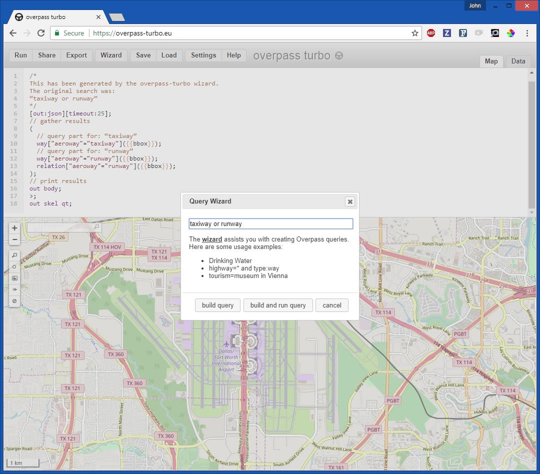
This data was lovingly and gratefully harvested from the wonderful OpenStreetMap. If you just felt a pang of despair because you don’t know how to download specific types of data from specific locations in OpenStreetMap then push that feeling down to your feet. I felt the same way. But hopelessness is often just a disguise that unfamiliarity wears. Dylan Moriarty, who does a lot of fantastic work for Humanitarian OpenStreetMap (and, by extension, all of us) showed me how to use overpass turbo to find and extract any sort of feature from within an area of interest.
So I zoomed in to an airport, chose “Wizard”, and typed taxiway or runway. OpenStreetMap has kajillions of feature types. Here’s a rundown of all the terms you can search for.
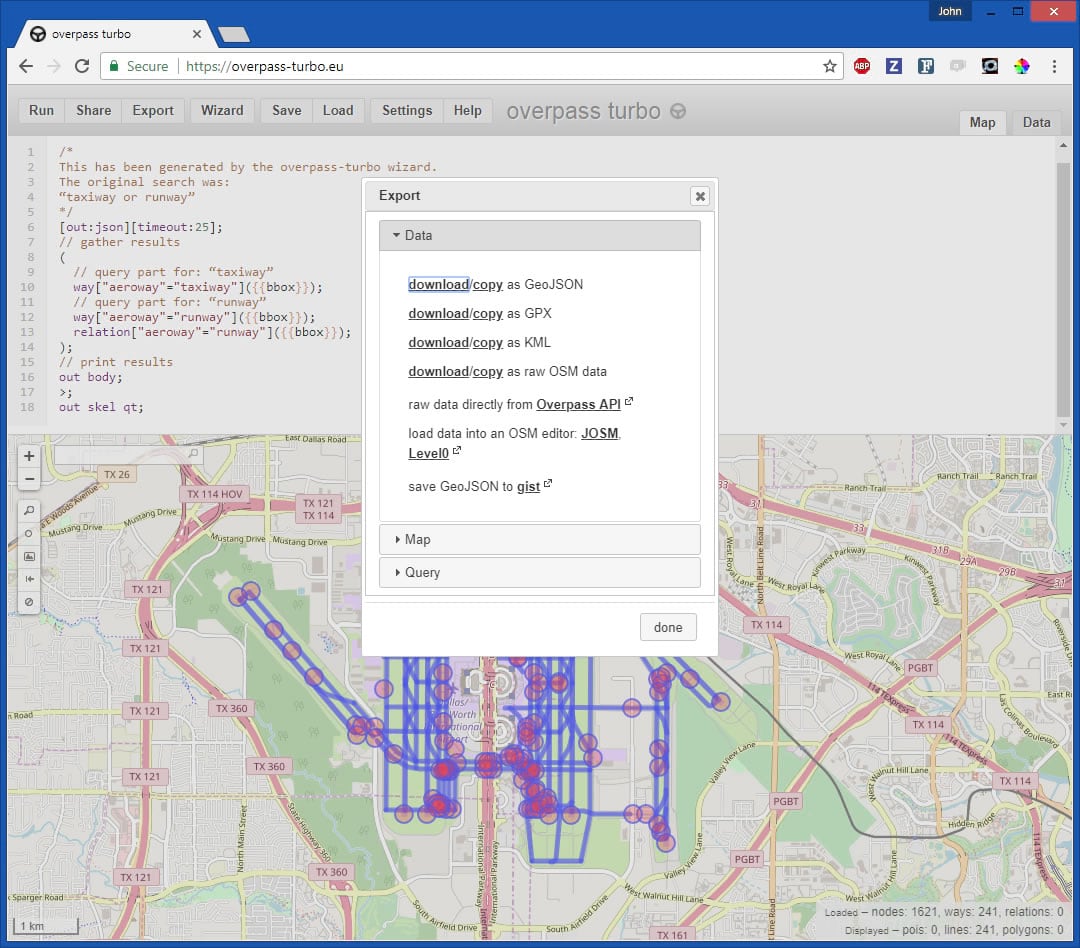
Then it’s just a matter of choosing “Export” and your favorite format. I picked KML so I could enliven in Pro.
In Pro, I created a separate Map for each airport I was going to include. Then I dragged the airport KML file onto the screen and KA-POW!
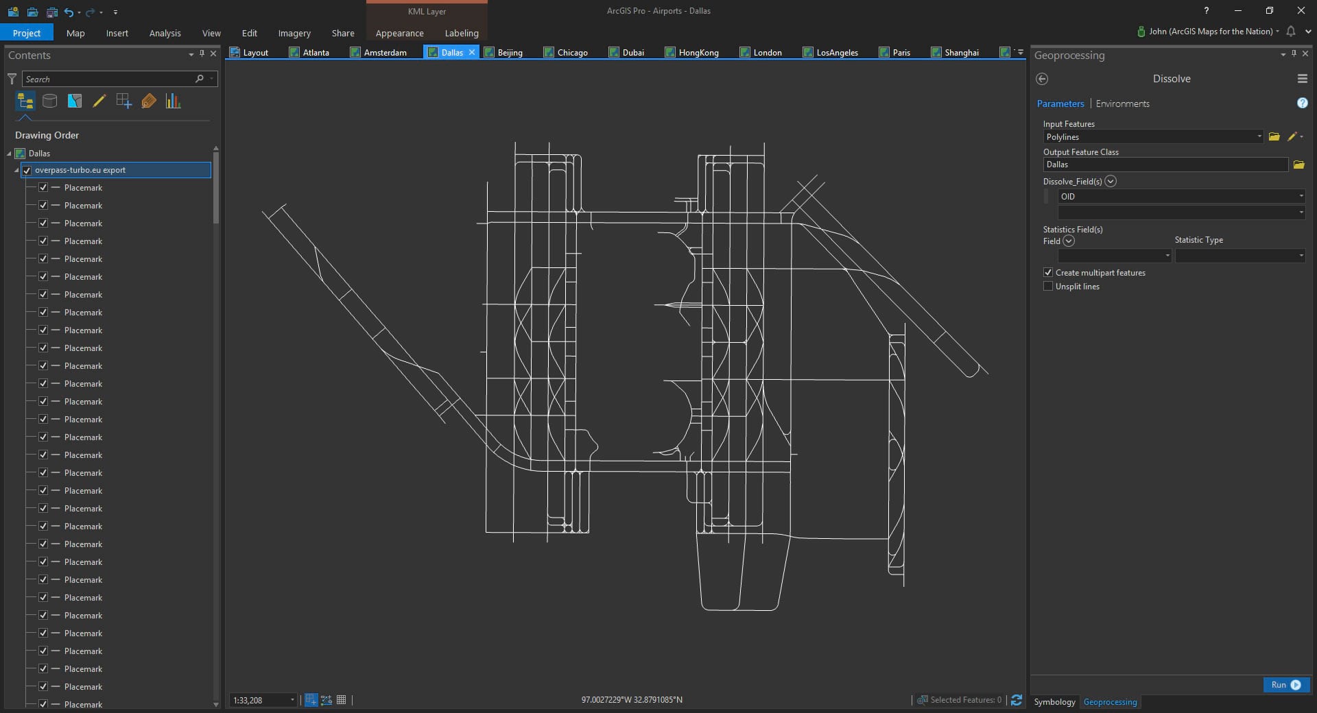
I wanted to easily play with line symbology so I converted each airport KML to a single simple line feature. I suppose you could use the Convert tool, but for some reason I chose to “dissolve” the lines by a shared attribute value. Same result. This is a helpful rationalization reminder that there are all sorts of paths in a GIS to get where you want to go. Live on the edge.
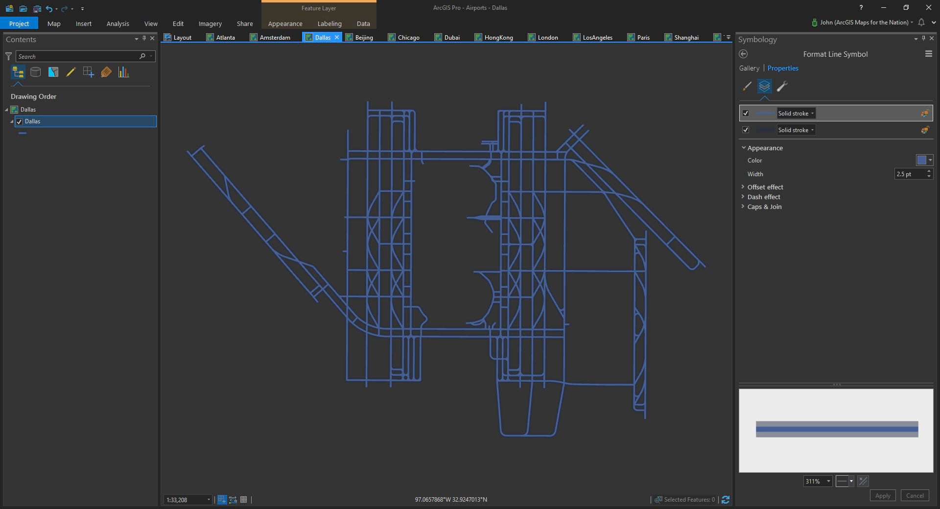
Now that it’s a nice flexible data format, I can apply some symbology. I chose to give it a blueprint-like stroke with a faint thicker stroke (to give it some “foreground” it when it happens to run over text later on).
Layout
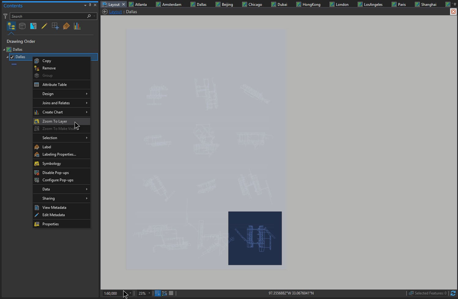
Once all 12 of my maps were situated, I created a layout and added all 12 maps. Pro tip: add one map to the layout, in the size you like, then paste it several times in your layout to create a grid, pointing each to its correct airport map.
Now a note about scale (wait, don’t skip over this; I could tell your eyes were wandering). In order for this whole crazy thing to work, each airport needs to be shown at the same geographic scale, or else this map will be geographic heresy (the implicit assumption being that this map lets you honestly compare airport sizes). So I found the most sprawling airport (Amsterdam) and found the scale that fit it (1:60,000). Then I applied that to all the other maps (right-click map > activate; right-click airport layer > zoom to layer; paste 1:60,000 into scale box).
And I had a tidy little small multiple layout with 12 maps in it, each showing an airport at the same scale. Sweet. Now to add in some text to label each airport and give some basics about the location and the passenger count.
Text
Ken Field and Wes Jones, bless their hearts, recommended I include the super cool 3-letter airport designation in the layout. Those codes add an easy 26-49% coolness increase to any visualization involving airports, across the board. Take that to the bank.
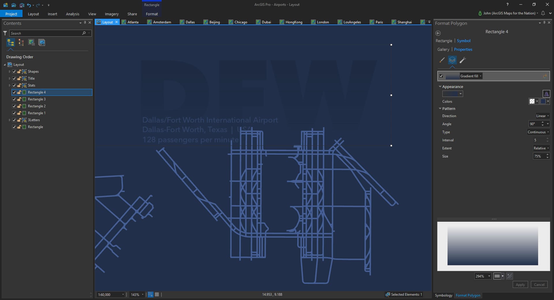
The insert menu in a layout lets you add text. But how did I get gradient text in there, you may be asking? Oh the sneaky tricks we cartographers resort to. The text is actually a solid color, with a rectangle gradient, in the same color as the background, over top that shifts from transparent at the top to opaque at the bottom. Hacktastic!
Then it was just a bunch of copying and pasting to fill in the smaller informational text boxes, like locations and passenger counts. The wikipedia article I sourced showed passenger counts per year. But, I can’t really picture 104 million humans (Atlanta Airport’s annual passenger count, the busiest in the world) any better than you can. So rather than showing the annual count I just divided it up into minutes. Richard Saul Wurman (you should click that link; I’ll wait) stresses the importance of context and meaningful units when driving understanding. I can totally picture 198 passengers per minute coming and going.
And that’s about it! I exported an image, and then wrote this blog. I hope you give small multiples a try. And I hope you give OpenStreetMap data a try! Both are loads of fun with even more loads of potential insights.
Happy Mapping! John Nelson
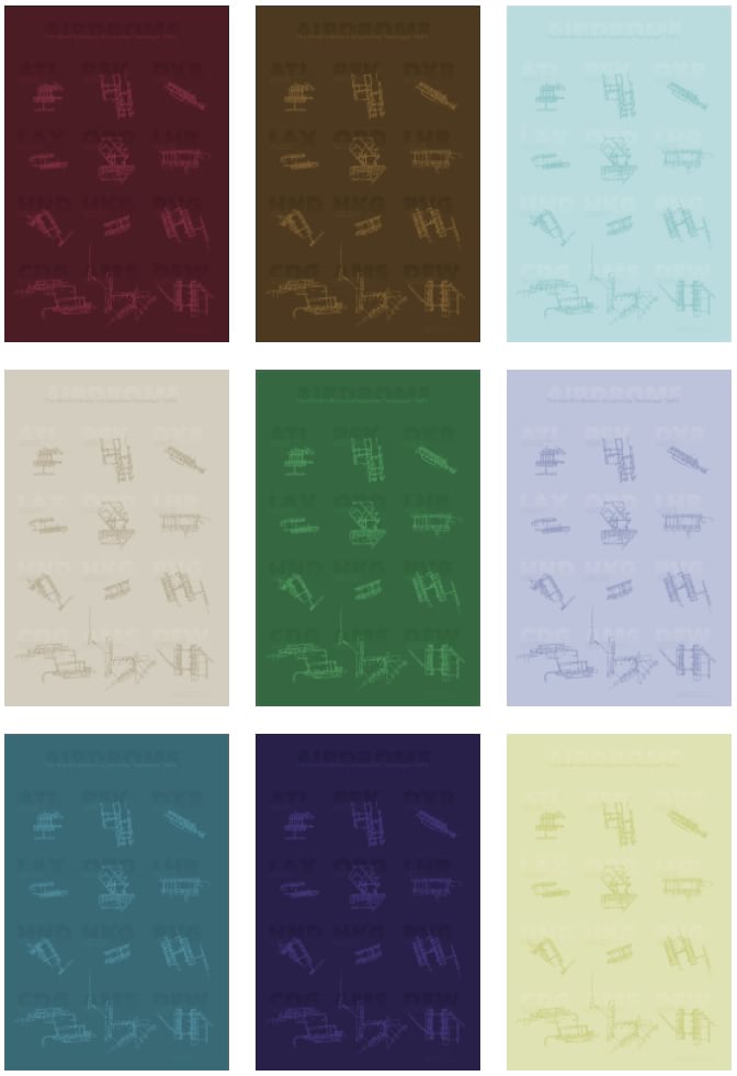
P.S. Since my map was largely monochromatic, it afforded me the luxury of taking the resulting image into Adobe and cranking out a bunch of color-shifted variants. Because why not? Click this image to go find mega-huge originals…

Commenting is not enabled for this article.