ArcGIS StoryMaps is built to foreground maps, but not every dataset can or should be visualized geographically. Fortunately, ArcGIS StoryMaps includes three blocks that provide alternative means of presenting – or representing — thematic data: charts, infographics, and tables.
Each of these blocks excels in a particular niche: Charts are ideal for comparisons within or across datasets; infographics draw attention to exemplars or outliers; and tables allow readers to dig into the details. In this post, we’ll take a closer look at these three blocks, highlighting their relative merits, use cases, and best practices.
Keep in mind that these blocks are designed for quick and reasonably simple visualizations. For more advanced uses — for example, working with large or dynamic datasets — we suggest creating a visualization in ArcGIS Dashboards or ArcGIS Experience Builder, and then embedding that visualization into your story via the ArcGIS Apps block. To learn more about alternative ways of creating and adding charts, check out this article.
Charts: Enabling meaningful comparisons
Charts are an essential instrument in the data storyteller’s toolkit. They can help readers see and interpret relationships, trends, and comparisons between data points at a glance — and when thoughtfully designed, they can enhance the visual character of a story.
The chart block makes it easy to add interactive, easy-to-interpret charts into your stories. These charts can serve as standalone graphics or can complement other data-driven visuals.
ArcGIS StoryMaps includes several different chart types, each optimized for a different data storytelling need. Once you’ve added your data, you can freely choose between the different chart types to identify the one that works best for the message you’re trying to communicate. Here’s a quick rundown of the different chart types:
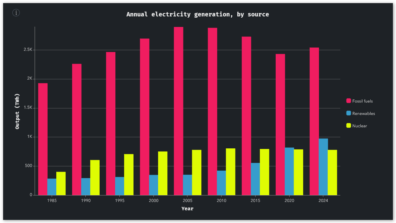
Column/bar charts
Column and bar charts are best-suited for comparing multiple categories of data side-by-side — but they’re also useful for showing just a single category of data. These two chart styles are equivalent; the only difference is their orientation (vertical vs. horizontal).
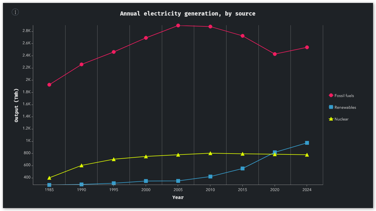
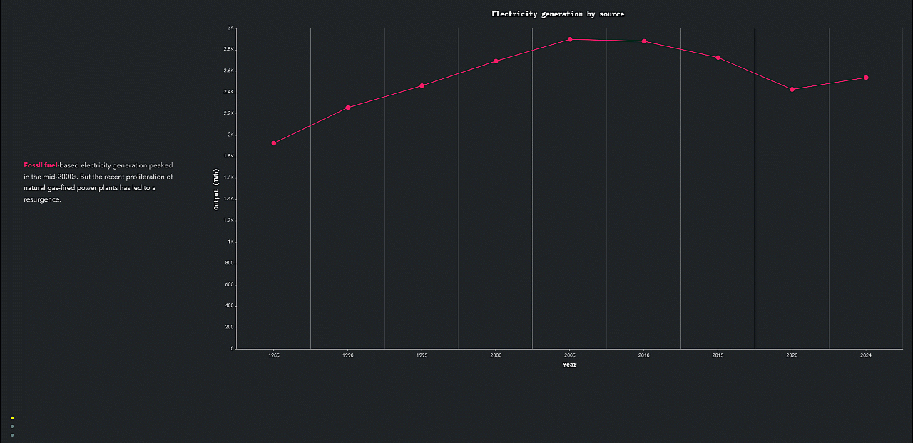
Line charts
Line charts trace a continuous path from one data point to the next, which makes them great for showing change over time. As with column/bar charts, you can include multiple categories.
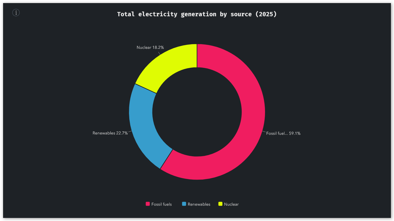
Donut charts
Donut charts are useful for representing proportional values, or parts of a whole. With a few clever color adjustments, you can easily and intuitively draw your readers’ attention to key slices.
Regardless of which chart type you’re using, there are a few steps you can take to ensure your charts are easily understandable. Limiting the number of categories or data points you show is a great way to keep things from getting cluttered — especially on smaller screens. For this reason, the ArcGIS StoryMaps builder only allows up to 36 total data points (up to 12 rows across 3 categories), but you may want to reduce this number even further (using medians, averages, or other aggregate statistics where necessary).
Don’t forget to label your axes and data categories clearly, and use colors that provide sufficient visual contrast both with each other and with the story’s background. By default, your chart will inherit the accent colors from the active theme, but you can always override these colors in the chart settings. Finally, be sure to add descriptive alternative text to your charts, to ensure that they’re
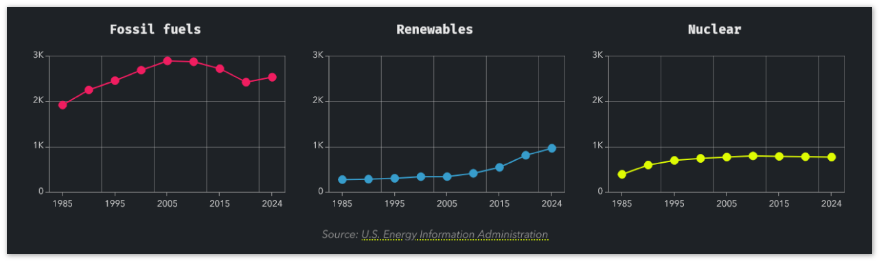
You can also position up to three charts side-by-side (as seen in the example above), allowing you to create small multiple grids. Be sure to customize the value axis of all your charts to be the exact same, otherwise the charts can’t be compared like-for-like. You can use the caption to provide a single data attribution for all of the charts, provided they use the same source.
Similarly, you can create elegant comparisons by adding a sequence of related charts to successive slides in a sidecar block. As long as the charts’ axes match, they will appear to animate as readers scroll through the sidecar. This method is especially useful if you’d like to provide some additional context alongside each individual chart. This descriptive text also ensures that your story is accessible to readers with impaired vision.
Infographics: Spotlighting key takeaways
The infographic block combines a single number with a caption and icon. It’s especially well-suited for drawing attention to the most important value in a dataset — often an exemplar or outlier — in order to emphasize a key narrative takeaway.
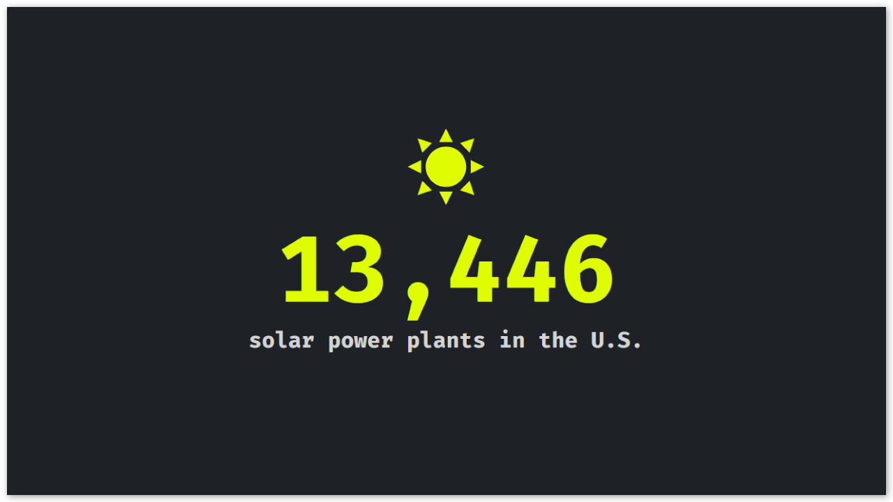
Like most data visualization blocks (including charts and tables), infographics are best used judiciously; if you include too many in your story, they’ll start to lose their impact. Also, note that many readers will pay more attention to the infographic’s icon than its caption, so be sure to choose an easily interpretable icon that reinforces the context or meaning of the highlighted number.
Tables: Diving into the details
The table block allows you to add a tidy list of values into your story. Tables can include up to 13 rows and 8 columns (including optional headers), and unlike most chart styles, they support both text and numbers, or even a combination of both.
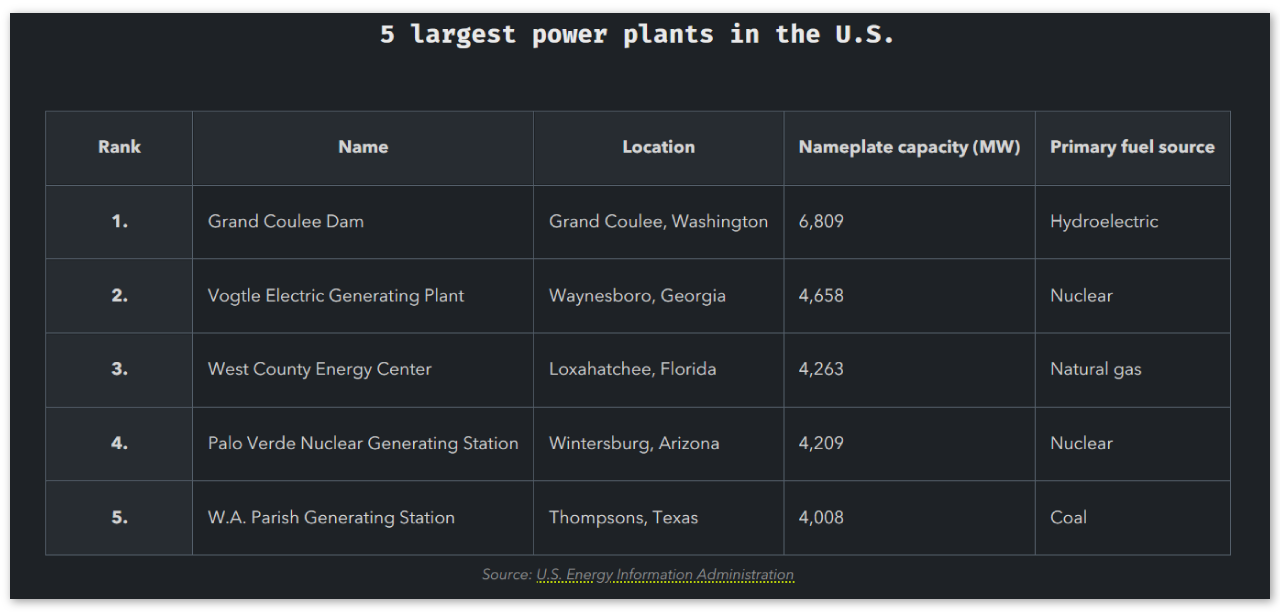
There’s no secret that tables aren’t as eye-catching as charts and infographics — but that’s kind of the point. Tables are an important alternative to those other data visualization blocks because they are designed to present a holistic or comprehensive view of a dataset, rather than a summary. Plus, tables created using the table block are supported by screen readers, which makes them more accessible than images or screenshots of a spreadsheet.
To ensure that your tables are easy to scan, be sure to format the individual cells consistently. Your row and column headers should also be styled to help readers navigate the data. If possible, keep your tables compact to avoid overwhelming readers with too many columns or rows. You can also use the caption field to acknowledge the data source.
Coming full circle
While the chart, infographic, and table blocks are conceptually related, they serve different needs and goals. Charts are great for revealing trends in a dataset; infographics highlight individual exemplars and key takeaways; and tables provide the most detailed look at a dataset.
By incorporating these blocks thoughtfully into your story — often in combination with maps and other media — you can strengthen your narrative, add credibility, and ensure your key insights aren’t overlooked by readers.
If you have ideas for how these blocks could be improved, we invite you to weigh in on the Esri Community; your feedback is invaluable and will help shape the future of ArcGIS StoryMaps. As always, we can’t wait to see what you create with these tools.


Article Discussion: