This is the second entry in a two-part series that aims to help you create and use legends that make your map-based storytelling clearer and more effective.
- Part I: Optimizing the basics
- Part II: Creative approaches
In the first part, we reviewed the role of legends in maps and demonstrated how to get the most out of the default legends generated by Map Viewer, Scene Viewer, and Express Maps.
In this installment, we’ll explore more creative ways to make legends an active part of your story. Techniques such as custom graphics, color-coded text, map actions, and more open up new possibilities for weaving legend information directly into the story.
In service to the reader
If you’ve read part 1, you might be wondering why a second installment is necessary. Your legends are optimized, clearly labeled, and visible when readers need them. So, what more is there to do?
It’s a fair question. But consider the experience from your reader’s perspective. You, as the cartographer, have spent hours with the data layers and maps woven throughout your story, having become intimately familiar with them. Your reader is encountering these maps for the first time. They’re moving between the narrative, the maps, and the legend each time your maps change. Even with well-optimized legends, that back-and-forth effort is a small but real interruption. Over just a few maps, the cognitive load adds up.
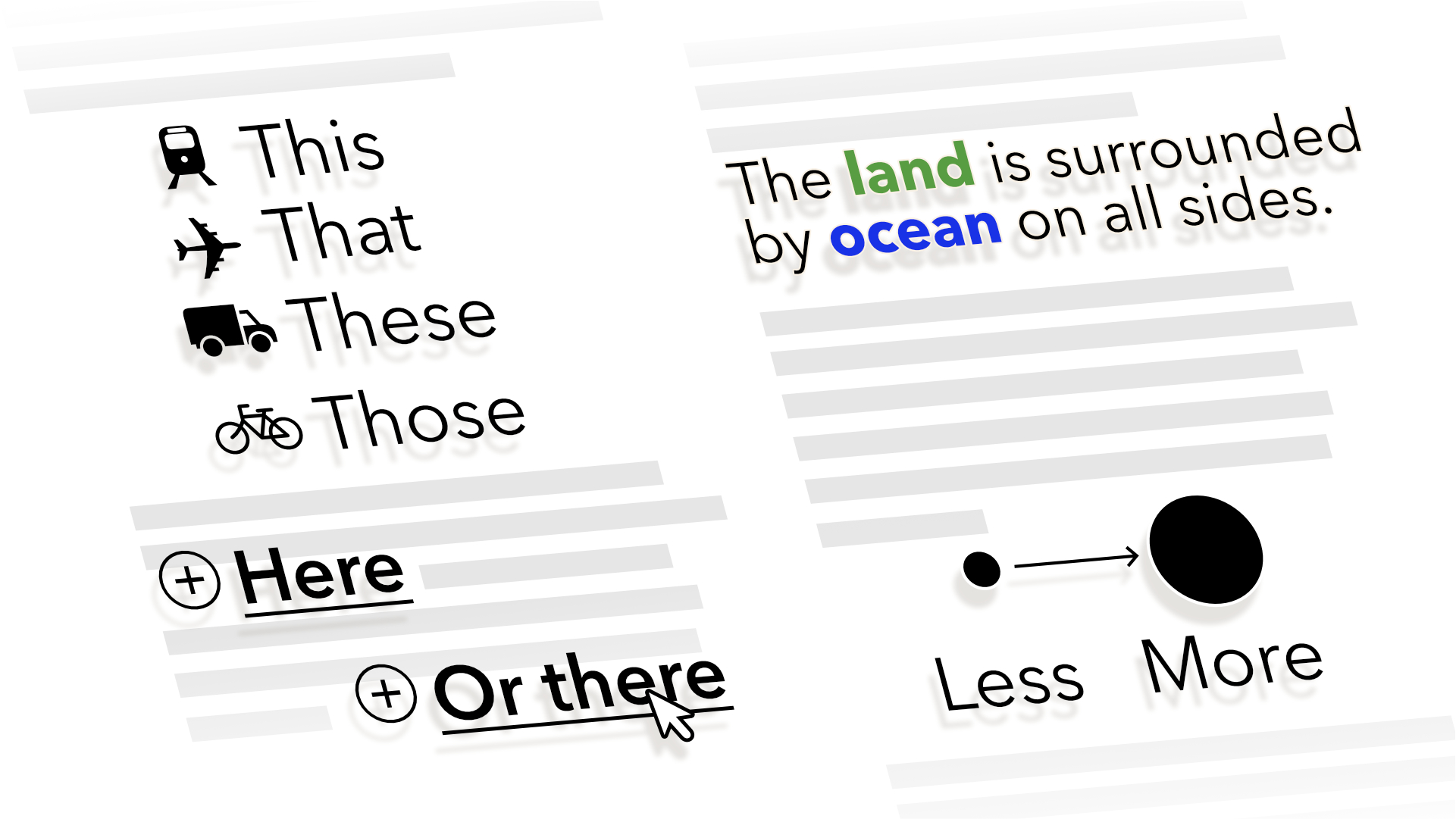
The techniques outlined in this blog are designed to reduce the effort required by the reader to interpret maps. By integrating legend information into the story itself, we can create a more seamless reading experience. These techniques also provide a meaningful visual benefit: without a legend panel competing for attention, the map gains breathing room, and the overall story a more polished aesthetic.
Techniques
Below is an assortment of techniques our team has used in our stories, offered up as inspiration. Feel free to use these as starting points, and I would encourage you to mix and match, iterate, and experiment with them. I have no doubt that as you get creative with your own legends, you’ll develop other methods that work best for your storytelling.
Color-coding
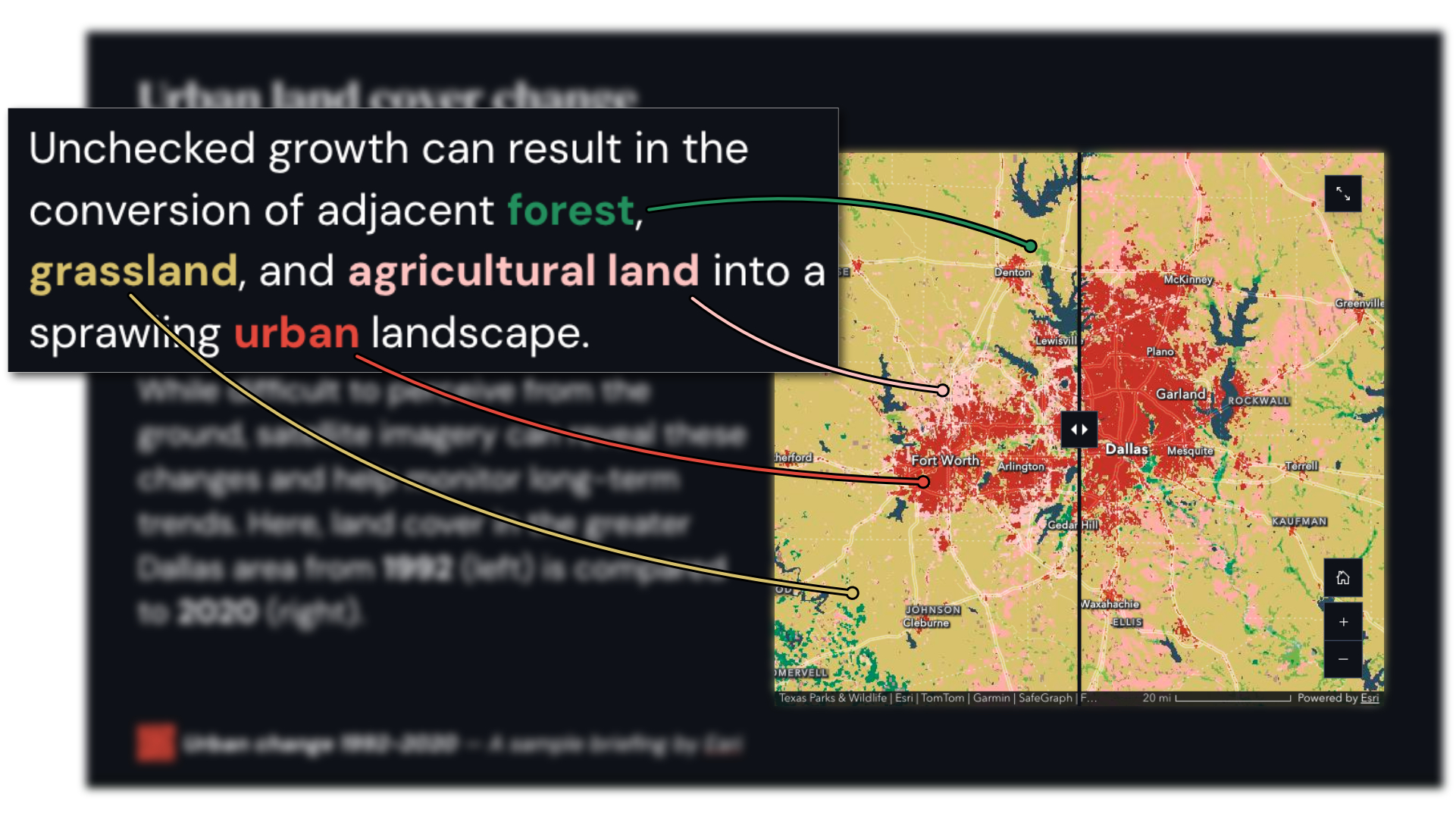
To start, this first technique is easy to implement. When storytelling with maps, features are often grouped into categories and encoded with colors. The easiest way to include this information directly in the story is to format the relevant text in your story to match the feature categories.
Although it might seem minor, this method is very effective. When color-coded terms appear naturally within the flow of your narrative, the legend information arrives exactly when the reader needs it — just as the relevant feature is being described. This creates not only a visual connection between the text and the map, but a cognitive one: the reader absorbs the map symbology as part of the story rather than having to seek it out separately.
Best practices
- Legibility: While the color of your map layers may work in the context of your map, ensure that they are legible in the context of your story, and they have enough contrast against each other and your theme’s background color for accessibility.
- Fewer is better: Taking a cue from cartographic best practices, keep the number of classes or categories mentioned in your story and map to a reasonable amount (2-5?). Just call out the most important features related to your story. More than this, and your paragraph will be less ‘integrated legend’ and more ‘psychedelic rainbow,’ and users will likely have a tough time gleaning meaningful information from it.
Symbol characters
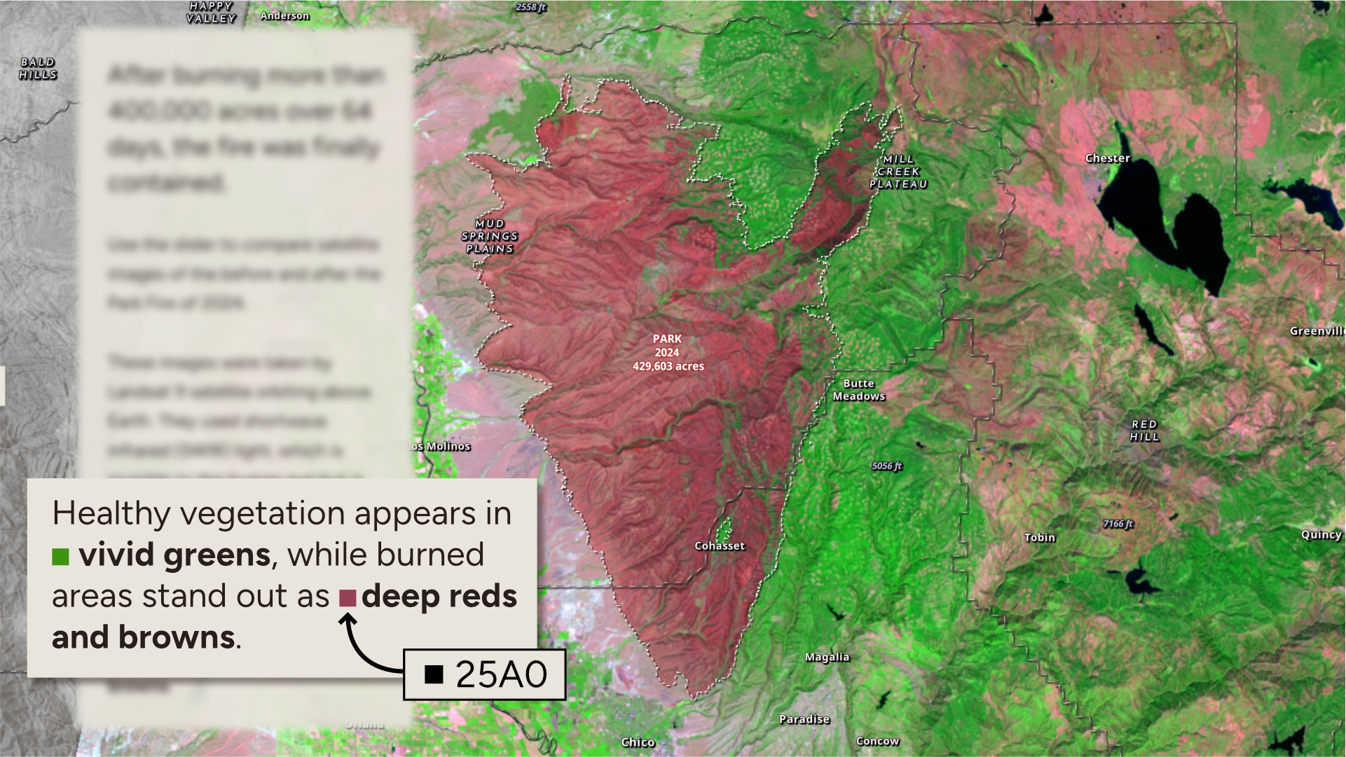
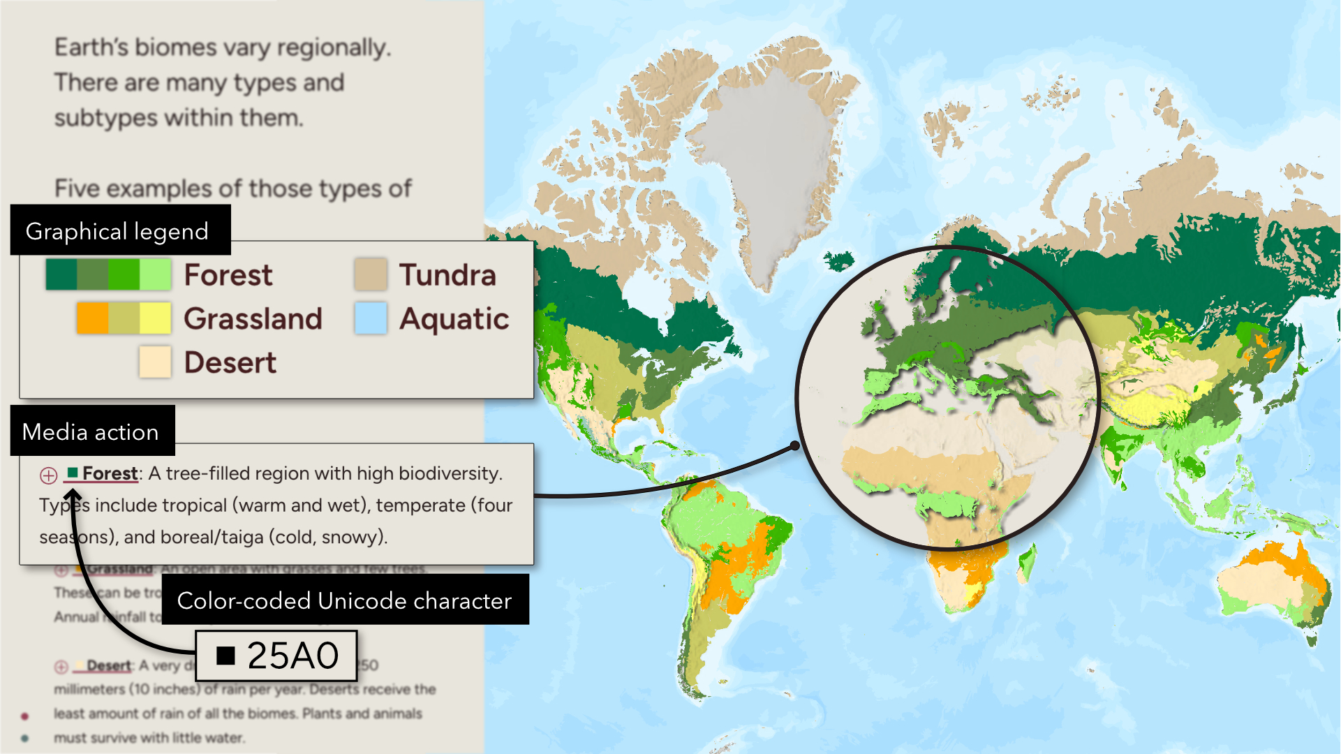
In addition to color-coding, we can use some simple symbols to encode shape information in our integrated legends. By using Unicode characters — the same character encoding standard that allows you to send your colleague a rocking :signofthehorns: emoji — we can include miniature legend swatches within the text
If you’re inclined to type these characters directly into your story, I’d suggest looking up the device-specific instructions. Personally, my brain can’t retain keystroke combinations exceeding two keys, and I’ve found it so much easier to copy/paste from the Unicode charts.
Once you’ve managed to drop the desired character symbol into your story, you can reap the rewards. The advantage of this technique is that it’s more subtle and less visually intrusive. Instead of color-coding the entire sentence or words, turning our paragraph into a rainbow, we only color-code a single character. The bonus is that we also encode a geometric representation of the map symbology, which aids interpretation.
Best practices
- Compatibility: Be mindful of font compatibility. Not all fonts support all Unicode characters. When using these characters, be sure to preview and test your story before circulating widely.
- Keep it tasteful: While everything from a fish to a fire truck is available as a Unicode character, we recommend keeping it subtle. As a starting point, the Geometric Shapes Unicode block includes circles, squares, diamonds, and triangles for all your map symbol needs.
-
- ● (25CF)
- ◉ (25C9)
- ■ (25A0)
- ◆ (25C6)
- ▲ (25B2)
- ▨ (25A8)
Media actions
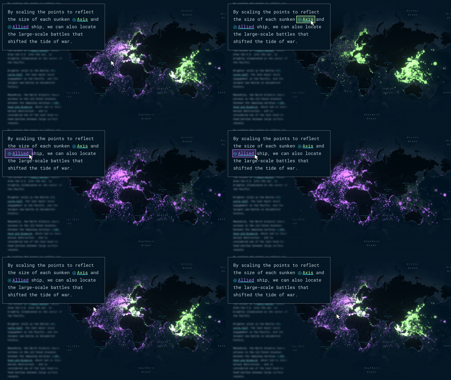
Media actions are a tried-and-true way to present relevant information to readers on demand. These optional interactive detours take the form of toggle buttons or text links that, when activated by the reader, alter the map view in a sidecar. They can be configured to change layer visibility or the map extent.
While they’re a fantastic technique on their own, they also complement the integrated legend. One advantage is that, when clicked, these actions explicitly show the relevant legend content on the map. When configured on color-coded text or text with Unicode characters, these integrated legend elements instantly transform into engaging interactive legends.
Best practices
- Less is more: Media actions work best when used sparingly. Since they’re optional, adding too many to a single slide can reduce the likelihood that readers will engage with them.
Custom graphics
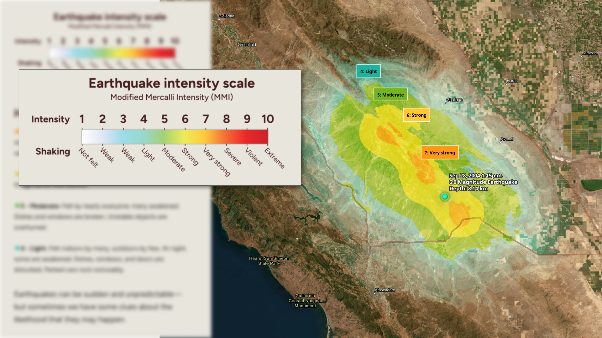
So far, these techniques cover some straightforward legend scenarios, but what happens when our map symbology uses more than just colors or simple shapes? Graduated symbols and multi-field renderers can be difficult to convey solely through text formatting or Unicode characters. In these cases, custom graphics become a great option. Using graphics software, we can recreate the default legend from Map Viewer or Scene Viewer and exercise complete creative control to make it suit our story.
A custom graphic lets you tailor the legend exactly the way you need it. For instance, default legends are oriented vertically, requiring scrolling to view the categories and proportional symbols in a color and size renderer. When incorporated into a custom graphic, they can be oriented horizontally to take advantage of extra space. At the same time, integrating the legend as an image in the story itself returns valuable screen space to the map, so your readers can see more with fewer distractions.
Best practices
-
- Make it transparent: This is one of my hard-won lessons. Creating several graphical legends with background colors that matched the story’s theme, only to change the theme and have to recreate those graphics, taught me to make them transparent PNGs. Trust me, do this. Your future self will thank you.
- Make sure it matches: When designing your legend, ensure it aligns with both the map and your story. For the map, that means ensuring that categories, ranges, and symbology of your legend match the data in your map. As for the story, a custom graphic lets you match your fonts, color palette, and the overall design language of your story’s theme, resulting in a much more visually cohesive result. If either the map or the theme changes, update your legend graphic
- Accommodate discrepancies: When added as an image, the graphical legend will scale to fit the available space in the narrative panel. As a result, proportional symbols in graphical legends may not match the map’s symbol sizes. Therefore, it’s best to generalize the legend and present simple ‘smaller’ to ‘larger’ estimates rather than specific values.
- Accessibility: While creating a graphical legend allows for complete creative freedom, since these are added to your story as images, you’ll need to provide descriptive alt text so that all readers can interpret the information they convey.
Final thoughts
The techniques we’ve explored in this blog series are just a handful of ways that you can make legends clearer for your readers and weave them directly into your stories. I’d encourage you to use them as inspiration as you craft the most effective legend that tells your story. Mix, match, and experiment.
Each of these techniques serves the reader, and integrating legend information into the story itself aims to reduce the back-and-forth between narrative and map while ensuring the map is easy to interpret. They also return valuable screen real estate to the map. The result is a story that feels more visually cohesive, where the maps and narrative work together.
Happy storytelling!

Article Discussion: