Data helps explain why things are the way they are. It reveals trends, and shapes solutions to issues. And, in this day and age, we have access to more of it than ever before.
But data can also be daunting. Uncovering meaning within it can require sifting through thousands—or even millions—of points, while also knowing what to look for. Then there’s the matter of relating those discoveries to a wider audience in an easily understandable way.

Fortunately, there are some strategies that can help you uncover the underlying story in that massive dataset and weave it into a compelling and engaging narrative. While it may seem counterintuitive, it often helps to start by thinking small.
Finding a focus
Highlighting specific examples can serve as a gateway into a potentially overwhelming set of data. Doing so gives the audience an anchor around which they can contextualize the full scope of information.
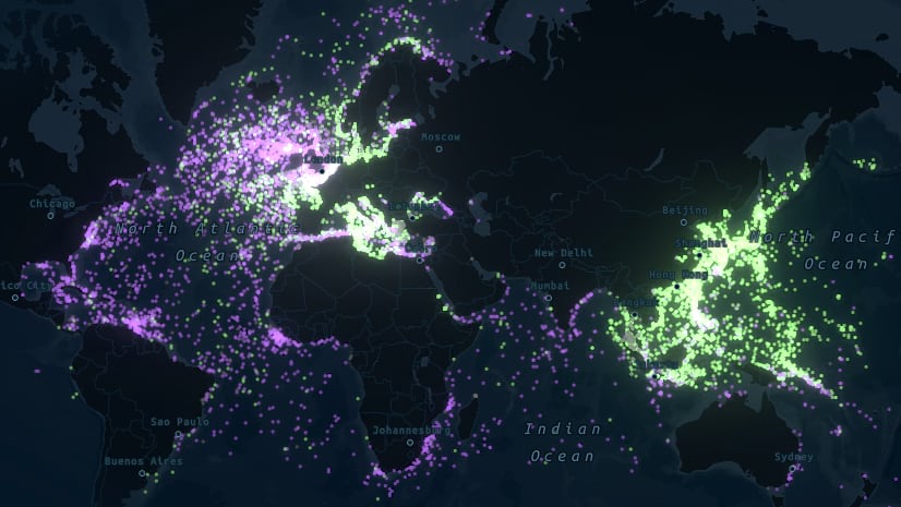
The story Resurfacing the past, for instance, serves as an introduction to a database of nearly 15,000 ships that were sunk during World War II. A map showing each of those incidents blankets virtually every reach of the world’s waters with points. Even a historian might find themselves unsure of where to begin.

But before even getting to that map, the story opens with a vignette that focuses on just one sunken ship. It’s not an especially famous or noteworthy vessel, but that doesn’t matter. By starting with just one story out of 15,000, the audience becomes grounded in context; they can connect to the human impact of the conflict at the individual level. At the same time, this approach makes the full extent of the data less dizzying when it’s later revealed.

Tying in a theme
The secret life of bridges is another example where our team seeks to distill an enormous volume of geospatial data into a digestible primer. The story begins to unpack the U.S. Federal Highway Administration’s inventory of motor vehicle-carrying bridges in the United States—all 618,000 of them.
By design, it is primarily a big picture examination of the data. It offers several high-level cross-sections, in hopes that readers will be inspired to do further digging on their own. But it uses media to make overarching themes—like the evolution of bridge construction over time—stick. Charts and graphs lay out numbers of bridges by attributes such as decade built and primary construction material. It’s the accompanying photographic asides, though, that feature a well-known example of a bridge from each period of time, making it easier to visualize the trends from each historical era.

Later in Resurfacing the past, a similar approach is used. A sequence of maps displays different ways to examine the data by symbolizing the sunken ships according to attributes like which faction of the war it belonged to, the size of the ship, and whether it was a military or civilian vessel. Map actions then allow the audience to drill down to specific examples that drive home the lessons of each theme.

Making it personal
Perhaps the most effective way to make a mountain of data relatable, though, is to present it in a way that enables the audience to feel how it might affect them, personally. One way to do that is to use the anecdotal experience of a real person or group of people. In doing so, readers can start to picture themselves in the shoes of those people, and thus in the story the data is telling.
In the story Charging across the country, the audience is introduced to the nuances of electric vehicle chargers through the eyes of a real-life couple who found themselves in a predicament while on an electric-powered road trip. It would be one thing to just explain the different types of chargers and plot them on a map. But in seeing how that couple’s options dwindled because of those differences, readers can easily understand why the nuance matters in a practical sense.

An ArcGIS StoryMaps effect called map choreography lets the plight of the couple unfold seamlessly as the audience scrolls through that section of the story. You can feel the anxiety building as their options disappear.
________________________
If you work with or investigate geospatial data, communicating the messages buried within it can be one of the biggest challeneges you face. But remember that zooming in to just a few atoms of that data is a useful way to start building a connection with anyone who might be seeking to understand it. And it can be especially eye-opening when the stories of those atoms involve real individuals.
Fortunately, it helps that ArcGIS StoryMaps is a platform that’s tailor-made for combining big data with inspired storytelling. For more tips on how to use ArcGIS StoryMaps to tell engaging data-driven stories, check out this blog post that breaks down the narrative and cartographic devices used in the Resurfacing the past story in greater detail. And, of course, plenty more storytelling advice can be found on the ArcGIS StoryMaps resources page.
________________________
Cover photo by Matthew Fassnacht, via Unsplash. Sand photo by Hassan Ouajbir, via Unsplash.

Article Discussion: