This article was originally published in November 2019. It was rewritten in August 2023 to reflect new capabilities and best practices.
If there’s one tough lesson I’ve learned in my career as a cartographer, it’s that not everyone loves maps as much as I do. Or rather, not everyone has the experience reading maps to interpret them quickly and reliably—a skill sometimes called graphicacy. Cartography is an exercise in compromise, and a challenge we commonly face as mapmakers is creating maps that are both precise and comprehensive, but that remain easily understandable for the people we’re trying to reach.
But guess what? This challenge is really just an unrealized opportunity—a code to be cracked—and ArcGIS StoryMaps holds the key. Enter map choreography.
In a nutshell, map choreography is a storytelling technique where a series of interconnected map views are deliberately arranged into a sensible sequence. As readers navigate through the story, these maps are presented one after another, often accompanied by relevant written narration. The resulting experience is akin to a slideshow or animation—or a sequence of ballet moves (hence the name). You might think of map choreography as a form of “scrollytelling” with maps.
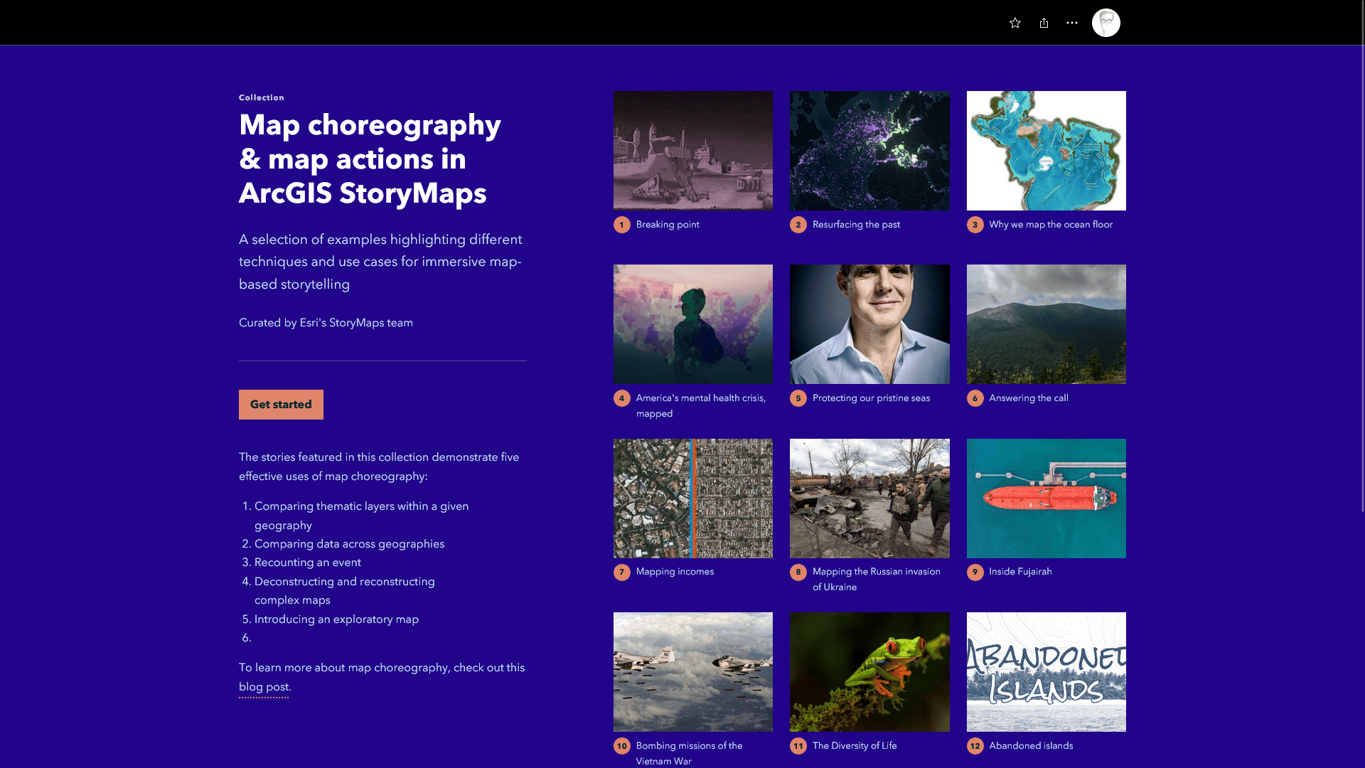
Map choreography is an excellent method for unraveling complex maps and guiding readers through them step by step. It can be used to direct attention to crucial patterns, features, or locations relevant to the story you’re trying to tell. When used effectively, map choreography ensures that your readers grasp your maps’ intended messages—and altogether elevates your storytelling. The map sequences you can create with map choreography are immersive, engaging, and at times, even a little cinematic. To see some examples of map choreography in action, take a peek at the collection below.
This post covers map choreography from top to bottom. We’ll start by exploring a few foundational concepts that provide a shared framework and vocabulary for understanding how and why map choreography works. Then, we’ll dive into some common and effective use cases for map choreography. Next, we’ll walk through its implementation using the ArcGIS StoryMaps builder. And finally, we’ll wrap up with a selection of indispensable tips and best practices for making the most of map choreography. Feel free to use the links below to jump between sections:
- Map choreography: the basics
- Map choreography in action
- Implementing map choreography
- Tips, tricks, and best practices
If your eyes are glazing over and you’d rather watch a short video about map choreography, check out John Nelson’s explainer video below—despite what John would have you believe, it’s well worth your time. Let’s begin!
Background information: exploration vs exposition
Maps are integral to ArcGIS StoryMaps—after all, the word “maps” is half of the product’s name. But maps can assume a variety of different forms and play a variety of roles in the stories we create and share.
When outlining, building, or describing a map-focused story, it is sometimes helpful to group maps into general categories, based on their intended uses and appearances. And on Esri’s StoryMaps team, we often assess maps along a functional spectrum from exploration to exposition.
What do I mean by this, and why does it matter? In short, exploratory maps encourage deep, open-ended exploration and discovery. They are often richly interactive, and invite readers to dig into the data themselves and to then draw their own conclusions. Because exploratory maps provide limited structure or guidance, they are generally best suited for audiences that are already familiar with the data, themes, or geographies being mapped.
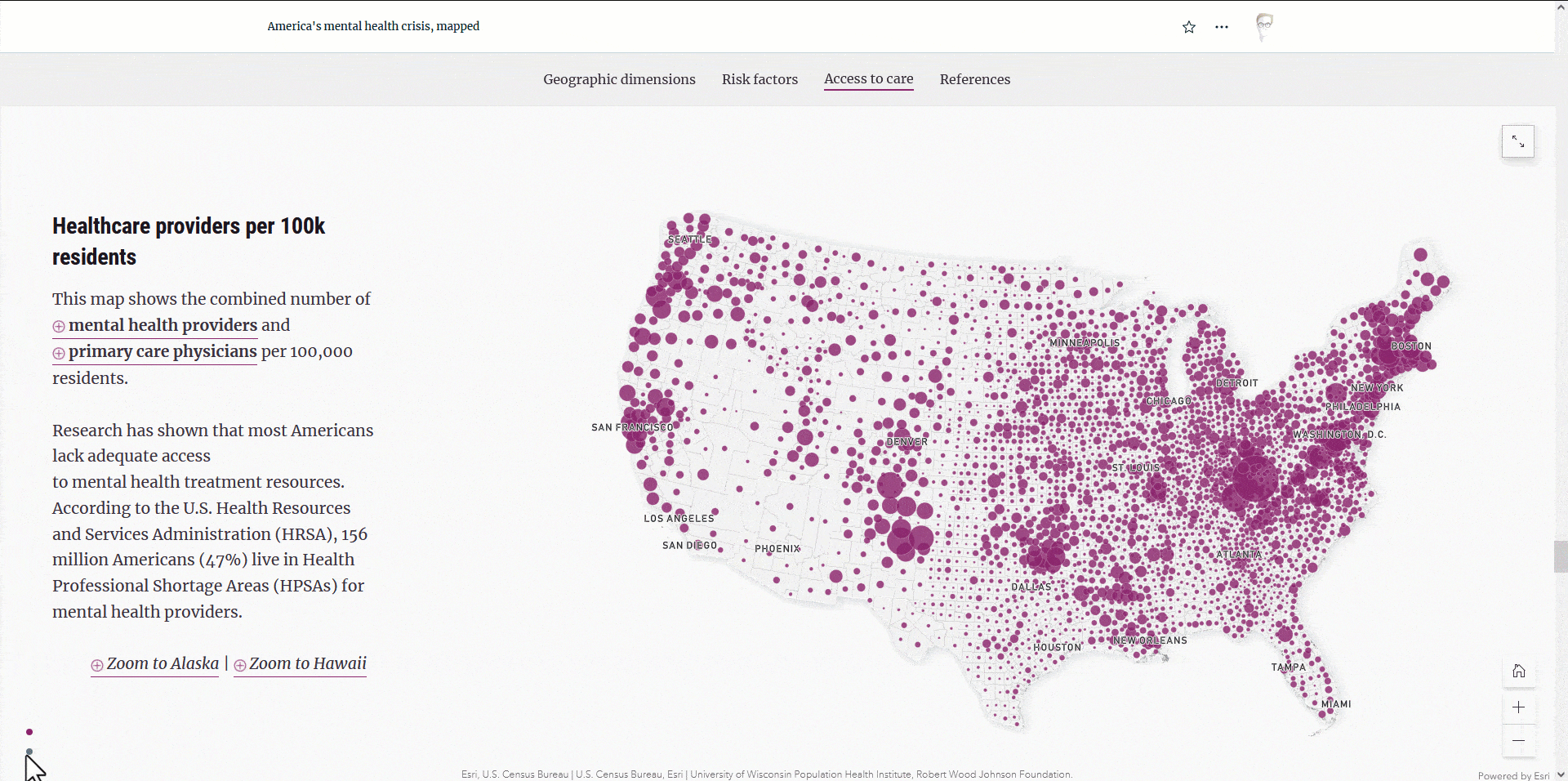
On the flip side, expository maps aim to channel readers’ attention to specific data patterns, geographies, or features of particular interest. Expository maps can be used to clarify complex subjects, making them approachable and digestible. Such maps are ideal for non-expert audiences because they require a lighter cognitive load to interpret. Expository maps are commonly rendered as static images or animations, preventing readers from navigating away from the author’s designated areas of interest.
In summary, exploratory maps emphasize reader-driven discovery, while expository maps expect the cartographer to illuminate key thematic messages. Understanding this distinction is essential for creating and sharing content that engages and resonates with your audience.
From theory to practice
Exploratory and expository maps each have their roles in place-based storytelling. They aren’t in competition; in fact, they can complement each other beautifully, as we’ll see later in this article. But given that ArcGIS StoryMaps is primarily intended for linear storytelling rather than free-form exploration, its content blocks are optimized for presenting and narrating expository maps.
Take the sidecar block, for example. This immersive block consists of a large, fixed-position media panel accompanied by a smaller narrative panel. Together, these two containers form a single slide (like a slide in a presentation). As readers scroll or click to navigate between adjacent slides, the content in both panels updates as the author has specified it to do.
The sidecar block works especially well with maps, inviting authors to craft logical and even cinematic progressions of related map views, with each view narrated in as much or as little detail as necessary. And this, gentle reader, is map choreography.
Map choreography generally involves adjusting three key elements of a given map (or maps): focal area (as determined by zoom level, center point, and sometimes rotation); layer visibility (i.e., which thematic layers are shown at any given time); and behavior (interactivity, widget visibility, and so on). In the next section, we’ll examine several common and effective use cases for map choreography—all of which can be achieved by adjusting these three map characteristics.
Map choreography in action: common use cases
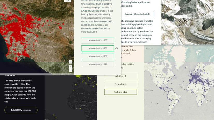
1. Compare thematic layers within a given geography: One common use case for map choreography is to showcase a variety of thematic layers within a single geographic area. By navigating forward and backward through the map choreography sequence, readers can swiftly compare and contrast related rates, trends, or patterns within a designated area. This use case accommodates both static and animated maps, provided that the geographic scope remains consistent across views.
2. Compare data across geographies: Conversely, map choreography can be used to show how values in a single dataset (or a predetermined selection of datasets) vary in different places. This involves altering the map’s focal point while retaining visible layers. As readers navigate through the map choreography sequence, the map will automatically pan and zoom to the author’s chosen locations. Note that this method works best with web maps and web scenes, as the geographic transitions between locations are fully animated. (In contrast, static maps will appear to “jump” from one location to another, which can be disorienting).

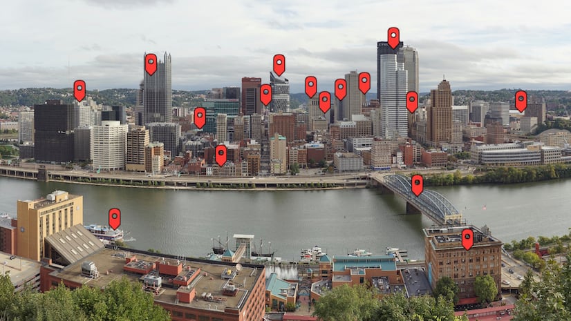
3. Recount an event: If you think of map choreography as a sort of scroll-driven animation, then you’ll quickly recognize its utility for recounting events. If your example is fairly straightforward and the content in each slide is consistent, consider using map tour instead. But if you want to maintain fine-tuned control over the map’s location and visible layers, then map choreography is the way to go.
4. Deconstruct and reconstruct complex maps: As highlighted in this post’s introduction, map choreography can be used to clarify complex maps, making them more comprehensible for readers. This often takes the form of a “progressive reveal”: Instead of bombarding your readers with a tapestry of thematic layers all at once, you first introduce one layer, and then add another, and then add another, gradually building your map up until it’s “complete.” Along the way, you can use the narrative panels to explain each layer’s significance within the map’s broader theme. Often, this approach includes changes to the map’s visible layers and its focal area (combining items 1 and 2 above).

5. Introduce an exploratory map: Remember how I said that expository maps and exploratory maps can complement each other? Map choreography is an effective tool for introducing a particularly dense map or dataset before inviting readers to explore it freely.
These are just a few use cases for map choreography, but the possibilities are nearly endless. To see even more examples of map choreography in action, check out this collection.
Implementing map choreography in ArcGIS StoryMaps
Now that you’ve seen some examples of map choreography in action, you might want to know how to recreate these kinds of sequences in ArcGIS StoryMaps. Fortunately, the process is quite straightforward. Here’s the basic step-by-step approach:
- Use sidecar block to create a map-focused slide:
- Add a sidecar block to your story
- Add a map to the media panel in the initial slide
- Configure the map’s appearance as desired
- Add descriptive text to the narrative panel, which will accompany the map
- Create a second map-focused slide
- Duplicate the slide you just created
- Adjust the map’s appearance for the second slide (you may need to replace it with a different map entirely)
- Modify the narrative text accordingly
- Repeat the process
- Continue duplicating slides and adjusting their maps and text until your sequence is complete
- Amaze your readers
- Watch as your choreographed map sequence captivates your audience!
Of course, you could also just add an empty slide to the end of your sequence and configure it from scratch, but we find that the duplicate-then-modify approach is a bit more efficient. That’s really all there is to it!
Optimizing your map choreography
As with any storytelling technique, map choreography requires certain considerations to meet its full potential in a story. Here are some essential tips, tricks, and best practices for mastering map choreography:
- Be mindful of scroll fatigue: Every slide in your map choreography sequence contributes to the overall length of your story, potentially deterring readers from reaching the end. To combat this, try to strike a balance between brevity and clarity. Instead of overly simplifying map views, consider using map actions to present map views that aren’t essential to the story (like specific areas of interest.) You can learn more about map actions in this post.
- Maintain continuity between slides: Establish a sense of flow by retaining at least one visible layer or recognizable geographic feature between adjacent slides. This continuity offers readers a familiar reference point, which reduces the time and effort they spend actually interpreting the map. Maintaining continuity is also advantageous from an accessibility standpoint, as it allows for more concise and understandable alternative text descriptions. Note that for the purposes of continuity it’s generally preferable to use a single web map or scenes containing many layers, as opposed to multiple maps or scenes with one or two layers apiece.
- Minimize distractions: Prevent unintended distractions by deactivating map navigation and layer pop-ups. Or, if your map choreography sequence exclusively on a single area and the underlying data isn’t changing, consider using static maps instead. This will ensure that readers stay focused on your designated area of interest and the messages you’re trying to communicate through your maps.
- Explore image choreography: Yes, you read that right! With the introduction of media layers, you can now achieve map choreography-like experiences using images, unlocking a host of creative storytelling possibilities. To learn more about image choreography with media layers, be sure to read this post.
As a cartographer, I may be biased, but I believe that map choreography is among the most powerful storytelling tools in the ArcGIS StoryMaps toolbox. The principles discussed in this post—and the examples illustrating those principles—are intended to provide a solid foundation for understanding and working with map choreography. But bear in mind that this technique is as much an art as it is a science. Don’t be afraid to experiment with map choreography; as an author, you’re limited only by your own creativity. We can’t wait to see what you create.


In a classic StoryMap, we had found a way to allow readers to pan/zoom to their extent of interest, and retain that extent as different layers turned on and off as they scrolled through the slides, with the sidecar explaining each layer and what was then the Main Stage allowing them to explore that layer in their community. Is there a way for me to set layers as on or off while retaining the reader’s chosen extent across slides with the new StoryMaps?