This post was ghostwritten by Lee Bock, an application programmer on Esri’s StoryMaps team. Cover photo by Gilly Tanabose, via Unsplash.
_____________
Sunk history
A few weeks back, my teammate, Cooper Thomas, stumbled upon a dataset (created by Paul Heersink of Esri Canada) that represents a thorough attempt to record every ship that was sunk during World War II. Upon seeing Cooper’s experimentations in turning that data into a web map, I had two immediate gut reactions: The first was “Wow…so many!” The second was “Wait, were Germans actually trolling around in the Gulf of Mexico torpedoing U.S. boats?!?” (Indeed, the Axis forces managed to bring the war so close to our backyard that they destroyed the US tanker Benjamin Brewster a scant 50 miles away from New Orleans.)

Now, when it comes to history (and sports), my observations tend to be famously lowbrow. So maybe you share my surprise, or maybe you’re knowingly shaking your head at yours truly while intoning “Bless his heart…”
Either way, if you haven’t checked out the StoryMaps team’s recent story, Resurfacing the Past, I encourage you to do so. Even if you spend your nights snoozing in front of the History Channel, a Jon Meacham tome resting on your chest, there’s bound to be something in this piece that will surprise you.
Thinking beyond the data
Resurfacing the past is an extension of a passion project from Paul Heersink, our colleague in the Great White North. For the past eight years, Paul, a program manager with Esri Canada, has painstakingly assembled his database of ships that were lost during World War II, the most comprehensive dataset of its kind to date.

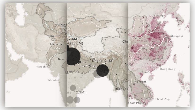
Brimming with over 14,000 verified locations (with thousands more still being vetted), such a dataset can benefit from the tried-and-true dashboard treatment. After all, there are dimensions to be explored: date, ship size, country of origin, cause of sinking, etc. A nerd could spend hours filtering and poking around—particularly if said nerd was out to investigate a specific question.
But what about the casual reader? If we’re uninitiated to the topic, many of us are more apt to be guided through an exploration. There’s a reason Ken Burns created a documentary about jazz instead of just a Spotify playlist. Sometimes we need a little explanation as to why we should care and hints as to how best to start sinking our teeth into the data. This is where ArcGIS StoryMaps can really shine.

The story within
When Cooper initially happened upon Paul’s work, he sensed an opportunity for some synergy between data and storytelling. Along with co-author Will Hackney, he set out to tease a relatable experience out of rows upon rows of geometry and attributes. In this quest, they employed a number of storytelling and cartographic devices. Here are some of the most noteworthy.
Starting small
14,000-plus dots…that’s a lot to get your head around. So rather than overload readers at the onset, this story begins with the sinking of a single ship.
Starting small provides the opportunity to bring in a human angle and inject some pathos. From this point, as the narrative gradually transitions to a global scale, hopefully the reader is emotionally invested.

Haunting cartography
Using a dark basemap, simple point symbols, and a glow effect that increases as points get more clustered together, the map depicts the sunken ships almost as a constellation. In addition to lending an eerie effect, this cartography allows the viewer to absorb the immensity of the data without losing sight of big picture trends and patterns.

Sidecar sequencing
The sidecar immersive block, used throughout this story, is a very effective tool for coordinating the appearance of text with map choreography. Each “slide” can trigger a change in the map extent, layer visibility, or data filters, with a series of narrative panels explaining it all along the way. In this way, the reader experiences a succession of reveals that can help them keep their footing in a sea of data.

Map action heroes
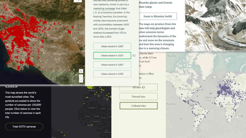
At certain points in the journey, the story uses map actions that enable the reader to focus on a particular aspect of the data, or even an individual ship. The buttons in the slide pictured below, for instance, isolate sinkings from a given year so that readers can see how the war unfolded over time. In other places, map actions embedded directly in the text pinpoint particular anecdotes on the map.

Tell your own data story!
As communicators, we often face the challenge of making a complex or vast topic accessible. Resurfacing the past demonstrates the effectiveness of a guided approach and the depth of capabilities afforded by the ArcGIS StoryMaps platform to help pull a captivating story out of a big set of data. Hopefully, what you’ve read here will inspire you to do the same with your own data! Let us see what you create by Tweeting at us @ArcGISStoryMaps.


Article Discussion: