This piece of content is no longer being maintained and may reference events in the past or product features that have changed.
How much interactivity to include in your map is a central question in modern cartography. As maps have evolved from static paper documents to interactive digital conversations, we now need to ask “How much do I want my readers to do with this map? How much of it should they be able to change?” While interactivity is a huge part of the appeal of digital maps, we have to be strategic in how we deploy that power.
On Esri’s StoryMaps team, for every map we create we ask ourselves these very questions. What follows are some of the ways we arrive at our answers.
First, a quick note—this post coincides with a useful new feature added to the June 2020 release of StoryMaps: You can now disable map navigation on express maps, web maps, and 3D scenes.
This means you can now include a map in a story that readers can still click on to see pop-ups, but that they can’t pan or zoom. If the map has no pop-ups, it functionally becomes a static map.
In other words, interactivity on a map isn’t all-or-nothing; you can turn down some interactivity while keeping the rest. Given this new capability, now is the ideal time to dig deeper into whether or not your maps should be fully static, fully interactive, or somewhere in between.

The answer to whether or not a map should be interactive is never “since interactivity is an unalloyed good, add as much as you can until the CPU is close to melting and the reader is completely overwhelmed with choices!” The art of both cartography and interaction design is how to get the biggest bang from the fewest moving parts.
A Double-Edged Sword
Interactive maps can change what they show and reveal details on demand. On any given day millions of map readers will change the basemap, do a search, filter their results, add additional data overlays, run analysis, click to retrieve content, and so on and on. It’s amazing how flexible our daily maps have become. And it’s equally amazing how popular they are. This is a good problem to have.
But all that power comes at a cost: interactivity is expensive to build, expensive to maintain, and expensive in cognitive effort. Readers have to learn what the map is capable of doing and then learn what the right sequence of clicks and taps is to get it to do those things. Sure, there are standard UI practices emerging, such as pinch-to-zoom, but they’re not 100 percent standardized (as I’m sure most of us have experienced). Good cartography is about avoiding those moments of confusion and frustration.
How often have we all thought “Am I doing it wrong? Or does the map not actually support this kind of interaction?” My confidence and joy both take a hit when that happens.

Does the map say all that it needs to say at a glance?
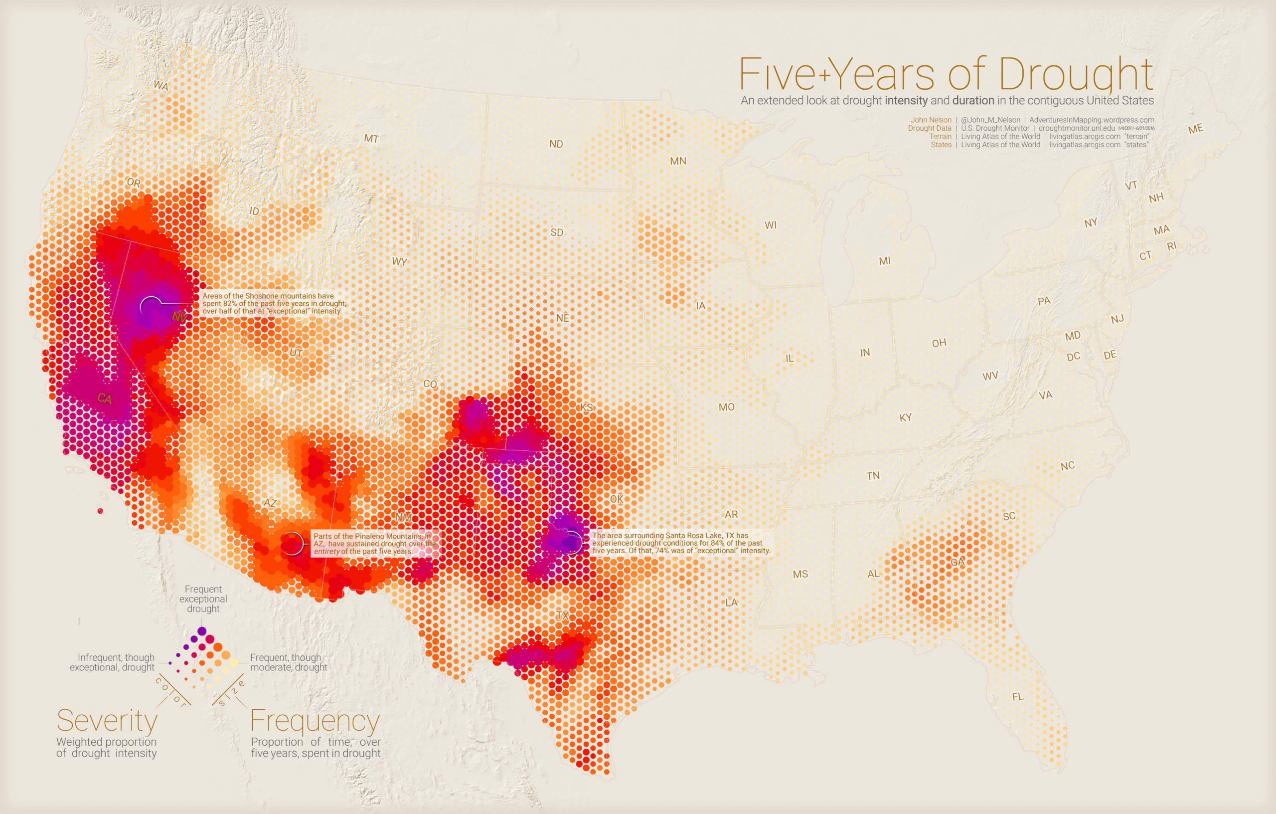
If so, you don’t need interactivity. If zooming in on the map adds nothing to my understanding of the data, I feel annoyed. Interactivity requires effort, so reward it. Put another way, if you can fit all of your data on the map and it still makes sense, you might not need interactivity. I’ve seen maps with a mountain of complex data that work beautifully as static maps. For one example, have a look at John Nelson’s Five Years of Drought. In fact, the lack of interactivity on his map means we have more time to study the map since we aren’t busy figuring out controls. And, if nothing else, static maps load faster and work better across devices.
However, when I have a lot of data and it can’t be synthesized into a single representation, I rely on interactivity. For example, the story map of the Battlefields of the Civil War , created by my colleague Stephen Sylvia, has so many fine-grain details about each battle that interactivity was essential. He settled on date filters, time sliders, pop-ups, search fields and a clickable list of battles. The list of possible interactions was longer, but this felt like the core set to help our readers tame that data and learn something new.
Sadly, people don’t click as much as we would hope
In recent years some very complex data visualization maps from top-tier producers such as National Geographic, the Washington Post, or the New York Times have largely been static, and it isn’t because these folks don’t know how to make great interactive maps! It’s because we’re learning that people interact with multimedia less than those of us in the business wish they did.
In fact, Gregor Aisch from the New York Times graphics department—a team that produces stunning interactive maps—showed that fewer than 1 in 5 readers will click on interactive content. Interactivity isn’t dead, it’s just less interesting to many readers than we might have hoped. Instead, many readers want to look at great graphics before scrolling past. They just don’t always interact. On the whole, as attention spans get shorter and our digital distractions louder, static maps that work quickly and require little of the reader are always a safe bet.
If you make a tooltip or rollover, assume no one will ever see it.
Consider scroll-based interactivity
One of my favorite features of story maps are scroll-based map actions. As the reader moves through the story, the text and media coordinate with the appearance of the map. In other words, the map changes on its own at the right point in the narrative. The map can pan to a new location, or different map layers can turn on and off to reveal new details. This requires nothing of the reader other than to scroll. Scrolling is very easy and is a low-cost form of interactivity. And compared to a row of buttons or pulldown menus it is also very touch friendly. Best of all, it works well when space is tight since there is no UI to fit around the map and no UI that your readers have to discover and master. Have a look here at this great example.
Final thoughts
Today’s cartographers are more like “experience engineers” who empower readers to take over more and more of the authoring process. With interactive maps powered by ArcGIS we can allow our audiences to do so much with maps. Don’t like the color ramp? Change it. Need to overlay different data? Go for it. Want to change the class break? No problem. A useful way to scope down all of those options is to ask “If I only want my readers to do three things, which would those be?” It’ll also help reduce the amount of time needed to finish our work, both of which are good things.
Stepping back, increasing the amount of interactivity means the author has less control to pre-determine the message of the map. In a very real sense, the map is being re-authored by each reader. I have seen maps be successfully used for purposes the author could never have anticipated. This is a good thing. The shift in maps from “static documents of record in which all decisions are made for the reader” to “living documents which facilitate a conversation between data and understanding” is a very cool development indeed.
Happy mapping!

Article Discussion: