Where stories happen matters. We take the “maps” part of “ArcGIS StoryMaps” very seriously. Geography isn’t merely a passive stage upon which things happen. It shapes our stories. It often explains those stories. Place matters and without it your readers may be missing the whole story. So, even if you’ve never had any cartographic or GIS training, we want you to be able to include maps in your stories — that’s why we created express maps within the ArcGIS StoryMaps builder.
Express maps help you to quickly create and embed simple locator and distribution maps in your narratives. Most stories happen somewhere and they usually need one or more simple maps to help readers orient themselves. If you’re not sure your audience knows where a place is, use an express map. Need to show the location of new store openings, and their business hours, in your hometown? Or how things are moving around, whether across campus or around the globe? Or the boundaries of a study area or region? These are all great ways to use express maps. Our goal was to make cartography as simple as possible so anyone can add focused maps at the right time.
The anatomy of express maps
There are only four components to an express map:
- The base or “canvas” of the map, which is already crafted for you; this is a good time to call out a really great thing about express maps, which is that you can opt to upload an image to serve as the base instead of a map.
- The drawn features you add to the map yourself to represent geographic information (like points, lines, or areas);
- The map pop-ups attached to those features, complete with any relevant details you supply; and
- The annotations you add to provide more context (like text or arrows).
If you’re in a hurry, express maps can simply draw from the design theme of your story for their graphic look. Of course, you’re not restricted to this and can customize most of the elements in an express map as you see fit: Change the basemap, the colors of the drawn features, the styles of the annotation, the size of the map symbols, even upload your own icons to use on the map. You can even organize your drawn features into groups and color-code them, such as different types of restaurants or hotel price ranges ($, $$, $$$). This is a big deal because it means you can either let us take care of the styling cues out of the gate or you can modify them if you want to go further, for instance, to have your express map complement a custom theme that you’ve made.
Basemaps have the biggest impact on the look of the map and you have a number of good choices here. The default basemap is derived from the theme you’re using for the story, and we also offer another 12 Esri basemaps in the map settings panel to quickly try out and see if those work better. It’s worth nothing that different basemaps contain different kinds of content, and emphasize different kinds of things. Some might emphasize things like terrain while other focus on human boundaries and roads. Some are colorful, some are muted.
But beyond Esri’s official basemaps, your express map can utilize any public web map as the basemap, whether that is a map you found in the Living Atlas of the World, your own collection, a federal agency, or live data service in ArcGIS. Why would you do this? Perhaps you want to place your content on top of a weather map, or one showing real-estate prices in your town, or a map of national voting patterns, or one showing seismic risk. And so on and on. Blending content together like this is the core strength of modern cartography and express maps make this a snap.
And, as mentioned above, an express map doesn’t actually need to be a map at all, if you choose to provide an image to serve as the base layer instead. Going this route opens up a plethora of possibilities for adding context and interactivity to images just as you can with maps, and allows you to apply a number of creative “map-oriented” ArcGIS StoryMaps techniques to the image, as well. If you’re curious about how the image layer in express maps can be employed, give this blog post a look.
Express maps are all about the drawing tools
When creating an express map, you’ll notice a variety of drawing tools available to you in the map designer’s toolbar. This is the heart of the express map authoring process: Use it to add points, lines or areas to your map as needed. It also includes helpful drawing tools to save time like circles/ovals and squares/rectangles. Rounding out the list are the annotation tools for labeling the map directly, or including arrows that can be curved to fit your exact needs.

The things that you draw will automatically appear in the drawn features panel on the left side of the map. Your readers won’t see this panel, but it’s there in the map editor so you can rename the features on the map, fill-out your pop-ups, change the color of points, lines or areas, or delete them. Note that annotations and arrows do not appear as line items in the map panel (or the map legend, which your readers can see if you enable it) since they are self-explanatory.
Pro Tip: You have the option to drag out leader lines from the annotation text by grabbing the handles at the top or bottom of the text box. Even if you reposition the text later, the lines will self-adjust and look great.
Want to speed up adding points? Hold shift while clicking to add up to 50 to your express map. Not sure how to use a tool? Hover over the icon and see an animated tooltip demo.
There are also a number of toggle-able settings, such as the ability to prevent readers from panning and zooming around the map (if doing so would be a distraction from the map’s intended purpose), or turning on a search widget. You can learn more about those options here.
When can express maps be useful?
There are a few different instances where my teammates and I find express maps really come in handy:
- As a small locator map
- To highlight important areas
- To show a route or sequence of events
- To sketch what’s inside your head
- To compare different versions of the same map
Here’s a closer look at each one of these, complete with examples.
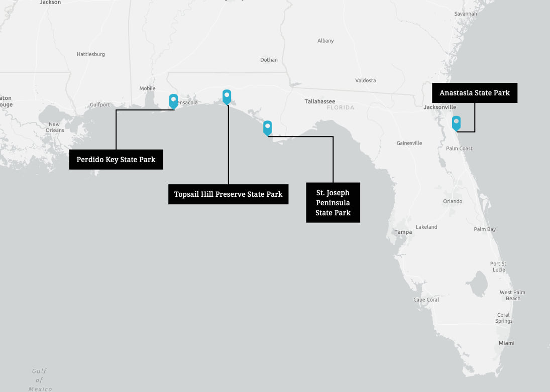
Add a small locator map
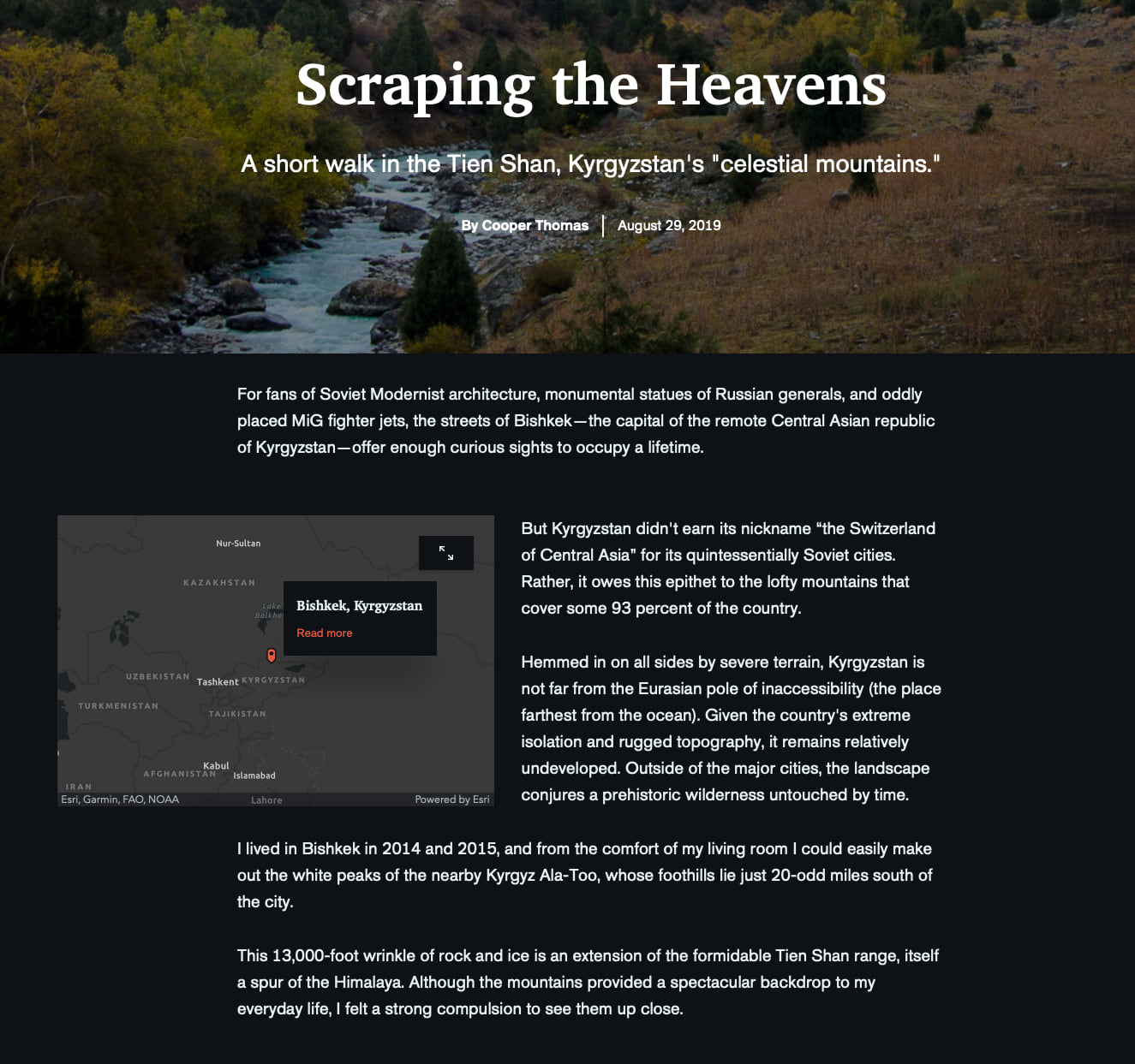
Simple locator maps should be compact and work at a glance. This story of Kyrgystan’s celestial mountainshits the ground running with a locator map to help us understand where this narrative takes place. Bonus points for using the float size option so the story wraps around the locator.
Pro Tip: You can disable navigation on express maps so your readers won’t be able to pan or zoom the map. For simple locators maps like the one above, consider doing this since these maps are suppose to work at a glance and interactivity adds little.
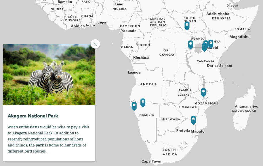
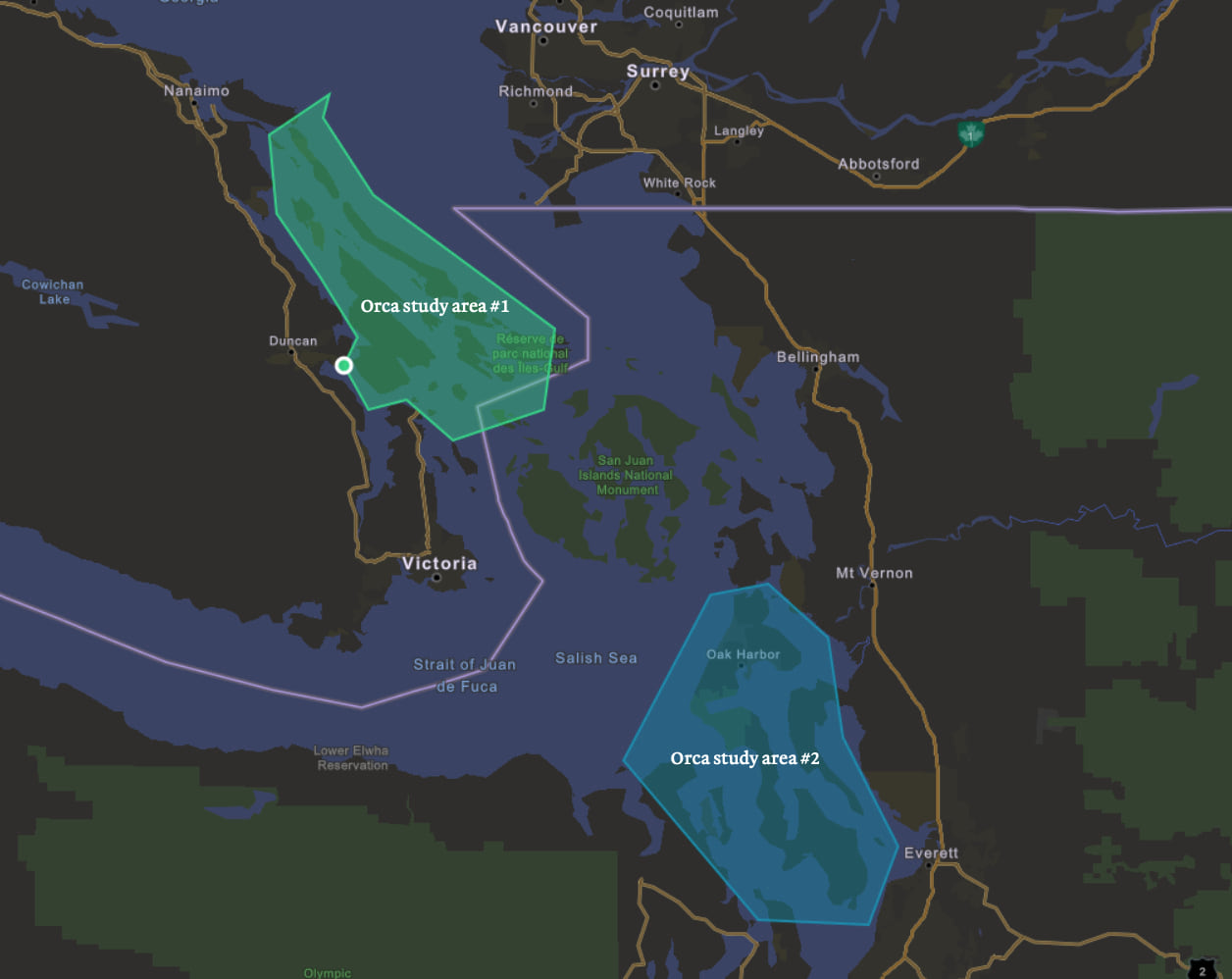
Draw important areas
Not all locators need to be pins; sometimes we want to show regions or areas. Think of a news story showing areas that need to be evacuated, or ecological study areas, or sales territories. This can be especially hard when the areas aren’t standard boundaries like states or counties. Luckily, in express maps you can use the area tool to outline your region one vertex at a time, or draw more fluidly with the freehand area tool.
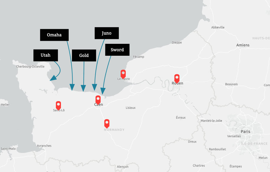
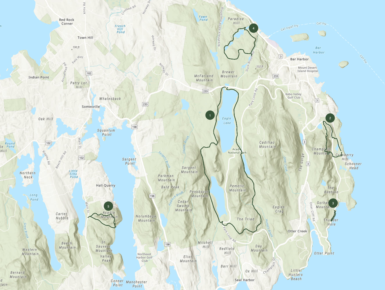
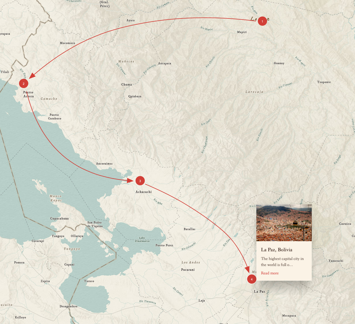
Show a route or sequence of events
Use numbered points in combination with the arrows to show a travel itinerary, a sequence of events, or the route of a delivery vehicle (for just a few ideas). Made a mistake? No worries, just click and drag any of the numbered points and move them. Or even delete one; the remaining numbers will re-order without missing a beat.
Sketch what’s inside your head
Many times I find it’s easier to explain my thoughts by sketching on a paper map and annotating it with arrows and text. We aimed to bring that same simplicity to the drawing and annotation tools in express maps. There are times when maps need to be made with millimeter precision, or include an incredible amount of detail—these are scenarios where ArcGIS Online and Pro excel. But not all of our maps need that level detail or complexity. Often, generalized maps will work better on small screens and communicate the salient bits of story quickly. This is where express maps shine.
Compare different versions of the same map
As you’ve now seen, a single express map can pack a huge punch when it comes to adding geographic context to any story. But that’s not where the fun ends: You can also duplicate sidecar or slideshow slides that contain an express map, then tweak those copies independently from one another in order to draw comparisons across multiple slides. For instance, you can add, subtract, or modify the appearance of drawn features to show changes over time or to emphasize different elements of the map. Another possibility is to switch up the basemap to relate thematic differences in the environment of your map’s extent.
We call this trick map choreography; check out this blog post by my colleague Cooper Thomas to learn more about the technique and how it can be applied to great effect as a storytelling tool. (Note that map choreography with express maps works optimally when the extent and zoom level remain identical across each slide that has a copy of the map.)
Let’s get going
There is a wonderful new hands-on tutorial for express maps available here. The best way to learn about express maps is to jump in and start playing. If it’s your first time making one, the ArcGIS StoryMaps builder has some onboarding material to get you oriented. But don’t be afraid to experiment and try things because (best of all!) we’ve built undo/redo into express maps so you can’t get into trouble. And if you don’t like what you’ve made, you can always delete the map from the story and try again.


Commenting is not enabled for this article.