Since time immemorial, people have used the power of narrative to transmit essential knowledge in a manner that captivates, connects, and resonates with their audiences. Naturally, the methods and tools that we use to tell stories have evolved through time (along with, perhaps, the very reasons we tell those stories). But the essential grammar of storytelling — e.g., conflict and resolution, evocative exposition, character growth, and so on — is practically written into our DNA. Today, the principles of storytelling manifest in nearly every form of human expression and communication, from art, to public policy, to law, to product design, to advertising, and beyond.
One discipline that frequently invokes the pillars of storytelling is science communication, which relates to the transmission of scientific information to non-expert audiences. Science communicators employ the same narrative methods that screenwriters or novelists might employ to engage their audiences. Few people understand the role of storytelling in science communication better than Joshua Stevens, a Senior Content Marketing Strategist on Esri’s Digital Experience team and the Cartographic Editor of Maps.com.

Prior to joining Esri in early 2023, Stevens served as the Lead Cartographer and Data Visualizer for NASA’s Earth Observatory, one of the agency’s principal outlets for public outreach and engagement. During his tenure at NASA, Stevens used satellite-captured data — much of which is available in the ArcGIS Living Atlas of the World, for anyone to use — to produce more than 3,000 maps, graphics, and articles covering a wide range of terrestrial phenomena.
The StoryMaps team recently sat down with Stevens to discuss science communication, cartography, storytelling, and the conceptual and technical threads that weave these disciplines together. The following conversation has been edited for brevity and clarity.
StoryMaps (SM): Thank you so much for joining us today, Joshua. Could you tell us a little bit about your background, and how you got your start in cartography?
Joshua Stevens (JS): Thanks for having me. I have been teaching about and conducting research in cartography for well over a decade. But like many contemporary cartographers, I didn’t start out studying geography. Initially, I was a photography and design student, and then I changed my major to computer science, before stumbling upon GIS during my junior year. I quickly fell in love with the idea of looking at the world through a spatial lens, and of visualizing spatial data. I later completed a master’s degree at Michigan State, and then went on to pursue a PhD at Penn State, specifically studying map interaction, and how certain design patterns signal different forms of interactivity to users.
SM: Do you recall a specific “aha” moment when cartography suddenly clicked for you?
JS: It was more of a gradual process. But while I was working on my master’s degree at Michigan State, I took a cartography course with Kirk Goldsberry, [a geographer and sports analyst who popularized the basketball “shot chart,”] and his approach to visual communication really transformed the way I thought about maps in general.
Cartography isn’t just concerned with what’s going on in different countries, or what’s happening at the county scale. There are also very local geographies that can be analyzed and mapped, such as a basketball court. Of course, there are even smaller geographies, too, if you consider things like medical imaging. Recognizing that these are all spatial forms really opened my eyes to seeing everything as a spatial problem that could be addressed and communicated visually.
SM: That’s a great point. As geographers, we sometimes overlook these “microgeographies.”
JS: For sure. Waldo Tobler’s first law of geography states that everything is related to everything else, but that near things are more related than distant things — and that holds true regardless of scale. Maps can help us understand what’s happening in both the biggest and smallest environments.
SM: I suspect that you mostly focused on those big environments at the Earth Observatory. What kinds of projects did you work on at NASA?
JS: The Earth Observatory publishes an Image of the Day, which usually consists of a map or graphic about a relevant geographic phenomenon, accompanied by a short explanatory article. My main task was to create these maps and visuals accompanying the articles. The Image of the Day is published 365 days a year, so during my eight years at NASA, I created more than 3,000 graphics and maps.
SM: That’s an incredible achievement! Given that you were transitioning into this job from a post in academia — which perhaps emphasizes depth over breadth — did you find it difficult to limit the scope of your projects to whatever you could accomplish in an 8-hour workday?
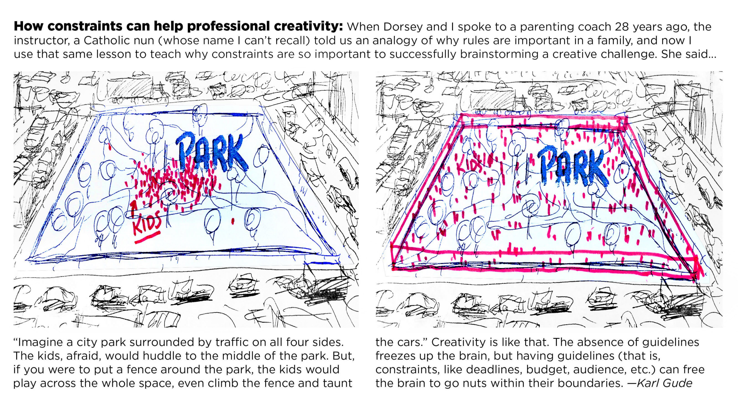
JS: Definitely. There’s always tension there as a creative. But those time constraints eventually became a sort of comfortable boundary, and ultimately helped us produce better work.
One of my professors at Michigan State, Karl Gude, provided this great analogy about kids playing in a town square surrounded by roads: If there’s nothing separating the kids from the road and traffic, they naturally avoid the edges of the square, and constrain their play to the center. But if a fence is built around the square, then the kids will use the full extent of that space to play. This applies to the real world as well: Constraints can help us expand what we’re doing.
SM: That’s a great analogy. I think many cartographers would agree that constraints often enable greater creativity. But you weren’t just creating maps at NASA — you were also explaining what those maps showed. What were some of the biggest challenges you faced in terms of communicating complex topics to a general audience?
JS: Well, satellite images can be pretty intuitive…but often in Earth observation, we’re not dealing with satellite imagery. Instead, we might be visualizing some other kind of data like, for example, a LIDAR profile. Communicating that kind of data to the public takes a special bit of care and nuance. Often, the units or data that we’re showing — for example, attenuated backscatter, in the case of LIDAR — don’t make intuitive sense to most people.
SM: So, how exactly did you approach this task? Were there specific publications or other sources of inspiration you referenced when it came to translating complex topics into more accessible language?
JS: We definitely relied on academic journals and the current state of science to ensure that we were getting the facts right…but it’s often a matter of trying to think about the subject through the eyes of someone who doesn’t read academic journals every day, or who doesn’t have lunch meetings with the scientists conducting this research.
In some ways, I see myself as a pretty simple guy, in that I’m not an atmospheric scientist, or an aerosol scientist, or whatever. So when I see these data, I often have a lot of the same questions — and face the same challenges in interpreting the data — that someone completely new to the topic would. In other words, if it doesn’t make sense to me, it probably won’t make sense for someone else.
SM: So, by putting yourself in the shoes of your readers, you were able to approach these topics with a measure of perspective. But you were also basically learning as you went, is that right?
JS: That’s right. And that’s one of the great things about this line of work: You can learn so much, whether it’s about a new instrument or method for collecting data, or a new way to interpret those data. There’s never a point where you feel like you’ve learned it all — for me, at least, it’s never even come close.
SM: Very cool. Speaking of Earth observation, I think a common misconception about this discipline is that it’s primarily concerned with natural phenomena, like weather patterns or ocean salinity. But we’ve also seen several ways in which Earth observation can inform our understanding of human experiences. Do you think the role of EO in various anthropological studies will continue to expand?
JS: Absolutely. The application of remote sensing techniques to, say, political or economic studies can be hugely illuminating. One great example is the urban heat island effect: We already know that cities get warmer than their surroundings, but as the resolution of satellite imagery increases, we can begin to identify the exact locations within a city that are getting warmer. Then we can begin to pull in community data to understand the specific human influences and effects at a local level. There are all kinds of equality and equity issues that can be studied and potentially addressed through the lens of remote sensing.
SM: That’s a great example. It’s neat to see how quickly the use of satellite-captured data is expanding into new fields. Speaking of which, eight years is practically an eternity in internet time. Do you think your audience’s reading behaviors or expectations evolved during your time at NASA, and if so, how did that affect your work?
JS: Well, for one, readers today are accustomed to incredibly sophisticated graphics, thanks largely to the work of major newsrooms. Readers today can understand or interpret very nuanced charts or abstract representations better than ever before. Of course, there are still challenges when communicating to a broad audience. You want to be able to satisfy those who do have a certain level of familiarity with the topic, while not losing those who might be encountering it for the first time.
SM: Interesting. Are there any particular methods or techniques you used, or still use, in your own work in order to engage expert and non-expert audiences alike?
JS: Sure. Here’s an example: One of the first more abstract visuals I produced at the Earth Observatory looked at the number of Landsat acquisitions over time. We built this detailed calendar view, intended for readers with some existing interest in the topic, but then complemented that with a standard line chart. In that case, providing two different views of the same data helped us meet both audiences where they are.
SM: Your work at NASA focused specifically on earth observation, but just for fun, let’s shift our focus away from Earth for a minute and talk a little bit about mapping the cosmos. Considering the growing interest (both public and private) in space exploration, do you think we will see an uptick in extraterrestrial cartography in the years ahead?
JS: Absolutely. The surface of the Moon and of Mars are already mapped in incredible detail, and it’s only a matter of time before we’re deploying satellites that orbit around other planets. But truthfully, and maybe tragically, it probably won’t be traditional cartographers creating the first maps of distant planets.
SM: It’s commonly said that we know more about the surface of the Moon than we do about the ocean floor. Do you think there’s a risk that as we look beyond Earth, scientific resources might be diverted away from understanding our own planet?
JS: I personally don’t think so, especially because the tools and methods used for scientific inquiry are often relevant across fields. For example, the first images captured by the Hubble Space Telescope were blurry. To solve this, NASA scientists re-developed the image processing algorithms for the data. This immediately improved the telescope’s image quality. But the same algorithms were then shared with the medical community and applied to the processing of mammograms. This improved the detection of smaller indications of breast cancer, enabling treatment to begin earlier. Someone could’ve said, ‘why should we fund this space exploration thing when we’ve got people with breast cancer?’ and vice versa. But it was funding Hubble that led to improved detection of breast cancers. Science paves the way for more science, often regardless of the discipline.
SM: That example serves as a good reminder that scientific progress rarely happens in a vacuum. And as we continue to map the Earth in greater detail, we might be assembling the same toolkit that will eventually allow us to go beyond our own planet. Joshua, thanks so much for sharing your experiences and perspectives with us and our readers!
JS: My pleasure.

This featured storyteller interview was prepared as a part of the March 2023 | Charting the heavens issue of StoryScape℠.
For more interviews and articles like this one, be sure to check out StoryScape℠, a monthly digital magazine for ArcGIS StoryMaps that explores the world of place-based storytelling — with a new theme every issue.
Commenting is not enabled for this article.