
“How should I approach workload separation in our ArcGIS systems?” It’s a frequently asked question for a reason.
When we talk about workload separation, we’re talking about isolating different types of work so they don’t negatively impact each other. In other words, you don’t want one part of your system hogging resources from other parts – especially to the point where it’s interfering with people being able to do work productively (or at all).
That’s easy enough to understand in concept. But it’s not-so-easy to figure out how to make that mean something for you in practice.
So, in this blog, you’ll:
- Learn different ways organizations might approach workload separation with ArcGIS, depending on their needs
- Review real test results for two different system designs with different levels of workload separation
- Consider the tradeoffs involved with making evidence-backed choices for your organization
Types of workload separation in ArcGIS
A common challenge organizations have is when different kinds of workloads create resource contention, which typically results in downstream performance problems and degraded user experience. To mitigate this “resource-hogging”, organizations can design for workload separation in different ways- and often in combination. For example, by:
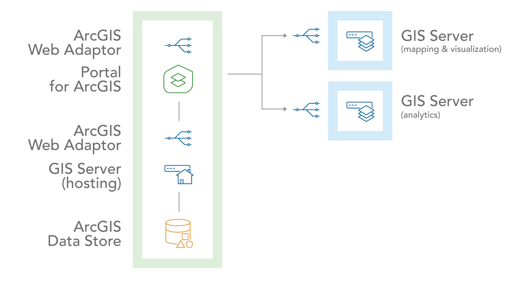
1. service type: ArcGIS delivers many kinds of capabilities, each of which can impact system resources differently. For example, the diagram below illustrates separating mapping & visualization and analytics services from the ArcGIS Enterprise base deployment.
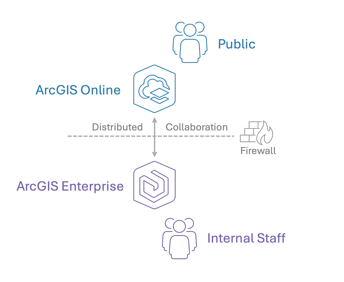
2. audience: depending on how different user personas participate in the system, some usage patterns might negatively impact others. For example, it’s typically a recommended practice to separate unknown, potentially high volumes of requests (like from the public) into a natively scalable and elastic environment like ArcGIS Online, so they can’t interfere with internal users working within ArcGIS Enterprise.
3. system component: ArcGIS systems are comprised of many components that all serve different functions. For example, ArcGIS Enterprise is comprised of four software components which each consume system resources differently. The diagram below shows a multi-machine deployment, where ArcGIS Enterprise components are separated from each other.
So, those are three common ways organizations may choose to design for workload separation in their ArcGIS systems.
This blog is going to look more deeply at just one of these- the latter option.
❓ How might a system under the same load behave with different levels of workload separation by component?
💡 We ran some tests to find out. So let’s take a look and discuss how the results might inform real-world architectural choices.
Keep in mind: we’re not prescribing a single correct architecture for everyone. Rather, we’re showing how designing and testing based on your organization’s needs can help you make better choices – evaluated using evidence (not assumptions).
Our testing approach
Our goal was to produce some quantitative results on how two different ArcGIS system designs behave under identical load – in this case, we used a Parcel Management System. However, the concept applies regardless of the ArcGIS system(s) you have.
That said, a Parcel Management System is a good model for our purpose, because they:
- are a commonly deployed in many organizations and industries
- have a mix of editing and viewing workflows happening concurrently throughout the day
- typically have high expectations for responsive editing and consistent availability
If you want to learn more about the test methods and tools we used, check out our system test study for a Parcel Management System.
For this blog, we’re going to look at two common designs:
A three-machine design:
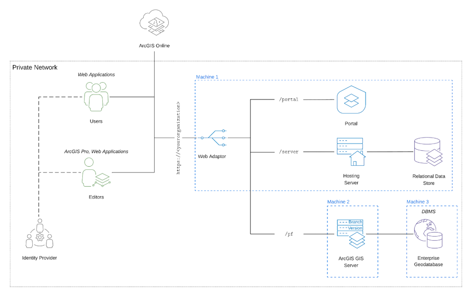
This reflects a common ‘minimally separated’ ArcGIS system deployment. The logical diagram below shows the base ArcGIS Enterprise deployment (Web Adaptor, Portal, Hosting Server, and Relational Data Store) on Machine 1. Then, it has a separate ArcGIS GIS Server supporting the ArcGIS Parcel Fabric on Machine 2, and the Enterprise Geodatabase on Machine 3.
A six-machine design:
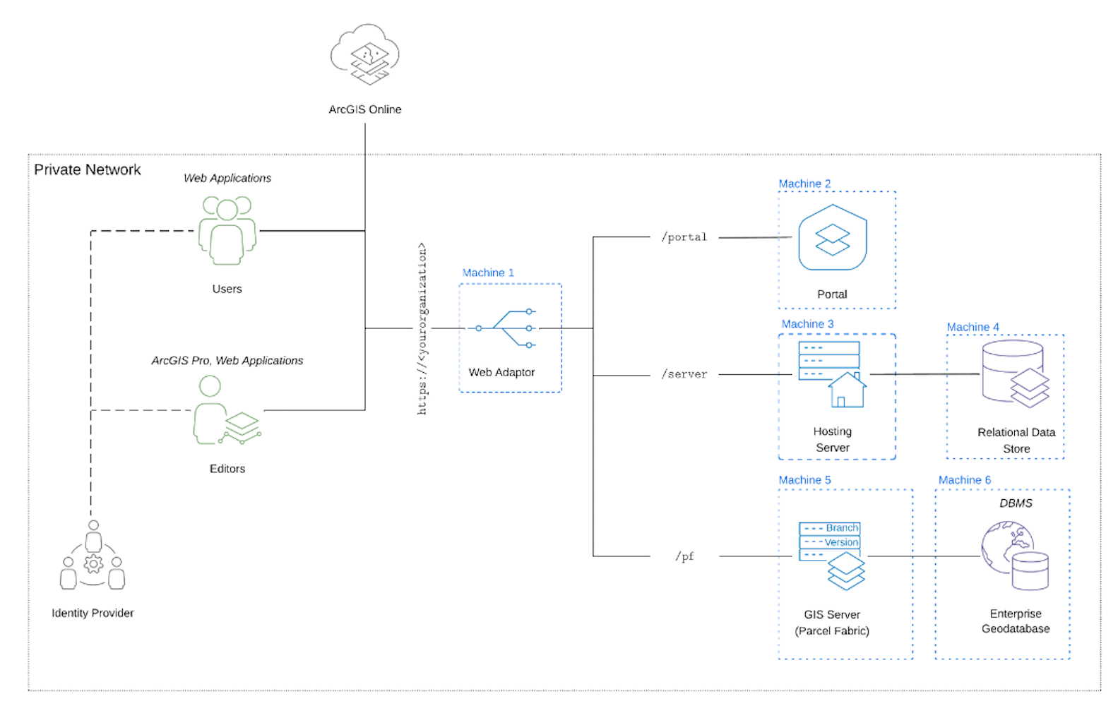
This reflects a fully component-separated ArcGIS system design. The logical diagram below shows how each component of ArcGIS Enterprise, along with the ArcGIS GIS Server and Enterprise Geodatabase, are separated out onto their own machines.
The only difference between the two designs (and two tests) is the separation of system components. Everything else is identical, including the licensing. You will also notice the editing and viewing workflows are separated in each test, with editors accessing the ArcGIS GIS Server and viewers accessing through the Hosting Server. This is an example of workload separation by service type.
Remember, there are many ways to design for workload separation, as listed above. Even within the scope of separating by system component, you have many options. The following examples are two common approaches, to give you an idea of how you can evaluate your own designs through testing.
Test results & observations
Let’s take a look at the load test results for each design. Let’s start with the simpler of the two – the three-machine design.
We monitored and collected telemetry throughout the duration of the tests. In the graphs below, you can see the resource utilization across the system components. Orange shows vCPU utilization, purple represents memory, yellow is disk, and grey is network. The bottom chart shows concurrent requests- the number of simultaneous editing (blue) and viewing (red) requests the system is responding to at any given moment.
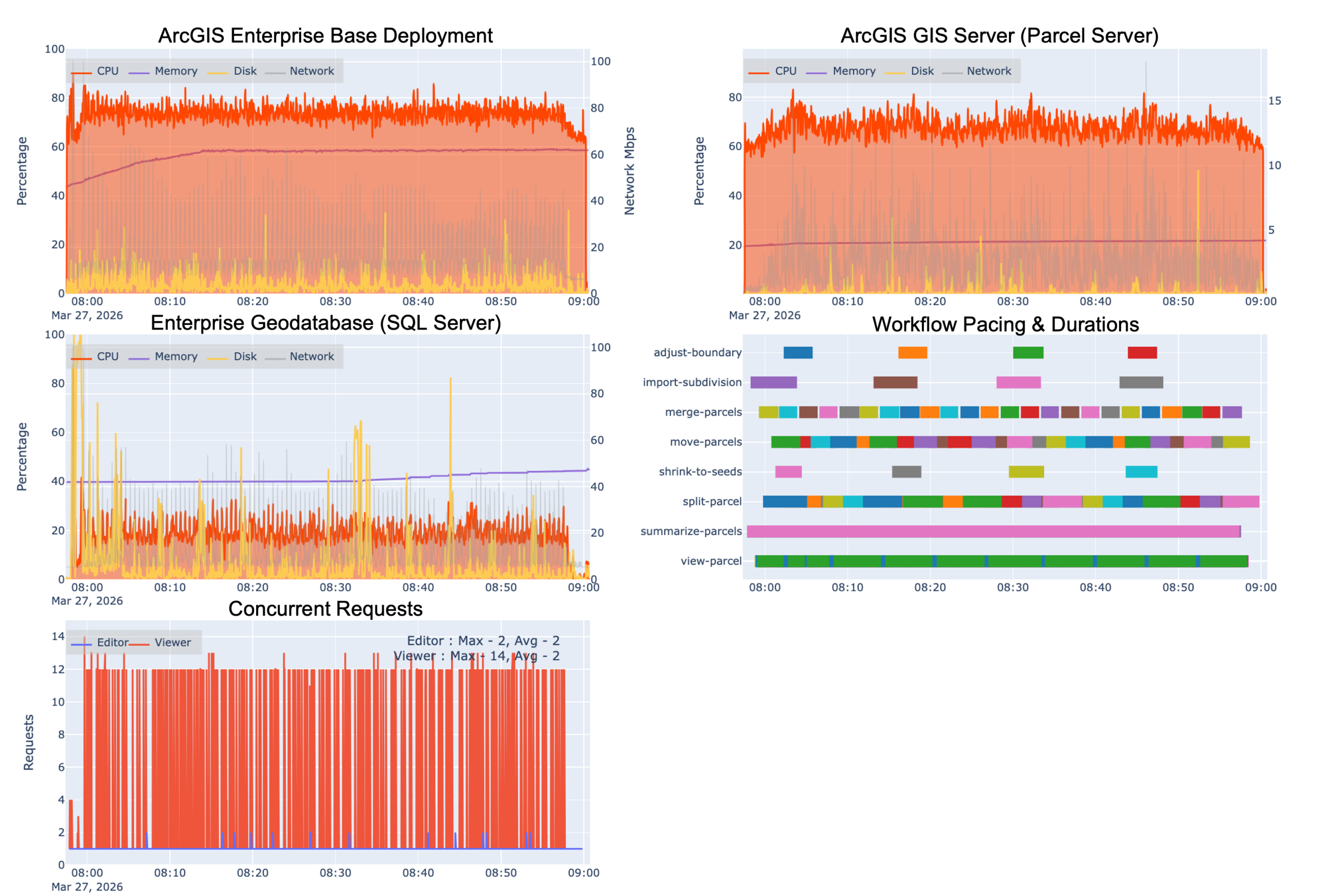
Key observations:
This system is at running at max (or close to) max capacity. It probably cannot support any more users or workflows without negatively impacting performance and user experience:
- CPU utilization for the base ArcGIS Enterprise (top left) consistently hovered around 80 – 85%. The separate Parcel Server (top right) shows slightly less.
- RAM utilization reaches about 60% in the base deployment and 20% for the Parcel (GIS) Server.
- The enterprise geodatabase (SQL Server) had fairly low CPU utilization – around 35%.
- Requests are still opening and closing as expected, demonstrating good responsiveness
- Workflow execution times were normal and there were no errors, likely because the system is not quite overloaded. There is not much room for additional requests before everyone starts experiencing wait times and timeout errors.
Now, what about our 6-machine design- how do you think it fared in comparison?
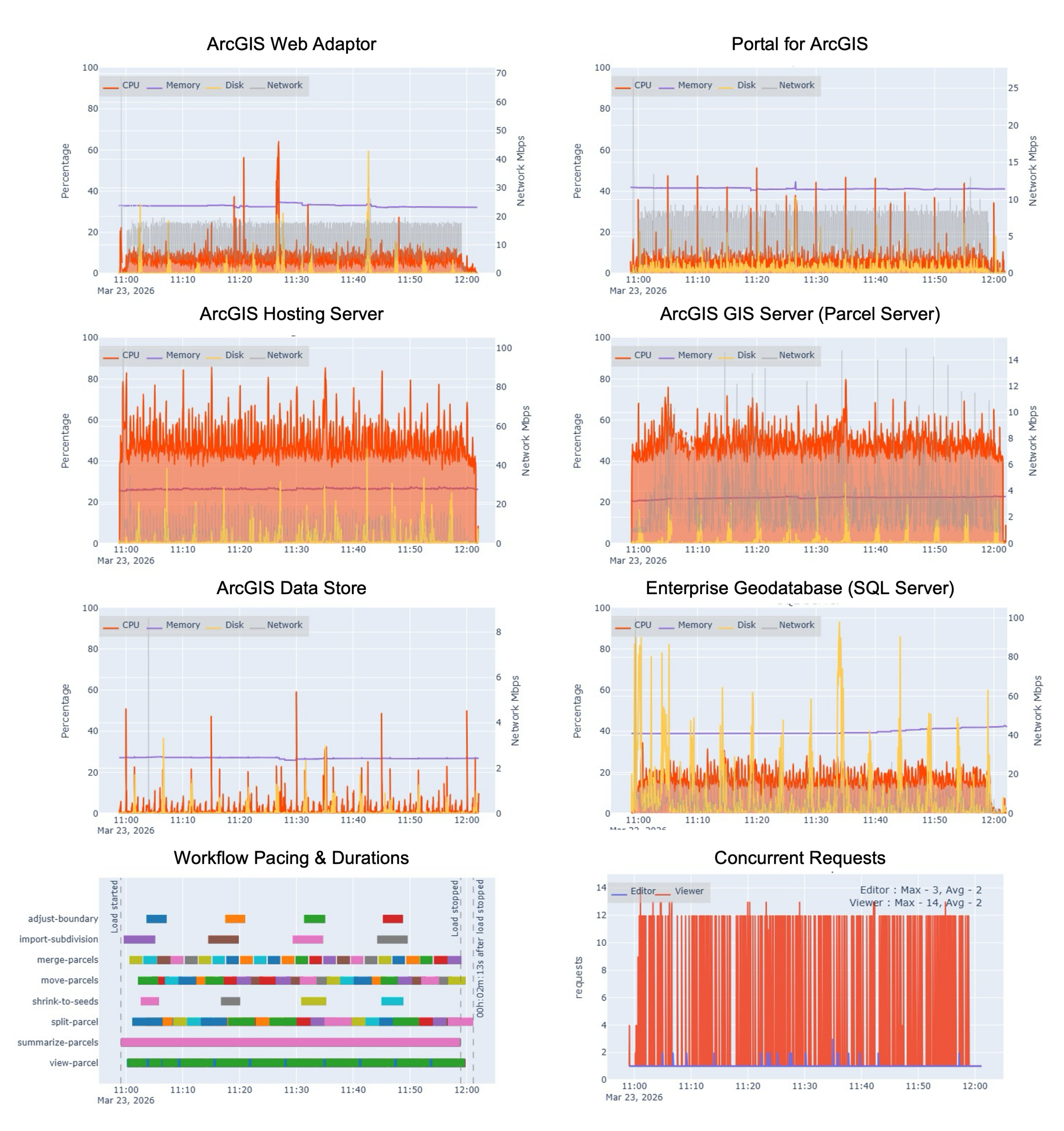
Key observations:
As we’d expect, this system design is showing the load being distributed across the additional virtual machines, and provides more “wiggle room” in terms of being able to accommodate a growing user based or new workflows:
- CPU utilization for Hosting Server and Parcel Server (GIS Server) both maintained a steady 55- 65% CPU. There were a few spikes over 80% on the Hosting Server, but it generally ran lower.
- RAM utilization decreased significantly after separating the ArcGIS Enterprise components out – around 25% on the hosting server and 20% on the Parcel Server.
- The enterprise geodatabase (SQL Server) had fairly low CPU utilization – around 35%, very similar to the first test, which was expected.
- Requests are opening and closing as expected, demonstrating good responsiveness
Moving from test results to making a choice
“Those are some nice graphs”, you might be thinking. “But, what does it really mean? How do I know what choice to make?” Excellent question, you!
Before I move on to answer that great question, I want to provide a disclaimer. These were our test results, based on our workflows, instance types, and environment. Yours will probably differ at least a little. So, the recommendation is not to take these results as if they were you own. Rather, it’s to help you think through your own test results and make enough meaning out of them to make a more informed design choice.
First, it’s important to remember that there isn’t an objectively ‘better’ design here. Each design has its benefits and drawbacks. To make telemetry data mean something, you have to consider it within the context of your organization’s business and technical requirements. You have to ask yourself, “what do we want to optimize for?” Let’s think it through considering:
- System performance
- User experience and productivity
- Infrastructure costs
- Skills required
- Vision for the future
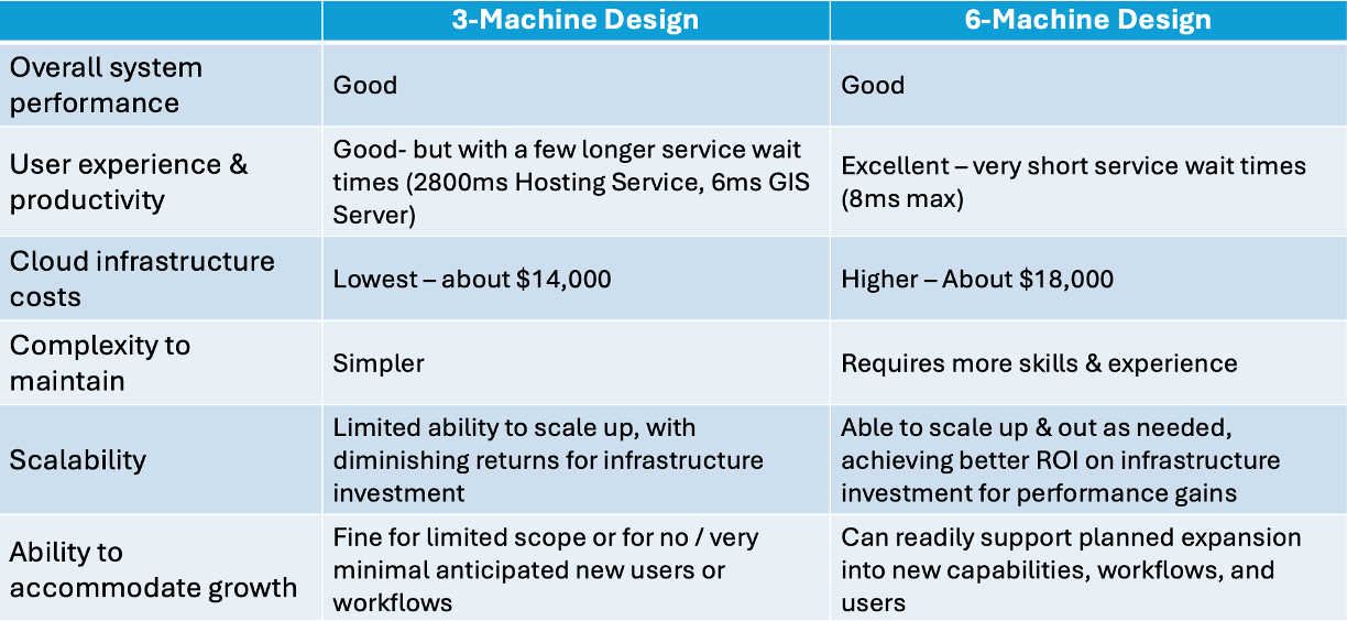
In essence, we are weighing the tradeoffs between simplicity, cost, performance, and flexibility. This is a simplified way of looking at it, but hopefully this helps you think through the tradeoffs involved with different design choices you make. A good design choice is one that optimizes cost (taking into account the cost of lost productivity) and complexity against your users’ needs and expectations.
Consider your own organization’s needs for a moment: if these test results were your own, which design would be more suitable for what you need to do?
- If you’re planning on expanding adoption, maybe you’d choose the 6-machine design.
- If you’re confident that these are the only users and workflows you will need to support, maybe the 3-machine is more cost-effective choice that still meets your needs.
- Which other characteristics are priorities for your organization?
Recommendations
Ok, let’s wrap this all up. To summarize:
- Workload separation isn’t binary. There are several levels to think about and many ways to apply the overall approach.
- Think about any design approach within the context of your organization’s needs, and weigh the tradeoffs with any possible choice
- Workload separation tends to introduce additional cost complexity into your design (and therefore typically requires more advance skills to maintain successfully). On the flip side, it also tends to balance utilization, improve performance, reduce service wait times, and increases flexibility and scalability.
- If you have an ArcGIS Enterprise base deployment and are seeing poor system performance, don’t assume that adding more infrastructure resources will solve the problem. It might be more cost-effective to separate components instead.
- You can’t make informed decisions without information. So, make sure to do your own testing (in test or staging environment!) before committing to design choices or changes. Remember, the telemetry data is only meaningful when mapped to business and technical priorities.
If you want some additional reference materials for testing, check out:
- Our catalog of test studies and blogs
- Design an effective test strategy
- Tools for performance testing
- Define and capture telemetry
Do you have ideas for how we can improve our resources in the future? Please share your thoughts with us!
➡️ You can also find our full catalog of test studies and blogs here
➡️ If you have questions or want to keep the conversation going, consider joining our LinkedIn group


Article Discussion: