Understanding the demographics of your customer base is more important than ever. With changes in customer spending and habits, it is essential to stay on top of these trends to understand how to best support your customers.
New with the Business Analyst Pro 3.7 release: the Generate Customer Demographic Profile Report tool. This new tool (with maybe one of the longest geoprocessing tool names?) gives users the ability to create an infographic report that summarizes the average demographics of a customer layer.
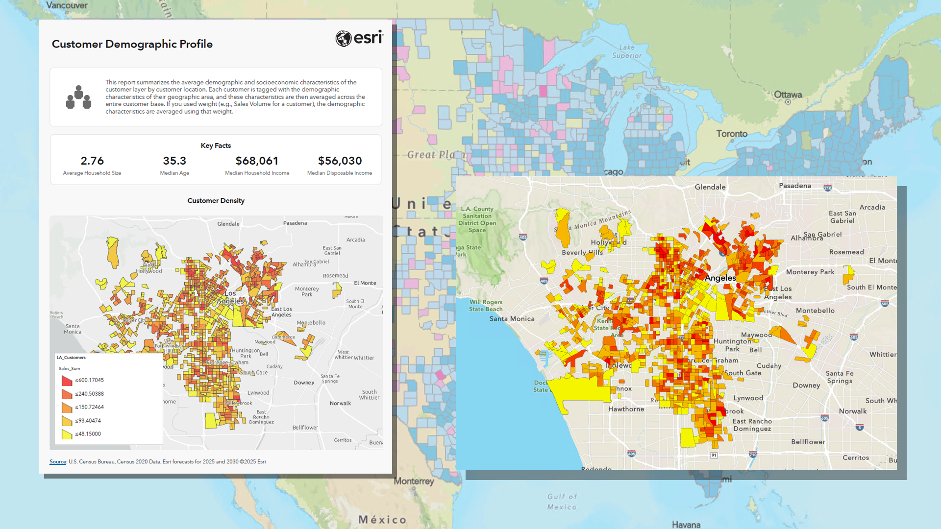
A couple things to note about the release of this new tool
The Generate Customer Demographic Profile Report tool is only available with local data for the The United States and Canada, since it’s a part of the Target Marketing toolset. There is a default template that is specific to this tool for the local USA data, but it is not included in the 2025 local data download. Check out this Knowledge Base article with a couple easy steps to install this template: Add and configure Customer Demographic Profile Report template.
Canadian local data users can use the tool with the Customer Demographic Profile template, or another template of choice (even custom ones). Users want to be mindful of what variables are being calculated in the infographic reports; this tool calculates a weighted average per geography unit. So, it is best to use report templates that do not include total counts or sums of variables because this can be misleading. For more information, read the Calculations section of the tool’s help documentation.
So, what does this tool do, exactly?
The Customer Demographic Profile report provides a portrait of your “average” customer based on the geographic locations of your existing customers. Using a customer point layer as an input, the tool calculates the average demographics from the standard geographies that the points fall into (block groups by default). The average is weighted based on the count of customers in each respective block group, to make sure the final variable calculations represent the majority of your customer base. If you would like the final result to be weighted differently, such as by sales or visits, you can assign that field in the “Weight Field” parameter in the tool.
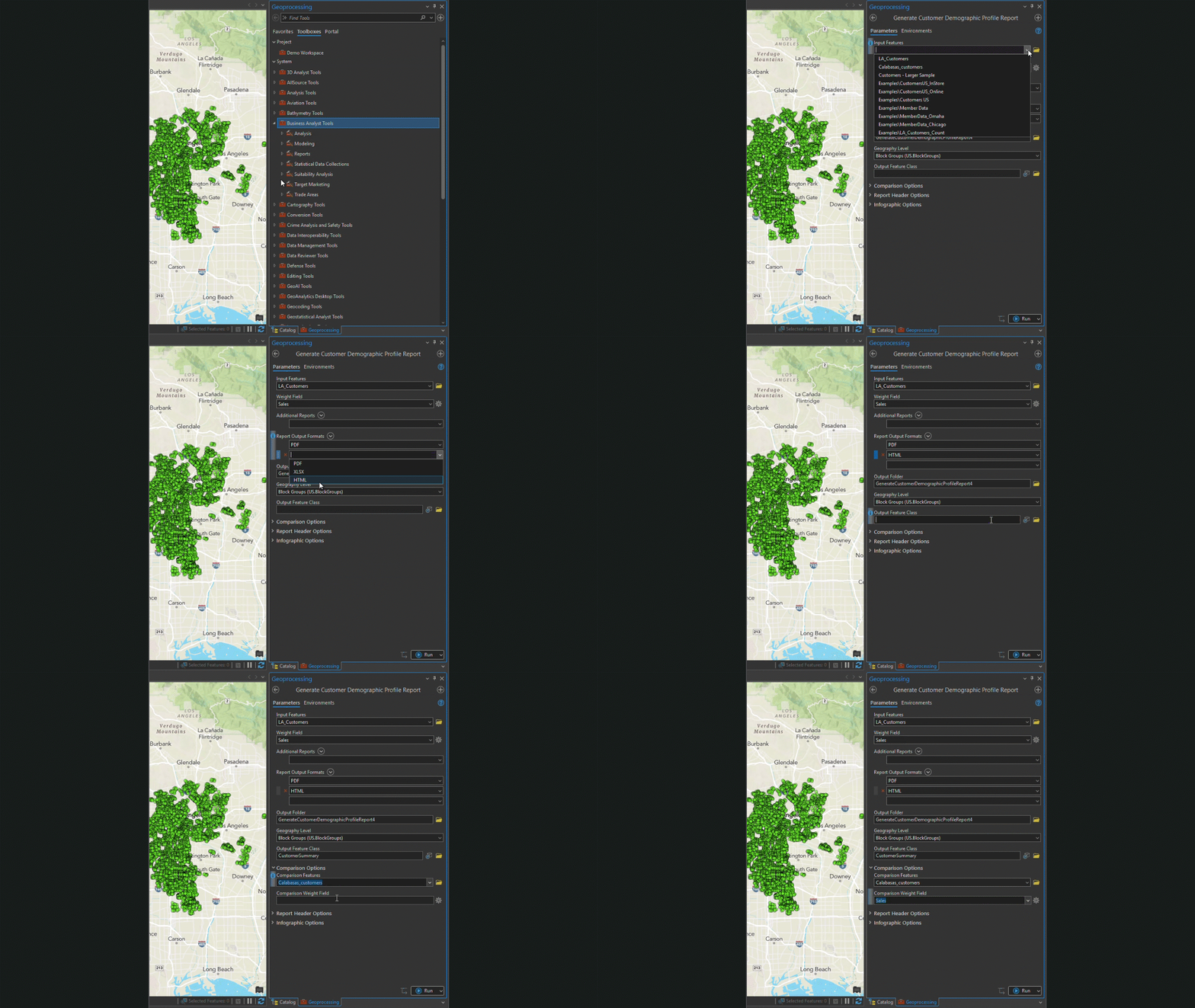
The result is an infographic report that summarizes the demographics of your customer layer. This brings to light key information about households, how they spend their money, how they make their money, education level, and even top Tapestry segments. You can view a sample of this report here.
Compare two different customer layers
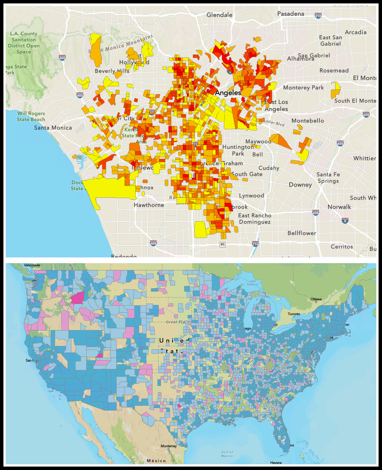
Another way to use this tool is to run a comparison between two customer layers, illustrating how two separate customer layers might differ. For example, you might compare:
- in–store vs. online shoppers
- customers who purchase different types of product categories
- high–spending customers vs. low–spending customers
The output is a comparison infographic allowing you to easily spot these differences. See this sample report here.
The tool will use block groups by default for the customer summaries; this can be changed for larger customer datasets. For example, if you wanted to run a nationwide analysis, it is best to use the county level or higher. This is great for being able to do hyper–local to country–level analysis. Adding an output name to the “Output Feature Class” parameter will also save the feature layer shown in the reports, and add it to your project.
How can this information be useful?
Understanding your customers can help refine business strategies around product assortment, promotional offers, and marketing strategies. And the term “customers” is used lightly. This could also be useful for non-profit organizations to better understand how the demographics of their attendees from a recent event or contributions from donors relate to overall success, helping to focus future outreach efforts. This could also help clinics and other health–related organizations refine treatment and services, so they are related to what is needed in a particular community.
This article uses the local U.S. 2025 dataset, containing ArcGIS Tapestry data from Esri.
This article uses ArcGIS Business Analyst Pro 3.7.
Resources
We hope you’ll explore more capabilities in Business Analyst Pro. To continue your Business Analyst journey, visit the following resources:

Article Discussion: