Hi there, it’s been awhile since my last blog, but I just had to write and share with you the value, power and beauty of the exciting features in the New Comparison Reports. I know Comparison Reports is one of your favorite features and while you liked the old comparison reports, you wanted and asked for more features and functionality, and New Comparison Reports delivers all you asked for and more. All your old favorite features are still available, and you will continue to use the New Comparison Reports to easily compare multiple sites side by side in tabular and chart view as always, but now you have powerful new capabilities with more customization and control to make comparison reports just the way you want them to be.
Try New Comparison Report
If you have not already tried New Comparison Reports, you really must to fully appreciate what I am talking about. There are two major reasons to try New Comparison Reports. First, you’re going to love all the new interactive capabilities, the ease of use, and dynamic customization. And second, the old Comparison Reports will soon be depreciated. But don’t worry; because you are getting a new way to quickly build interactive comparison reports with informative benchmark tables and beautiful charts while adding your own personal touch.
I love the new features and you will too. Come on, let’s go through the new enhancements together. Even if you are already using New Comparison Reports, you will likely discover something along the way.
You can start with sites currently on the map or easily add sites from projects. By default, New Comparison Reports will open to your most recent sites.
Use and customize starter comparison templates
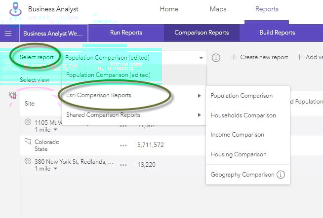
One of your old favorite features from the previous Comparison Report is the popular quick view Esri starter reports. These Esri Comparison Reports are still available; only now, the reports have an updated appearance with interactive enhancements. The first time New Comparison Reports is used, it will open to the Esri Population Comparison report and subsequently will open to your most recently used comparison report.
You will find the Esri reports under Select report – Esri Comparison Reports, but the exciting news here is that now you can customize these popular reports with your own special touch. The current Esri Population Comparison report with the default total population, household and family population variables has always been a favorite, but haven’t you wished you could add, delete or replace a variable to make the report better meet your needs. The old version didn’t allow this, but the new version does. For example, you might like to add the Population: Annual Growth variable to the template. Simply click Add variables and select the variable from the Data Brower to quickly update the report with the additional variable. You can also delete or replace any variable.
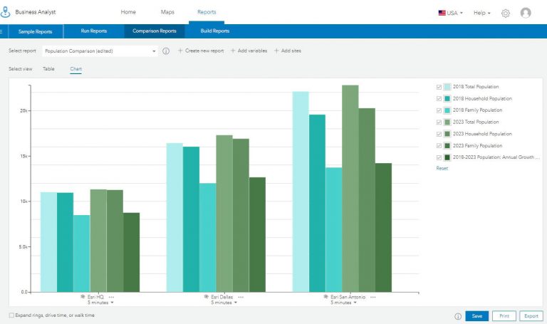
Select Chart to see an easy to compare bar chart with the default colors. Don’t like the default green color shades, or you would like to make one variable standout, then change it to your desired color by simply clicking on the color box and change to the color of choice.
In this image, I customized the standard Esri Population Comparison report by adding the Population Annual Growth variable and changed the 2018 data variables to shades of blue. This edited standard report can be saved to use again.
Create comparison reports interactively with just a few clicks
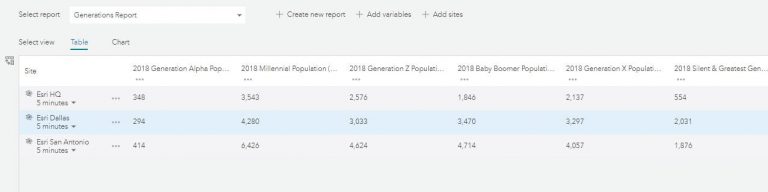
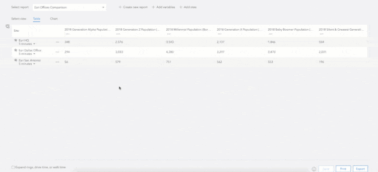
- Create new report and give your report a name. In this example, I will create a new Generations report using the Generations data.
- Add Variables
- Select the 2018 Population by Generations variables from the Data Browser
- Apply
That’s it; just that quickly; with only a few mouse clicks, a new comparison report was created that can be used again at any time for any set of candidate sites.
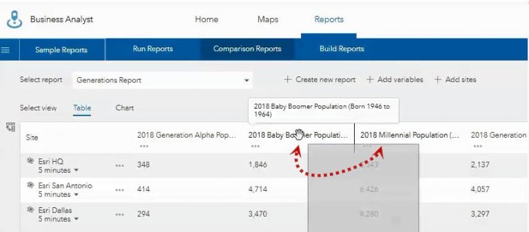
Get the layout you want by interactively arranging columns and row
Once you’ve created your report, you can customize it the way you want it to be. Interactively organize the layout of the report by rearranging columns and rows in the order you desire, add and delete sites or variables, change chart colors, define a benchmark site and compare sites with neighboring geographies. Getting the report layout, you want is much easier in New Comparison Reports than in the old workflow where you had to go back and forth.
Simply drag and drop columns and rows in the order you want by clicking on the column or row title, hold down the right mouse to drag and drop where you would like the new placement.
See it in action…
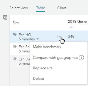
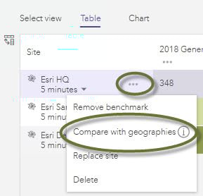
Click on the action icon next to the variable to make a benchmark site, compare with geographies and replace or delete sites.
See benchmark comparisons more effectively
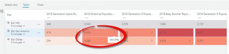
Making a benchmark site creates a colorful visual report to easily compare the benchmark site with other selected sites in your report. Simply click the action icon next to the site you want to make a benchmark and instantly get a beautiful and informative new benchmark style report. The benchmark site is indicated by the gray shade and is shown in the top or in the left row. The arrows in each of the other site cells indicate if its value lies above or below the benchmark site. Mouse over the arrows to see the actual percent differences.
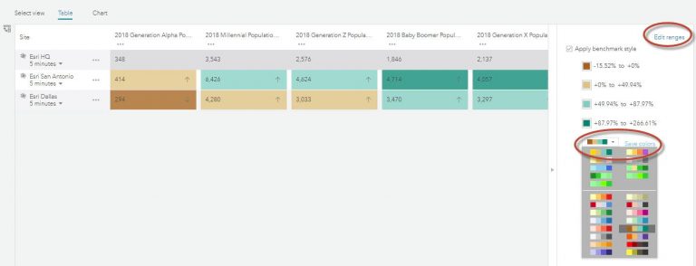
You can easily change the benchmark color style and edit the ranges in the right panel. To change benchmark colors, click the dropdown arrow below the color ramp boxes to select another color scheme or click the individual color boxes to create your own color scheme. The color changes are dynamically updated in the table. Save the colors if you would like to use them again in other reports. Default Benchmark style colors can be set in Preferences. Interactively edit ranges from this panel to get your desired custom report. You can always click reset to go back to the previous colors or default ranges.
Understand comparisons more easily using the interactive chart view and a little bit of magic

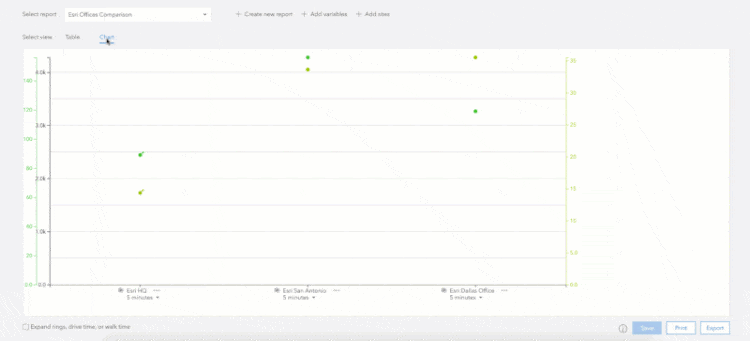
Let’s explore the New Comparison Report chart options.
Continuing with our previous Generations report, select the Chart view. Now, I would like to show you a remarkable chart magic trick to impress your colleagues. Unlike other magicians, I am perfectly willing to share how to perform this magic trick and don’t worry, no live rabbits are used. The magic is made by adding an index or percent variable to the chart. To perform the trick, just click Add variables and select the 2018 Median Household Income Index and the 2018 Education: Bachelor’s Degree Percent and apply them to the report. Now, the chart magic begins. Notice how the variables are dynamically added to the chart. Impressive right?
Mouse over any of the bars and lines to view a popup with the variable name, value and variance from the defined benchmark site.
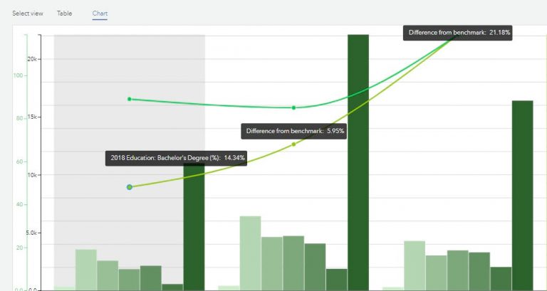
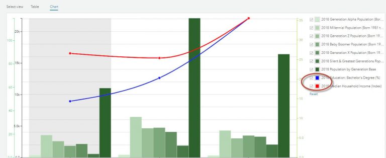
Want to make the Median Household Income Index and Education percent (multi-axis) standout? Simply click the color box next to the variable name and change it to your desired colors.
Isn’t that a magical and inactively beautiful chart! Are you loving New Comparison Reports now?
When edits are made to a report, you have the option to Save the edited report as a new report with a new name or allow the changes to override the previously saved report.
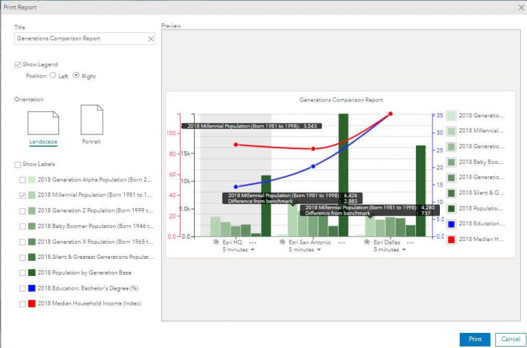
Export and print results new options
Your new comparison reports can be exported to Excel and printed just like in the old version, but now there are new chart printing options. When printing charts, you have more control on how the legend is displayed and the ability to show chart labels.
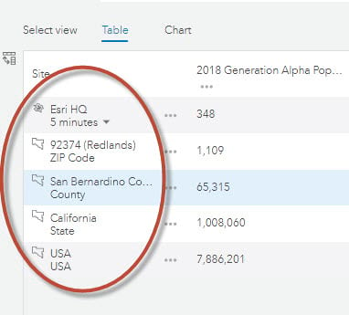
Compare with Geographies in a single click
From the Table view you can compare a site with the geographies it lies in by a single click. Click Compare with geographies on the site action icon to view a comparison of the site with the geographies.
A confirmation message is displayed letting you know the comparison reports view will be reset to remove sites other than the one selected for geography comparisons. Click Yes, to view the selected site with geography comparisons. You can now easily compare the selected site with the associated ZIP Code, county, state. and with the USA.
You can also select the chart view to get an instant visual understanding of the comparisons.
Compare several 1000 variables for up to 100 sites
By now, you are probably realizing the value, control and customization offered in New Comparison Reports, but if you still need a little convincing, this next new feature will certainly be the one that makes you smile. You have long asked for the ability to compare more than the 20-site maximum limit in the old version. Drumroll please… New Comparison reports provides the ability to compare up to 100 sites. Yes; that’s right, 100 sites!
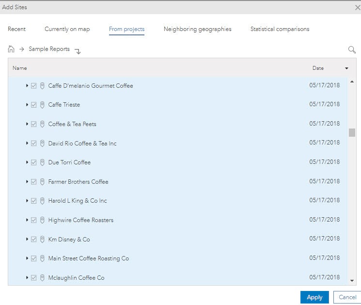
Let’s give it a try by clicking Add sites. Notice the convenient new Add Sites dialog. You can easily add up to 100 sites for comparison from recent sites that were added, sites currently on the map, and sites in your projects. No need to worry that you must click 100 times to select the sites; you can use the left mouse click and Shift or Ctrl keys to select multiple sites at once or select the whole layer.
From the Add Sites dialog, you can also add neighboring geographies and statistical comparisons. Click Neighboring geographies to view ZIP Codes, Counties, and States that are associated with your selected sites and USA to compare.
Save and share template with others
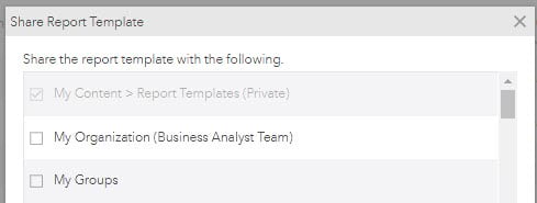
Another highly requested feature in New Comparison Reports, is the ability to share comparison reports. Once you have created valuable comparison reports, you will probably want to share them with others so they can use the same template without having to recreate them. New Comparison Reports makes it easy to share with the whole organization or with specific groups.
In the Select Report dropdown, mouse over the report you wish to share and click the Share icon.
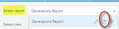
The Share Report Template dialog will open, and you can select to share the report with your entire organization or with individual groups.
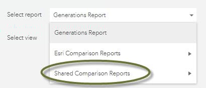
Shared comparison reports can be found in the Select reports dropdown.
Now you must be impressed with the new functionality and how easily comparison reports can be customized to meet your needs? I hope this gives you an indication of the valuable capabilities available in New Comparison Reports. To learn more about creating comparison reports and view a helpful New Comparison Reports overview video, see the online documentation for Business Analyst Web App here.
I would love to hear your thoughts on New Comparison Reports, so please send me your comments and feedback.
Till next time!

Commenting is not enabled for this article.