The Generate Grids and Hexagons geoprocessing tool in ArcGIS Business Analyst Pro is becoming a popular tool for analyzing markets in site evaluation, customer marketing, and predictive modeling. Part of its allure is the ability to aggregate data from traditional administrative boundaries into grid cells that remain a constant size across a region, nation, or the entire globe.

In the ArcGIS Pro 3.2 release, the tool was enhanced to include grid cell centroids as an output layer. This enhancement came from a long-time Esri partner and user, Susan Zwillinger, who entered it as an ArcGIS Idea on Esri Community.
Susan has some fantastic ideas for how cell centroids could be used:
Although I can do this through some manual steps or a model, I would love to have an option for the Generate Grids and Hexagons tool to allow the output to be associated with a POINT map layer (centroid of the grids, hexagons, or H3 hexagons) rather than only being able to join the trade area data back to the original grids or hexagon polygons.
This option has several benefits.
1) By having a point output, you can use the “heat map” symbology with the “Weight” option rather than a choropleth symbology.
2) Having a point output allows you to use the output with a Network Analyst Location-allocation model as the input for potential candidate locations.
3) Having a point output makes it easy to use the data with the Suitability Analysis tools.
We monitor ArcGIS Ideas closely and have built several new features and capabilities inspired by ideas like this one. The team was excited to incorporate this as a product feature.
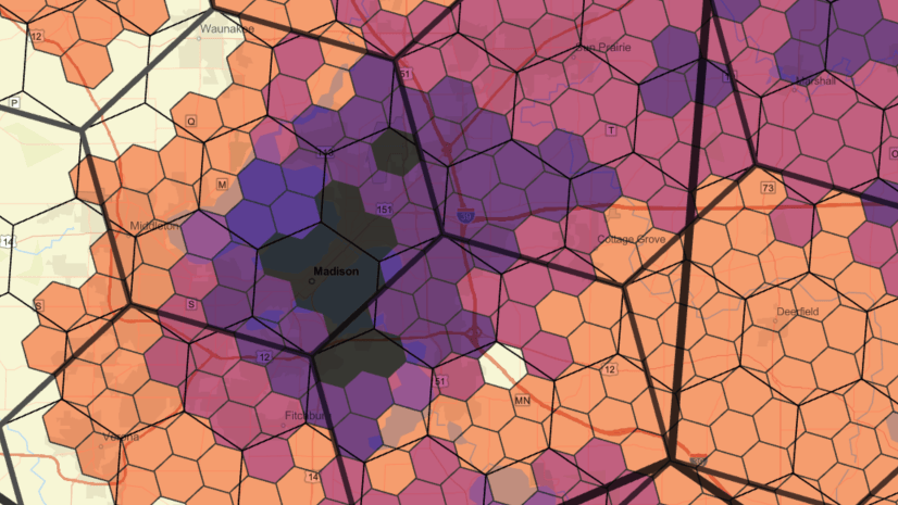
To help illustrate Susan’s heat map idea, the maps below show cell centroids symbolizing a market area. The first map is a typical 2 sq. km grid layer symbolized by 2023-2028 percent population change. In this example, areas shaded red represent the most positive change, or population growth.

The map shows a distinct pattern where the highest population growth is occurring, but we are looking to expand our analysis.
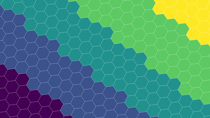
This next map shows the 2 sq. km grids in the same geographic area, but with grid cell centroids added when we run the tool. Each grid cell is assigned a cell centroid. No symbolization is added this time. If we opted to enrich grids cells with data attributes, the same results are transferred to the cell centroid. Unique grid cell IDs are transferred to the cell centroids as well.

The cell centroids are the geographic centers of each cell. In the tool you can enrich their cell boundary with data or use the cell centroid as a starting point to build and enrich a surrounding buffer, such as a 7-minute drive-time. This means that the enriched cell centroid data can represent statistics for the area reachable within a 7-minute drive and are a more realistic coverage area of a customer or constituent, not just the grid or hexagon boundary.
This final map shows the same geographic area, but this time displays only the grid cell centroids. The centroids symbolize same 2023-2028 percent population change variable as the first map. Grid cell polygons can be displayed in a map as point symbols, but like Susan mentioned, having the grid cell point layer has many benefits and can be used as inputs to other applications. One such is application is Suitability Analysis where enriched cell centroids can be used as point layer-based criteria to select the best candidate site.

One more note about aggregating data into cell centroids. Attributes transferred to each cell centroid can be represented in two ways:
- The area contained within the grid centroid’s associated grid cell boundary
- A buffer of any size or distance (examples: a 4-minute drive-time, a 2-mile ring) around the grid cell centroid
There are benefits to both methods. For instance, by enriching grid cells in a healthcare research project you can reduce privacy concerns by obscuring the source of patient data represented by ZIP Codes. By enriching cell centroid buffers in a transportation study, you can define the areas accessible by walking 15 minutes and use the demographic data to determine if a new rail station is viable. Because the enriched attributes are transferred to the cell centroids, the points can be used to continue your analysis.
This capability is an exciting addition to ArcGIS Business Analyst Pro. We are thrilled that Susan socialized the idea and we look forward to learning about new ways it can be used to solve complex problems.
More resources
You can review the blog article Using Uber H3 Hexagons in ArcGIS Business Analyst Pro to learn more about aggregating data from buffers to cell centroids.
Other grids and hexagons story resources from some of our favorite Esri solution engineers:
- Using Grids to Create a Target Market Index – by Sue Dunham
- Where To Launch – EV Charging Station Site Selection for Multifamily – by Dennis Kaplan
If you have feedback or ideas for Business Analyst, check out the Esri Community and consider adding an ArcGIS Business Analyst Idea.


Article Discussion: