ArcGIS Business Analyst includes a web app and a mobile app (and a Pro extension, Experience Builder widget, and Enterprise environment—but let’s stay focused here).
The mobile app is a companion to the web app; it offers a subset of capabilities for on-the-go analysis. In this article series, you’ll learn about how you can use the mobile app to create a site, take site photos, compare and customize site facts, and run infographics.

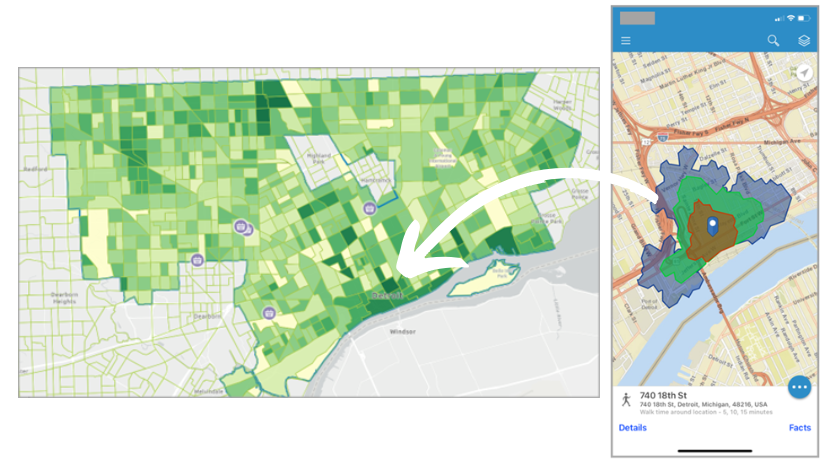
In this blog article, you are a flea market coordinator searching for a site for your pop-up event in Detroit, Michigan. You are interested in running an infographic to learn more about the consumer interests of people near your potential site. This scenario is entirely fictitious, and while it may reference real-world locations, it does not consider zoning laws or actual land permissions.
In Business Analyst, infographics and reports allow you to visualize and analyze information about your sites. Let’s use the mobile app to run infographics for your site with information relevant to flea markets.
Run an infographic for your site
To get started, sign in to the ArcGIS BA app on your phone. You can either use your ArcGIS Online or ArcGIS Enterprise login.
For this walkthrough, you can use a previously created site at 740 18th St, Detroit, MI 48216. To open your site, tap a pin symbol on the map, or open a site from the Projects screen. Here, we have a 5-,10-, and 15-minute walk-time site for the potential flea market location. When your site is open, tap Site Options to open the site options menu.
In the site options, tap Run Reports. The Reports screen opens. Alternatively, you can first tap Details to open the Location Details screen for the site, then tap Reports to open the Reports screen.

On the Reports screen, the Infographics tab is open by default. Tap Esri Infographics to view the list of predesigned infographics available to you in the mobile app.
You are interested in viewing information that can help plan what kind of vendors and merchants to invite. The Retail Demand by Industry (Tabular) could be helpful, as it includes figures on total and average spending by industry.
 infographic")
The Retail Demand by Industry (Tabular) infographic opens on the screen. You can:
- Swipe up on your mobile device screen to view more of the infographic.
- This infographic was run for a site with 5-, 10-, and 15-walk times, and by default it is displaying information for the first walk time. To switch to another walk time, tap the drop-down menu on the top left to expand it, then tap another walk time.
- Tap on a section header for Filter and Settings, which are some of the options to explore the data that we will look at in the next section.
 infographic")
Explore the data in the infographic
Did you know that interactive options for infographic panels are also available in the mobile app? Let’s take a look at some of them.
Filter and Settings
Suppose you want to only view the top few spending variables in a section, as measured by average spending compared to the US average. Tap on a section header, tap Filter and adjust the Index slider as desired. When a filter is applied, it is indicated. To remove it, tap Filter again and tap Reset filters.
Do you want to visualize the data in a chart? Tap Settings, expand the View as dropdown menu and select an available chart option.
 infographic")
More information about a variable
In a tabular infographic like this one, you can tap a variable to view a tooltip with more information, and a link to a data documentation page. For example, the Clothing and Clothing Accessories Stores variable may help you decide how many clothing shops would be ideal to have at the flea market. Tap it to view metadata and more information about it.

Other interactive options
To help plan the flea market, some of the other infographics might also be helpful – for example, Shopping and Spending. It is not a tabular infographic and includes panels with different interactive options. For example, in the Shopping infographic panel, you can tap a row to expand it and view a chart for that variable. In other panels, you may be able to tap on a fact for additional information. In the Disposable Income for this Area panel, tap on Median Disposable Income for the Explore for more option. Tap it to view the interactive chart.

Tap elements in the bar chart to view tooltips and Filter and Settings options. When done, tap the Close button to return to the infographic.
Export an infographic
To export an infographic as a PDF, tap Export infographic on the top right. The Export infographic window opens, where you can:
- Add header and edit title – Edit the title of the infographic and add a header that will appear on every page.
- Add data source – Include information about the sources of the data that appear in the infographic
- Add a footer – Add a footer that will appear on every page.
- Include interactive panels in export – iInclude all interactive panels in the infographic in the exported PDF.

When you’re done modifying these settings, click Create PDF to export the infographic as a PDF file.
Display infographics in Desktop (full screen) mode
By default, infographics in the mobile app are displayed in stack mode. Did you know you can also enable the full-screen display mode for infographics in the mobile app? You may be familiar with it from viewing infographics in BA Web App. You may want to give it a try on the mobile app too, especially if you’re using a larger-screen mobile device such as an iPad or other tablet.
Enable the View Desktop Mode setting by following these steps: Tap the Menu button, then tap Settings to open the Settings screen and enable the View Desktop Mode toggle.

Now when you run infographics in the mobile app, it will be displayed in full-screen mode.
Let’s recap!
In this article, you learned how to run an infographic in the mobile app, explore the data and information in it, export it, and change the display mode. Go ahead, leverage infographics on-the-go with the mobile app!
P.S. Did you notice that the screen captures in this article utilize a dark background? Yes, BA Mobile App supports dark mode, if you prefer to use that device setting.
What’s next?
This is the last in the Get started with ArcGIS Business Analyst Mobile App series of articles. We would love to hear whether you find the series helpful, and especially if there are other aspects of BA Mobile that you also want to learn more about. Please share your comments!

Article Discussion: