Food deserts (now known by the USDA Economic Research Service as low access areas) are areas where there is limited access to grocery stores and affordable food. You can use GIS to support demographic analysis of potential low access areas, such as in the Atlanta metro area. This information can be used to inform target locations for emergency food pantries.
For example, use the AI assistant in ArcGIS Business Analyst Web App to map grocery stores with POI search and create a bivariate color-coded map of population density and poverty. With this information, you can identify an impoverished area with no local access to grocery stores and create a site for further analysis, like running an infographic to learn more about that community’s demographic composition.
Check out the video below for a demonstration or follow along with the written description.
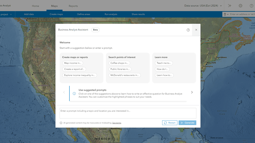
For this example, you’ll use the AI assistant in Business Analyst to generate suggestions for your mapping and analysis. Access to the assistant is administered at the ArcGIS Online organization level.
To get started, click Business Analyst assistant (preview) on the app header.
 on the app header")
Map grocery stores
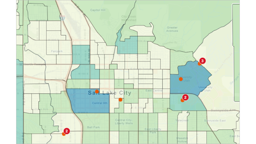
Let’s perform a points of interest (POI) search to evaluate where grocery stores are located in the Atlanta metro area. Map grocery stores with the prompt: Create a map of grocery stores in Atlanta metro.
Turn point clustering off so that each point represents an individual grocery store. You can see that the center of the Atlanta metro area has the densest grocery store distribution; the number of stores declines as you move away from the city. This is likely because the metro outskirts have less population density compared to the dense urban center.

Create a bivariate color-coded map
Let’s study these outskirts to analyze population density, poverty, and grocery store availability. You can evaluate if there are any target areas to strategically identify new grocery store locations to promote equitable food access using a color-coded map. Create a bivariate color-coded map with the prompt: Create a map of the poverty index and population density.
By default, the map uses block groups as the standard geography. In general, a block group is composed of 600 to 3,000 residents and is not uniform in size. Some block groups may appear larger than others because the population is not as dense. To better visualize patterns in the data, use hexagon mapping with resolution 6 hexagons. Hexagons are six-sided polygons that are used in GIS to apply a uniform grid on a map. The hexagon size is referred to as the resolution, with 1 being the smallest and 15 being the biggest. Resolution 6 hexagons cover a smaller average area per hexagon, so the analysis is hyper-localized.
You can use the map legend to understand the meaning of the hexagon colors. To simplify the colors, use a 3×3 grid. (Your color scheme may differ than what is pictured below and in the video.) In this, brown represents high poverty and high population density, whereas pale yellow represents low poverty and low population density.

Visually, you can see areas that have fewer grocery store icons and hexagon color-coding that indicates high poverty index and medium to high population density. For example, zoom in to Canton. This hexagon does not include a grocery store POI dot, nor do its neighboring hexagons. It is also navy blue in color, indicating high poverty and medium population density. You can further analyze this region to understand if it qualifies as a low access area and should be prioritized as an area in need of new grocery stores.
Create a site and run an infographic
To further analyze this region, let’s create a site in Canton, Georgia, to understand if this area qualifies as a low access. Create a site with the prompt: Create a site in Canton Georgia with 5 and 10 minute drive times.
The site is added to the map with 10- and 20-minute drive times. Drive times determine how the area around a site is measured; 10- and 20-minute drive times represent the distance traveled to or from the site in a given time. With a site, you can perform more localized analysis, like running an infographic.

Click on the site and use its pop-up menu to run the State of the Community infographic. This infographic includes information about population growth, households compared to housing units, community participation, jobs and the economy, health, and at-risk population variables.

In conclusion
With the information from this analysis, you can identify a target neighborhood to support food access, such as with a community donation center or food pantry. The decision is informed by the location of other grocery stores and the community’s composition, specifically serving low-income communities with insufficient grocery store access.
In this blog article, you used Business Analyst assistant (preview) to perform a POI search, create a color-coded map with hexagons, and create a site. We welcome your feedback! Please use the feedback option at the bottom of this blog article or post on Esri Community.
This article uses the Places dataset from Data Axle, the Esri Updated Demographics dataset from Esri, and basemaps provided by Esri.
This article uses ArcGIS Business Analyst Web App. You can use the assistant, map points of interest (POI), create a color-coded map, create a site, and run infographics using Standard and Advanced licenses. Hexagon mapping is only available with an Advanced license.


Article Discussion: