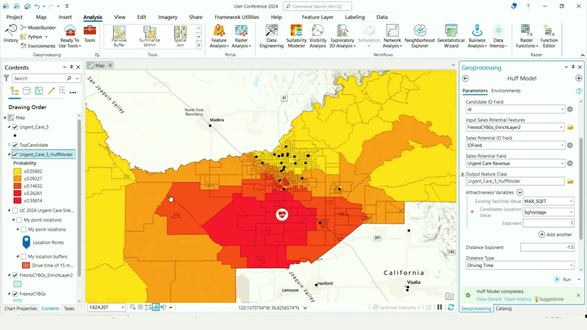
The Huff model tools in ArcGIS Business Analyst Pro perform a unique set of calculations that allow you to model potential demand for a business or service, based on the attractiveness of that business or service. Once you have created and run the model, your map contains color-coded features, such as block groups, that display the levels of likelihood that customers in those block groups will visit a business location.
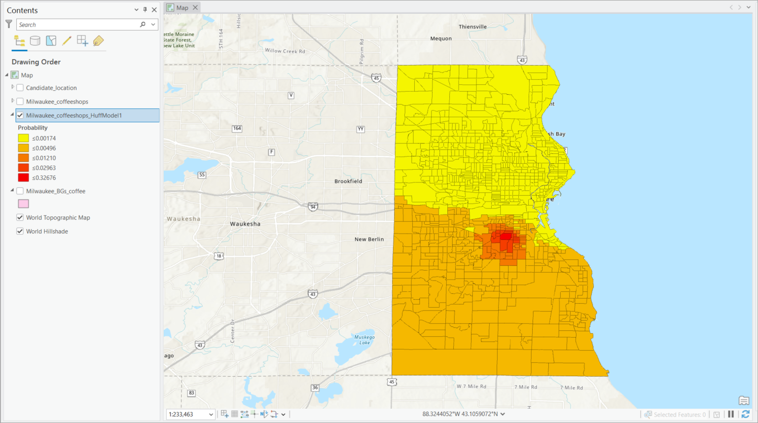
In the example above, the Huff model estimates the probability of customers visiting a new coffee shop location in Milwaukee, Wisconsin. Now that you have a visual representation of these probabilities, you may want to perform further analysis on the areas based on their grouping into different levels of probability.
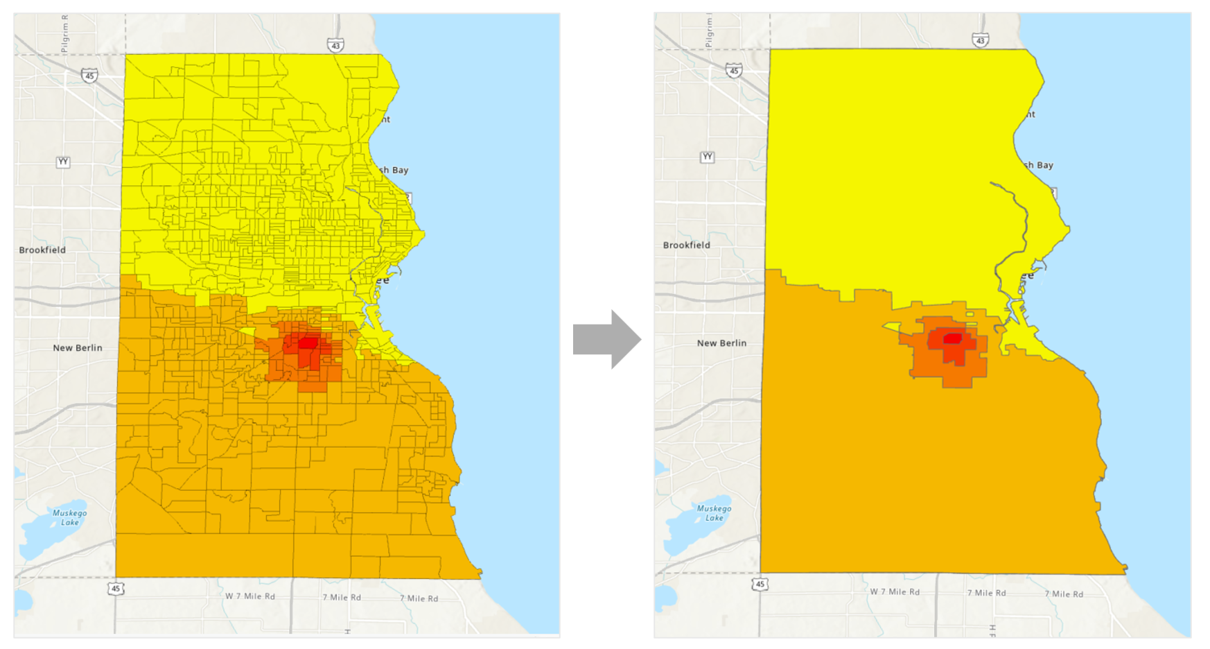
This article will describe the process of dissolving individual features to create solid polygons from the Huff model output. You might use these polygons as trade areas, run infographics on them, or as input for many other tools and workflows.
Run the Huff model
First, you’ll run the Huff model for your use case. You might be trying to assess the economic impact of a new site location, forecast sales and potential of existing stores, or get a sense of the impact of competitive and environmental changes on a location’s performance. For the purposes of this article, we won’t walk through the tool itself, but rather focus on modifying the output.
For guidance on running the Huff model, visit:
- Create a Huff model (help documentation)
- Use the Huff model to affirm site selection in Business Analyst Pro (ArcGIS Blog article)
- Using the Huff model in Business Analyst Pro (Esri video)
Reclassify the fields
Once you have a Huff model output, you’ll then run the Reclassify Field geoprocessing tool. This will allow you to create classes within the data. To reclassify the Huff model fields, do the following:
- On the Geoprocessing pane, click the Toolboxes tab and expand Data Management Tools.
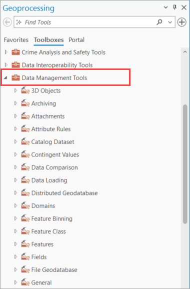
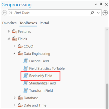
- In the Data Management Tools toolbox, expand the Fields toolset, and expand Data Engineering. Click Reclassify Field.
- In the Reclassify Field pane, specify the following fields:
- Input Table: Your Huff model layer
- Field to Reclassify: Probability
- Reclassification Method: Natural breaks (Jenks)
- Number of Classes: 5
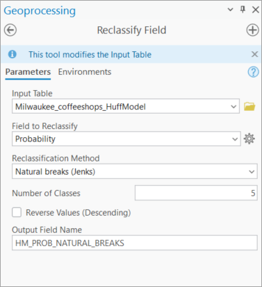
- Click Run. Nothing will visibly change on the map or the Contents pane, but the data undergirding the Huff model layer has changed.
Now that you’ve classified the data appropriately, you can create solid polygons from the many features in each class.
Dissolve features by attribute
The last step is to dissolve the individual features into larger polygons that you can use in later analyses. For this, you’ll use the Dissolve tool.
- On the Geoprocessing pane, click the Toolboxes tab and expand Data Management Tools.
- This time, expand the Generalization toolset and click Dissolve.
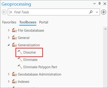
- In the Dissolve pane, specify the following fields:
- Input Table: Your Huff model layer
- Output Feature Class: Leave as default, or name to your preference
- Dissolve Fields: HM_PROB_NATURAL_BREAKS_CLASS
- Statistics Fields: Total
- Statistic Type: Sum
- Create multipart features: Turn check box off
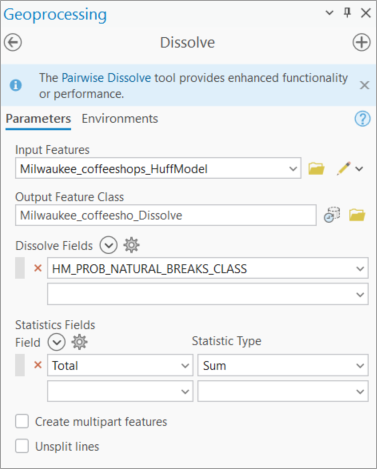
- Click Run. A new layer is created containing polygons for each class of features from the Huff model.
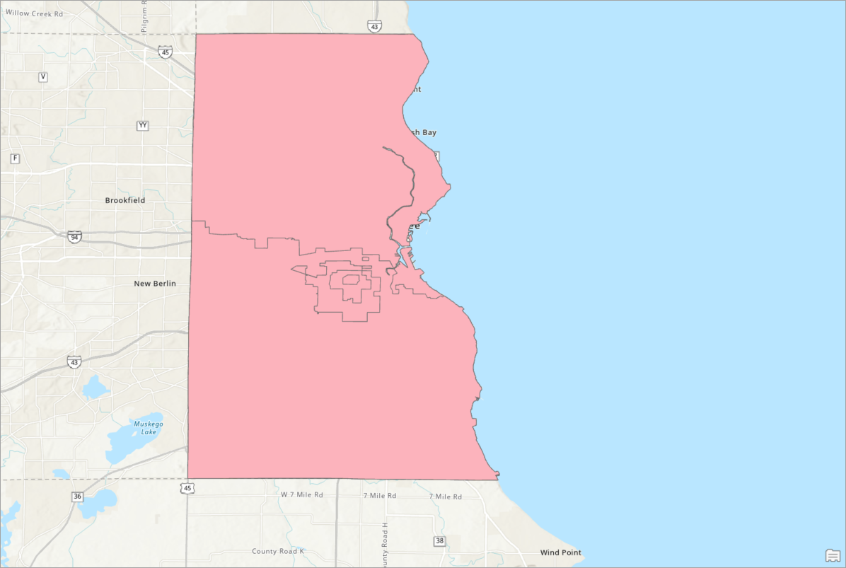
Symbolize the features
You’ll notice that the color of the new layer is uniform. To take advantage of the classifications you created in the data, you’ll adjust the symbology to a graduated color ramp.
- On the Contents pane, right-click the newly created layer of dissolved features and select Symbology.
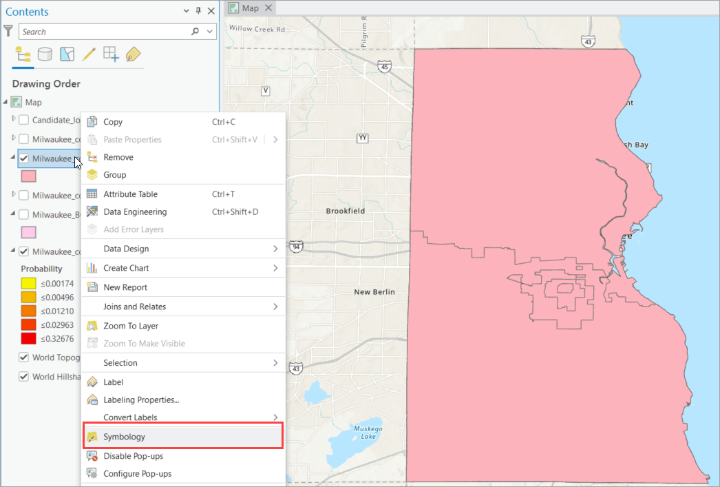
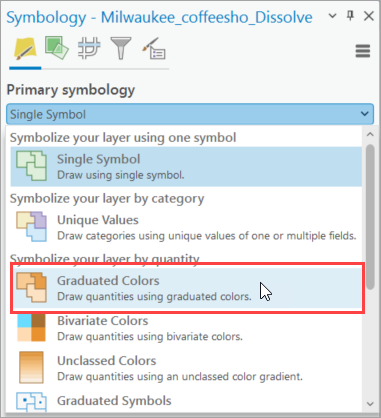
- On the Symbology pane, under Primary symbology, change the setting from Single Symbol to Graduated Colors.
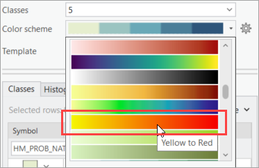
- Use the Color scheme drop-down menu to choose a color ramp. For example, to mimic the default colors of the Huff model output, you could choose the Yellow to Red color ramp.
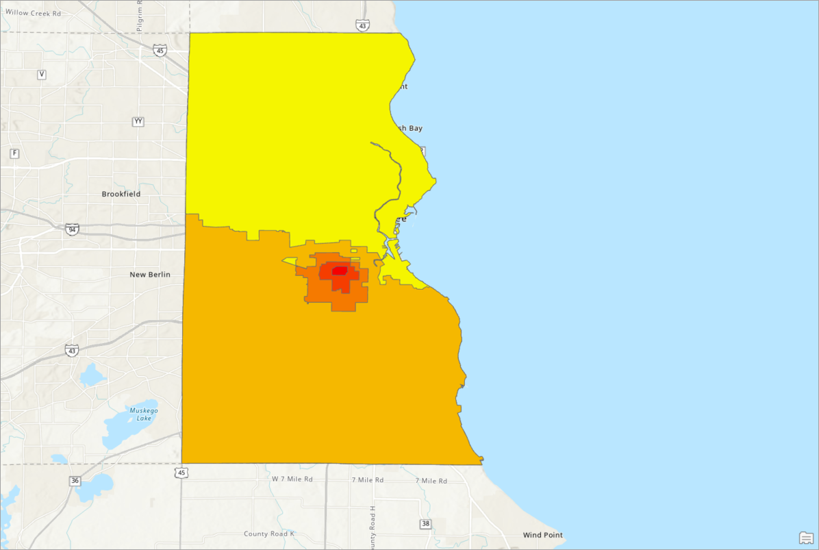
The map now contains a layer of your Huff model output with the individual feature borders dissolved.
Now that you have collapsed the probability attributes in the block groups to create trade areas, you could use these trade areas to target potential clients that suit your business needs, such as marketing campaigns or sales territory generation. Flattening many features into contiguous polygons has many uses—we can’t wait to see what you’ll do with it!
This article uses the local Esri Updated Demographics dataset from Esri.
This article uses ArcGIS Business Analyst Pro 3.7.
Resources
To continue your Business Analyst journey, visit the following resources:
- Business Analyst product overview page
- Review pricing and purchase Business Analyst
- Business Analyst resources page
- LinkedIn user group
- Business Analyst Web App video channel
- Business Analyst Pro video channel
- Business Analyst on Esri Community
- Business Analyst Web App login page
- Email the team: businessanalyst@esri.com



Article Discussion: