The workflow in this post explains how GIS software can be used to identify underserved places through data and comparative analysis of resources and demographic information.
Martin Luther King, Jr. had a vision of equitably serving disadvantaged communities. He was a prominent leader in the Civil Rights Movement, affirming nonviolent protest and civil disobedience to advocate for racial and economic justice. His legacy is honored in the United States through memorials and the federal Martin Luther King, Jr. Day holiday on the third Monday of January. However, there is an immense amount of work still to be done to deliver his vision because, as Dr. King wrote, “injustice anywhere is a threat to justice everywhere.”
Through his leadership, Martin Luther King, Jr. advocated to uplift people in poverty. In his Nobel Peace Prize acceptance speech in 1964, he said: “I have the audacity to believe that peoples everywhere can have three meals a day for their bodies, education and culture for their minds, and dignity, equality, and freedom for their spirits.” These basic human rights fail to be delivered to everybody. As a result, disadvantaged communities experience adverse social and health outcomes at higher rates than communities with more economic opportunities.
In an effort to deliver resources equitably, the Justice40 initiative will deliver 40 percent of benefits of certain federal investments to these communities. The difference between equity and equality is that equity pertains to fairness whereas equality means even distribution. Disadvantaged communities require resources in proportion to their needs. A snapshot of disadvantaged communities in the US reveals that the most disadvantaged U.S. counties “exceed the threshold of five or more (out of eight total) categories of disadvantage, according to Justice40 initiative criteria.”

The socioeconomic status of communities can be analyzed using GIS, empowering decision makers to deliver resources to underserved communities. In this blog post, we will look at how ArcGIS Community Analyst allows users to enrich sites on a map with demographic data, providing necessary context for understanding communities. (You can do the same workflow in ArcGIS Business Analyst.) To analyze inequities in places, you can add a web map of Justice40 tracts to see where places meet or exceed the threshold of categories of disadvantage using Justice40 initiative criteria. Create sites to focus on a specific area. Select multiple tracts in Birmingham, then analyze their socioeconomic context by running a comparison report using variables such as housing affordability, median household income, and race. This type of comparative analysis can dynamically reveal the systemic nature of the disadvantage in resource availability that can be used to inform which places need investment.
Add a Justice40 web map
ArcGIS Living Atlas includes a web map representing Justice40 sites. Web maps contain a basemap, data layers, and map extent, providing geographic information that can be used to further analyze your data. Let‘s open ArcGIS Community Analyst, add a web map layer, and search for justice40 on ArcGIS Living Atlas.

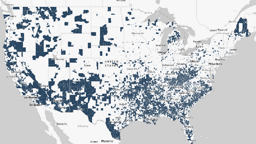
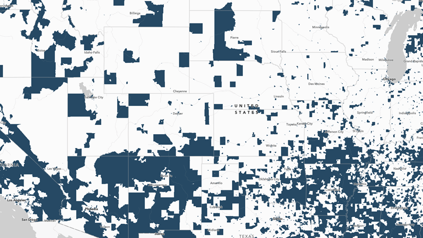
I used the Justice40 Tracts November 2022 Version 1.0 web map. This is a useful tool to see which places in the U.S. are disadvantaged as defined by Justice40 criteria.

The web map uses color-coding to differentiate between disadvantaged, partially disadvantaged, and not disadvantaged tracts. The legend displays what the color-coding signifies on the map.

Create sites in Birmingham, Alabama
The Justice40 web map can be used for further analysis to understand the socioeconomic context of places. Create sites to focus on a specific area, such as Birmingham, Alabama, where Martin Luther King, Jr. organized sit-ins to pressure the city to desegregate public places in 1963. Search for Birmingham, Alabama. It will be identified with a pin on the map.


Now the map is zoomed in to Birmingham, Alabama. Multiple tracts surrounding the city have dark blue highlighting, which signifies that they are disadvantaged according to Justice40 criteria. There are also tracts further from the city that have no highlighting, which indicates that they are not disadvantaged according to Justice40 criteria. To further explore this disparity, we can run a comparison report to compare the resources available to those living there. For this post, I selected a variety of tracts using the select tool and created individual sites near Birmingham for analysis. You can further explore disparity between areas by choosing different sites. To distinguish sites that I selected from the highlighting used in the Justice40 web map, I used green fill.

Analyze sites near Birmingham, Alabama, using comparison reports
Now that sites are selected, we can look at socioeconomic variables and compare the context of places near Birmingham, Alabama, using comparison reports in ArcGIS Community Analyst. Comparison reports enrich the context of sites with statistical, demographic, and socioeconomic data.

Create a comparison report using the sites that you have selected near Birmingham, Alabama. Add variables that you find relevant to understanding the demographic and socioeconomic context of the communities. For instance, Dr. King spoke and wrote about the necessity of establishing civil liberties for people of color, creating economic stability for poor people, providing students with access to quality education, and providing all people with access to food. These human rights can be reflected by variables such as housing affordability and data regarding households below the poverty level.
I added the following Esri 2022 demographic variables: Total Population, Household Population, Housing Affordability Index, Diversity Index, Median Household Income, Median Net Worth. To understand the population of these communities, I also added U.S. Census data pertaining to population of race by percentage and American Community Survey (ACS) five-year data regarding households below the poverty level.

To compare site data more easily, I prefer switching the axes of the comparison report chart view so that each column represents a site and each row is a variable. Now the comparison report includes all sites with data for each variable you have selected. As I was looking at the comparison report, however, I found it hard to orient myself in the table.

To create meaningful relationships between the sites and variables, and to render the comparisons more legible, it is helpful to add statistical comparisons and benchmarks. If the U.S. is not one of your sites, add it from the Neighboring geographies options on the Add Sites window. This is helpful so that sites can be compared to the national average for geographic context. Then, I recommend adding the average of all sites. Select Statistical Comparisons and add Average of Sites. The national data and site average data are helpful benchmarks for comparison. For instance, you can compare the national average to the average of the sites or compare an individual site to the average of the sites to contextualize whether the data is above, below, or at the average. Note that when you add these sites, they may be added to the end of your site list. Manually drag them to the front of the list to compare each variable with the national and site averages.

Use the data in the USA column as a benchmark to compare if the sites are above, below, or at the national average. Set preferences to customize the colors of the indicators. Now the data clearly visualizes how a particular site’s variables trend. The comparison report shows that the average of the Birmingham, Alabama, sites are at or below national averages. For instance, the median household income in the United States is $72,414 whereas the average of Birmingham sites’ median household income is $40,982. Also, more households are below the poverty line in the Birmingham area. This information can be used to inform decision makers where resources are needed.

If you’re interested in exploring Community Analyst in another way, you could use a Points of Interest (POI) search. POI searches enable you to find places using data from Foursquare (people’s interactions with places), SafeGraph (people’s transactions with places), or Data Axle (business locations data). Using Foursquare data, you can search for places with greater specificity, such as finding places named in honor of Martin Luther King, Jr. Sites can then be analyzed using walking time buffers to explore the surrounding environmental context.
Data analysis of disadvantaged communities can be used to inform where to allocate resources and uplift underserved people. As Martin Luther King, Jr. wrote, “Nothing in all the world is more dangerous than sincere ignorance and conscientious stupidity.” It is necessary to look at what the data shows us and see how economic justice fails to be delivered within the U.S. This workflow explains how GIS software can be used to identify underserved places through data and comparative analysis of resources and demographic information.


Article Discussion: