Pop-ups are an essential part of making a useful map because they help your audience understand what they’re seeing. That’s why it’s important to make sure your pop-ups are well configured. A good pop-up will help answer these questions:
- What am I looking at?
- What’s important about this?
- How does it relate to the rest of the map?
When you add a layer from Excel using ArcGIS for Office, pop-ups are enabled by default. However, they still need a little love from you, the map-maker, to make your data shine!
Let’s go through an example. Using an Excel table containing open source data on earthquakes, I created this map in ArcGIS for Office:
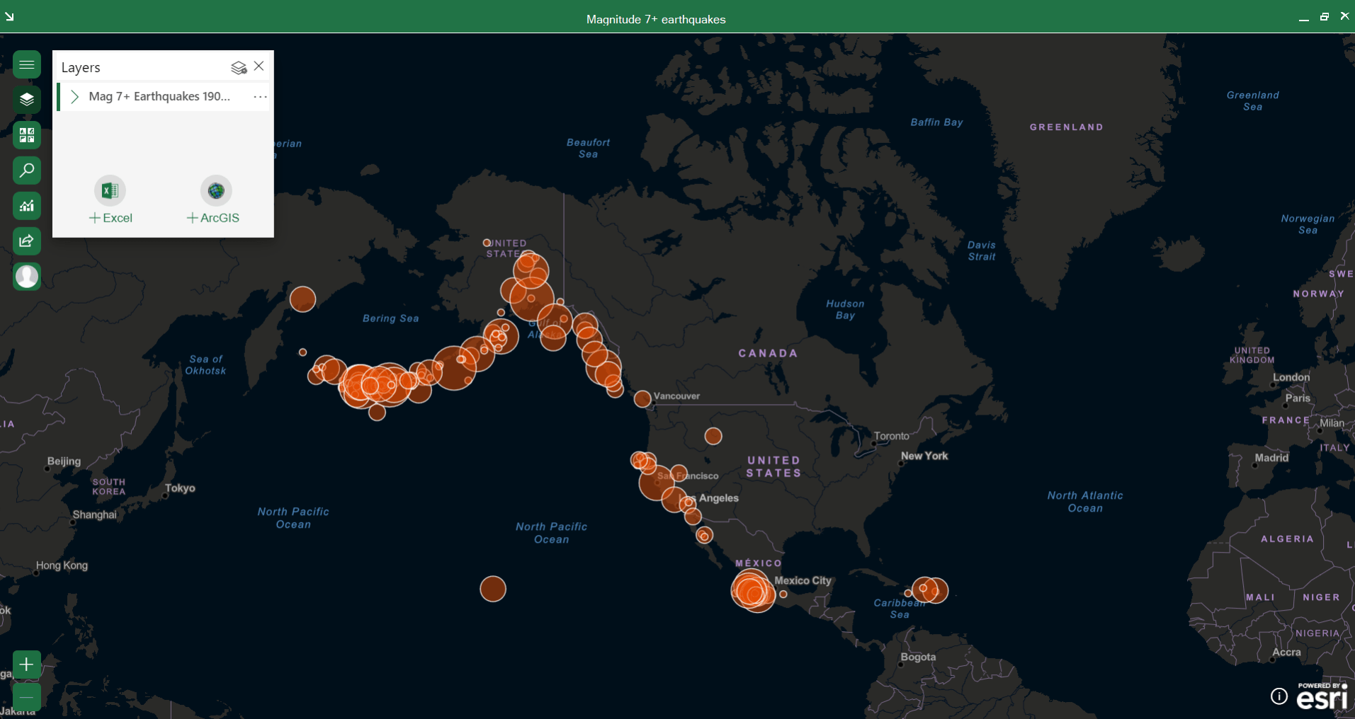
With this map, you can explore earthquakes of magnitude 7 and higher in North America. Each symbol on the map represents an earthquake, and the points are styled by size so that earthquakes with higher magnitude have larger symbols.
Default pop-ups
To view a pop-up, I click a symbol on the map. The default pop-up appears, showing all the data attributes.
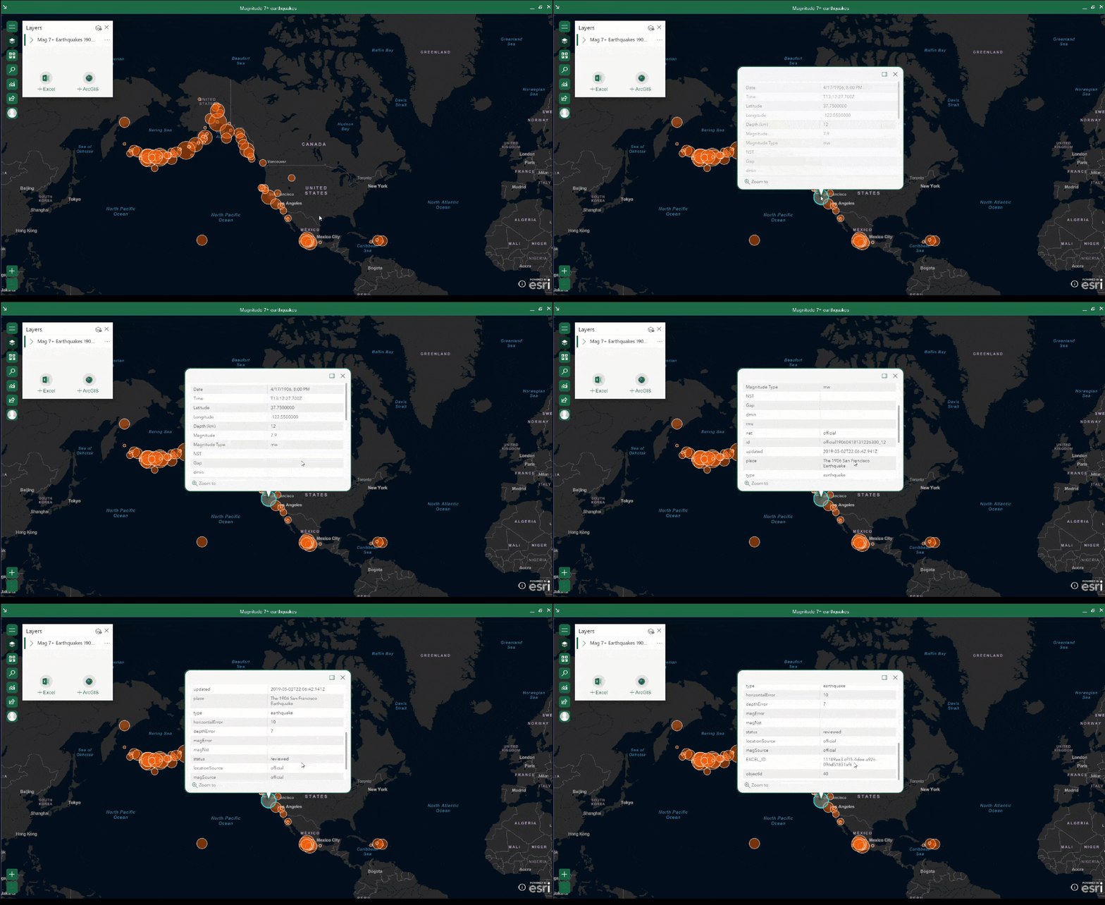
This pop-up is cluttered and confusing. It’s not easy to see what the symbol represents or why it’s important.
There are two things that will make this pop-up more meaningful: reduce the amount of information it contains and choose information that’s more specific and relevant. I can make these changes using the Layer options menu in ArcGIS for Office.
Pop-up settings
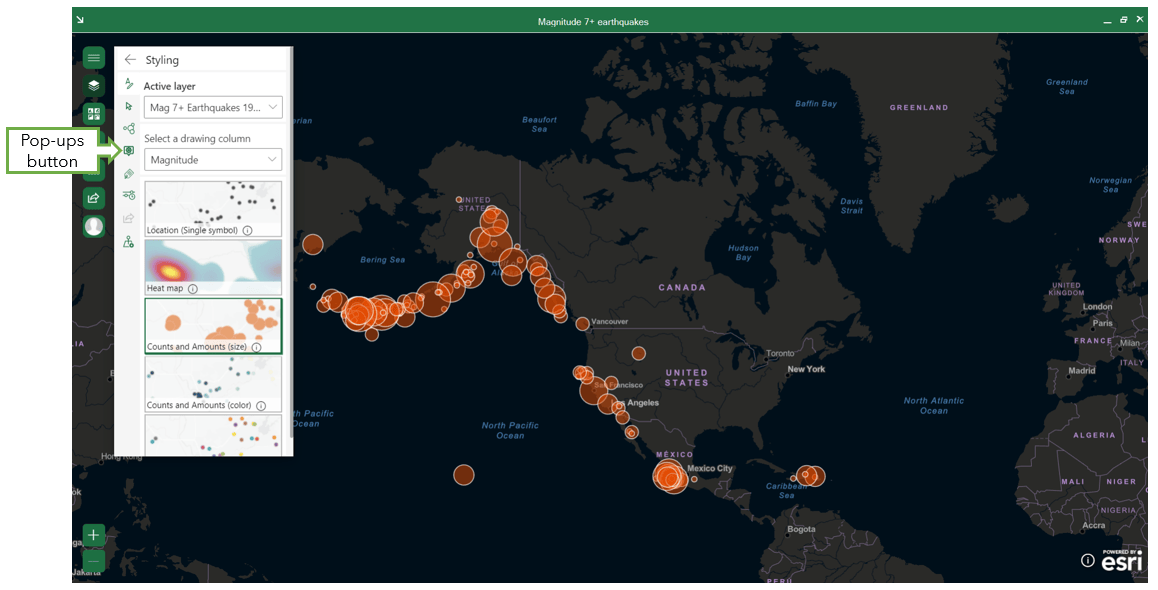
First, I click Layers to open the layer list. Then I click the Layer options button and select the Pop-ups button from the options column.
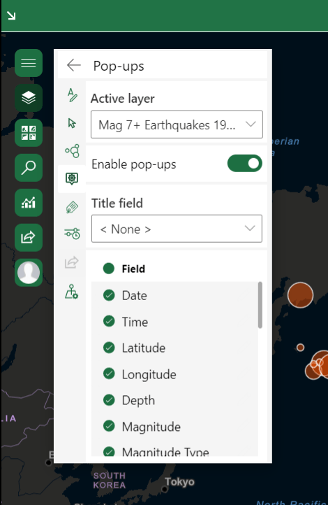
The Pop-ups window appears. It contains the Active layer switcher, the Enable pop-ups toggle button, a drop-down menu for a title, and a list of attributes from the Excel table that can be included in the pop-up. For my purposes, I will be modifying the pop-up’s title and attributes.
When modifying the pop-up settings, pop-ups in the map display your changes in real time. You can click on a feature in the map and keep the pop-up open as you make changes.
Title
The pop-up’s title should highlight a distinguishing factor of that feature or an important piece of information that isn’t clear anywhere else. In this case, because the styling of my map already illustrates the magnitude of the earthquakes, I don’t want the magnitude as my title. Instead, I choose the place attribute to help my audience immediately identify the exact location or region of the earthquake.
The pop-up I opened now displays the title I chose:
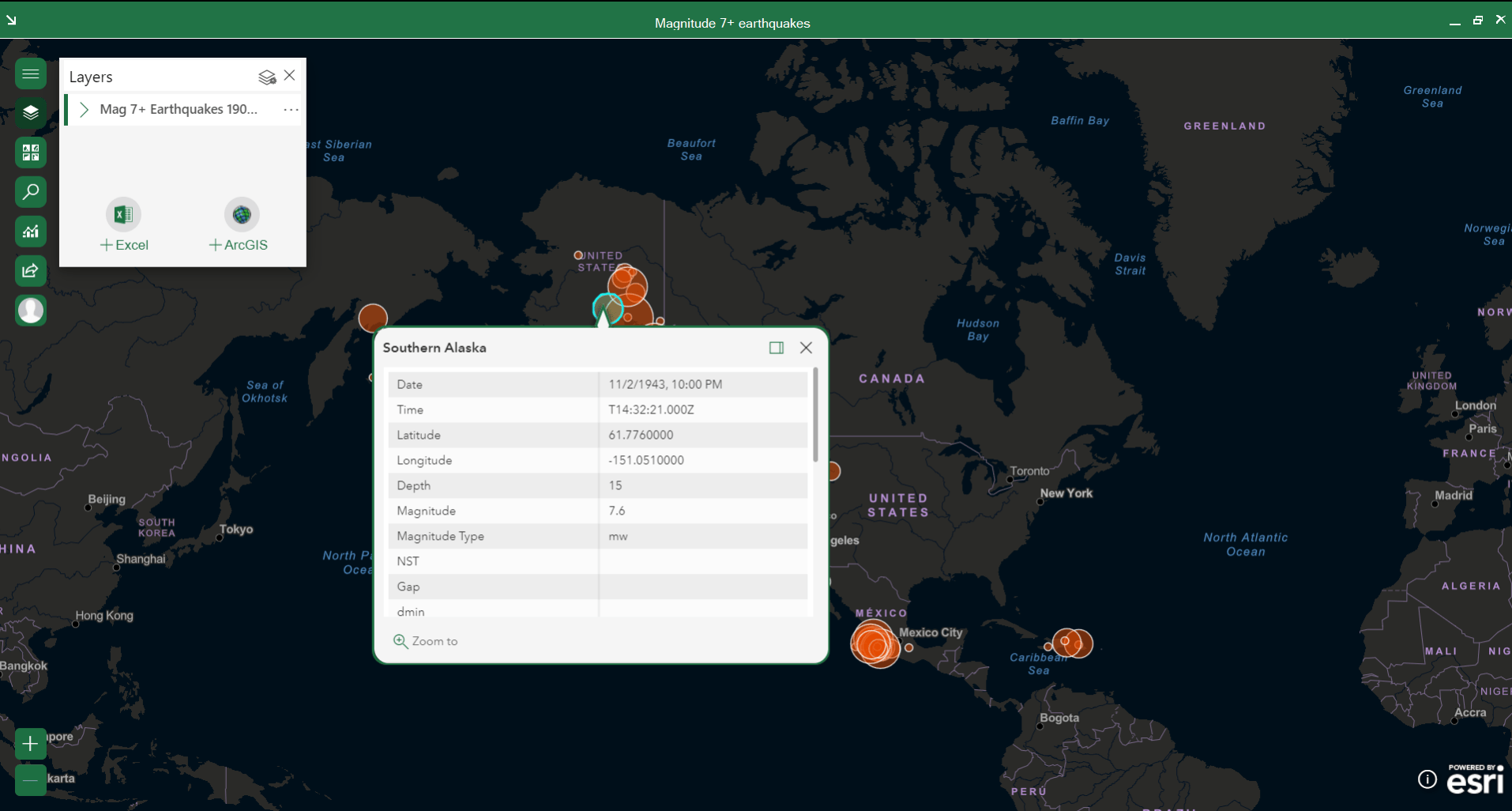
Fields
The title helps add clarity, but there’s still too much irrelevant information in the table below it. I can refine those selections and choose what to include in the table.
Because I have such a large number of attributes and I only want to include a few, I start by clicking the Field check box to uncheck all the attributes at once.
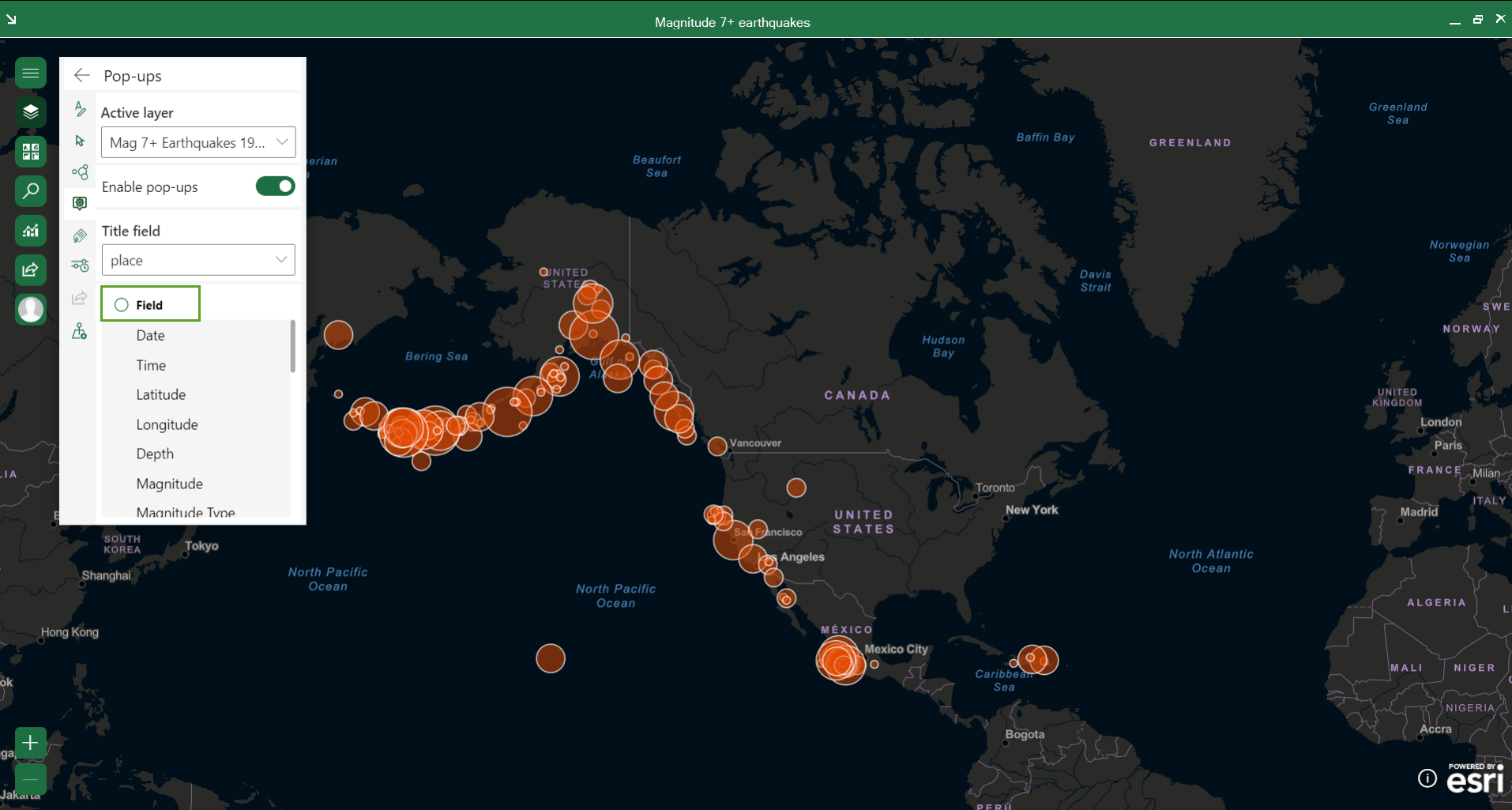
I can now choose specific attributes to include in the pop-up. I check the Date, Depth, and Magnitude boxes to include them in the table. These are the most useful and important details that a user may want to know about an earthquake. I already provided layer and map titles that make it clear that the symbols on the map represent earthquakes, so I won’t include that information again in the pop-up.
The pop-up updates as I make changes.
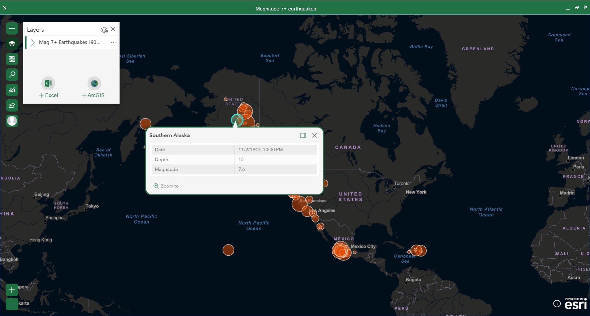
There’s just one last thing to take care of now. I notice that Depth displays a number with no unit of measurement. This row is incomplete. I know that the organization that provided my data measures earthquake depth in kilometers. I need to change the alias of this column to include more information.
Back in the Pop-ups window, I find the line for Depth. I hover over the Depth field until the Edit button appears.
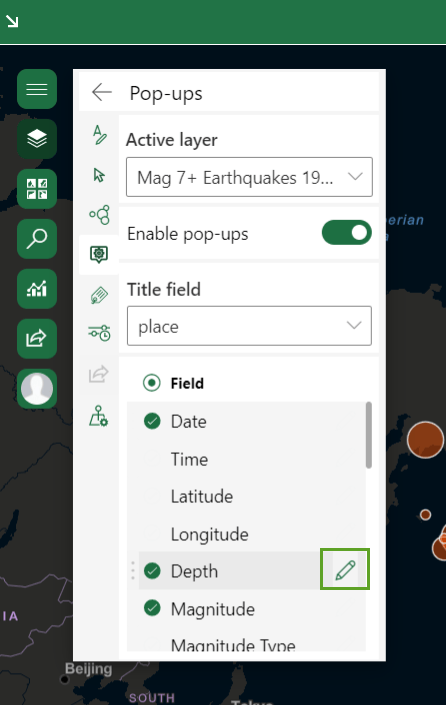
To edit the field name, I type (km) in the text box and press Enter.
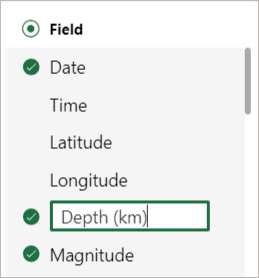
I click the Back button to return to the layer list.
The final result
Now let’s look at the default pop-up compared to the configured pop-up:
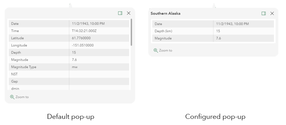
The default pop-up on the left is cluttered and provides unclear information. The pop-up I configured on the right shows focused details that explain what’s displayed on the map and what’s important about it. The pop-up effectively highlights the defining features of the earthquake: where it happened, when it happened, and how strong it was.
And don’t forget the impact of styling. The differently sized symbols on the map help me understand context and make comparisons at first glance. Then, I can easily continue my analysis using the information in the pop-up.
For example, I see from the clusters of symbols that Alaska and the area west of Mexico City both experience a lot of strong earthquakes. I then use pop-ups to discover that Alaska has experienced an earthquake more recently than Mexico and that Alaska’s strongest earthquake was 1.1 higher in magnitude than Mexico’s strongest.
Explore the completed map and see what else you can learn using pop-ups. Then, download the ArcGIS for Office add-in and discover how location intelligence can maximize the value of your data.
Magnitude 7+ Earthquakes in North America
This map was created in ArcGIS for Office and shared to ArcGIS Online. If you’d like to take your learning further, check out what you can do with pop-ups in ArcGIS Online.
Card and banner photo by Jan Piatkowski on Unsplash
This article was originally published on February 6, 2020 and has been updated.


Commenting is not enabled for this article.