The October 2025 release for ArcGIS Experience Builder in ArcGIS Online introduces many new features to help you easily build web apps you envision.
First, we’ve introduced an enhanced theme system, giving you more flexibility to create the look and feel that matches your vision. We’ve also added two new widgets – Login and Image Collection Explorer. The Login widget adds an ArcGIS account sign-in/sign-out experience to your app, complete with customizable redirects. The Image Collection Explorer widget allows you to easily browse and select individual images from a dynamic imagery layer. Other anticipated enhancements include split and merge tools in the Edit widget, display of number, date, and time formatting configured in Map Viewer, current location support as an input in the Near Me widget, and page visibility permission based on user roles or groups. Let’s explore these new features.
Quick links:
- Enhanced Theme System
- Login Widget
- Page Visibility Permission
- Image Collection Explorer Widget
- Enhancements
- Accessibility Update
- More Info

Enhanced Theme System
The theme system has been upgraded with more options to create cohesive experiences and branding. There are new options for color, shade, tone, Google Fonts integration, button styles, and more.

Color, Shade & Tone
In the new theme system, colors are neatly organized and clearly labeled as primary and secondary brand colors and functional colors for information, success, warning, and error states.

In individual widget settings, the color picker component includes a wider range of theme colors, giving you more options to customize a widget’s look.

Each theme color comes with three shades—light, main, and dark—displayed in a preview. The shades are automatically applied to different widget states, making your app feel more dynamic. For example, click an icon in a Widget Controller and watch the icon color shift from the main shade to the dark shade. This is a subtle but friendly way to interact with users.

These shades are automatically generated based on the colors you choose and can be optimized for contrast when you enable the Optimize my color choices option. That means you get a consistent professional look without extra work — but you can still tweak the colors to perfectly match your organization’s style.

Neutral colors are a great way to establish the overall tone of your app – perfect for defining the default text color and the page background. From there, you can fine-tune your design with more specific settings. The following screenshots show how theme colors are used in a Table widget:
- The container color is used for the table background, while a lighter shade of the same color is applied to the table cell backgrounds.
- The overlay color is used for the drop-down action menu.
- The default interactive element color is used for the tools.
- The selected color is used for record selection.

These settings help create a clean, and readable table while keeping interactions visually distinctive.
The following screenshot shows how theme colors are used in a Map widget. The tools on the map also use the same interactive element color defined in the theme settings as the Table widget above, ensuring consistency across all interactive features in the app.

Google Fonts Integration
You can now use Google Fonts directly. Here’s how:
- Visit the Google Fonts website and choose your font.
- Click Get code and then Get embed code.
- Under the Web tab, copy the highlighted static URL as shown below.
- Paste it into the Add Google Fonts window in your theme settings.

It’s that simple – and it opens a variety of typography options to match your brand’s style.
Border Radius & Component
No more setting border radius for each widget individually. Now, you can define it once for the entire app to ensure a consistent look across all widgets.
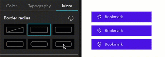
You can now choose a vivid color for input fields, a small but powerful way to encourage user interaction and make your app feel more inviting.

Compatibility with Previous Themes in Existing Apps
Worried about how the new theme system might affect your existing apps? Good news! If your app was created using the previous theme system, you won’t see any changes right away – your current theme and customizations will remain exactly as they are. This means you can continue working without disruption.

When you are ready to explore the new themes, switch to one of the available options. You will see a warning message before the change is applied. Once confirmed, the new theme system will be activated, giving you access to the latest customization options. To safely update your existing apps, we recommend taking these steps:
- Create a copy of your app.
- Switch the theme in the copy, ideally keeping the same light or dark mode.
- Test thoroughly.
- If everything works as expected, apply changes to your production app.

Login Widget
The Login widget allows users to sign in and sign out of their ArcGIS accounts directly within your app. This means you can share your app publicly while still offering additional, secure content to authenticated users. For example, you might have a public landing page that anyone can view, but once a user signs in with their ArcGIS account, they gain access to extra pages and content.
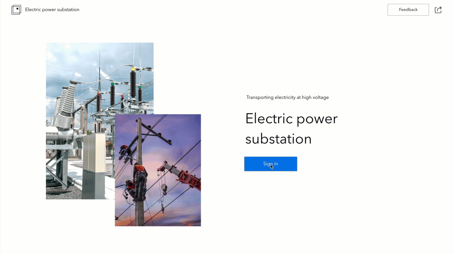
In the example above, we’ve configured the Post sign-in settings to send users directly to the More Info page after logging in.

But that’s not the limit – you can also redirect users to a specific view, window, or external URL, and set up post sign-out redirects to ensure they always land in the right place after leaving the app.
Note: If you use the Login widget to access secure content in the Embed widget, you should use the Redirect to sign-in page option. Currently, the Pop-up window option does not work for this scenario. We plan to enhance it in the next release.
Further, you can enable and customize the user menu that appears when the signed-in user clicks the widget.

Want to create a single app that serves both public and ArcGIS users – automatically showing each the right layers? Now you can.

In this example, we’ve disabled the sign-in prompt and credential banner for public users, while still allowing signed-in users to view secure layers based on their access permissions.

This approach offer a greater flexibility for building apps with secure layers that cater to multiple audiences, delivering a cleaner, and more intuitive user experience for everyone.
Page Visibility Permission
Alongside the Login widget, you can use the new Page visibility restriction setting to control who can access specific pages based on user roles or group membership.

This feature lets you create multi-page apps for different audiences, such as knowledge workers and project managers. For instance, project managers can view a page displaying project spending, while this data remains hidden from knowledge workers.

Image Collection Explorer Widget
The Image Collection Explorer widget allows you to view individual images in an image collection from a dynamic image layer. You can select images that meet your criteria and create a new layer in the map for detailed analysis or change detection.

In addition to previewing images, you can also filter them based on the display extent or attributes such as date as shown below.

Enhancements
Edit Widget
Just like you could with Web AppBuilder, you can now use Split and Merge geometry editing tools to clean field-captured data and create more accurate representations. You must enable the Batch editing option in the widget settings to use the Merge tool.

Batch editing is now also available in Attribute only mode, making bulk attribute updates easier and faster.

Number, Date, and Time Formatting in Field Values
Map Viewer now supports number, date, and time formatting for feature layer fields. When you connect a widget, such as Table, to layers with these fields configured in Map Viewer, the widget will display the values using the defined formatting.

Export
Exporting selected features to Shapefile, FGDB, or KML is now more streamlined. If the service supports the Create replica capability, the files will directly download to your local computer – no need for a Creator user type.
Map Widget
Like you could with Web AppBuilder, you can now limit the zoom scales available to users by customizing a scales list in the Map widget settings.

The new Level URL parameter lets you set the map’s zoom level for easier navigation. For example, zoom level 10 for city view and zoom level 18 for street/building view. Additionally, you can choose different styles and units for the scale bar to match your map’s need.

Map Layers Widget
Previously, removing the runtime layers, such as the results from the Analysis and Query widgets, or sketches from the Draw widget, required clicking the small trash icon at the bottom right of the map. Now, you can easily remove these layers directly from the Map Layers widget, making the option more visible and user-friendly. In the example below, the highlighted result layer from the Query widget is removed using the new method.

We’ve also enhanced the search tool for group layers. Search results inside group layers now automatically expand, so you can quickly find the layer you’re looking for.
Near Me Widget
Improvements for the Near Me widget include new clip features and use your current location as the input location for the widget. For more information, read this blog post.
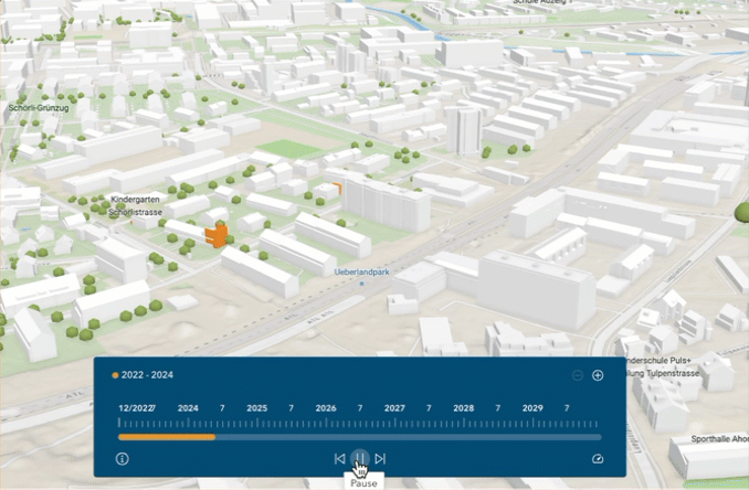
Timeline Widget
The Timeline widget now supports time-aware web scenes and scene layers, enabling you to visualize changes over time in immersive environments.
Filter Widget
Just like the Map widget and the Search widget, the Filter widget now supports URL parameters under Manage URL parameters.

Obtain a URL that opens your app with filters already applied so you can easily share targeted, pre-filtered views with others.
Note: This is only supported for filters with Ask for values as the input style.

Add Data Widget
You can also upload File Geodatabase (FGDB) Zip files into your app by selecting the option from the dropdown menu in the Add Data widget.

Table Widget
In addition to honoring the number, date, and time formatting configured in Map Viewer, the Table widget now offers two paging styles – Scroll and Multi-page. Furthermore, you can choose to show data only for layers visible at the current map scale, keeping your data relevant to what’s displayed on the map.

Chart Widget
Working with time-based data is now more flexible:
- Rolling window – Intervals are aligned to the first or last data point such as September 22 to October 22.
- Calendar-based – Intervals follow calendar units, like October 1 to November 1 as shown below.

Sorting data also gets upgraded with the new Prefer to use label checkbox.
- Use label – Sorted by the field alias or coded domain description.
- Not use label – Sorted by the field name or coded domain values.
Arcade Expression Template
The Home Match template, available under the ArcGIS Online tab, uses Arcade expressions to generate data and display dynamic content and styling. This creates a responsive, interactive experience that adapts to your data. You can create an app from this template to explore how Arcade expressions work in Experience Builder and how to apply them effectively in your own apps.

Accessibility Update
- Keyboard-friendly widget insertion – You can use the Enter key or the Space key to add a widget to full-screen pages from the Insert widget panel in the builder environment, no mouse required.
- Widget accessibility settings – The new Enable accessibility settings for each widget setting is available when you click the A11Y button at the bottom right of the builder.
- This adds an Accessibility settings section to the Content tab of every widget’s setting.
- You can add accessible widget labels that are readable by screen readers.
- For first order widgets (widgets that are not nested inside other widgets or layout containers), you can enable the Enable in skip to option to use the shortcut, allowing you to directly jump to the widget in the keyboard tab order at run time.

- Improved color contrast controls – In Theme settings, background color and text color options for pages, containers, overlays, and interactive elements are now linked. This helps ensure sufficient color contrast for better readability and accessibility. This feature is also available in Page settings and in certain Layout widget settings.
- When you change a background color, Experience Builder automatically selects a contrasting text color.
- If you choose a text color with insufficient contrast (less than WCAG minimum of 4.5:1), a warning prompts you to select a more accessible color.
- The Widget Controller widget now supports accessibility features.
- Four more default templates are now optimized for accessibility—Chronology, Frame, Preface, and Ribbon.
- The Search widget and the List widget now announce changes to suggestions and search results, improving usability for screen reader users.
For more information, see Accessibility.
More Info
Want to level up your web app-building skills?
- Register for the new instructor – led course – ArcGIS Experience Builder: Advanced Technics.
- Discover how Tallahassee – Leon County in Florida successfully migrated their web apps from Web AppBuilder to Experience Builder in this inspiring story.
- Check out the new Top 20 Essencial Skills for ArcGIS Experience Builder book
For more information, see What’s new in Experience Builder. Please reach out to experiencebuilder@esri.com with questions.
Thank you,
The ArcGIS Experience Builder Team
Subscribe to our newsletter to receive the latest ArcGIS Experience Builder updates, news, and content.


Jianxia Song is the very best! We are all very grateful to her!
I am just not getting around to experimenting with the new ‘enhanced’ themes…I think you guys took a significant step in the wrong direction here. In the original theme, the algorithm used for the different tones for primary and secondary colors is so much better then this new one! The colors don’t even look similar in some cases and now I will have to add custom colors. Can you please go back to the original algorithm? Or give an option for different tone algorithms?