Custom widgets in ArcGIS Experience Builder provide flexibility over layout, interaction, and data workflows. The flexibility also comes with responsibility. When you build a widget, you define how users move through it, how they discover information, and how they complete tasks.
Accessibility directly shapes that experience. Individuals who rely on keyboard and assistive technologies, or who have low vision, depend on clear structure, predictable focus behavior, and operable controls. Experience Builder provides accessibility support at the framework level, but custom widgets require deliberate design decisions to maintain those standards.
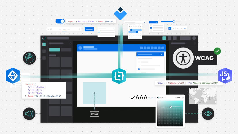
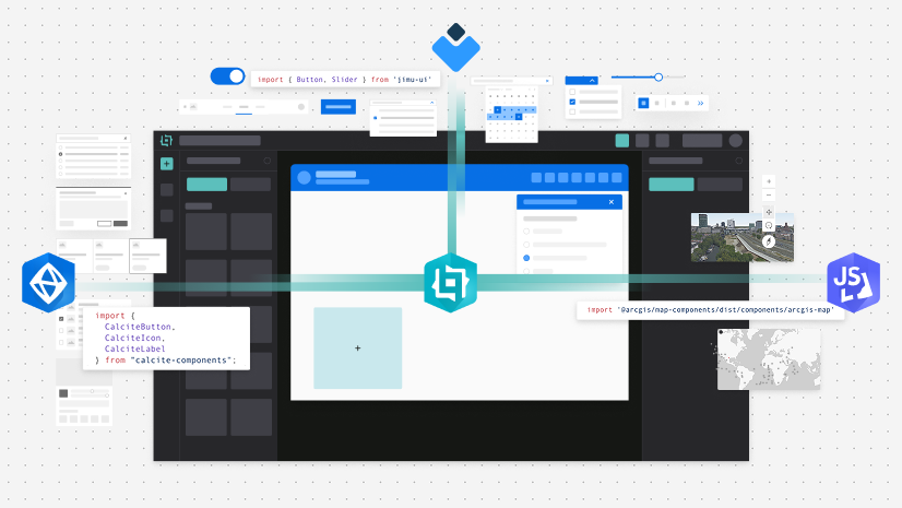
Explore practical techniques for building accessible custom widgets using Jimu UI, Calcite components, and ArcGIS Maps SDK for JavaScript components, which include practical patterns, developer responsibilities, and implementation techniques ensuring accessibility is built into your widget from the start.
Why accessibility matters
Accessible widgets support individuals who rely on keyboards, assistive technologies, or alternative input devices. Accessibility also improves the overall usability, consistency, and maintainability of the solutions you build, including:
- Alignment with the Web Content Accessibility Guidelines (WCAG)
- Avoiding fragile, input-specific interactions
- Reducing late-stage rework and costly last-minute fixes
- Building widgets that integrate with Experience Builder layouts
Experience Builder applications often combine multiple widgets on a single page, where accessibility constraints in one widget could affect an entire experience. Accessibility must be integrated throughout widget design and development, not treated as a final review step.
Accessibility in custom widgets
Custom widgets are built using React and integrate with the Experience Builder framework. Accessibility in custom widgets is supported by three component systems:
- Jimu UI as the native React toolkit
- Calcite components as Esri’s design system comprised of web components with accessibility in mind
- ArcGIS Maps SDK for JavaScript components comprised of web components built with Calcite components supporting map interactions
The Experience Builder framework supports custom development with accessibility features. Developers must continue building accessibility best practices into their widgets to support more individuals, including:
- Starting with semantic HTML prior to using ARIA attributes
- Ensuring interactive functionality is available for keyboard navigation
- Providing visible focus indicators on interactive elements
- Managing focus and providing context when content changes dynamically
Understanding the roles of each system
When building accessible custom widgets in Experience Builder, accessibility responsibilities are distributed across three systems, where each library solves a different problem. The table below outlines offerings and developer responsibilities.
| Library | Primary role | Offerings | Developer responsibility examples |
|---|---|---|---|
| Jimu UI | React components for Experience Builder |
|
|
| Calcite components | Part of Esri’s design system built as standards-based web components, which provide robust accessibility support |
|
|
| ArcGIS Maps SDK for JavaScript components | Web components focused on mapping solutions, including controls and interaction |
|
The key takeaways between these component libraries, include:
- Jimu UI manages framework integration
- Calcite provides accessible UI building blocks
- JavaScript Maps SDK ensures map interaction is operable
- The developer composes them into an accessible workflow
Common accessibility themes
Jimu UI, Calcite components, and JavaScript Maps SDK components serve different purposes, but share foundational accessibility principles, which are applied differently within Experience Builder, including:
- Keyboard operability
- Visible and predictable focus behavior
- Accessible roles and states
- Logical interaction patterns
- Alignment with WCAG guidance
Accessibility and Jimu UI components
When using Jimu UI components in custom widgets:
- Avoid introducing heading elements unless required, since Experience Builder manages page-level hierarchy
- Manage focus when widget state changes dynamically
- Prioritize framework components over custom HTML where possible
Design accessible interfaces with Calcite components
When composing interfaces with Calcite components:
- Provide visible labels or accessible names
- Ensure DOM order matches visual order
- Define required properties explicitly
- Return focus to the initiating control when panels or dialogs close
Build accessible mapping experiences with JavaScript Maps SDK components
When using JavaScript Maps SDK components:
- Prioritize built-in map controls such as Zoom, Search, Legend, and LayerList
- Provide alternative formats for map data, such as lists or tables
- Synchronize map selection with accessible UI outside the canvas
- Avoid hover-only interactions without keyboard equivalents
Applying accessibility in a custom widget
In this widget, the user interaction workflow of an individual filtering a layer to reveal a map component and obtain the feature details is handled outside the map, so that assistive technologies do not need to interact with the map canvas. This example demonstrates:
- Using Jimu UI and Calcite components when possible and
- Managing keyboard navigation and a visible focus, including restoring focus after action
Set an accessible name on the map
Once the map view is ready, add an accessible label via the aria property, setting the aria-label to the webmap title. The accessible label provides context for assistive technologies:
useEffect(() => {
  const mapEl = mapElRef.current;
  if (!mapEl) return;

  (async () => {
    try {
      await mapEl.viewOnReady();
      const { portalItem } = mapEl.map;
      mapEl.aria = {
        label: portalItem.title,
      };
      setStatus("Map loaded.");
    } catch {
      setStatus("Map failed to load.");
    }
  })();
}, []);
Provide context to dynamic changes
Next, create a single-line status message and update it for asynchronous actions, such as “Applying…” or “Applied…”. Use the aria-describedby attribute to connect the controls to the status text, and use aria-live to announce dynamic changes on demand to assistive technologies.
<p
  id="widget-status"
  role="status"
  aria-live="polite"
  aria-atomic="true"
>
  {status}
</p>
Add a button that updates the status text:
<Button
  id="apply-filters-btn"
  onClick={applyFilter}
  aria-describedby="widget-status"
>
  Apply filters
</Button>
...
setStatus(`Applying "${layer}" filter…`);
Note that the Jimu UI <Button> already has an accessible name from its visible text Apply filters, and the focus order will follow the DOM order.
Label form controls with Calcite components
Use visible labels by wrapping inputs with CalciteLabel. The component provides a consistent UI and accessible labeling without the need for aria-named attributes:
<CalciteLabel>
  Select layer
  <CalciteSelect
    label="Selected layer"
    value={layer}
    onCalciteSelectChange={(event) => {
      const target = event.target as HTMLSelectElement;
      setLayer(target.value as LayerKey);
      setStatus(`Layer set to "${target.value}". Ready to apply filter.`);
    }}
  >
    <CalciteOption value="parcels">Parcels</CalciteOption>
    <CalciteOption value="buildings">Buildings</CalciteOption>
    <CalciteOption value="roads">Roads</CalciteOption>
  </CalciteSelect>
</CalciteLabel>
Return focus after applying changes
After asynchronous updates, return focus to the initiating control to prevent users from losing their place. Returning focus to the triggering element is especially useful when applied filters change content that may not be visible in the current UI, or which affects content that isn’t in close proximity to the current control.
const restoreApplyFocus = () => {
  if (applyBtnRef.current && "focus" in applyBtnRef.current) {
    (applyBtnRef.current as HTMLElement).focus();
    return;
  }
  document.getElementById("apply-filters-btn")?.focus();
};
...
const applyFilter = async () => {
  setStatus(`Applying "${layer}" filter…`);
  await new Promise((r) => setTimeout(r, 250));

  setSelectedObjectId(101);
  setStatus(`Filter applied to "${layer}". Showing selected feature details.`);

  restoreApplyFocus();
};
To view the full code sample, explore the GitHub gist.
Accessibility testing for custom widgets
Automated accessibility tools help identify common issues, however testing cannot guarantee compliance. Some testing techniques include:
- Move focus to the widget and traverse interactive components using only keyboard navigation
- Using a screen reader, such as JAWS, NVDA , or VoiceOver
- Verifying focus order and focus visibility
- Confirming all interactive elements contain accessible names
Explore recommended testing tools including a developer checklist to further boost custom widget development.
Summary
Accessible widgets are not automatic. They result from thoughtful design, semantic markup, keyboard operability, and careful consideration of Jimu UI, Calcite components, and JavaScript Maps SDK components. When accessibility is integrated from the start, custom widgets become more reliable, usable, and inclusive by design. To learn more about accessibility support and how to adapt accessibility into your solution, visit:
Stay in the loop with the latest in developer technology by subscribing to the Esri Developer Newsletter.


Article Discussion: