Have you ever cracked a little smile, when your smart phone seems to share your own intuition or recommend something you adore? Let’s examine these analytical moments through a link analysis using Insights for ArcGIS.
To do this, our team thought it would be fun to explore centrality measures with relatable data (hint Valentines Day) to demystify meaningful experiences common to social networks. How does Pandora music know that I love The Strokes? Even though it seems like the station owner may have lived within earshot of my speakers, these personalized suggestions are actually a result of a graph analysis with centrality measures that factor in an entire platform of users. These measures then help tailor different software experiences. Within Insights, you can build graphs and calculate centrality measures to deliver meaningful recommendations based on relationships within your own data.
This is powerful. It’s powerful because decisions that involve link analysis typically factor in complex relationships which are difficult to see in classic row-and-column data structures.
Even though many of us will use Insights to explore linkages from different industry domains, the aim in this blog post is to keep things simple and apply research in an arena where link analysis is deeply rooted. No, it’s not epidemiology or forensics (even though it could be).
Given that it’s Valentines Day, we’ve decided to see how Link Charts and Pre-Defined Filters can be applied in a similar fashion to popular dating app features – aka, to find love interests (but without the swipes). We will use Insights to sift through online dating data and see how well ArcGIS can find matches for companionship.
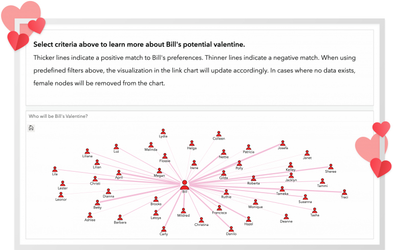
Keep in mind our key message here is not about how to be a busybody. Rather the take away is how Link Charts can slice apart descriptive information and reveal hard-to-see visual linkages and centrality degrees, which make data actionable. In Insights we do this by enabling different ways to style nodes and links in charts using color, sizes, line thickness and layouts (force directed, circular and hierarchical). For the rest of this blog we will romantically analyze Bill. Bill is a fictitious person (located in the center of the link chart above) who is overwhelmed by a large online dating pool of women who have different tastes, desires and preferences. Does this sound familiar? Perhaps on several levels, it should. This is a similar problem that practitioners will face when it’s time to make a needle-in-a-haystack type recommendation and they are overrun with information overload.
Data Gathering Process
For our research we have analyzed open data collected by a popular dating site named OkCupid using Insights. The nature of the data includes 68,000’ish anonymous responses to some 2,000+ self-assessment questions. Per OkCupid, this sampling is the exact type of data they use to build their matching algorithms. While we did not have time to review the interesting R scripts and reports packaged with the data, on the whole we will attest that OkCupid’s sample data collection is pretty awesome and the Q&A topics were pretty fun to read. Here is a direct link to the data.
Data adjustments and alterations
To save some of your time, I’ve outlined our data munging process. Since the OkCupid data is completely anonymous, we made a few changes to add a bit of context.
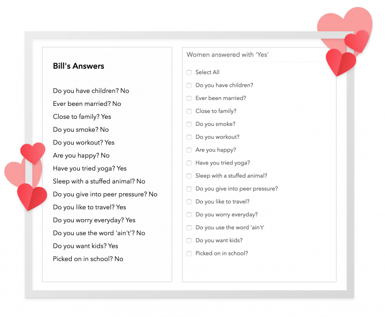
- We extracted the first male record in the 68K data set and named this record Bill
- We then selected a dozen or so OkCupid questions of type Yes / No to do our match on (see questions in image above)
- We then randomly selected a sample of women suitors for Bill and gave these women random names
- We then coerced the yes and no answers to an ordinal scale, slugging yes with a 1 and no with a 0
- We then inner joined Bill back into the table containing sample females and their responses
- We then created a new field and summarized Female responses that were the same as Bill (when there was equality we coded those cells with a 1)
Link Analysis and Visualization Process
With the data adjusted we were in a good spot to use Insights to do spatial and non-spatial analysis. Since the OkCupid data did not contain geographic areas we made a decision to build workbooks which contained Link Charts (ideal for non-spatial) and Pre-Defined Filters, so we could select for different questions and drill-in on how female answers lined up with Bill’s preferences. We also added a few additional charts, which were helpful in surfacing no data “NA” values.
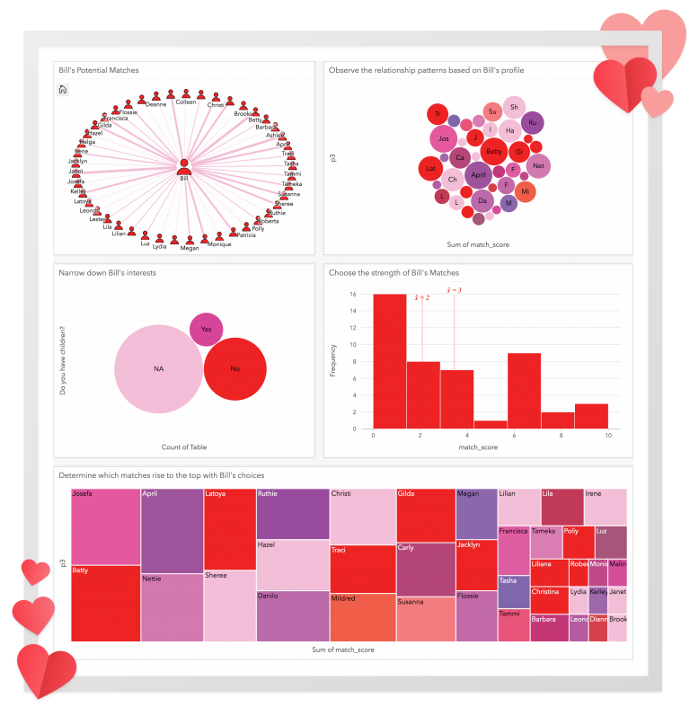
Our results are fun! They poke at the heart of Link Analysis and show clearly defined links (lines) connecting people that are based on relationship values (centrality measures in degrees). To share our lovely data journey, we’ve made our interactive workbooks available through publicly shared Insights pages, with Text Cards explaining how to interpret the charts (specifically the Link Chart).
Use these links to access our workbook pages.
In short, what the link analysis has revealed is how quantifiable graph-based recommendations can be made to support important decisions. In terms of Bill, his romantic life is not that bad. He has some really good options out there for finding a Valentine, but his options are limited. Even though our scenario may seem a bit silly in showing how Bill and Josefa may be a good match for Valentines Day, we think the process of learning Link Analysis using online dating criteria is pretty cool and useful if you’re just getting started. In closing, we hope you’ll try Link Analysis and generate your own centrality measure using data that is important to you. If you do please tell us about it! We’d love to hear your story and learn about your analysis.
Do you like powerful visualizations? Do you like simple? Check out some of our Insights case studies. Don’t have access to Insights for ArcGIS, follow this link to get a free trial!


Commenting is not enabled for this article.