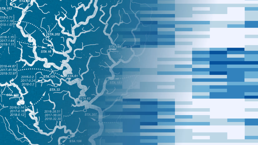
In this series, we’ll be stepping through the workflow for creating an Insights workbook of watershed monitoring data using this map as inspiration. Along the way we’ll be using the analysis strengths of Insights to crank things to ‘11’.
We left off last time having collated our fragmented data using the Insights scripting environment and loading it into our workbook. Along the way, we discovered that it wasn’t even all that scary! More importantly, it crucially helped us in preparing our data for analysis. No need to admit it aloud, but you may just have even gotten a thrill out of it, you know who you are (knowing wink).
As we begin our analysis stage, it’s always good to have some research questions partially formed beforehand. Maybe there’s a trend in the data you’re looking to uncover, or are there measures that may possess a relationship, or maybe you’re looking to visualize a spatial distribution?
My professional recommendation is that carefully considered research questions can help guide your analysis. However, just between us, I’d also suggest a healthy dose of experimentation and exploration! Insights has a buffet of tools and visualizations on offer and you have my blessing to toss your data around. Go ahead, fill your workbook with visualizations, and see what sticks! If something doesn’t work, just drop it, no harm no foul. You’ll have learned something in the process. If anyone questions you, boldly point to your screen full of charts and tell them that you’re conducting exploratory data analysis!
In that spirit of exploration, I’ve granted myself a blank check to explore this river flow data. Who knows, maybe I’ll even sprinkle in some precipitation data and see how that shakes out!
Feature Charts
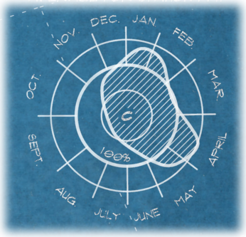
In our map inspiration, these charts showing where river flow rates exceeded the average were definitely a neat feature. Let’s dig into the Insight visualizations and see if there’s some chart(s) that we can add to our workbook to improve upon this chart.
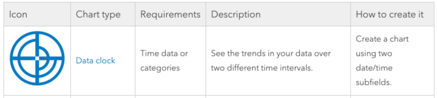
If you’re just getting used to Insights, the analysis capabilities overview is a great place to start! This helpful cheat sheet contains reference to all the chart types, their use, and the recipe for creating each one. There are even some great tutorials on the ArcGIS Blog for how and when to apply some of them like heat maps and pie charts.
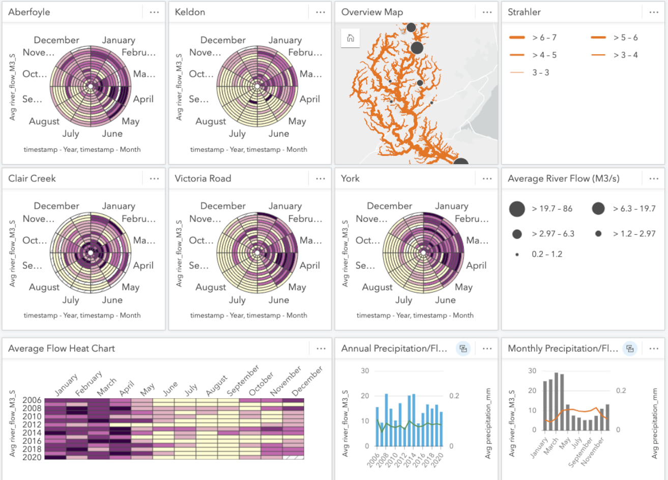
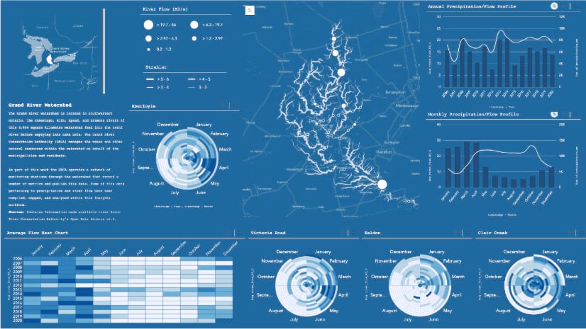
While scrolling through the analysis, I found the data clock and experienced an overwhelming moment of ‘viz-brain’ (it’s that feeling when you stumble across a great data-viz opportunity). It was round like our inspiration and also perfectly suited for analyzing temporal data.
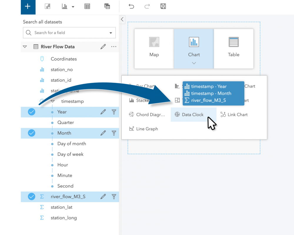
Right then and there, I opened a new workbook and dragged the river_flow_M3_S, Year, and Month measures from our collated data and dropped them onto the data clock chart type.
After making a quick adjustment to AVERAGE the flow metric, as opposed to SUM, we have a chart showing us the average river flow over the temporal range of our data.
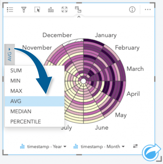
This already a great start! The data clock calls back to the seasonal trends in our inspiration, but also cranks the analysis up to reveal how flow changes across years (concentric circles). We can already see some trends with this first exercise: Summer months tend to have lower flow rates whereas, Spring months tend to be higher. We won’t stop there though! Our data clock summarizes just the general trend of flow rate across the watershed, but we can still exploring further.
Digging deeper into a specific station, we can apply a card filter on the specific chart. These filters limit the data within just the selected card where the data meets the criteria of the filter. I’ll be using a specific station_name of interest to filter this card.
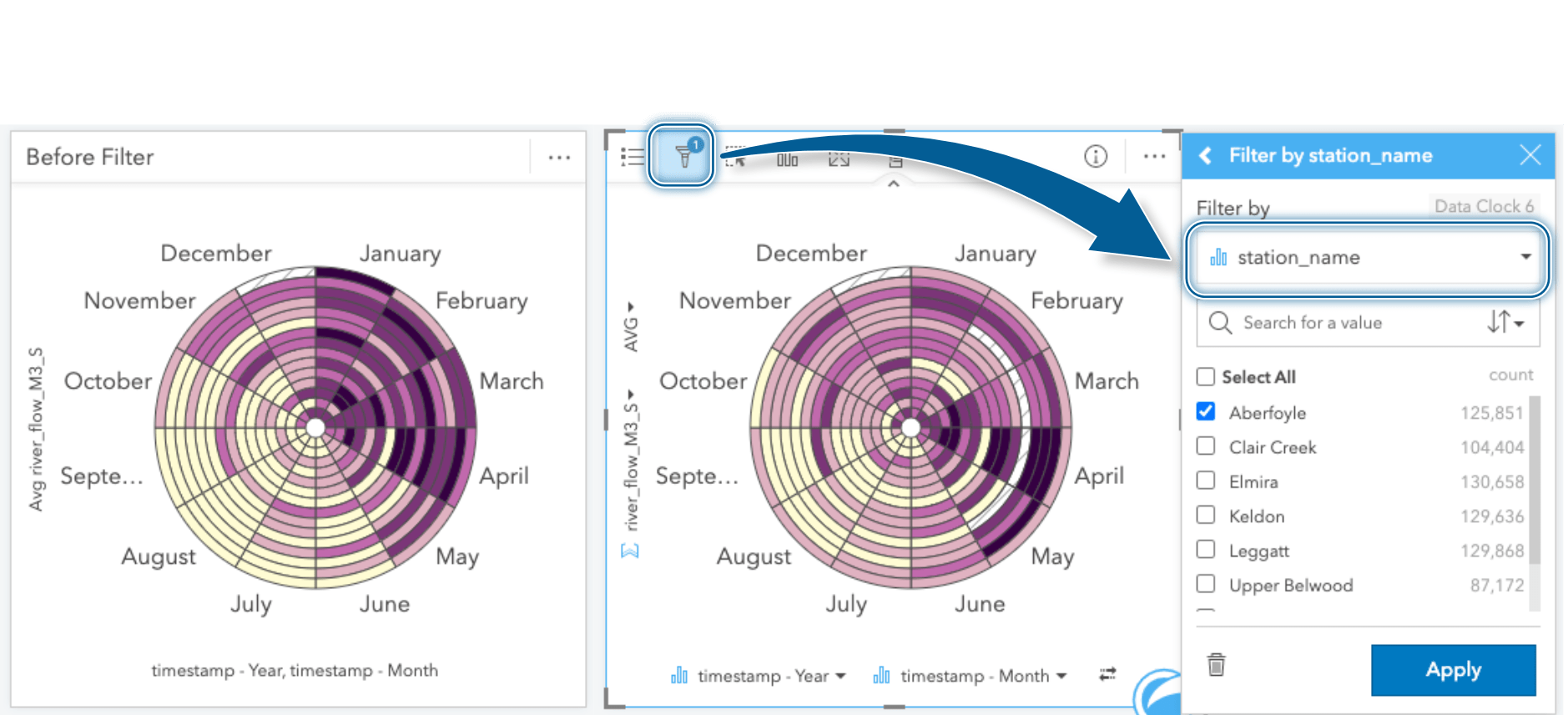
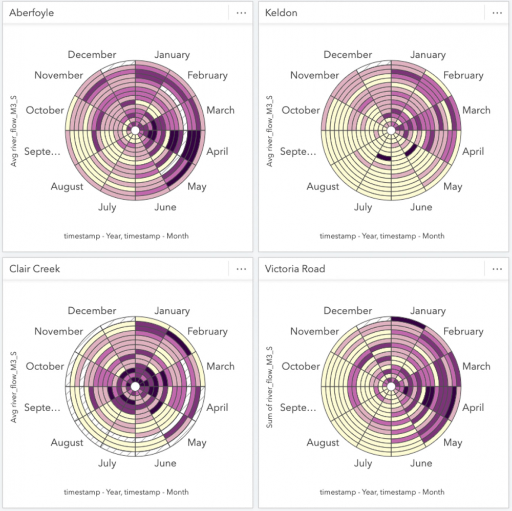
Look at that, definitely different than the overall trend! It would appear that the river flow observed at this station tends to peak in April and experiences a shorter duration of low flow rates through the Summer months. In order to compare other monitoring stations and fill out our workbook, we’ll create several more data clocks and apply a card filter specific to each station and change the summary statistic to AVERAGE. Of course, to help keep things organized I’ll rename the cards with the station name as I go.
Just a few data clocks later and we can already see that temporal trends vary greatly by station. For now we’ll park the Data Clocks here with these selected stations and move on to some other exploratory charts.
Overview Map
As we reimagine the map within Insights, we’ll be letting the data and analysis take centre stage. However, keeping in mind that we’ll eventually want to communicate our analysis to our audience, having an overview map will be useful for context. Let’s see if we can cook something up that shows readers where our stations are located within the watershed.
Flow Gauge Stations
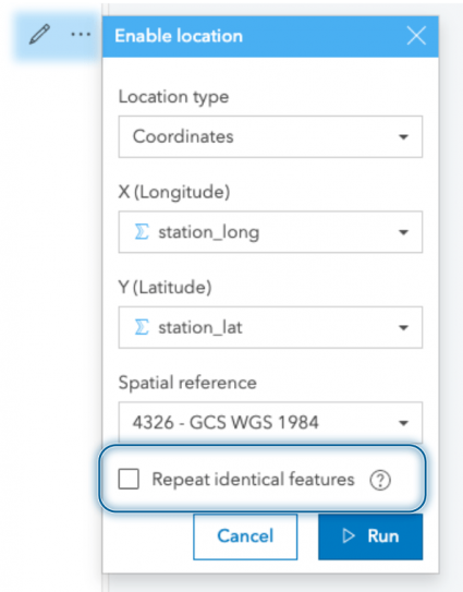
The flow measurement data is the centerpiece of our analysis, so we’ll add that to the map first. Using the coordinates that we restructured in our processing script, we can enable location and plot them on our map. When plotting these records, we’ll ensure that the repeat identical features option is unchecked. Using this option, Insights geolocates the unique locations and relates records observed at these locations through a one-to-many relationship (no need to fear, all your data is still there). Our monitoring data is then aggregated specifically within the map card.
We’re left with a station feature that has summary statistics based on all the recordings observed at that location. We can use these summary statistics to style our map. For instance, when we drag the new Coordinates attribute to our map, we’re immediately shown our data aggregated by count. However, knowing how many records were recorded at each station isn’t a spatial phenomenon of interest, so we’ll change the styling here to reflect the average river flow at each location.
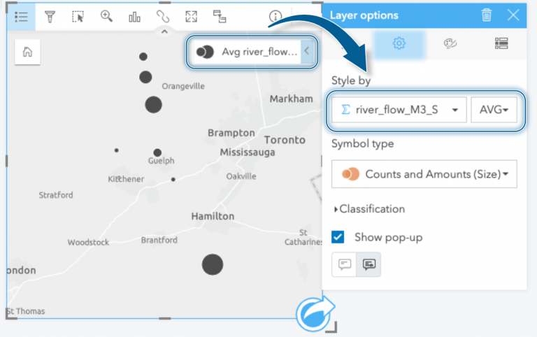
Styling the stations by river flow rate shows us which stations have the highest average river flow and where they are located. For completeness, I’ll add all of the other flow gauge stations that exist within the watershed even though I haven’t prepared data for them. We’re still missing some map layers, but we’re making progress!
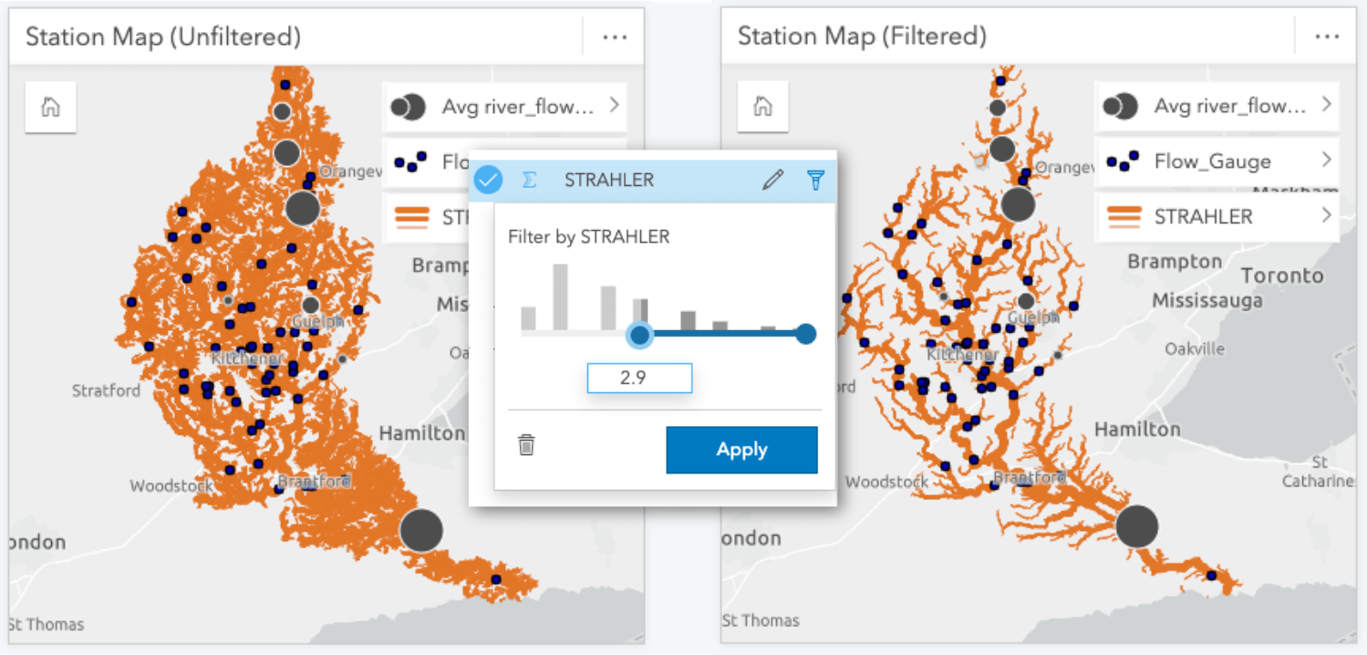
Watercourses
I got swept up in making charts and map cards from our river data, but you didn’t think I’d actually forget to map the rivers, did you?
Adding the watercourses to our map provides valuable context of where our sampled stations are located within the watershed. However, there are times when even us data nerds end up with too much data! In this case, the watercourse dataset included every small stream and creek, which is fantastic, but it makes it difficult to discern the overall structure of the watershed. Therefore, I’ve opted to place a filter on the dataset using the STRAHLER attribute to simplify the map through omission. The Strahler number describes the hierarchy of the watercourse segments and will allow me to filter lower order streams from the map. In this case, applying a filter to omit streams that had a STRAHLER value less than 3 worked well to show the structure of the watershed without too many features.
We may not be winning any prizes for cartography at this point, but we’ve got a solid contextual framework for our analysis. We’ll aim to spruce up our visuals in a later post once we’ve laid out all the analysis. With the map complete, we’ll move onto our stretch goal and add precipitation data.
Bonus Analysis
Congrats on making it this far, here’s where we start layering some bonus analysis into our workbook! Perhaps you even gotten adventurous and already added a few more charts. If you’d like to take it a step further, let’s try incorporating some precipitation data and compare how it impacts the river flow rate measures.
For this bonus step we’ll re-purpose our script from part 1. This serves as both a lesson in why you should save your scripts and to prepare your research questions ahead of time (do as I say not as I do). Regardless, the precipitation data has a similar structure to the river flow data. With a few modifications, the script can also be used it to collate the observations from various tipping bucket stations (work smart not hard, right?).
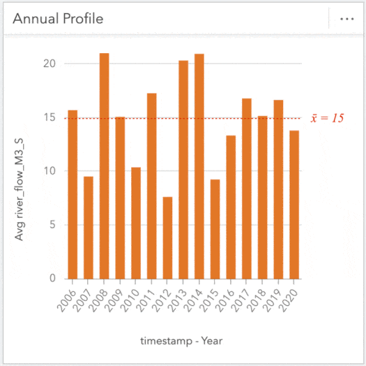
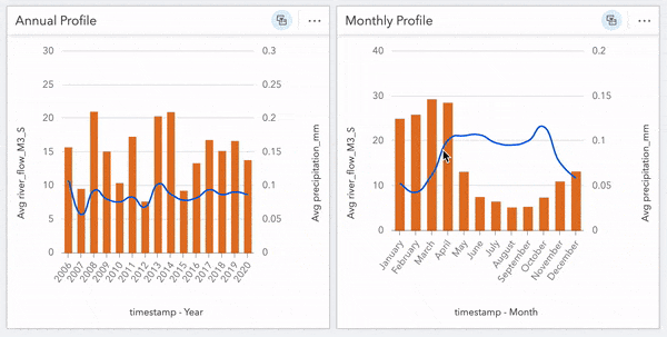
Alright let’s toss some data around! I’d like to see how precipitation compares to river flow throughout the year. I’ll start by creating a Line Graph from the flow data using the Year and river_flow_M3_S measures. I want to compare this with precipitation, so I’ll also drag and drop Year and precipitation_mm from the precipitation data onto this chart and ‘auto-magically’ convert it into a combo chart showing the trends by year across the dataset.
Using the same method, we’ll create a chart showing the Month value to inspect trends occurring within a year. These charts alone are useful, but cranking it up again, we can apply a cross filter and tie these cards together further digging into specific years to investigate fluctuations. For instance, clicking on a year of interest will reveal the flow profile for that year. Conversely, clicking a specific month will show how the flow within that month compares across all years within the dataset. These filters are great for peeling back layers and exploring the depths of your data.
Since all of our cards were created from our River Flow Data, they are connected in this manner and can be interactively explored; clicking on regions of our data clocks and map will highlight/filter other cards as we probe the data.
Take a step back now and take in all your data-crunching charts. Don’t let me stop you from exploring and creating more, I may even add a heat chart, but I’ll pause here. So far, we’ve created several chart cards and assembled an overview map.
Our workbook may be a little rough on the eyes right now but we’re going to take care of that in the next post, the important work of building our charts has laid the groundwork. Next up we’ll style our workbook top to bottom and preparing it for sharing with others!

Article Discussion: