In the last blog, we discussed why it can be difficult to interpret patterns in large dataset on a location map and how to use spatial aggregation and graduated symbols maps to understand your data. In this blog, we will look at two different map types: binned maps and heat maps.
Binned maps
In some cases, the counts across the study area are important, but the comparison between standard boundaries, like we saw using spatial aggregation, is not. A binned map displays the counts of points in a uniform grid across the entire study area, which helps you understand the distribution of your spatial data, often at a more acute scale than with a graduated symbols map. The resolution of the binned map can be changed to increase or decrease the size of the bins, and the cell size will change as you zoom in and out on the map.
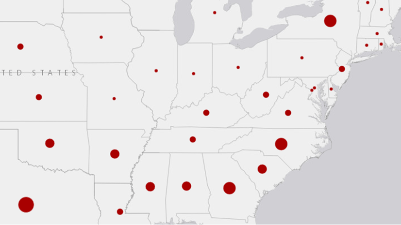
In the case of the wildfires, the binned map is a higher resolution visualization than the graduated symbols map, which allows us to analyze the distribution of fires without boundaries. We can see that the areas with the most wildfires still correspond to the states with the most wildfires in the graduated symbols map, but the binned map provides a more granular view of the areas in the states in which the wildfires are occurring.

Zooming in on the map automatically displays the data at a higher resolution. If you zoom in far enough, the bins will be replaced with raw data points.
The map below is zoomed in on Texas and surrounding areas.

When should you use a binned map?
- When you want to know counts or statistics across the entire study area.
- When standard boundaries are not needed.
Heat map
Like a binned map, a heat map shows the distribution of the data across the entire study area. However, rather than aggregating the wildfires into bins, the heat map reflects the density of the data on a continuous surface. The heat map does not provide specific density calculations (you can use Calculate Density if you want those); instead, it provides a quick visualization of the relative densities by zoom level. For example, the heat map of the full extent of the data shows the same general pattern as the binned map.

When you zoom in to the high density blob above Texas, the densities are rendered at a new scale and provide a more precise visualization of the distribution of wildfires across Texas and its neighboring states.

When should you use a heat map?
- When a quick visualization or broad pattern is needed.
- When counts or other statistics are not required, so relative distributions are detailed enough.
- When you want to know where high and low values are occurring.
Up next
Learn about using pie and column chart symbols to map unique values in Easy as pie: Mapping large dataset in ArcGIS Insights, part 3.

Article Discussion: