In this series, we’ll be stepping through the workflow for creating an Insights workbook of watershed monitoring data using this map as inspiration. Along the way we’ll be using the analysis strengths of Insights to crank things to ‘11’.
Welcome back to the third and final installment of Make this Watershed Workbook! If you’ve been following along, we’ve already assembled our datasets, and prepared our analysis. This time around, we’ll be shifting focus to how we might showcase our work by creating a compelling visual and sharing it with others.
Opening up our workbook, you’ll recall that we pretty much left it in its default arrangement. This was a conscious decision on my part. I didn’t want to get mired down in styling details while I was creating charts. To be entirely honest, I also was excited by the prospect of leaving all the styling to the end for the big reveal!
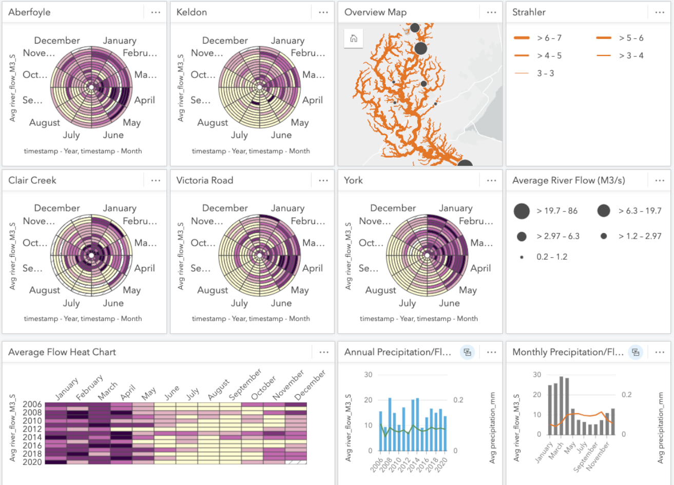
But I digress, I wanted to make a quick point about default settings. These settings are great for getting the ball rolling. For instance, we were able to quickly create chart after chart without much effort and they’re all perfectly functional without any styling. However, when we’re sharing our work to a larger audience, it’s worth spending some time within the various settings and styling panels. A little extra effort spent can go a long way to captivating your audience and communicating your analysis.
While applying this to our workbook, we’ll look at ways to take it from the defaults to something of a ‘blueprint’ style. Now, I’ll admit that a blueprint style isn’t necessarily relevant for a watershed. However, in this case there was a long backstory and of thread of inspiration originating from this map. Regardless, I’m here to provide workflow examples and little bits of tradecraft, how you apply them is in your capable hands.
Perhaps you’d like to configure your workbook to match the branding of your organization, or style your workbook to be embedded within Story Map you’re authoring, or simply just to add a little flourish.
Map Card and Basemap
For this workbook, and likely most that you’ll create in Insights, the data is the foundation of our page and the map provides context. For that reason, we don’t want to invest in creating a whole new basemap just for our lonely map card in our workbook. I’d suggest browsing some of those already available in ArcGIS Online to find one that fits your theme.
If you do happen to get a little adventurous and would like to configure your own vector tile basemap, check out this editor. Since this configuration requires a little more time investment, I’d suggest only digging into it when styling a basemap that’ll you’ll use repeatedly.
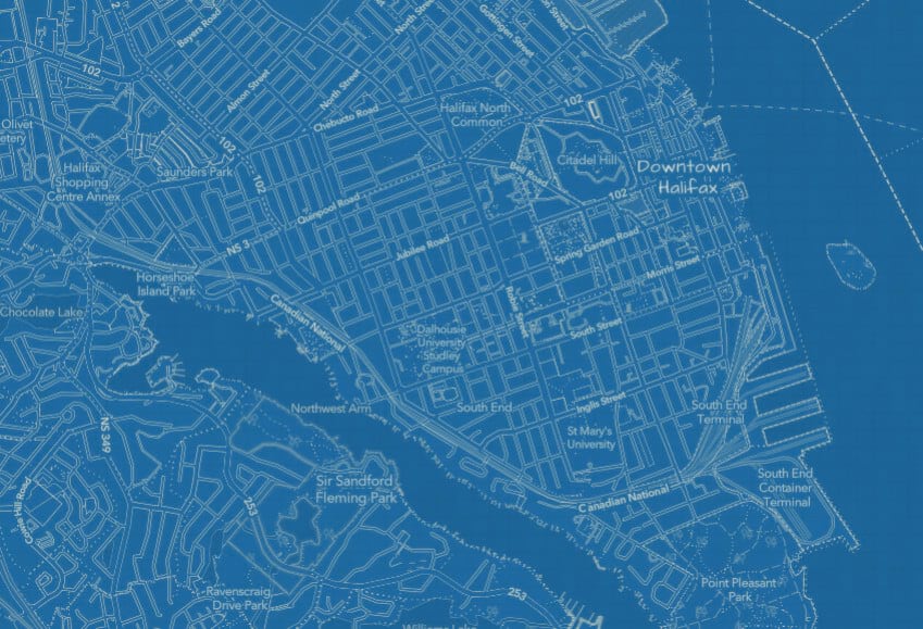
In my case, I quickly snapped up this conveniently pre-existing blueprint style and added it to the basemap group of my organization, easy right?
Sharing the basemap to this group makes it available within Insights and to others in your organization. With a few quick shares I can then change the basemap of my map card in Insights.
Just like that we’re now well on our way to a blueprint workbook! I’ll now style our watercourses, flow gauges, and average flow rate symbols to suit the basemap.
Map Layers
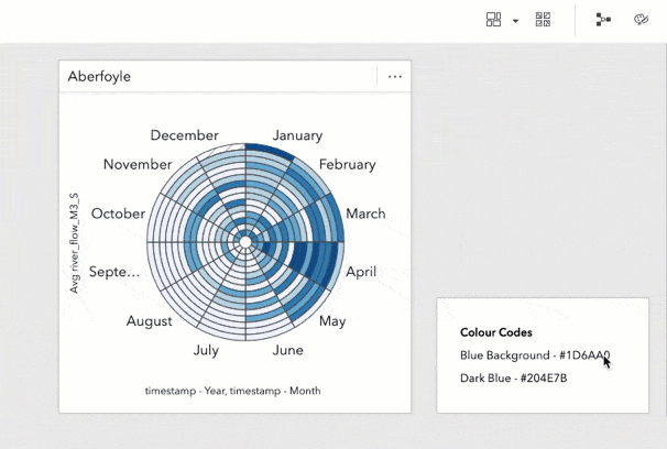
Here’s a quick tip as we embark on styling our workbook, this first one’s free! It’s helpful to keep a text card somewhere with all the custom colour hex codes you’re using. You can then easily copy/paste them from this palette when styling multiple elements.
Average Flow Rate (Selected Stations)
Jumping into the style tab of the layer options, I’ll use a white fill for our flow rate symbols. Our symbols are much more visually distinct now and further adding a blue outline, sampled from the basemap (#1D6AA0), provides a knockout and separates them from the rivers beneath.
Flow Gauges
I’ll do the opposite, blue fill and white outline, for the flow gauges since they aren’t the focus in this analysis. They’re still present for context, but I’ll allow them to recede into the background.
Watercourses
For the watercourses, I’ll style them as white lines and even add a slight transparency. Finally, to finish off the map card I’ll pop out the legends as separate cards. Did you know, that the legend cards are also interactive? Clicking the legend classes highlights those features in the map and other cards.
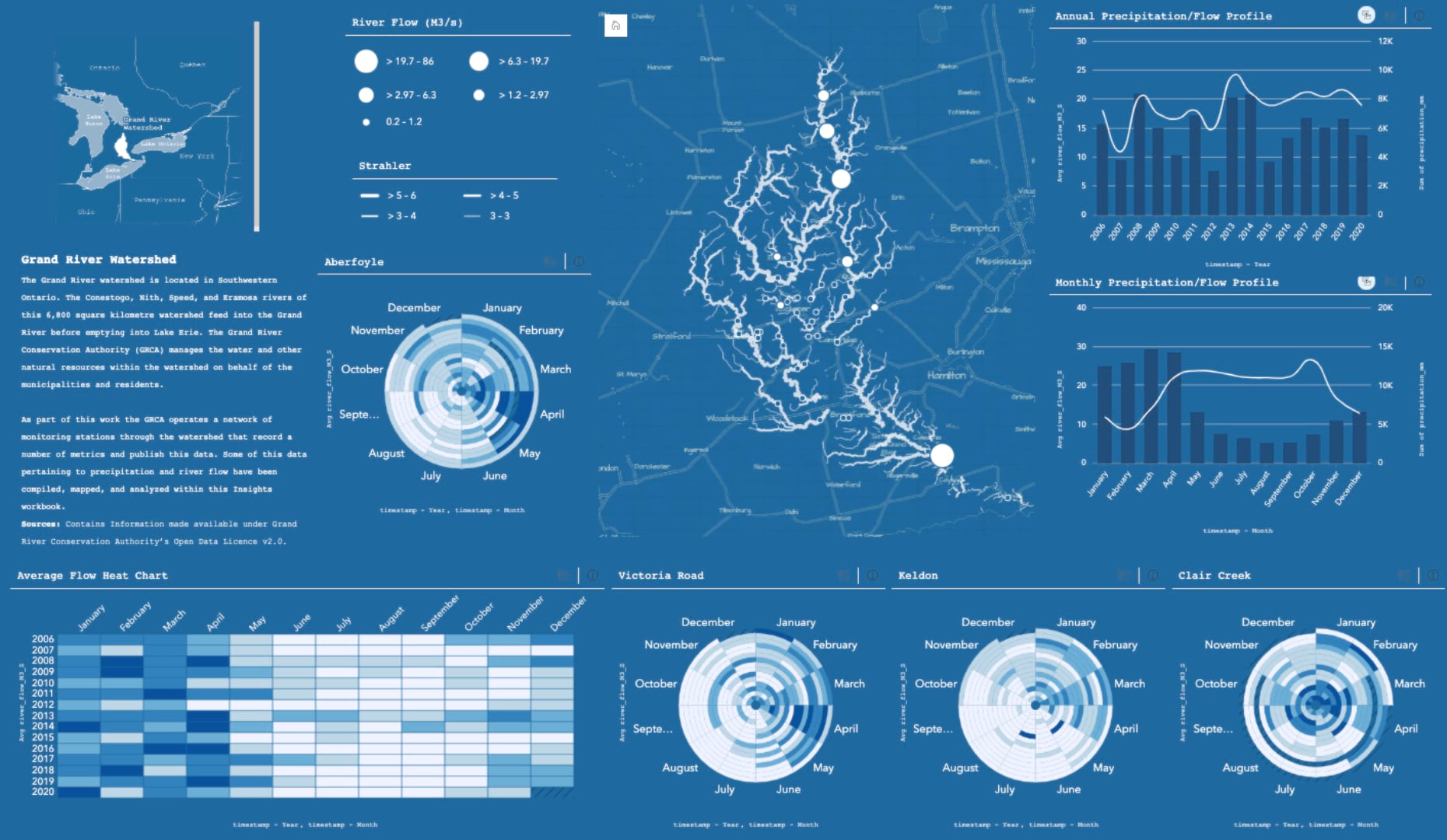
Stepping back to take it all in, our map looks completely different! We’ve left the default values behind and authored a map card that invites our audience to visually explore the datasets.
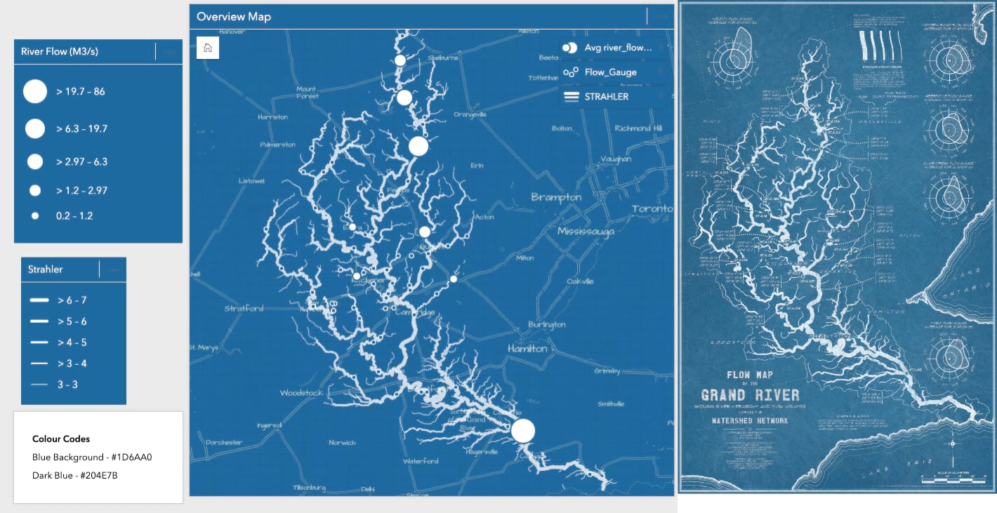
Chart Cards
Since our map card determined elements of our colour palette, we can carry those elements into our chart cards. We have a several options available to configure: the dataset palette, card background and foreground colour, border style, and font. We’ll aim to make these consistent across all of the cards in our workbook.
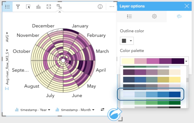
Data Palette
I’ll start with some basic styling of the dataset within our cards. The first consideration should be whether the colour scheme is appropriate for the data. Is the colour data sequentiual, diverging, or qualitative? Knowing the data that I was working with, I picked a white-to-blue sequential palette that closely matched the blueprint blue.
Workbook Settings
Insights workbooks also have page style configuration. We can use these to style our workbook to align with our theme. Yet again, I find myself using our blueprint blue colour. Keeping that colour code saved on a text card is paying dividends at this point.
Styling the foreground colour sets the colour of our text. I’ll use a crisp white ink and change the font options and apply like Courier and Courier New to our card headings and axis labels to fit with our theme.
Our workbook now unrolls as one expansive technical drawing, we’re nearly there!
Card Settings
Jumping over to the card settings, we can style the foreground (text colour) and the background (card colour). For these values, I’ll apply our blue again as the card background and use white as the text colour.
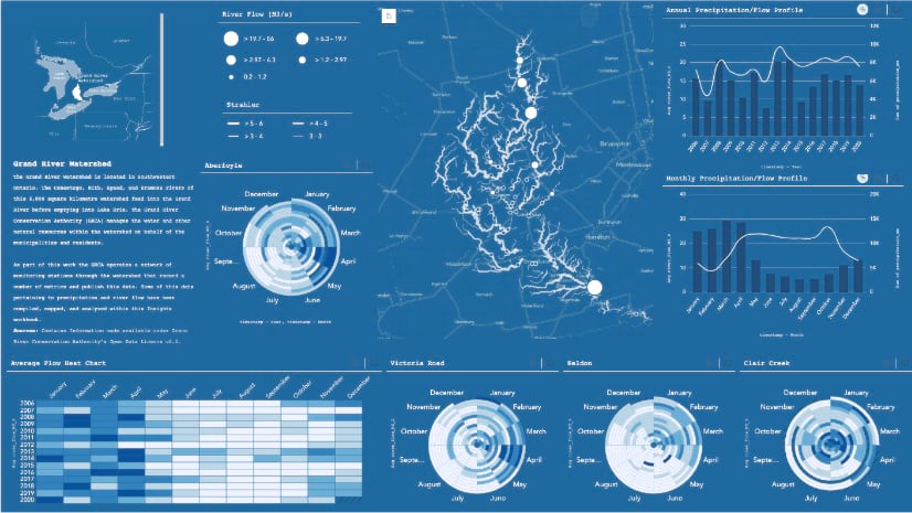
Here’s all of the style steps distilled down into one easily consumable gif.
Wrap Up and Share
Our styling tuning is complete and our journey ends here. That’s it we’re done. It’s bittersweet, but check out this stellar workbook we have to showcase our hard work. It neatly summarizes our analysis in a compelling visual and is ready to be shared with others. Give yourself a pat on the back and try out some of these tips & tricks on your next workbook!


Article Discussion: