In the first two blogs we looked at ways to map large datasets using counts based on the location of features.
What if, instead of location-based maps, you want to map your features by category? The previous maps were all created using only the location of the points (although, in the case of the spatial aggregation there is also the option to display a calculation based on a number field). Something that hasn’t been covered yet is how to display categorical data in large datasets. The default way to display categorical data is with unique values.
The following map uses the same United States wildfire data as the previous blogs, but this time the symbols are showing the cause of the fires with unique values.

There is a lot of value in displaying all your data with unique symbols. However, as the dataset gets larger there are issues related to how the data is rendered that can make it difficult or impossible to make accurate conclusions about your categorical data. For example, in areas with high densities of data the points may overlap, making it appear like one category is dominant when in reality the other categories are being hidden underneath.
Pie chart or column chart symbols
Insights has two ways of displaying categories in large datasets: pie chart symbols and column chart symbols.
These maps require multiple features in the same location (either the same point or within the same boundary). You can use a join or enable location to make a dataset compatible with pie chart symbols and column chart symbols. For more information on the steps to create a map with pie or column chart symbols, see the help documentation.
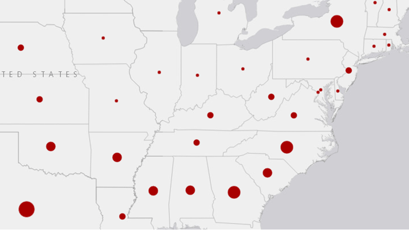
In the following example, the data was aggregated using a spatial join with the same state boundaries as the graduated symbols map, but the display field was set to Cause rather than Count. According to the map and the information from the legend, debris burning is the most common cause of wildfires, particularly in the southern states. Lightning is a major cause in most of the west, but Miscellaneous and Missing/Undefined are more common categorizations in California. Hawaii and Puerto Rico are both almost entirely Missing/Undefined.

The pie chart symbols are also sized using graduated symbols based on count, the same as the aggregation map. Therefore, a map with pie chart symbols can give you the same information as an aggregation map, along with the categorical information.
Likewise, column chart symbols can be used to display your categorical data, rather than pie charts. Pie charts and column charts display a lot of the same information. The decision about whether to use pie charts or column charts could come down to the size and shape of your features, the number of categories, the values of your data, or even personal preference.

When should you use a map with pie chart or column chart symbols?
- When you have too many data points to display with unique symbols.
- When you want to compare categories and proportions within and between boundaries.

Article Discussion: