He’s making his list, he’s checking it twice. Gonna find out who’s naughty and nice. It’s that time of year again, the hustle and bustle of the holidays is now in full swing. Santa is as busy as ever. So busy in fact, he enlisted help from the Insights team here at Esri, to help him with his naughty and nice list for the United States. Santa started with a few questions. We’ve helped provide him some answers with a shared Insights for ArcGIS page here.
But how did we make a shared page like this you ask? Once we completed our analysis, we thought about the needs of our audience. We wanted large text, so Santa didn’t need to get his reading glasses out, holiday colors, a legend and a way for Santa to easily filter some of the cards. This was all made possible through a series of new features, first introduced at 3.0 and improved upon at 3.1. These features allow for adding text, media, colors, legends, editing chart labels and predefined filters. There’s even some bonuses to make your experience better such as copy cards, creation of themes and sharing pages publicly. In this example we’ve done all of that and here is how.
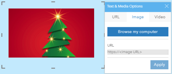
First off, we used the Text & Media widget several times to add some context to the page. We used this type of card to add a title, and a paragraph on how to use the predefined filter. Using the card’s Style button and Font options, we changed the font style, font size and font color to make the font larger and easy to read. We also used the Text & Media card to provide a little embellishment with the Christmas tree image. You might think of using the Text and Media Card to brand your pages with your company’s logo or even add a video.
Next, we needed a little bit of holiday color. We touched on the Text & Media card styling options already but, there is more to coloring than just on that card. Using the Page Settings, we changed the background color to a wintery blue and the foreground color to navy.
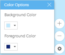
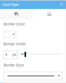
The foreground color changes the color of card titles, the text color on charts, summary tables, predefined filters and legends. It does not affect the text on Map cards (other than card title) or the Text and Media cards. Using the Card Settings, we changed the border of each map, chart, legend and predefined filter card to a winter white and made the border a few pixels thicker.
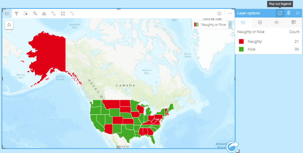
Next on the list (no pun intended), was a Legend, so Santa can remember what those colors represent on the maps and charts. We created ours from the Map card by opening the Legend tab on the Layer options and using the Pop out legend button located at the top of the dialog. This places the legend card underneath the active card. We then sized it down and placed it on top of the map. This feature is available on any Map or Chart card.
Following legends, was editing chart labels. We were able to change the titles of the x and y axes. To do this, we activated the chart card and then clicked on the edit button. We then clicked on the title of the axis and typed in the title we wanted to appear. When the card is active, the chart will show the default drop downs so you can continue to change the fields and statistics set on the chart. The title you set will show when the card is deactivated and when the page is shared.
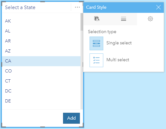
Next, was a way for Santa to filter some cards. Here, we added a Predefined Filter. What’s a predefined filter, you ask? A predefined filter is a refinement the author of the page sets up for their users to use at their leisure. This allows users to filter down your analysis results with filters you have setup. This could include single select filters such as show only results from 2018 or multiselect filters such as show results from only department and toy stores. The filter we chose to set up was a single select filter, so Santa could choose one state, view the distribution of niceness in that state over the course of the last 11 months and see its average niceness on a KPI card.
Some things that Santa won’t see but you may enjoy are; copying cards, creating themes, and sharing publicly. Do you have cards across multiple pages but only want to share one page? Now, you can use Ctrl C and Ctrl V (Command C and Command V on Mac) to copy and paste a card onto the same or a different page. Do you like the layout you’ve created and want to use it as a template repeatedly? Save it out as a Theme and apply it again and again. We’ve saved our theme, so we can use it again next year. Finally, share your workbooks and pages publicly. When you share, you now have the option to share to Everyone (public). We’ve shared our page for everyone to see.
We hope you get a chance to look at the latest version of Insights and play around with the features we’ve describe here. With all the good work you’ve done this year, we hope you are on the nice list. Happy Holidays from the Insights team!
Blog written by Dara Burlo, Esri

Commenting is not enabled for this article.