
The ArcGIS Instant Apps Nearby template is a powerful, ready-to-use tool. It’s fast and effective at helping people understand what exists around a location, making it a good choice for providing public-facing search capabilities.
In many cases, that’s exactly what users need. In others, like feature-dense environments, interpreting the results can become difficult. Often in these situations users aren’t really trying to explore, they’re trying to decide. That distinction turns out to matter quite a lot for how Nearby results should be built and shown.
I ran into precisely this while deploying the Public Parking solution for the City of Columbia, Missouri.
Nearby as a starting point in downtown Columbia
Columbia is a city of about 130,000 with an active downtown bordered by two colleges and the University of Missouri, whose SEC football program draws large numbers of visitors on game days. Significantly more than in similar-sized downtowns, the people navigating Columbia are unfamiliar with the area, and even less familiar with how parking works here.
On-street parking can play a big role in the downtown visitor experience. There are over 1,500 metered parking spaces clustered along downtown blocks, each governed by a traditional parking meter. As we deployed Esri’s Public Parking solution and began working with our data in the public-facing app, our assumption was that those meters would be the features returned in a search. That would keep us from having to maintain additional individual parking space features, which would require a relationship to their governing meters, or duplicate (and maintain!) many attributes.
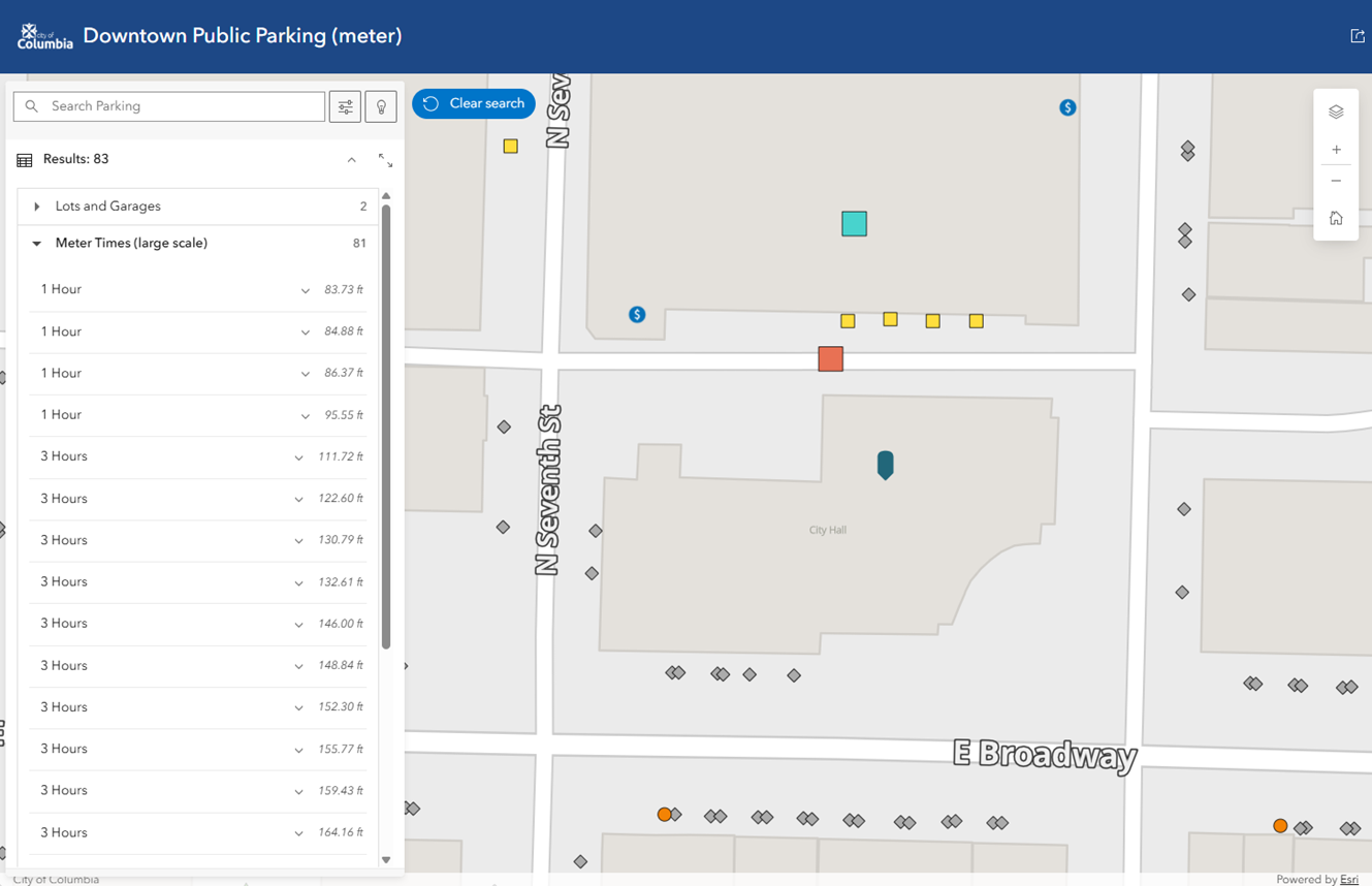
When we tested our parking space proxy theory, Nearby did exactly what it’s designed to do. When a user searched near a destination, even when zoomed into just a few blocks, the app returned accurate, proximity-based results for every nearby meter. Hundreds of them. From a data perspective, it was accurate, but from a user perspective it was way too much!
Reframing our driving question
It was clear that the issue wasn’t accuracy or performance. Nearby was answering the question it knew how to answer, it just wasn’t the one our users were actually going to ask. Downtown visitors want to know “where should I try parking near my destination?” not exactly where every parking space or meter lives.
In this shift, distance still matters, but it isn’t the entire decision. Once someone identifies a place to park, other questions immediately follow. How long can I leave my car there? Do the rules change after business hours? Presented with hundreds of nearly identical meters, users had all the information, but less clarity about what they should do. The challenge wasn’t helping people find any and all parking, it was helping them identify an option that would meet their needs.
From inventory to options
Facing this reality, it was necessary to step back again and ask what a single search result should represent when someone is researching downtown parking.
Answering this question required us to rethink the role our features were playing in the search experience. While individual meters and spaces were essential for internal operations, they weren’t the right unit for people looking for parking. What we needed was a different kind of feature, one whose primary purpose was not to represent an asset, but to represent an option. We needed “decision features.”
Building decision features from assets
1. Define the decision unit
Before touching schema, we focused on defining a decision unit. A good decision unit is something a person can reasonably compare to another option and say, “I’ll try this one instead.” In downtown Columbia, that unit turned out to be a block face: one side of one block on a street.
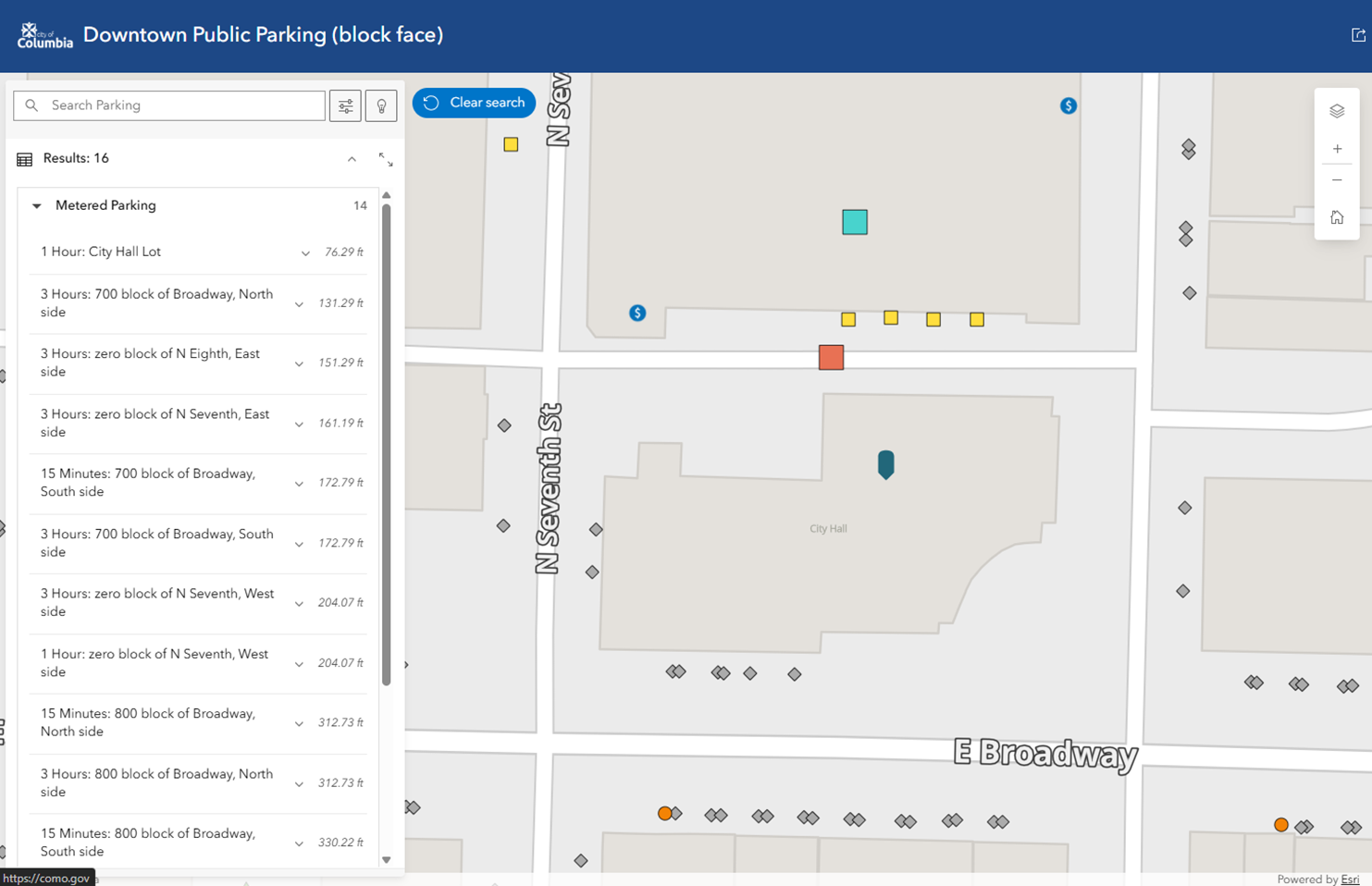
Technical work: we created another feature sub-type of “On-Street Aggregated” in the Public Parking layer along-side sub-types of “lots” and “garages” for our decision feature, since this layer already had the attributes someone looking for parking would care about
2. Grouping assets
In Columbia, block-level descriptions were already part of how parking was discussed. Street name, block number, and side of the street appeared in parking department spreadsheets, and in everyday conversations about where someone might try to park. These concepts became the attributes we used to define our parking decision features.
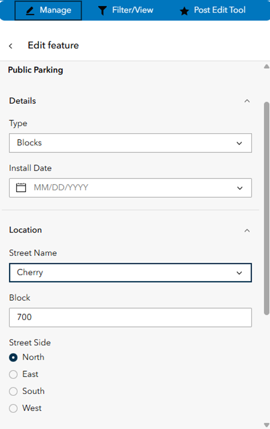
Technical work: we added “Block” “Street Name” and “Street Side” fields (with domains) to the features involved to act as a compound key relating the pieces together

3. Where do they live?
Another important choice was where these higher-level features should appear on the map. Rather than allowing decision features to inherit the coordinates of a single meter, we introduced a small set of block-level anchor points, one per block face. These anchor points define where a parking option appears in search results, and remain stable even as individual meters are added, updated, or removed. This consistency is a small detail, but limiting unnecessary change helps maintain user confidence and makes it easier to compare parking data over time.
Technical work: we created another feature sub-type in the Public Parking layer for our block anchors, and placed and attributed (including our compound key attributes) one per block face
4. Aggregate thoughtfully
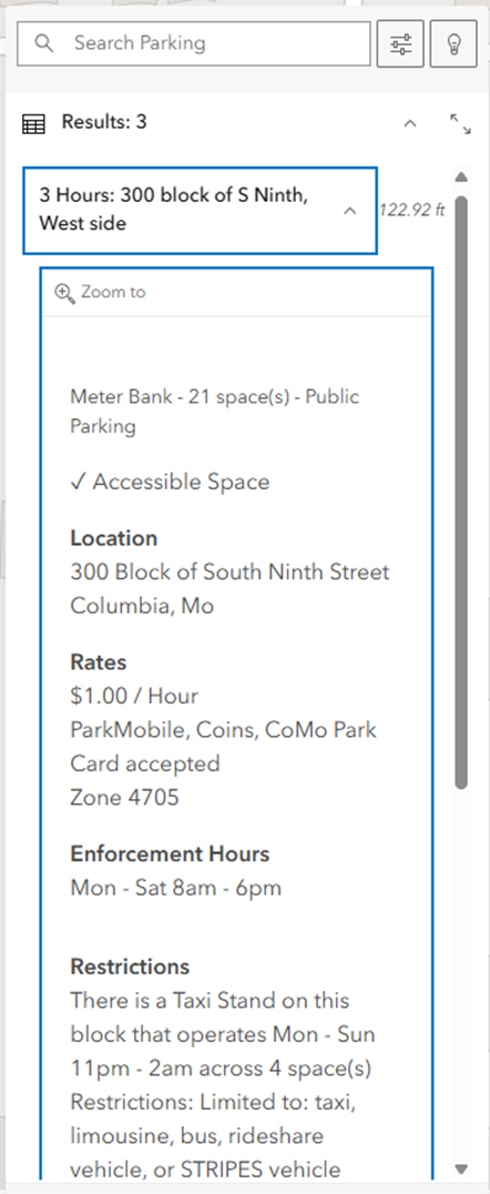
To build the decision features themselves, we aggregated the underlying meter inventory that participated in each block face. Crucially, aggregation stopped where differences mattered. Time limits, for example, directly affect whether a parking option will work for someone’s visit, so meters with different maximum time limits were not forced together into a single result. The focus was on organizing information without burying important distinctions.
Technical work: we built a Python script that iterated on the block anchors, queried the “related” meters, and built the aggregated decision features. bonus: we had additional feature types not otherwise discussed here that were added to these decision features, via the same compound key, so we could add information to blocks that had other attributes like a ride-share stand that would mean spaces on that block were unavailable during certain hours
5. Keeping decision features in sync
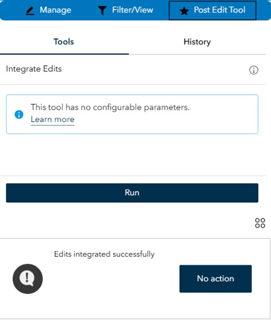
Of course, this couldn’t be a one-time transformation. Meter inventory changes regularly as construction projects temporarily remove or occupy spaces, timing rules are adjusted to optimize usage, or long-term rentals are negotiated for hotel valet and other business uses. To keep our decision features in sync with our authoritative inventory, we built a zero-input, lightweight Python web tool. Every time parking staff makes meter changes, they use an inventory management Experience Builder app to record it. Just one more button click sets off the aggregated feature update process, so editors continue to work only directly with individual meters, and the public-facing Nearby app reliably reflects those changes without additional work.
Technical work: we turned the Python script into a notebook and published it to a web-tool, and used the analysis widget in the inventory management Experience Builder app to give access to parking employees. The tool has no inputs and runs on the standard Python runtime. bonus: we added some data validation checks to the tool, and if any of the conditions were triggered we wrote them out to a separate feature layer, then displayed the validation text to the user in a list widget underneath the web tool results
6. Configure
With the decision features built and maintained via automation, the last step was to configure pretty pop-ups and the Nearby app to return them when a search is performed. The result is a user experience that surfaces fewer, but far more meaningful, results. Instead of scrolling through long lists of nearly identical meters, users are presented with clear, block-level options that can be evaluated quickly.
Technical work: we used arcade to make easy-to-read pop-ups for our decision features, and then in the Nearby app settings we changed which map layers showed up in the results
Applying decision features beyond parking
This same approach can be used for countless other contexts. For example, consider a park with multiple trailheads, intersecting trails, and destinations like overlooks or waterfalls. In this setting, users aren’t exactly asking where each destination or trailhead is, they’re asking what they could reasonably see if they start from a particular access point.
Here, trail segments and destinations are the inventory features, while trailheads become the decision features. Aggregated attributes might include reachable destinations, difficulty ranges, or time estimates rather than simple counts. We don’t have to collapse complexity, but building useful search results often means organizing complexity around a meaningful choice.
Designing what a Nearby result represents
The Nearby Instant App is an effective tool for spatial discovery. In dense or rule-driven environments, its usefulness depends on what each result stands for. If Nearby results feel noisy or overwhelming, it’s worth stepping back and asking a simple question: Is this result representing an option?
By keeping authoritative inventory data intact and configuring Nearby to return decision features instead, Nearby is better able to support how people actually make choices.

Article Discussion: