Animations can be useful to detect or visualize patterns in your data as the geometry or attributes change. Adding animations to your applications can really help bring your data to life, and allows you to see spatial patterns that you might not realize at first glance.

This post will walk you through how to create different kinds of animations using the ArcGIS API for JavaScript. While animations can be fun and can help create a sense of things happening, it’s important to remember to ask yourself: What did I just see? How did the data change as I animated it?
There are two main categories of data animations – animating locations (moving features) or animating attributes (stationary features). To animate locations, we recommend keeping the renderer fixed and applying a data filter. For animating attributes of stationary features, we recommend using a visual variable or data variable animation.
Feel free to skip ahead ?
Animating locations
Animating locations can help you detect patterns or changes in your data. For example, if the location or geometry of your data changes over time, adding an animation can be helpful to understand how/when the data moved or changed.
Data filter animation
Data filter animations can be performed by updating a filter on your layer to animate the data. You can filter by attribute, geometry, or time extent, while keeping the renderer fixed.
To perform a data filter animation based on feature attributes or geometry, use layerView.filter. This requires having all the data that you want to animate through available in your MapView. Only the features that fall within the given filter will be shown.
TimeSlider widget – filter temporal data
Animating temporal data can help to detect a change or pattern over time – for instance you can see how the location or geometry of features changes over time or for stationary objects, how their attributes change over time.
To animate based on temporal data, use the TimeSlider widget. This requires your layer or service to have a date field, or to have timeInfo defined.
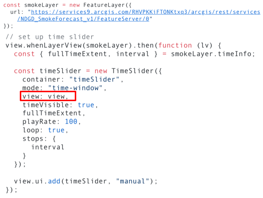
The TimeSlider widget makes animating temporal data much simpler for the developer. If the service or layer is time enabled (has timeInfo defined) – then all you need to do is set the TimeSlider’s view property, as shown in the code below, and the TimeSlider will be set to the timeInfo of your layer. Once you hit “Play” on the TimeSlider widget, only the features that fall within the TimeSlider time extent will be shown.
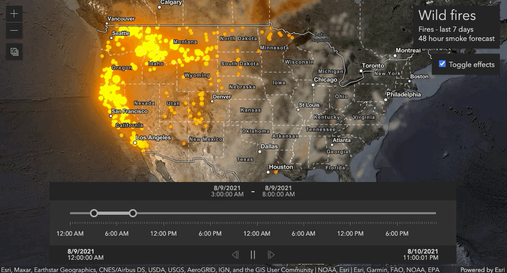
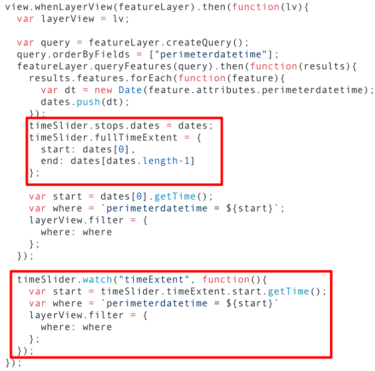
If timeInfo is not set in the service or on the layer, then you can animate the data using any date field in your service. Let’s take a look at how to do this with an example showing the spread of the Kincade Fire in 2019.

Since the layer in this app did not have timeInfo defined on the service, we instead use the perimeterdatetime field on the service, and manually set the TimeSlider stops and fullTimeExtent. Then, we watch the timeSlider.timeExtent property, and filter the data in the layer by that date using layerView.filter.
Filter data by attributes
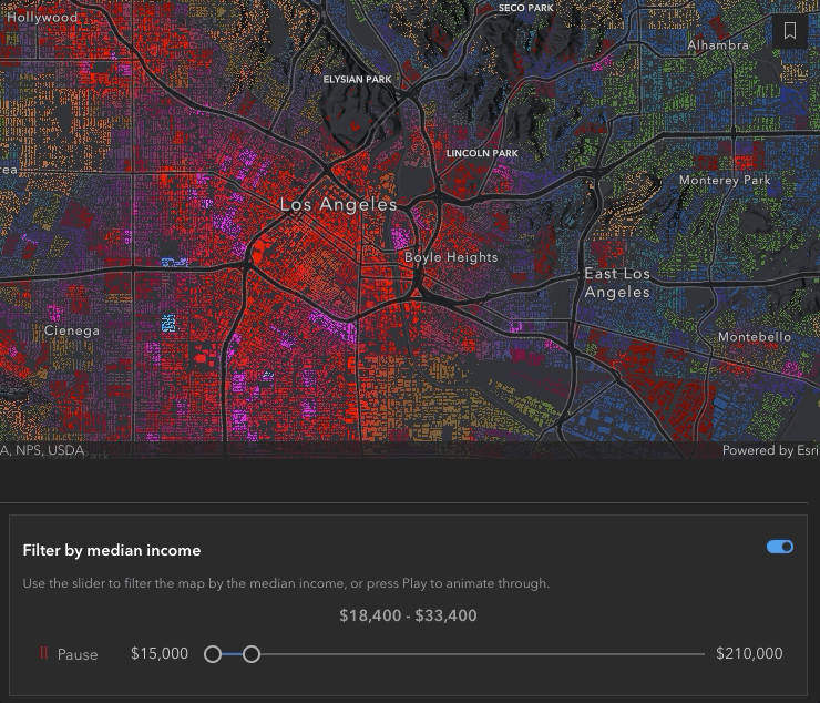
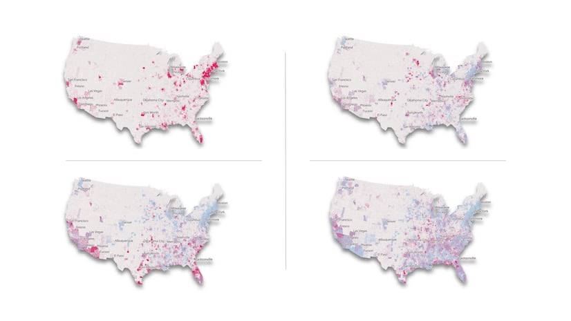
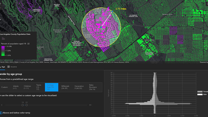
Data filter animations don’t always have to be done by time – you can also create an animation by filtering the attributes of a layer. These kinds of animations can be useful when looking at election results, demographics, income, etc.
In the following example, we animate the median income in Los Angeles using layerView.effect. Effect allows you to emphasize or deemphasize features that satisfy a given filter. Unlike layerView.filter, with effect all available features are shown in the map, but an effect is applied to features that satisfy the filter.
Animating attributes
Animating attributes can be a useful way to add animations to a layer with fixed geometries or locations, such as maps showing administrative boundaries (countries, states, counties). To animate attributes in your layer, you will update the renderer on each animation frame or slider change.
Visual variable animation
In this type of animation, you would update the visual variable stops of the renderer on each animation frame or slider change while keeping the data variable fixed. In this type of visualization, you are only looking at a single field or column of interest in the table.

This example shows New York City building footprints visualized by their construction year with animations added to show when the building was built. A slider is set up to move through each year. In the year the building was constructed, the footprint will flash bright blue, then will gradually turn purple as the years continue so we can still see where these existing building footprints are located in the more recent years.
Let’s take a look at some code to see how this is done. The animate function (shown below) is called every time the slider updates, which updates the year value and passes that value to the setYear function. setYear updates some UI elements, but more importantly, updates the renderer based on the year value.
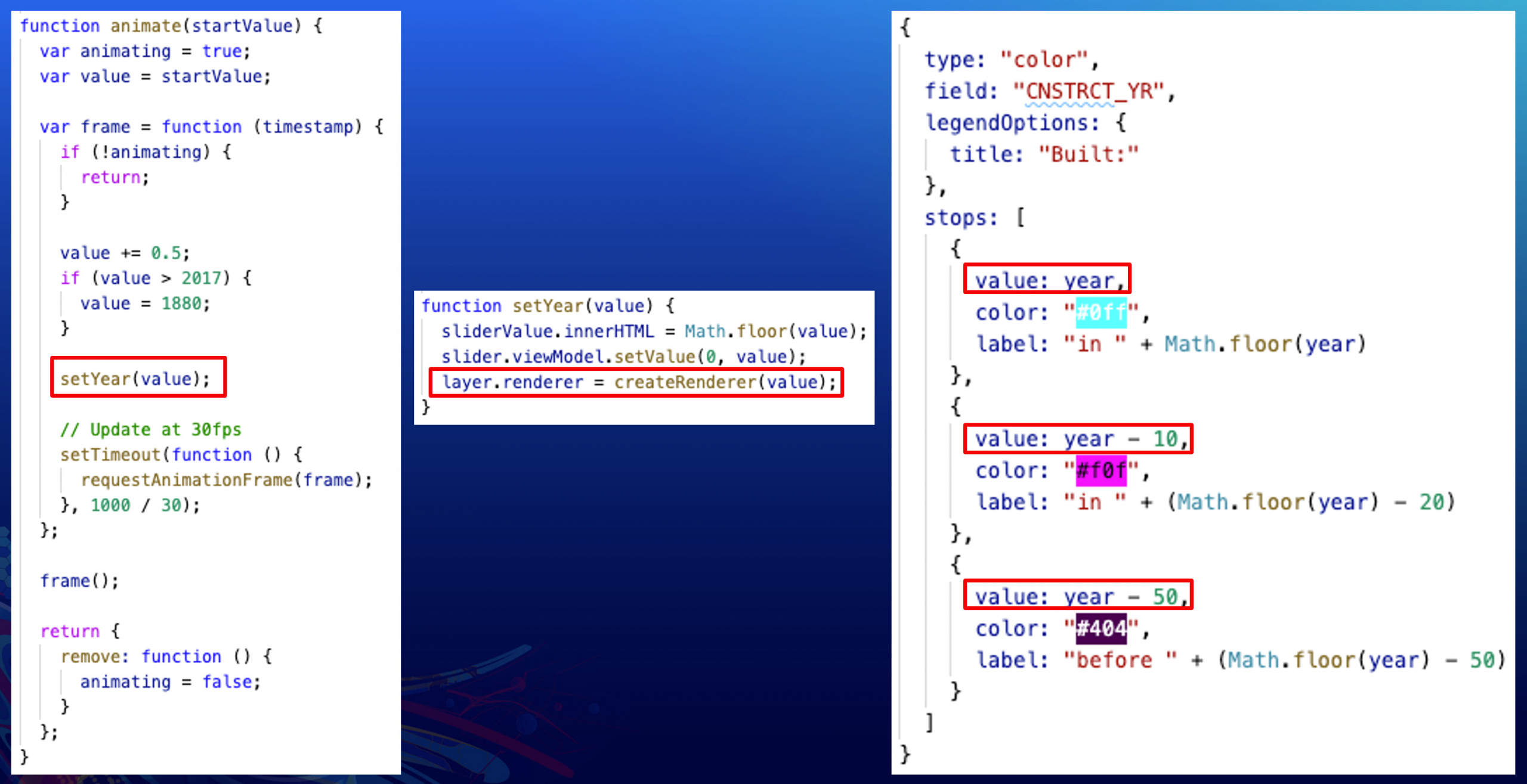
The createRenderer function updates the values of the stops in the visual variable, so buildings constructed during the current year on the slider are always shown in bright blue, buildings constructed 10 years prior will be shown in magenta, and 50 years prior will be shown in a dark purple. It’s important to note here that only the values of the stops are changing, the colors of each stop stay constant, as does the data field.
Data variable animation
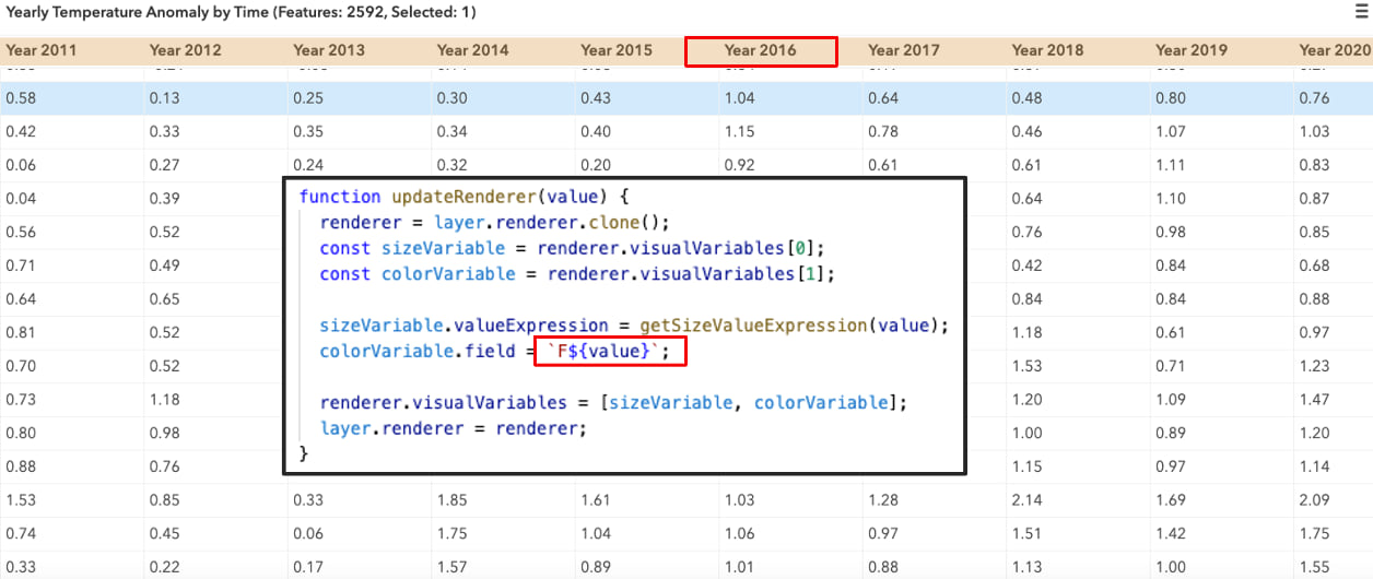
Similar to visual variable animation, data variable animation also uses fixed geometry or locations, but instead of updating the stop of a visual variable, you update the data variable you use to render the layer. This requires you to have a field for each attribute at each time interval. Depending on the amount of data, this may result in a very wide table. This doesn’t always have to be animated by time, it could also be another dimension (like depth).
Data variable animation by time
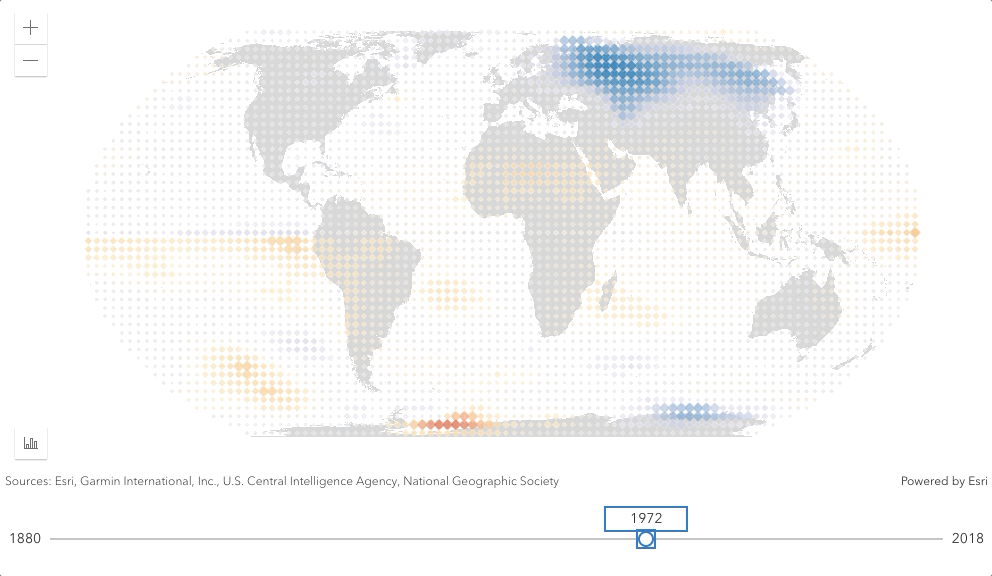
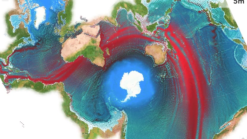
The following example shows global temperature anomalies over the past 100+ years. This layer contains one field for each year – from 1880 to 2018, and as the slider updates, we update the renderer to point to the field that matches the slider.
The resulting animation can be seen below. The color blue represents areas where it was cooler than normal and the color red shows areas where it was warmer than normal. As we animate through this data, we can see that what was once a cooler world is becoming warmer and warmer. Open the app by clicking on the GIF below and notice the performance as you update the slider – the renderer updates so quickly!
Looking for more advanced animations?
The JSAPI also provides support for more advanced animations through custom WebGL layers that can be extended from existing layer types. To get started and learn more about animations with custom WebGL layer views, check out this sample.
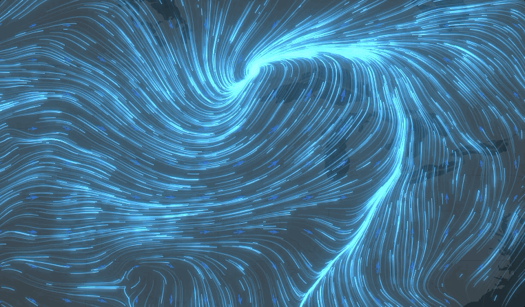
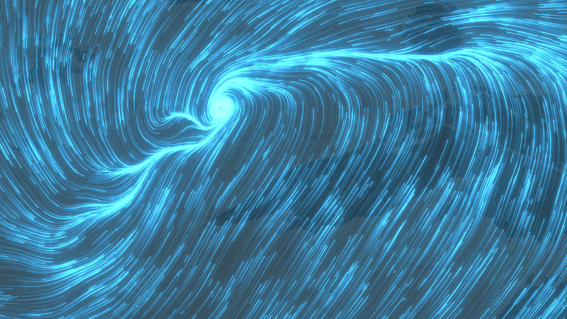
For more of a deep dive into animating data with a custom layer view, my colleague Dario D’Amico wrote a detailed blog post about visualizing and animating flow with a custom WebGL layer. The result is pretty stunning. Check it out!


Article Discussion: