In the June 2018 ArcGIS Online release, you can now explore possible relationships between two attributes within your data by using the new Relationship mapping style. This style is an easy way to explore if two different patterns are happening in the same places, or if they are geographically separate patterns.
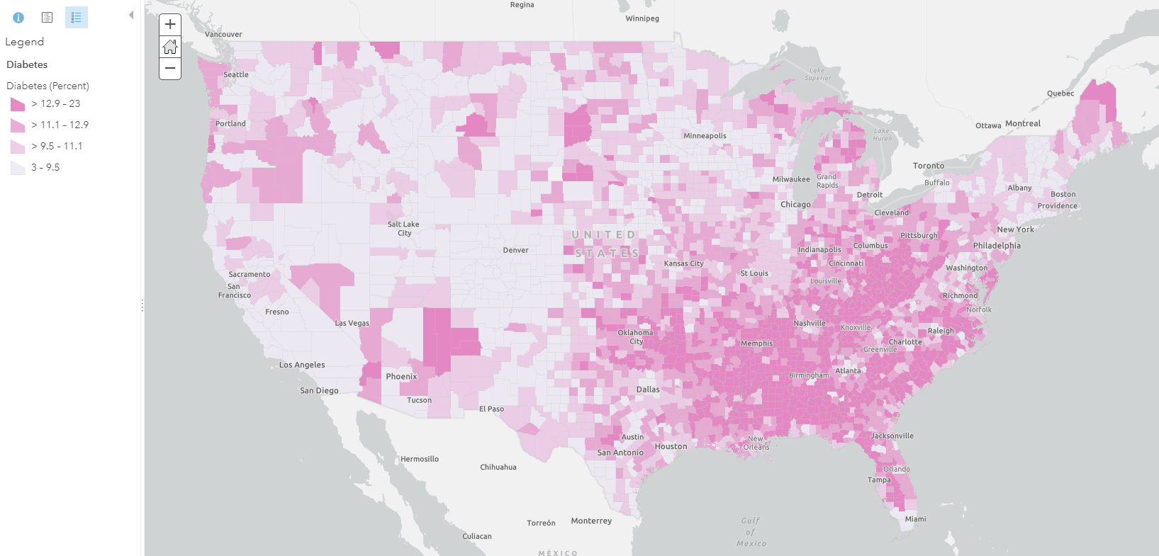
To help introduce this mapping style, I’ll show you the building blocks of a relationship map. For example, here is classic thematic choropleth map showing the percentage of the adult population who has diabetes in the US (according to the Center for Disease Control and Prevention). This data is from the Behavioral Risk Factor Surveillance System, available as a layer within the ArcGIS Living Atlas of the World.
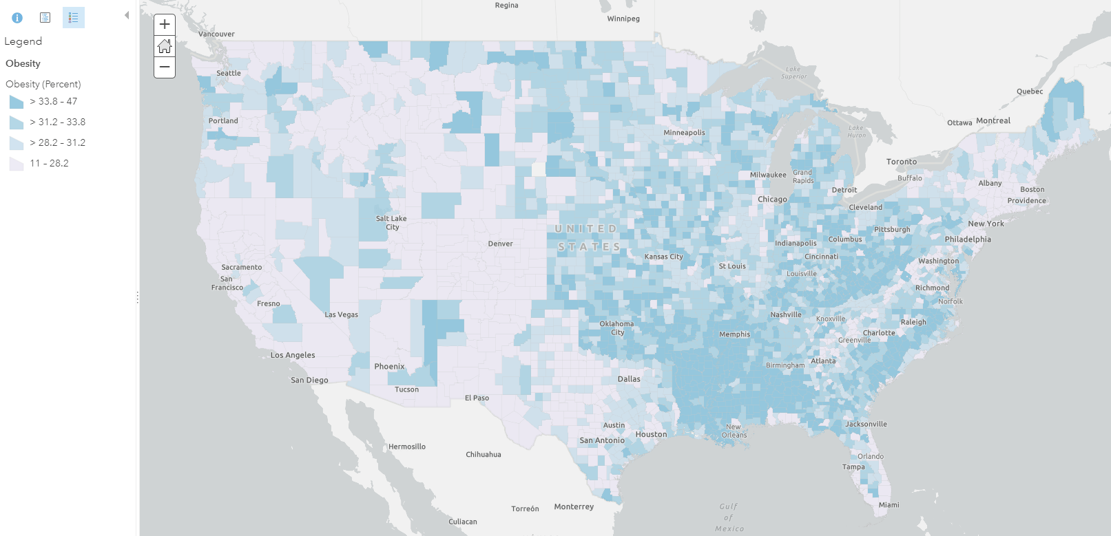
Below, we see another thematic choropleth map showing the percent of the adult population surveyed as obese by the CDC:
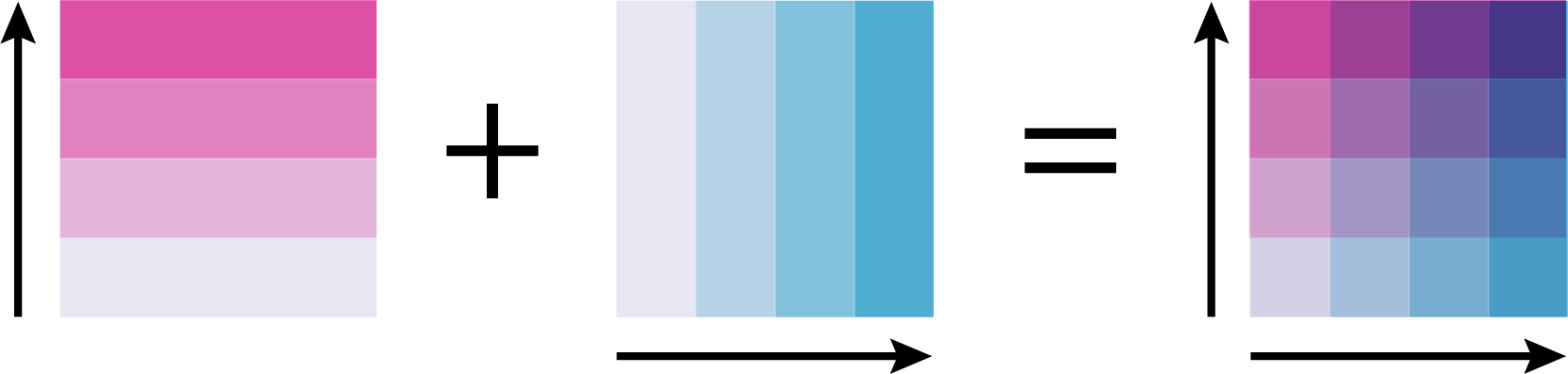
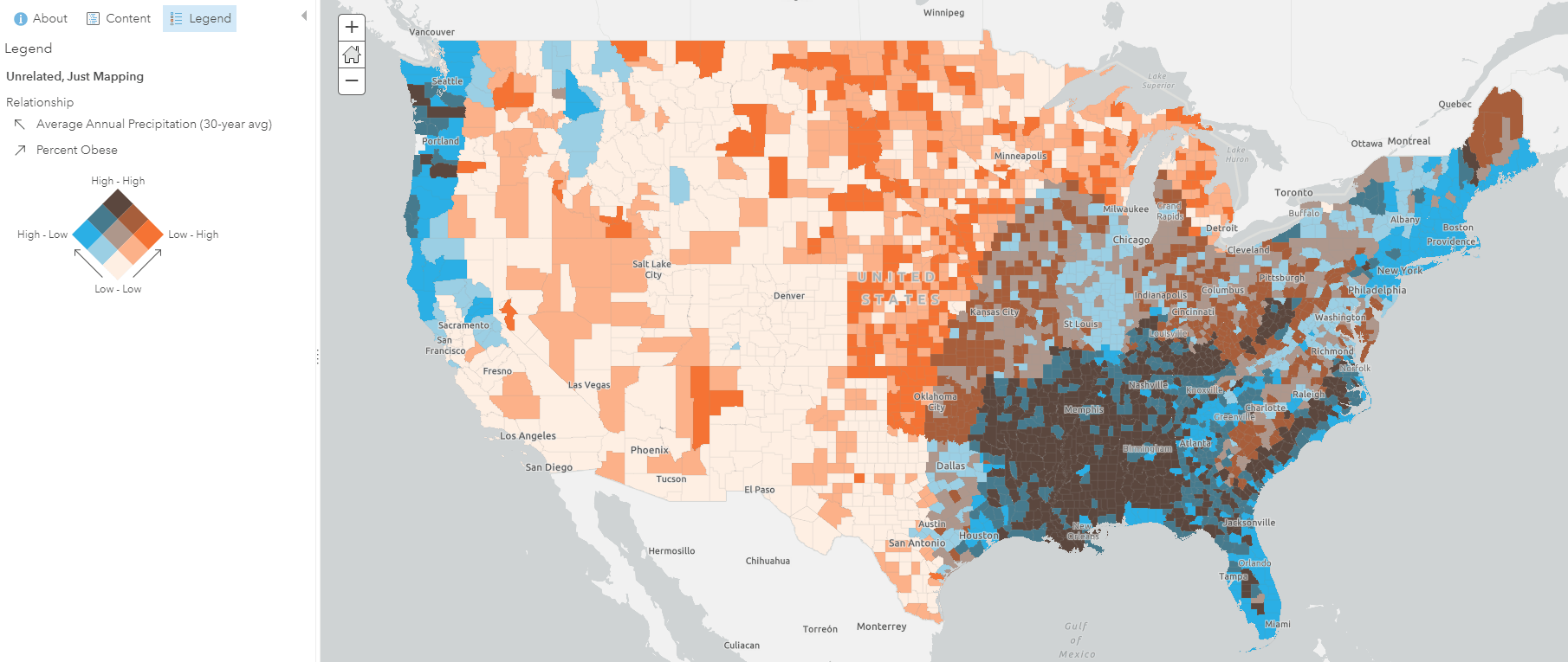
At a glance, these patterns look similar, but I want to see where the patterns are both high, both low, or occurring strongly on their own. Relationship mapping allows me to combine these two map patterns in order to explore where patterns overlap or diverge. So if we combine these two color ramps to show a combination of the patterns, we would get a grid and map like this:

From this map, we see that the corners of the legend tell us a great deal of information. The purple values show where high rates of both obesity and diabetes. The darkest pink values show where there is a high amount of diabetic population, but fewer people with obesity. The darkest blue values show where people are most likely to be obese, but less likely to have diabetes.
This mapping style, known as bivariate choropleth mapping, has been around for years. The two distinct color ramps, which are combined into a grid, are defined by Cindy Brewer as a sequential/sequential color ramp. Cindy describes these saying:
"Sequential/sequential schemes are the logical mix of all combinations of the colors in two sequential schemes. Thus, the schemes are based on two hues. The hue mixtures may form a third hue."
- Cindy Brewer, Color Use Guidelines for Mapping and Visualization
This color technique is shown within the graphic above. The two ramps essentially create a spectrum of colors that show where the patterns are high and low, on their own and together.
This mapping technique has always been possible within ArcGIS software, and there are many examples and blogs that already exist. Traditionally, these bivariate choropleth maps required time and customization before ever seeing if a pattern existed. Now, you can simply select the two topics you want to compare, and then select the “Relationship” mapping style. This reduces the amount of time to create these maps, and also makes it easy to quickly try new maps from your data. For example, if I want to see if there is a relationship between adults who smoke cigarettes and adults who drink excessively, relationship mapping will automatically give me this map:
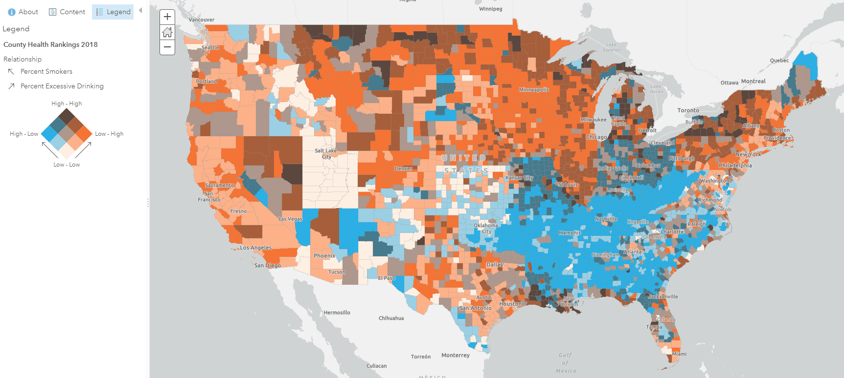
I can see that many counties either drink OR smoke. Within a few clicks, I was immediately able to learn something new about these two patterns by seeing them on the map.
It’s important to understand that a visual relationship does not always mean statistical causation. For example, If I map average rainfall against the percent of the population that is obese, the map does not show us that rainfall causes obesity in the United States. Relationship mapping simply shows where two patterns are happening (or not happening).
The relationship mapping style is valuable for helping us explore new patterns within our data. It transitions us from exploration to hypothesis but doesn’t necessarily imply causation. With this in mind, these maps are now so simple to make, that we encourage you to try and find new patterns using this map style.
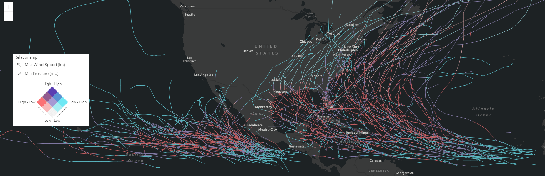
For example, here are a few interesting patterns that we found with relationship mapping:
This map shows how pressure and wind speed are related during the life of a hurricane. Hurricanes are strongest when they have low pressure and high wind speed. This map shows the areas where hurricanes are strongest in pink. When they are forming or if they go over land, you can see that the pressure is relatively higher than when the hurricane is at its peak (seen in blue), which is when hurricanes die out.
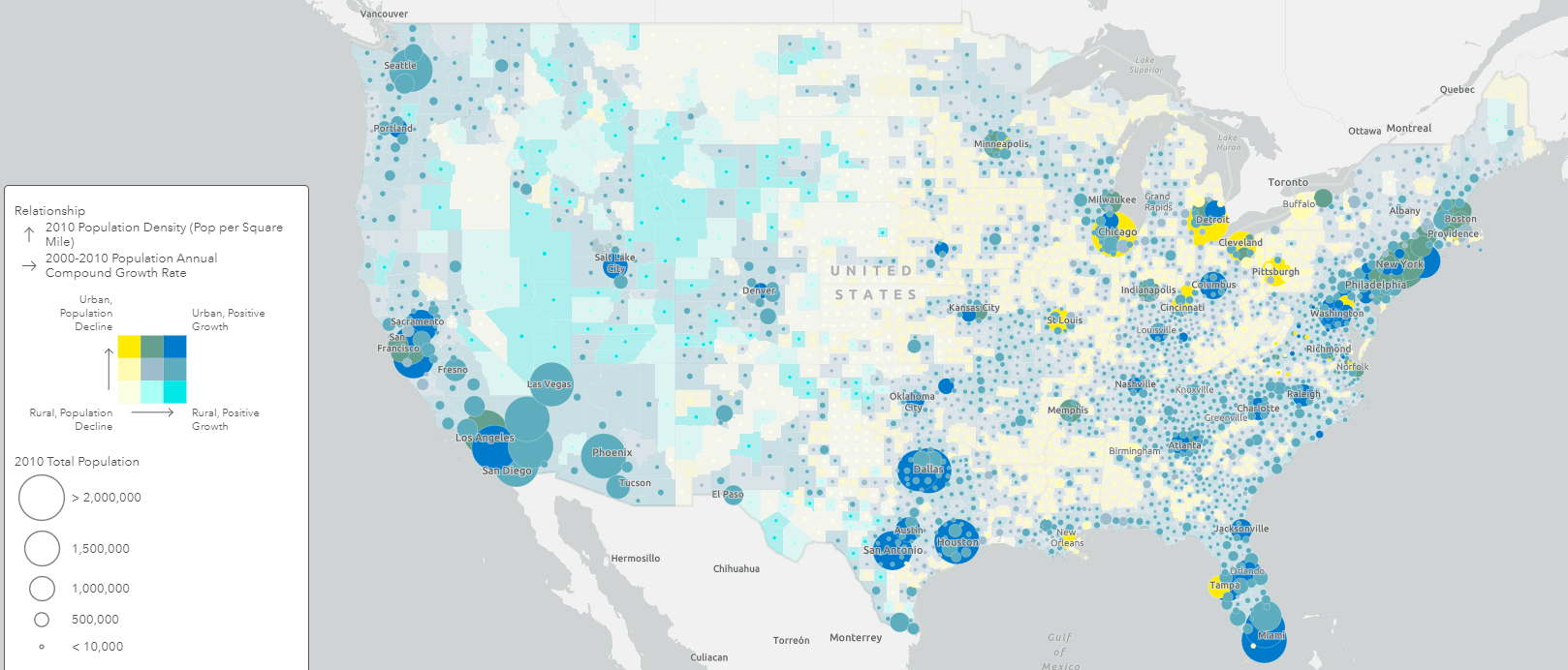
Another example shows a new spin on a similar map done by the US Census. This map uses relationship mapping to show where areas are urban/rural or have had growth/decline in population. The size of the symbols shows the total population within each US county.
Making these maps is now so simple, that there shouldn’t be anything stopping you from at least trying it out! Simply choose two attributes and select the Relationship mapping style. Easy as that!
There are a ton of ways to customize and change settings within these maps, which you can learn by visiting this blog. You can also access the following resources to get started:

Article Discussion: