Welcome to ArcGIS Maps for Microsoft Fabric. Using this tool, you can access spatial insights from your data directly in the Fabric environment.
Microsoft Fabric is changing the way businesses and organizations manage their data by providing a platform to unify the many data sources they use to manage their day-to-day operations. Now you can access the dynamic mapping capabilities of Map Viewer right from the workspace where you manage and analyze your data with ArcGIS Maps for Fabric. ArcGIS Maps for Fabric can help you optimize the process you use for accessing spatial insights from your data by reducing data silos and bringing spatial data visualization to the application you use to store and analyze your data.
What you can do with ArcGIS Maps for Fabric
ArcGIS Maps for Microsoft Fabric is a workload developed directly within the Microsoft Fabric environment. This application allows you to visualize spatial data by creating interactive, multiscale maps within Fabric. In particular, you can use ArcGIS Maps for Fabric to do the following:
- Harness insights from a variety of data unified in the Microsoft Fabric environment.
- Analyze trends with contextual layers like demographics and imagery from ArcGIS Living Atlas of the World.
- Support organizational decision-making through interactive mapping.
- Facilitate real-time stakeholder collaboration.
- Integrate spatial intelligence into existing business workflows.
Experience ArcGIS Maps for Fabric in action
Imagine you work for a small national retail chain that’s interested in adding a store. Using fictitious data, let’s see how ArcGIS Maps for Fabric can help us make that decision.
Open ArcGIS Maps for Fabric
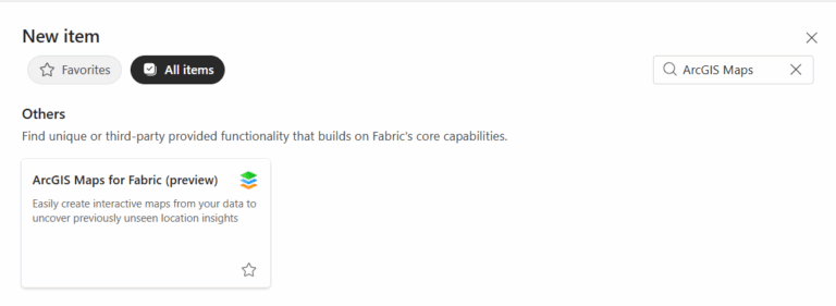
To find ArcGIS Maps for Fabric, go to your workspace in Fabric and select + New Item. From the New Item menu, scroll to the Others category or search for ArcGIS Maps in the Filter by item type search box and select ArcGIS Maps (preview).
Your company stores customer sales and location data in a lakehouse in Microsoft Fabric. Additionally, you have store location data hosted on ArcGIS Online. With ArcGIS Maps for Fabric, you can easily add these data to the same map, whether they are stored in your lakehouse in Fabric or your organization’s content in ArcGIS Online. If you’d like to get to work in ArcGIS Maps for Fabric, you can find the fictional sample data used in the maps below in our data repository. You can also add a variety of demographic layers from ArcGIS Living Atlas of the World. To access your content from ArcGIS Online and extend your experience with access to additional ArcGIS Living Atlas layers, click Sign in to ArcGIS from the Contents (dark) toolbar.
Visualize your data
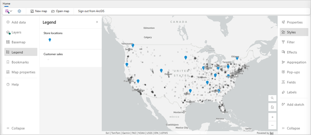
Once you add your data from your lakehouse and ArcGIS Online to ArcGIS Maps for Fabric, you can see the locations of your customers and your existing stores. To replicate this map, adjust the Symbol style for your store locations in the Styles pane on the Settings (light) toolbar to distinguish between your layers, displaying your customers as white dots and your existing stores as blue pins.
Choose a different basemap
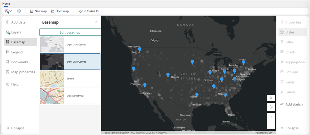
As you look at your map, you notice that some of the data isn’t showing up well against the light basemap. You can change your basemap to something with more contrast from the Basemap pane on the Contents (dark) toolbar. The map below features the Dark Gray Canvas. If you click Sign in to ArcGIS, you may also be able to choose from an extended menu of basemap options.
Aggregate customer point locations
It looks like there are customers from all over the United States, but their locations are dense and, at this scale, it’s difficult to see the overlapping points. In ArcGIS Maps for Fabric, you have access to a variety of mapping styles that can help you visualize and obtain insights from your data. These style options are specifically curated to the layer you’re mapping, so you don’t have to be a seasoned cartographer to make the best map for your data.
There are several style options to choose from to get a better idea of where your customers are located within this crowded data, including aggregating points and making a heat map.
First, you can choose the Clustering style in the Aggregation pane on the Settings (light) toolbar. From here, you can apply the style and adjust the style settings, such as Cluster radius and Size range. You can also change the color of your clusters to represent total sales from Year 1, by adding the Sales_FY1 attribute to the style options. With a few clicks, your points are joined into clusters with counts displayed as labels.
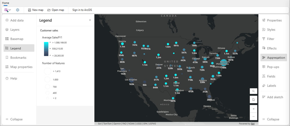
This map shows the number of point features represented by each cluster, and, as you can see in the Legend, the clusters vary in size based on those counts as well, with larger clusters representing more customers. It also represents year 1 sales using a color scale.
Create your heatmap
It seems that the areas of Dallas, Texas, and southern Florida could be good candidates for a new store, since there are no stores nearby and there are large customer clusters. However, to more clearly interpret that customer data, you can apply the Heat map style from the Styles pane on the Settings (light) toolbar.
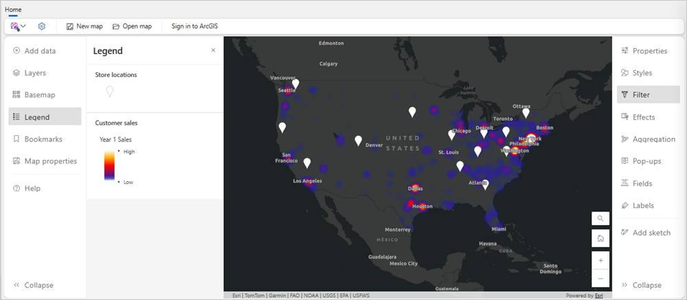
This heat map shows the density of customer locations and sales across the country weighted by sales from year 1. As you can see in the Legend, the high-sales areas are displayed in shades of white and yellow, while the lower-sales areas are displayed in gray and purple. The map shows that the customers in Texas have high sales from year 1 and they are from any stores. There are also a number of customers in Florida, but their sales total is lower. Based on this analysis, Texas might be the best fit.
Here, you’ve found two candidate locations for a new store and prioritized those locations based on the criteria of customer convenience and distance from other stores. With only a few clicks, this workflow provides you with the capability to visualize your data spatially and inform important decisions for your business. After you save this map, you and other members of your company can quickly make the decision to place a new store in Texas, just outside of Dallas. Before you share your web map file, you can refine details to improve readability of your data. For example, you can rename the layers in your map to remove file extensions and increase understanding.
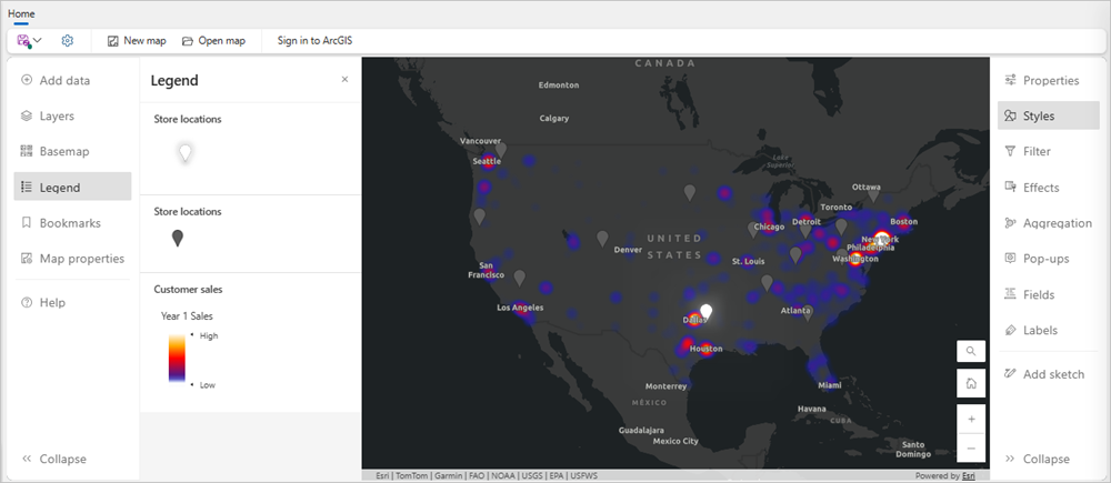
Add insights from GeoAnalytics to your workflow
Next, we’d like to evaluate the amount and types of resources we’re allocating to these retail stores based on changes in revenue over the last two years for an annual report.
Your customer data stored in Fabric includes the amount spent for the last two years. You need to match each customer to their closest store and summarize the total amount spent at each location in order to create this map for your report.
First, the ArcGIS GeoAnalytics for Microsoft Fabric has several command options to easily calculate the distance between the points in your two datasets. For example, the ST_GeodesicDistance function will calculate the distance between each of your customers and the nearest store. Read more about this tool and others in the documentation for ArcGIS GeoAnalytics for Microsoft Fabric. Once you’ve found the nearest store, aggregate your customer sales data for years 1 and 2, calculating the sum for each year by the nearest store location.
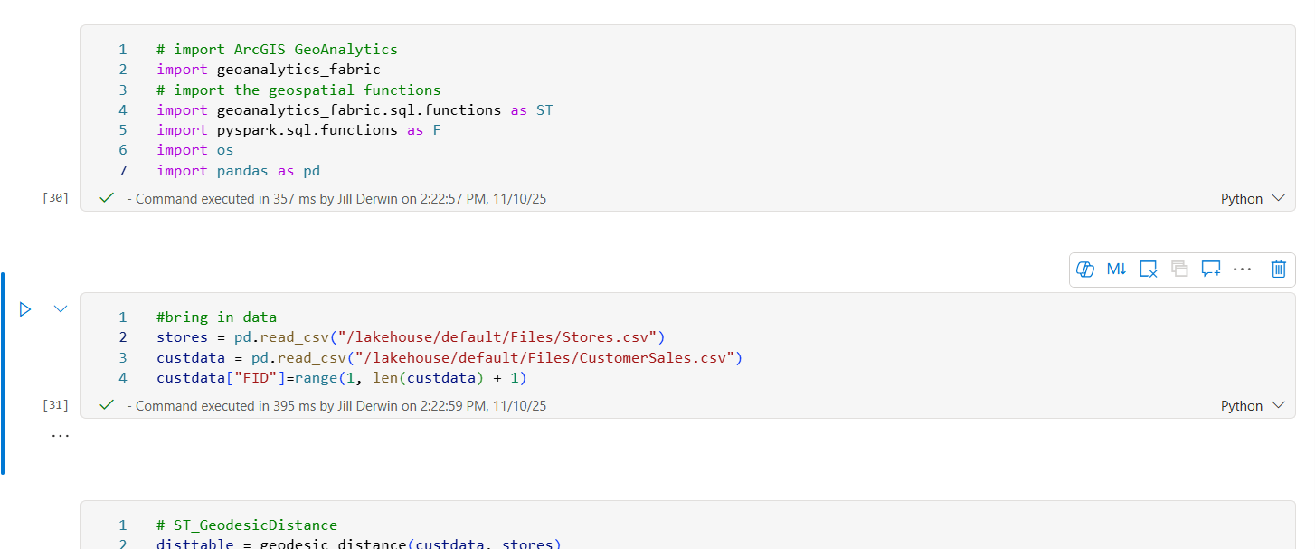
Compare your sales from years 1 and 2
Now that you have the information you need in your dataset, open ArcGIS Maps for Fabric and add this new data to your map. The Compare A to B style, found in the Styles pane on the Settings (light) toolbar, allows you to visualize the percentage increase or decrease in sales between years 1 and 2 in a single layer on your map. Add your year 1 and year 2 sales Fields to the Choose attributes section in the Styles pane in order to see the Compare A to B style option.
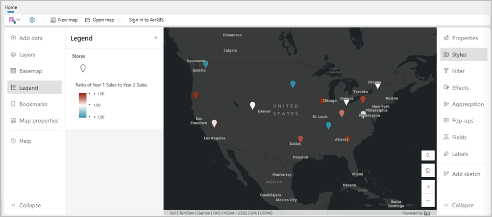
You can use the Relationship style to contextualize your map with the total range of sales. This style adjusts the color of each point including information about whether the sales were consistently high (High-High), increasing (Low-High), decreasing (High-Low), or consistently low (Low-Low).
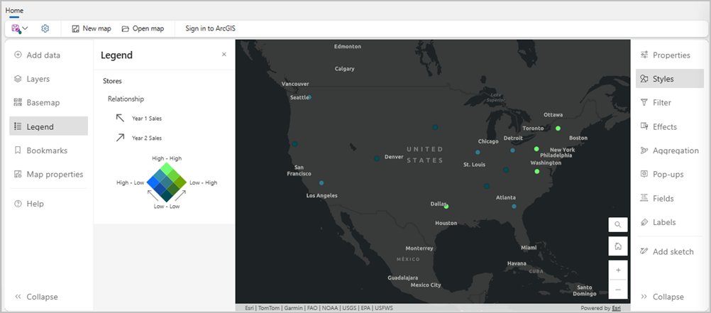
There are many more ways to visualize and interpret your data with ArcGIS Maps for Fabric. Explore the hundreds of ways you can use this tool to bring your data closer to decisions. Check out our Community Site, or follow us on ArcGIS Blog to learn more and find support.
Get started with ArcGIS Maps for Fabric
Learn how to get started with ArcGIS Maps for Fabric with our Quick Start Guide. You can also use fictional sample data from this data repository to make your first map.
This blog is part of a suite of support resources to get you started using ArcGIS Maps for Fabric. To engage with our community, access up-to-date information, or provide feedback on this product, see the information below:
- Join the ArcGIS Maps for Fabric community on Esri Community. Here, you can join discussions with other ArcGIS Maps for Fabric users and Esri staff, ask questions, or submit ideas for features you want to see in the future.
- For news and updates from the ArcGIS Maps for Fabric team, follow them in the ArcGIS Blog.
- Request to join our Early Adopter Community or check out our early adopter community resources.
- Contact our team to provide feedback.
Esri’s products and services
To learn more, check out these other resources:
- Access more detailed documentation about workflows that are shared between ArcGIS Maps for Fabric and Map Viewer for ArcGIS Online. For example, learn how to organize layers, set transparency and visible range, or apply filters.
- Learn more about Esri’s partnerships with Microsoft:
- Contact Esri Technical Support for technical issues or Esri Sales for licensing questions.
Article Discussion: