Whether you’re reviewing requests for service, tracking inspections, or looking at upcoming projects, dates are often at the heart of your GIS data. That’s why we’re excited to introduce a new way to interact with temporal data in ArcGIS Dashboards: a slider option for the date selector.
This enhancement brings a more intuitive and interactive experience to temporal filtering—making it easier than ever to explore your data.

Why a slider?
A traditional date selector—like defined options or a calendar picker—is great for relative date filtering and precision. However, it is not in sync with the underlying data and does not support quick comparison across periods. That’s where the slider comes in.
With the new slider option, dashboard authors can now configure a horizontal slider that allows users to:
- Drag to select a specific date or date range where your data resides
- Filter connected elements like maps, charts, and indicators as you move
- Quickly scan through time to spot patterns or anomalies
- Compare key metrics across evaluation periods
It is a natural way to explore data—especially when you’re not sure exactly what you’re looking for, but you know when it might have happened.
Key Features
Here’s what you can expect from the new slider-based date selector:
- Single handle or two handles
Choose whether users can select a single period in time or a start and end period. - Specific resolution
Define the granularity of the slider—hour, day, month, or year. - Immediate filtering
As the user moves the slider, all targeted dashboard elements update, keeping the experience fluid and responsive. - Data-aware limits
The slider limits can be data-derived, so selections are limited to dates within your dataset’s range. - Label display
A floating label shows the selected date(s) as the slider moves, providing immediate feedback.
Sliders in action
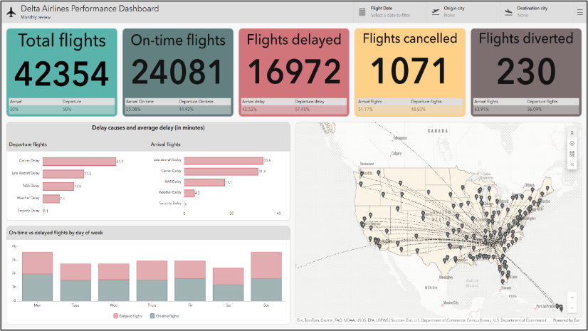
Consider a Department of Transportation dashboard that tracks emergency traffic signal outages. Each month, managers review activity metrics—such as outage counts and response volume—alongside performance metrics like handling time and service level compliance. With a muted visual theme, the dashboard highlights key insights such as significant percentage changes and whether targets are being met.
Previously, users had to scroll through a dropdown list to compare months, which slowed exploration and introduced risk: a static list of months could fall out of sync with the data, and authors had to manually update it as new data arrived.

By configuring the Date Selector Slider with a monthly resolution, this dashboard now offers a fluid and intuitive way to explore the time-based data. Users can drag the slider to move across months, instantly updating connected charts and indicators. This enables rapid comparison of performance periods, helping managers spot anomalies, seasonal patterns, or emerging issues—without breaking focus.

The slider’s data-aware limits ensure users only select valid dates, and its immediate filtering keeps the experience responsive and engaging. For DOT teams, this means faster insights, reduced authoring overhead, and a dashboard that better supports operational decision-making.
What about animation?
While the new slider enhances manual time exploration, animation and playback support will come with future support for the map’s native time slider as a map tool. This means you’ll be able to animate time-enabled layers directly within the map element to see environmental conditions change over time.
Try it out
The date selector slider is available in the latest release of ArcGIS Dashboards. To get started:
- Add a Date selector element to your dashboard.
- Choose the Date picker mode.
- Change to the Slider display type.
- Choose Limits from Statistic and pick a layer and date field.
- Configure Filter actions—and you’re ready to go.

You can also try out the dashboard shown above or make a copy to see how it was made.
Conclusion
This new slider option is all about making temporal data more accessible and engaging. Whether you’re building dashboards for internal teams or public audiences, it gives users a smoother, more intuitive way to explore the data—one moment at a time.
Have a use case? We’d love to hear how you use the new slider in your dashboards. Share with #arcgisdashboards. Also, learn about other new features in the October 2025 release.

Article Discussion: