Whether you’re building your first dashboard or refining an existing one, the June 2026 update of ArcGIS Dashboards is designed to help you move faster, communicate more clearly, and trust what you see.
This update focuses on making dashboards easier to use in everyday workflows, while ensuring everything you’ve already built continues to work as expected.
Key Features:
- A better experience from the start
- Interactions that make sense the first time
- Clearer dashboards at a glance
- Turn dashboards into storytelling tools
- Built for global audiences and broader access
- Everything you’ve built still works
- Start exploring what’s new

A better experience from the start
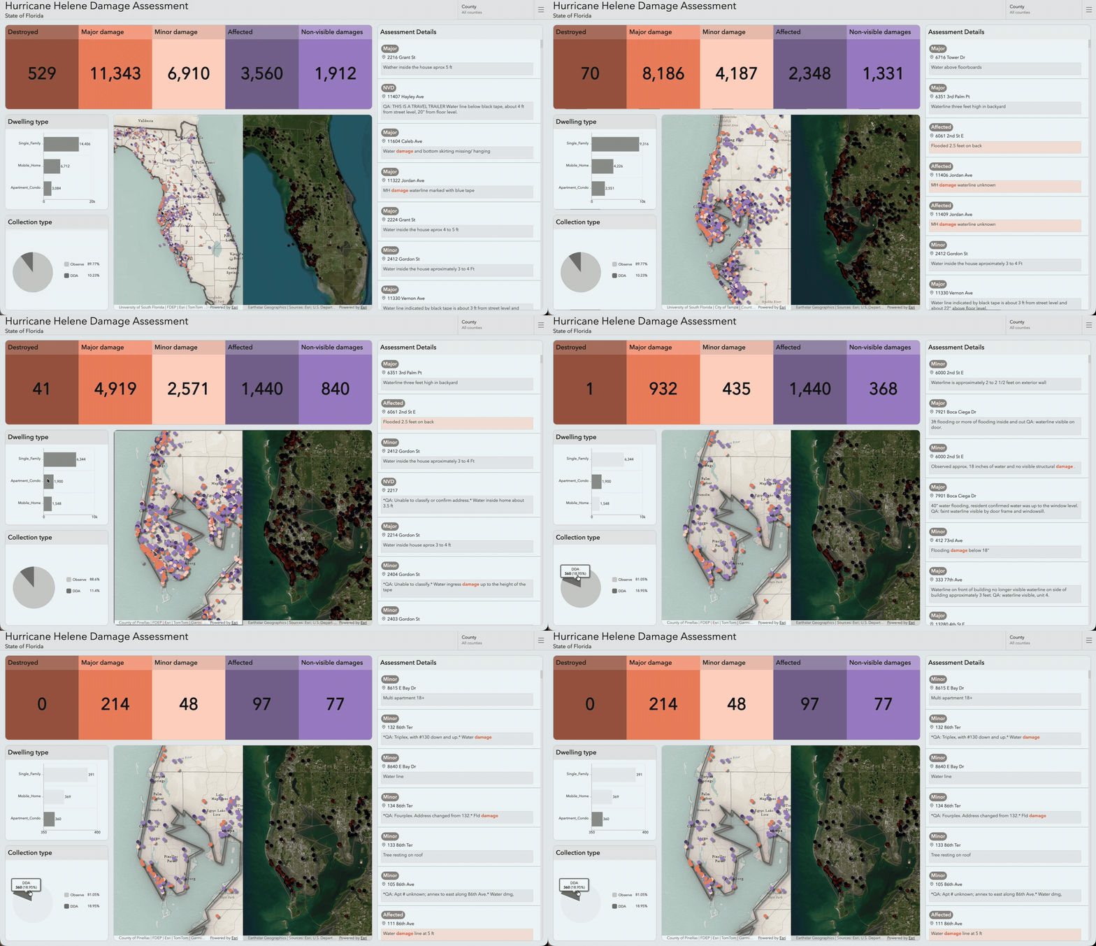
If you’re new to ArcGIS Dashboards, getting started is more straightforward. Dashboards load cleanly, interactions behave as expected, and elements stay in sync as you explore your data.
For existing users, the difference is immediate: dashboards feel faster, more stable, and more consistent, without requiring any rework.
Behind the scenes, performance improvements help dashboards scale more reliably, even under heavier usage.

Interactions that make sense the first time
Getting comfortable with dashboards is now easier.
Across the experience, interactions follow shared ArcGIS patterns. Whether you’re working with lists, tables, indicators, or details, controls behave in familiar and predictable ways, reducing the amount you need to learn up front.
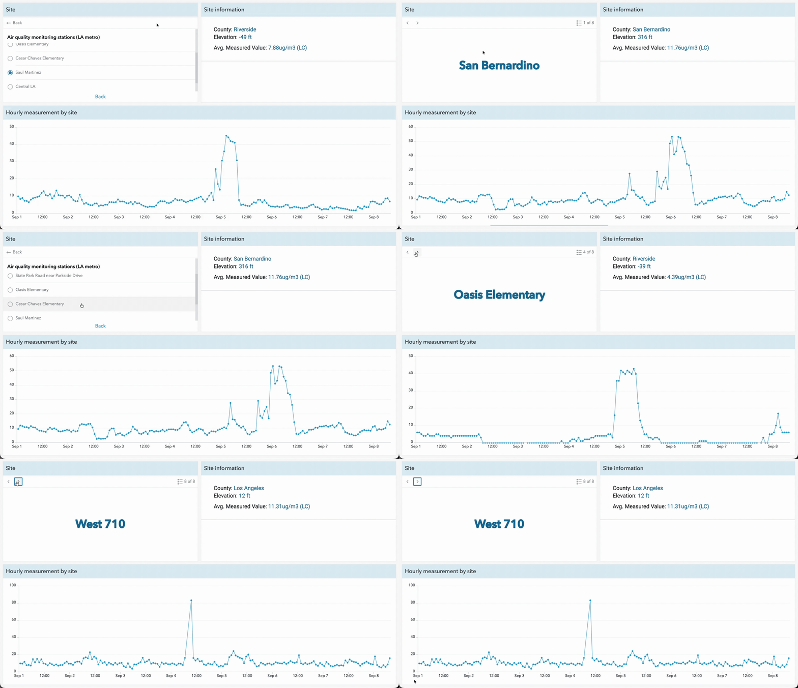
Pagination is now unified across feature-based elements, making it easier to move between records and jump directly to the information you need.
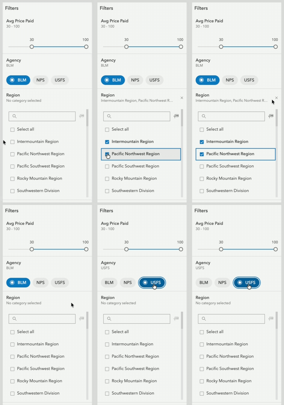
Selectors have also been simplified and clarified:
- A built-in unselected state clearly indicates when no filter is applied
- Authors can explicitly define whether a selection is required
- Date selectors now focus on a single purpose, either precise date selection or relative filtering
For new users, this means a shorter learning curve.
For existing users, it means fewer inconsistencies and more predictable behavior.
Clearer dashboards at a glance
Dashboards are designed to be understood quickly, and this release improves how information is presented.
Indicators now scale text more consistently, making it easier to compare values and maintain a clear visual hierarchy across your dashboard.
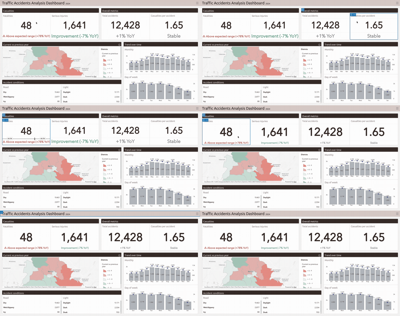
System messages such as “No Data” or “Selection Required” have also been redesigned to provide clearer, more actionable guidance using a consistent structure.
These changes make dashboards easier to scan and interpret more quickly, especially in operational environments.
Turn dashboards into storytelling tools
Dashboards are not just for monitoring; they’re also for explaining what’s happening.
If you’re new to ArcGIS Dashboards, it’s now easier to combine context and data in a single place. The Rich Text element can include live data from layers, maps, or Arcade expressions and update automatically as data changes.
Learn more in THIS BLOG by Rocky Jia!
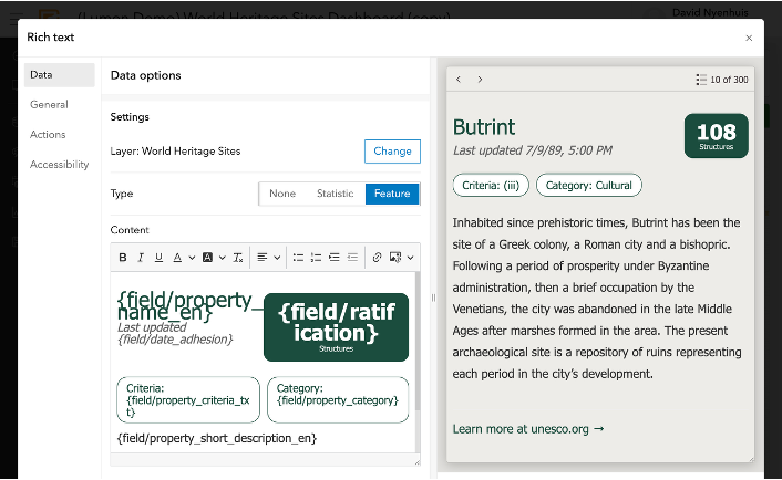
At the same time, the Details element now supports related records, allowing users to move from a selected feature into associated information without adding extra visualizations.
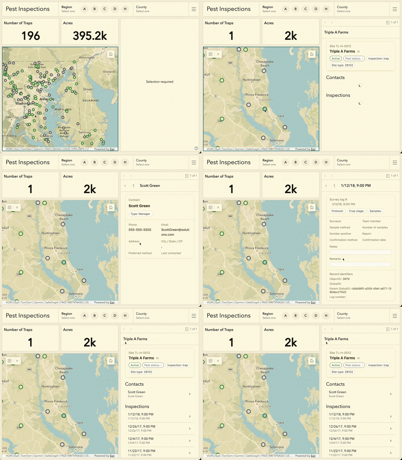
For existing users, these changes expand how dashboards communicate. You can pair live metrics with narrative context, allowing users to explore connected information in-line, all within the same experience.
Together, these updates make it easier to explain what is happening, not just display it.
Built for global audiences and broader access
Dashboards are easier to use across different audiences, regions, and accessibility needs.
Authors can define layout direction from left-to-right, right-to-left, or based on viewer settings, so dashboards align with language and regional expectations.
Learn more in THIS BLOG by Olga Serebryannaya!
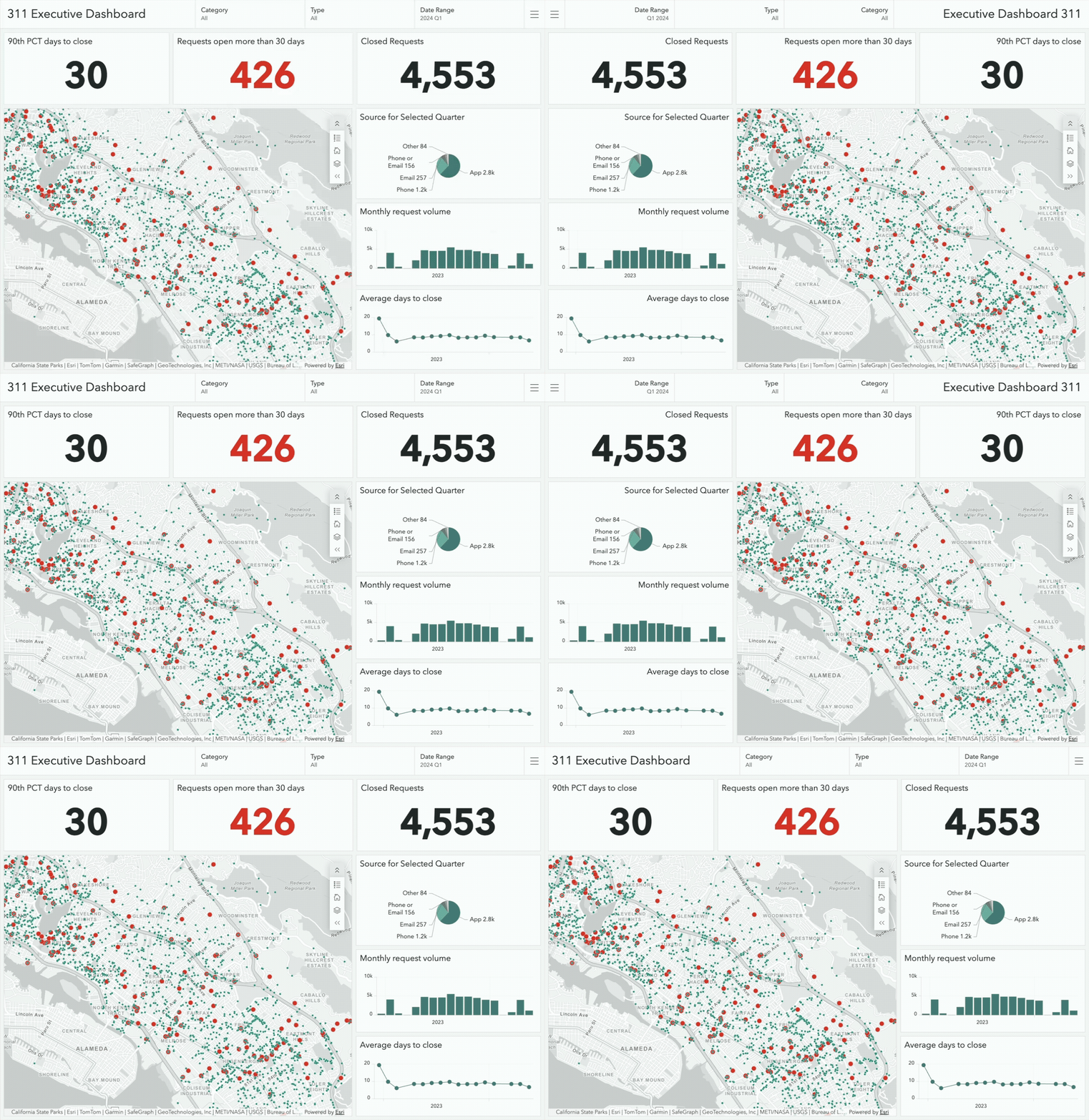
More consistent system messaging and interaction patterns also improve accessibility and make dashboards easier to use with assistive technologies.
For new users, this ensures dashboards behave as expected in their environment.
For existing users, it brings greater consistency across teams and use cases.
Everything you’ve built still works
For existing users, your current dashboards continue to work as expected.
This update improves the experience without requiring you to start over. Updates to selectors, messaging, and interactions are designed to preserve existing behavior while making dashboards clearer and more predictable moving forward.
Start exploring what’s new
Whether you’re just getting started or managing a large set of dashboards, this update helps you work more efficiently and communicate more effectively.
Explore the updates in your own dashboards and see how a more consistent, modern foundation makes it easier to go from data to insight.
For more information on the latest enhancements, explore the product release notes. We also encourage you to join the Esri Community to connect with other users, ask questions, and access resources that can help you get the most out of ArcGIS Dashboards.

Thank you for the continued updates. The simplified selector unfortunately breaks a layer toggle workaround that people were using, where you set OID 0 for OFF, and anything else is ON. There’s now no condition for else in the selector. A clean layer toggle element was nice to have instead of the in-map tool button.
Hi Martin. Thanks for continuing to develop ArcGIS Dashboards, they are a powerful tool in our organisation. However, the latest update has a pretty severe UX impact on some of our public facing dashboard – please see this idea I have just raised – https://community.esri.com/t5/arcgis-dashboards-ideas/reinstate-the-ability-to-add-dynamic-text-and-html/idi-p/1711492. Essentially you have no removed the ability to fully customise the no data and no selection messages. Please could these be reinstated as soon as possible? Thank you.
Thanks for the feedback Johnny and Alfie!
Please stay tuned for a blog on how the June 2026 selector updates give dashboard authors more explicit control over filtering behavior while making dashboard interactions easier for viewers to understand. By clarifying how selector states work and aligning date selectors with specific use cases, these changes support more intentional dashboard design and help organizations create dashboards that are easier to maintain, govern, and evolve over time.
Related records aren’t loading in dashboards in the popup or details tab. They load just fine in the map, but spin forever and don’t load in the dashboard.
Jacki, thank you for bringing this to our attention. We recommend contacting Esri Technical Support and having a support case logged as soon as possible so the team can investigate further.
You can contact Esri Technical Support through the following resources:
https://support.esri.com
https://support.esri.com/en-us/contact
https://my.esri.com
Once a case has been created, please share the case number with us so we can help track progress and coordinate with the appropriate teams if needed.
I completely agree with this. There is no way to allow users to show all data for a single selection without having to provide additional messages to the users. Definitely not as clean as it was.
I was responding to the comment posted on June 30. It would help to have an obvious way to reset the single selection, such as a Reset button.