Smarter Data, Sharper Dashboards
ArcGIS Dashboards brings together maps, data, and visuals on a single screen, helping you monitor activity, identify trends, and make informed decisions at a glance.
The October 2025 update introduces several exciting enhancements, bug fixes, and performance improvements.
This blog post provides a detailed overview of the new features and enhancements available when creating or editing a dashboard in ArcGIS Online.
Let’s dive straight in!
____________
Data Source & Dependency Management
As dashboards become central to decision-making, the need for resilience and transparency in data connections has increased.
We are excited to introduce a new capability in ArcGIS Dashboards: Data Source & Dependency Management.
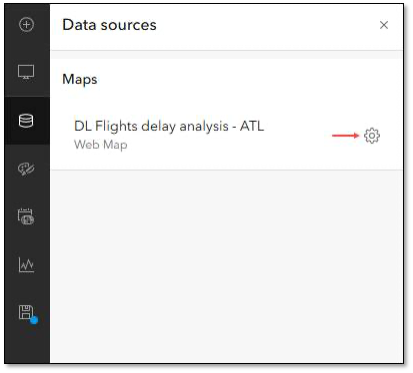
Dashboard authors can now use the Data sources panel in the action bar to access all data sources. This includes maps, layers, and data expressions used in the dashboard, all in one location.
Authors can quickly identify, replace, or repair broken data sources by reconnecting them to valid sources.
Check out THIS BLOG to learn more!

____________
Date Selector Slider
Whether you review service requests or track inspections, dates are central to your GIS data.
We are excited to introduce a new way to interact with temporal data in ArcGIS Dashboards.
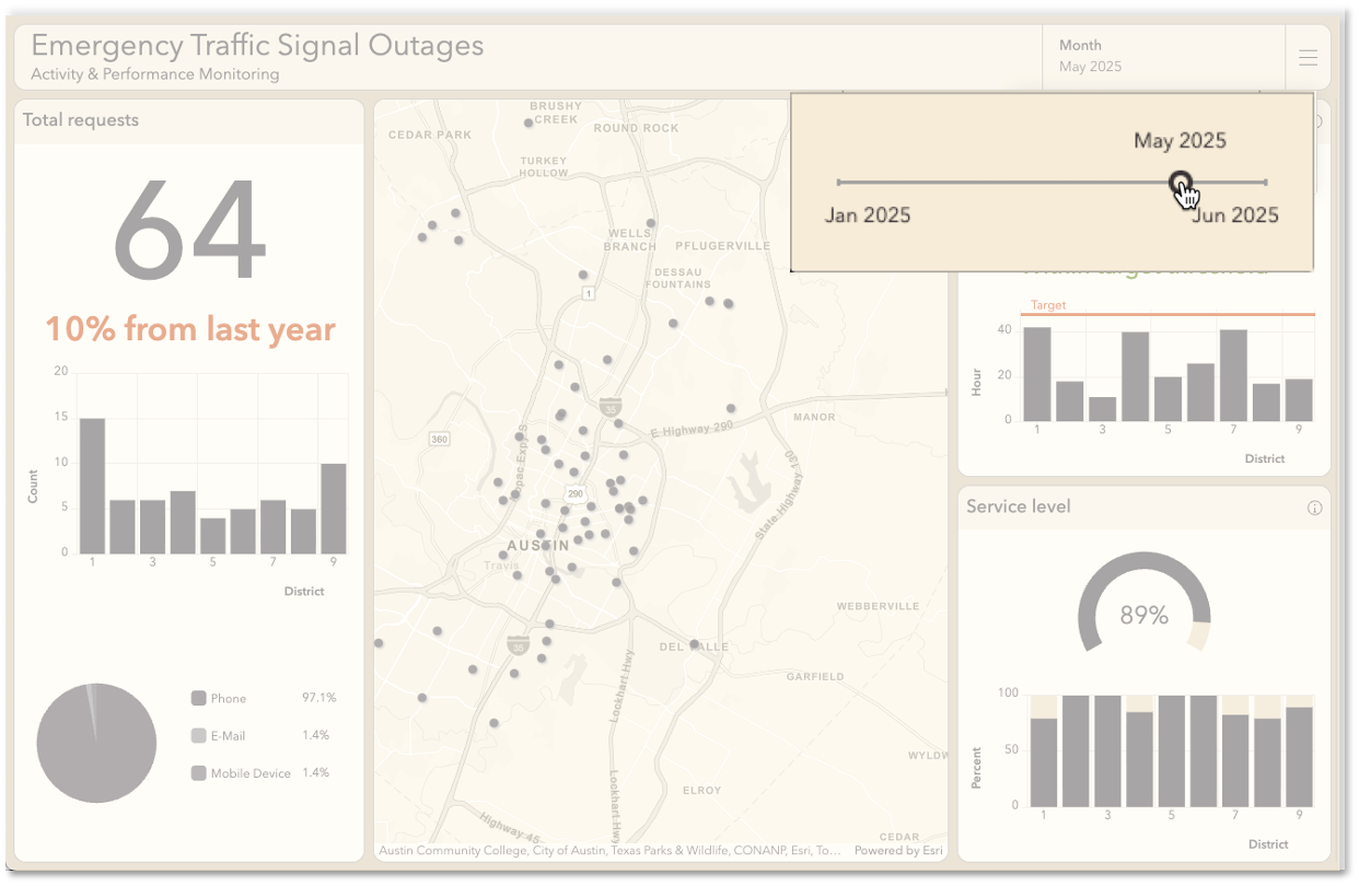
Now, there is a slider option for the date selector.
This enhancement allows users to filter and analyze temporal data with a sleek, draggable slider.
It is ideal for exploration, record lookup, and analysis over time.
Check out THIS BLOG to learn more!

____________
Date Axis Label Spacing
Dashboard authors can customize the spacing of date axis labels in time series charts.
They can use the Compact, Default, and Spacious options.
This enables them to enhance the readability of the chart. It also helps optimize screen real estate. They can add details to fill previously unproductive white space.
____________
Final Thoughts and Recommendations
We invite you to explore these updates and see how they can bring new life to your dashboards.
These tools can enhance your workflows, spark creative ways to visualize data, and help you get more from every project.
The path to more powerful dashboards starts today. Dive in and discover how these enhancements can elevate your experience.
And, for a more in-depth look at What’s New in ArcGIS Online at this release (October 2025), check out THIS BLOG.


Commenting is not enabled for this article.