Spring is here and so is the March 2022 update of ArcGIS Dashboards. Last update, we introduced a new user interface, with the goal of making dashboard layouts easier to manage. With this update, we’ve added a new way of adding elements directly to your dashboard’s layout, intuitive action configuration, and other enhancements to make authoring dashboards even better. We also have some important product announcements to share with you.
Authoring user interface
The first thing you will notice when you next open ArcGIS Dashboards, is more updates to the authoring experience. Last update, dashboard level configuration was updated, and with this update, you will see similar enhancements in the element configuration. All the configuration options for your elements are still there and in their same tabs, but you will now see a more unified and common feel between element and dashboard configuration, and the rest of ArcGIS.
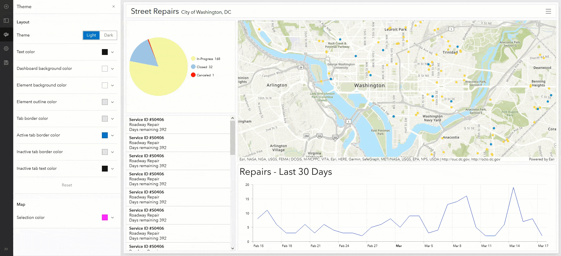
Dashboard theme settings are now available directly from the toolbar. You can click the theme button to open the new Theme pane, and make changes to your dashboard’s colors and theme while still previewing your dashboard.
For data-drive elements, we have also enhanced the element preview area. As you’re configuring your element, no matter which tab you are in, you can now expand and collapse the data table to help you make more informed configuration choices. With the data table expanded, you can view the data that is powering your element while simultaneously seeing a preview of your element’s configuration.

Color picker
The color picker has also been enhanced to make choosing the right colors for your dashboard and elements easier. The color picker now includes the ability to save custom colors so that you can easily use them elsewhere in your dashboard.

Action configuration
For elements that support actions, the actions configuration has been enhanced to be more intuitive. Rather than adding actions and targets one by one, you are now presented with all possible actions and targets at once. From the available actions, you can enable the ones you want quickly and easily.

To better identify and manage your actions, the configuration window also displays an icon when the target is based on the same data source as the source element. Additionally, you can see the number of active targets for each action.
Dashboard layout
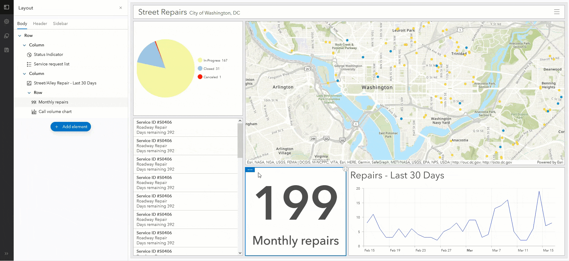
Last update, we introduced a layout panel that made it easier to see and manage the layout of your dashboard. With this update, we’ve enhanced the layout experience even more. You can now add elements directly where you want them on your dashboard, including directly into groups or tabbed views.
Using this new add element ability, you no longer need to add an element then drag it to the spot you want it, meaning you are never messing with your existing layout.
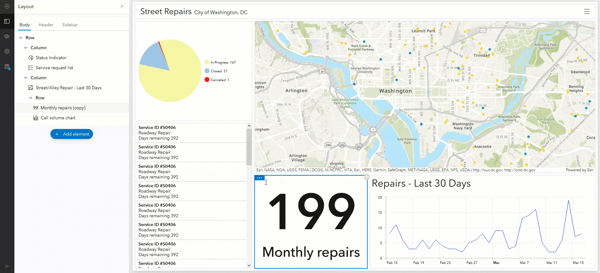
Additionally, we have updated the way duplicating elements impacts your dashboard layout. Previously, when you duplicated an element, it would be added to the side of your dashboard as a new column.
Now, when you duplicate an element, it is added to the same row or column of the original element.
Serial charts
Sorting in multi-series serial charts has been improved. When a serial chart is based on grouped values with a split by, you can now sort the data points in each series in addition to the chart’s series. Sorting data points in each series ensures they display in a specific order and is reflected in the chart legend.


Table formatting
When you use advanced formatting for the table element, you now have two new properties you can return in your expressions:
- textColor – Set the text color for the cell.
- hoverText – Add text that appears when you hover over the values in a cell.
Product announcements
ArcGIS Dashboards Classic has moved to mature support and will be retiring with the November 2022 update of ArcGIS Online. All functionality of ArcGIS Dashboards Classic is supported in ArcGIS Dashboards, with the exception of the Follow Feature action. Dashboards that contain the Follow Feature action will still open in ArcGIS Dashboards but the action won’t be available.
For dashboards last updated in ArcGIS Dashboards Classic, it is strongly recommended that you open their data sources in Map Viewer and the dashboards in ArcGIS Dashboards to verify all functionality. Once verified, upgrade your dashboards by saving them.
Learn more about the retirement of ArcGIS Dashboards Classic
Esri and the ArcGIS Dashboards team recognize the importance of adhering to accessibility guidelines and standards for all users of our product, including users with disabilities. An Accessibility Conformance Report for ArcGIS Dashboards is now available that describes the conformance level for accessibility features.


Article Discussion: