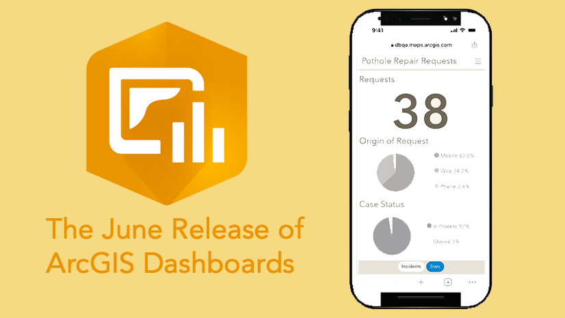
If you’ve used ArcGIS Dashboards for some time, you may have created a “mobile” dashboard for your users. This would have involved creating two dashboards and embedding them under one URL. With the June 2023 update, we’ve made it easy to configure a single dashboard with different views that are optimized for both desktop and mobile devices. Mobile views are a carefully crafted display of your data that can be read and understood on a small screen when not at a desk. Interactivity is designed to be touch friendly, from filtering, to the map tool menus, to the layout of visualizations.

Dashboards are about important information at a glance. A mobile view of a dashboard is not about providing a comprehensive mobile equivalent to its desktop counterpart. If a mobile dashboard has too many visuals, it is likely not focused enough.
A mobile view should do the following:
- Provide only what is needed on-the-go (high-level info)
- Be kept as simple as possible (e.g., minimal map tools, or perhaps a map isn’t needed)
- Consider alternative data visualizations to convey the information in a constrained space
Creating a mobile view
To create a mobile view, open the dashboard’s View pane and click on the Add mobile view button.

Once created, add elements to it or copy over elements from your desktop view that are necessary for information on-the-go. When you copy over elements from your desktop view, all the configuration options, except for actions, are carried over to your mobile view.

If your visualizations are too complicated for a mobile view, you can configure the element differently in a more optimal and space saving way. Configuring an element on your mobile view doesn’t change the configuration of the same element on the desktop view – and vice versa. On the other hand, if you make changes to an element on your desktop view that was copied over to your mobile view, you can choose to update the element on the mobile view to pick up those changes.
Making updates
If you copy elements over from your desktop view, it’s best to make any updates or changes in the desktop view. Once you make any changes, in the mobile view, you can then choose the Update option from the corresponding element’s menu to bring over the changes.

Design for mobile
Space is at a premium, so use discretion on what to include. As you add elements, you can move them around in the view’s layout.

Important information should be kept within view on load, but if additional supportive information is needed, you can include it behind another element by creating a stack.

If filtering options are needed, a drawer and a reset button can be added to the bottom of your mobile view. In the drawer you can allow the user to filter the data by adding selectors. You can choose to copy selectors from the desktop view, or add new ones.

When you copy over selectors from your desktop view, actions that were configured are not copied over, so you will need to reconfigure any desired actions.

Managing dashboards in ArcGIS Online
As you get into the process of adding mobile views to the dashboards you manage, it can be helpful to know which dashboards have and don’t have mobile views. To check without opening a dashboard, you can look at the dashboard item page under the Details section. Next to Dashboard views it will list either Desktop or Desktop, Mobile.

You can also use the following advanced search terms to see a list of dashboards without a mobile view on the Content page: type: 'dashboard' AND !typekeywords: 'Mobile'

Sharing
A single dashboard item contains both the desktop and mobile view. As such, the sharing level applies to both views. The optimal view will load for each viewer based on the screen size of their device. Be sure to test the dashboard on both an iPhone and Android devices to validate the mobile view before announcing its support to your users.

With both a desktop and mobile view of your dashboard, you are able to provide your users the flexibility of accessing important information on any device.
Creating a mobile view for your dashboard ensures that when your dashboard is opened on a mobile device, users are seeing the information they need. A dashboard’s mobile view should complement the desktop view rather than replace it. When creating your mobile view, follow best practices to ensure effective design and optimal performance.


Hello, I am very excited about this function! I am curious as to when actions are going to be available for the mobile components? I have a use-case where most users of the dashboard do not have access to a computer and they need the ability to interact with the application in a similar fashion as on desktop.
Thank you.
Hi Abigail. Thanks for the feedback. We are looking into adding support for actions as you noted.
Hi Abigail. All visual elements in mobile views now have the same action support as in desktop views.