ArcGIS Dashboards enables you to provide managers and executives real-time updates on people, services, assets, and events via a dashboard. A dashboard is composed of visual elements that present key information. Data can often be visualized in a variety of ways. However, some are more effective than others.
So, how do you choose the “right” visual element? In large part, it depends on what your dashboard viewer needs to know. Let’s look at some use cases that have come up over the past year and how we might improve the way the data is visualized.
Monitoring Progress of a Survey
Let’s say we are making a dashboard to assist a project manager to monitor the progress of a survey of utility poles. The manager wants to be able to answer a couple questions by glancing at the dashboard:
- How far along are we?
- Are we on schedule?
There are a total of 7,525 poles that need to be surveyed. To be done in 6 months, an average of 41 surveys must be completed per day.

The dashboard above represents an initial design for answering those questions. In the upper-left an indicator shows the current number of surveys that have been completed, addressing the first question above.

In addition to showing the current count of completed surveys, the indicator is using a reference statistic to provide context with the percent completion. Although informative and accurate, this indicator stresses the raw values. Alternatively, we could graphically show the current progress in relation to the goal with a progress gauge.

It is a visually quick and elegant way to display how far along the survey is.
In the lower-left of the dashboard is a serial chart showing the number of completed surveys per day for the last 14 days.

This chart is effective in providing a pulse on the last couple weeks. However, it doesn’t actually communicate whether the project is on schedule for being completed 6 months after the start date.
As stated above, as long as the project averages at least 41 surveys per day since the start, the project is on track. Let’s use an indicator and a bit of creativity to display the overall rate of progress for the project manager.
First, we have to get the number of surveys that have been completed since the start of the survey. Then, we have to get the number of days since the survey started. The overall rate is equal to the number completed divided by the number of days. We can do this through defining a Value and Reference in the indicator and displaying the ratio (value/reference).
For the indicator Value, use a count statistic and filter it to only surveys with a status of “complete”. For the Reference, we can’t directly query for the number of days since a date. But, we can query against some data we fabricate. We can publish a csv (as a feature layer) with one row per day spanning the project’s dates. For the indicator Reference, do a count statistic on this layer. Filter to get rows with dates on or before today and on or after the project start date. On the Indicator tab, use {ratio} in Middle Text to display the number of surveys completed divided by the number of days since the project started. This represents the overall rate of completion.

Now, the manager has an easy way to determine if the project is on track to be completed on time using the 41 surveys-per-day benchmark. The following is the updated dashboard.

Counting Events
Many dashboards monitor and summarize event-based data: for example, crimes, open pot-hole requests, emergency situations, completed inspections, etc. Indicator elements are often a great way to visualize how many events have occurred or currently need attention. Including an icon quickly communicates what that number represents.
I enjoy seeing the plethora of ways people creatively use indicators on dashboards posted on Twitter. The following dashboard, monitoring traffic incidents of various types, is similar to a dashboard I came across recently.

Indicators are used to display the count of 9 types of traffic incidents. The count is then broken down into severity types: critical and major. Although clever, I found it difficult to use. To find out the most prevalent type of incident, one has to scan the entire grid and compare numbers. There are also a fair amount of indicators with zero incidents, which don’t provide much value. These inefficiencies work against the goal of dashboard, which is to provide easy-to-read data for at-a-glance decision making.
I found that a bar chart (via the serial chart element) can visualize the data in a more effective and concise way. Consider whether your viewer really needs to know the breakdown of incident severity. If not, make the chart simple.

From the chart I can quickly see that the most prevalent incident type is construction and there are significantly more construction-related incidents than even the next in-line, road closures. I’ve used a logarithmic axis so that both the large counts and small counts can be rendered well and compared. Zero-count incidents do not appear on the chart
If knowing the severity level is important, you can split each category into the two series similarly done with the indicators by defining a split by field.

The grid-of-indicators concept is not bad per se. I’ve used it myself in a crime dashboard. However, be careful not to go overboard, and always consider whether you are better off with a trusty bar chart.
Monitoring Measurements
The health of an ecosystem in lakes and rivers is dependent on many variables. When some of those variables get out of normal ranges, they can have adverse effects. The following dashboard was created to monitor the health of various water bodies. Selecting a site from the list on the left provides a summary of three water quality attributes via indicators on the bottom. Let’s assess the effectiveness of how this data is visualized.

The three indicators are configured with conditional formatting such that when the attribute goes above a safe value, the indicator’s background color turns red.

If the intent is to simply indicate whether the value is acceptable or unacceptable, then they are effectively doing that. If, however, it is relevant to know where the value is within these ranges, then a meter gauge can provide that context.

With the meter gauge, the minimum and maximum provide the user with information of the range of possible values. Colored bands can be shown in the gauge to inform the viewer of acceptable and unacceptable ranges. The needle indicates where the current measurement falls within these ranges. This method of visualizing water quality data is simple, yet rich in information.
Filtering to Meaningful Sub-Areas
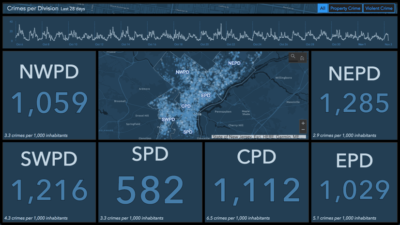
In many dashboards, it is useful to provide the user the ability to interactively filter visual elements spatially to a subset of their data. For example, in a crime dashboard it may be useful to see statistics for only a portion of the city at a time. One common technique for this is to spatially filter based on the current map extent.

In the dashboard above, as the viewer changes the map display, the data in the visual elements are constrained to the area within the map extent. This is done by configuring the map element. In the Map Actions tab, for the “map extent change” event, add target elements for the filter action.
Although effective for looking at a localized subset of your data, a map extent is fairly arbitrary. Also, there is no visual cue that this filtering is taking place (the red box in the image was added and does not appear in the dashboard).
An alternative technique is to filter to well known geographic boundaries using a category selector. The selector can be configured to have its data source be a polygon layer. In the Actions tab, add a filter action and choose the Spatial filtering method. Target your map layers and other elements as desired.

In the dashboard above, the viewer is initially presented with a summary of crimes for the whole city. Using the dropdown in the upper-right, they can choose a particular police division, a well-known and studied boundary, to constrain the visualizations to that area. The boundary, and only crimes within it, are displayed clearly to the viewer.
Summary
When thinking about how to visualize data, always go back to what the dashboard viewer needs to know. Let this validate your visualization or drive another iteration on it. If you need help, reach out to Esri Support or the GeoNet Community.
Perhaps what you need isn’t offered in dashboards yet. We, the dashboard team, encourage you to tell Esri Support or post your idea/request on the GeoNet Ideas site. You may also find that the embedded content element will allow you to bring in your needed visualization or functionality.
As always, we’d love to see what dashboards you’ve created! Please share your dashboard on Twitter or LinkedIn tagged with #OpsDashboard.


Commenting is not enabled for this article.