ArcGIS Dashboards enables you to use a variety of visual elements to see the status of people, services, assets, and events in real-time. Indicators in dashboards can provide essential information at a glance. With a few basic configurations, you can have a title and number on your indicator that communicate meaningful information to your audience. Sometimes, however, additional context is needed to aid in its effectiveness.
This article provides three techniques to add context to your indicators through reference values and conditional formatting.
- Apply situation-based styling
- Compare your metric to a baseline
- Normalize your metric
Each technique will be illustrated by taking an indicator and enhancing it. If you are just getting started with making dashboards, check out these posts on creating a real-time dashboard and configuring your first dashboard.
1. Apply Situation-Based Styling
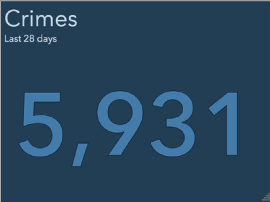
Let’s say we have an indicator on a dashboard showing information about recently reported crimes. The dashboard is used by a police chief and staff, and it is mounted on a wall in the department office. The purpose of the indicator is to inform them of recent violent crimes.

This indicator uses effective, attention-grabbing color and simple, informative text. However, over periods with no violent crimes, the indicator is unnecessarily prominent. Let’s use a reference and conditional formatting to change this.
In this case, a reference value can be thought of as a threshold. When combined with conditional formatting, you can style the indicator differently depending on whether your value is above or below the threshold.
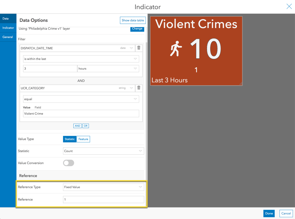
Step 1: Add a Reference
For the reference type, choose Fixed Value. Set the reference value equal to 1. We have, in a sense, defined a threshold of one violent crime. Next we’ll see what we can do with this “threshold”.
Step 2: Turn on Conditional Formatting
Conditional formatting allows us to render the indicator differently depending whether we are above or below the threshold we defined. In the Indicator tab, turn on conditional formatting.
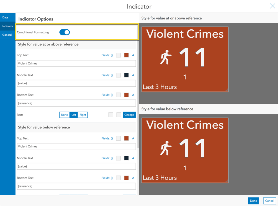
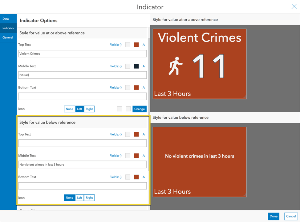
Step 3: Update Text and Color for “No Crime” Scenario
Now we have two previews that represent our two scenarios: 1) when there has been one or more violent crimes and 2) when there has been no violent crimes. We can now configure the indicator differently for each scenario. Change the Middle Text in the Indicator tab for the second scenario to a simple message saying “No violent crimes in last 3 hours”.
In the General tab, change the text color to #f4f4f4, the background color to #444444, and delete the description text.
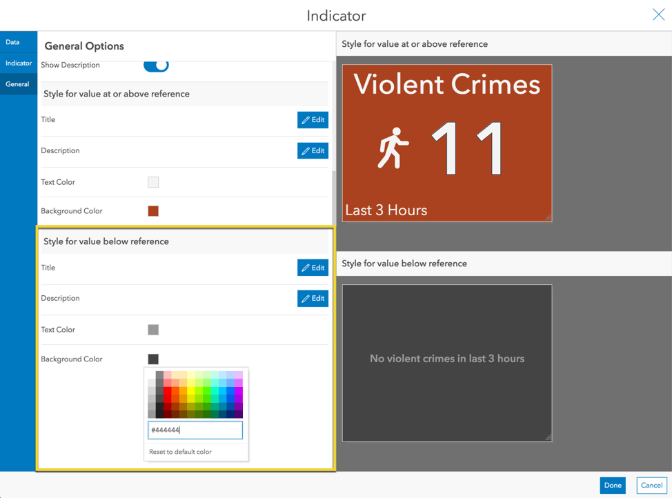
The indicator is now more effective at informing the chief and staff—it will only be the eye-catching bright red when there has been one or more recent violent crimes.
2. Compare Your Metric to a Baseline
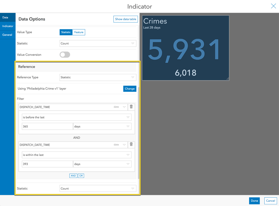
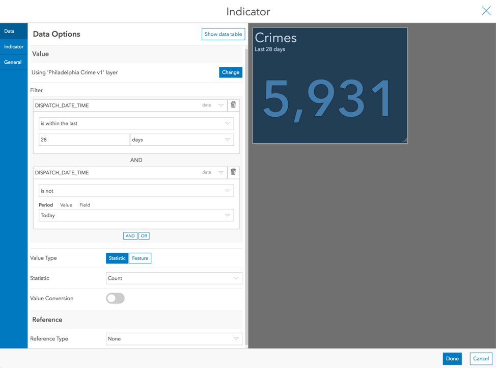
Let’s look at another way to use a reference and conditional formatting. Say we have an indicator showing the number of crimes recorded in the last 28 days. It will be displayed on the same wall-mounted dashboard for the police chief and staff.
The indicator shows the 28-day crime count. The indicator would be more effective if we provided context to this number. Crimes fluctuate by time of year, and so it can be helpful to compare it to the same timespan last year.
Step 1: Add a Reference
For the reference type, choose statistic. We will query the same layer, but with a different time window defined in the filter—the previous 28 days from last year on this date. By default, the same layer is selected—keep this unchanged. Also keep the default statistic type Count. Add a filter and define a constraint for DISPATCH_DATE_TIME is before the last 365 days. Click “AND” to add another constraint for DISPATCH_DATE_TIME is before the last 393 days.
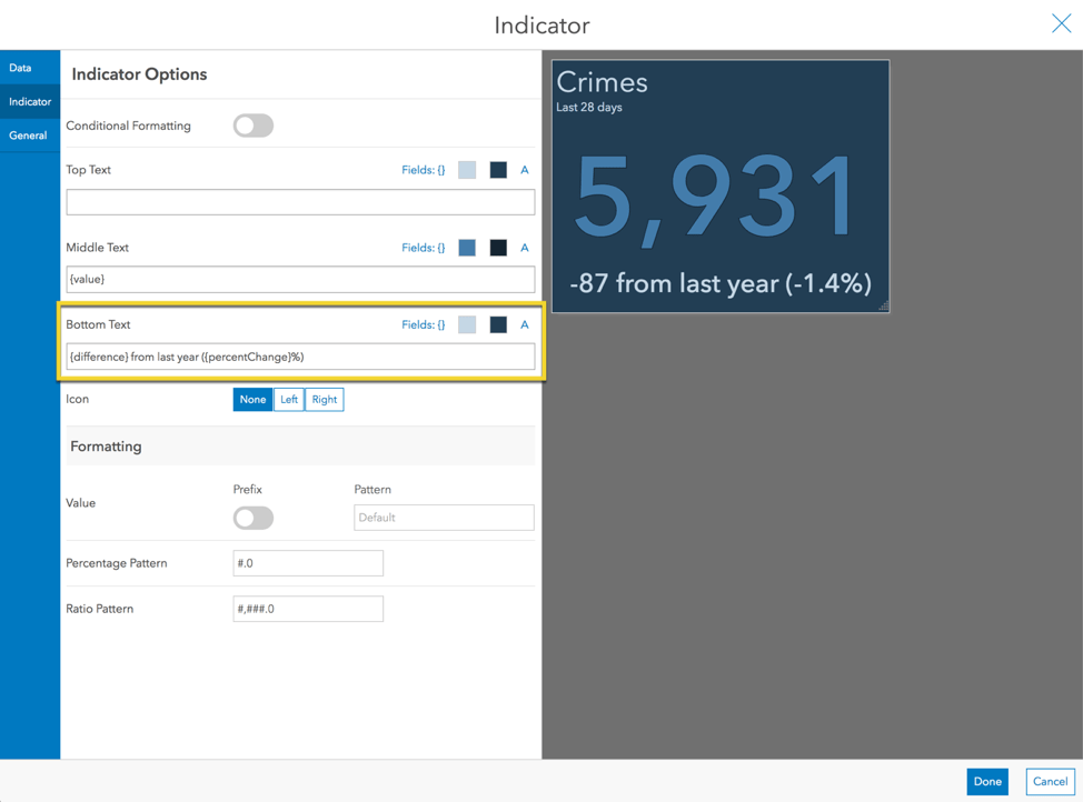
Step 2: Update Indicator Text to Include Comparison Metrics
In the Indicator tab, add in text to convey how it has changed. In the Bottom Text, inject the difference between the value and reference as well as the percent change.
{difference} from last year ({percentChange}%)
Step 3: Turn on Conditional Formatting
To further enhance the indicator, turn on conditional formatting. A preview is shown for each condition: 1) when the crime has increased/remained the same and 2) when the crime has decreased.
Style the text red for when the crime rate has increased and green when it has increased. We can even add small up and down arrows via Unicode characters. Also, since we have the arrows, we don’t want to show the “-“ sign when the rate has decreased (i.e., the difference is less than zero). So, use the absolute value of the difference. Insert the following text.
▴ {absoluteDifference} from last year ({percentChange}%)
▾ {absoluteDifference} from last year ({percentChange}%)
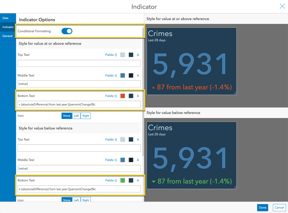
Now that the indicator provides context to the last 28-day crime count, viewers can easily interpret whether crime has improved or gotten worse compared to this time last year.
3. Normalize Your Metric
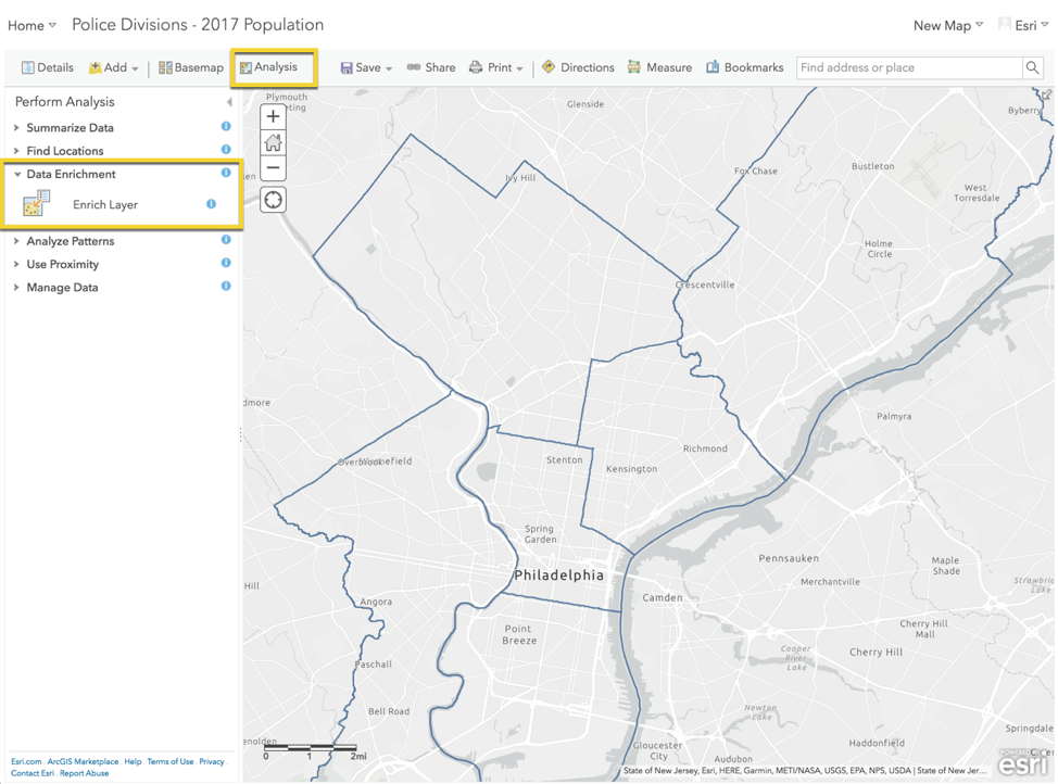
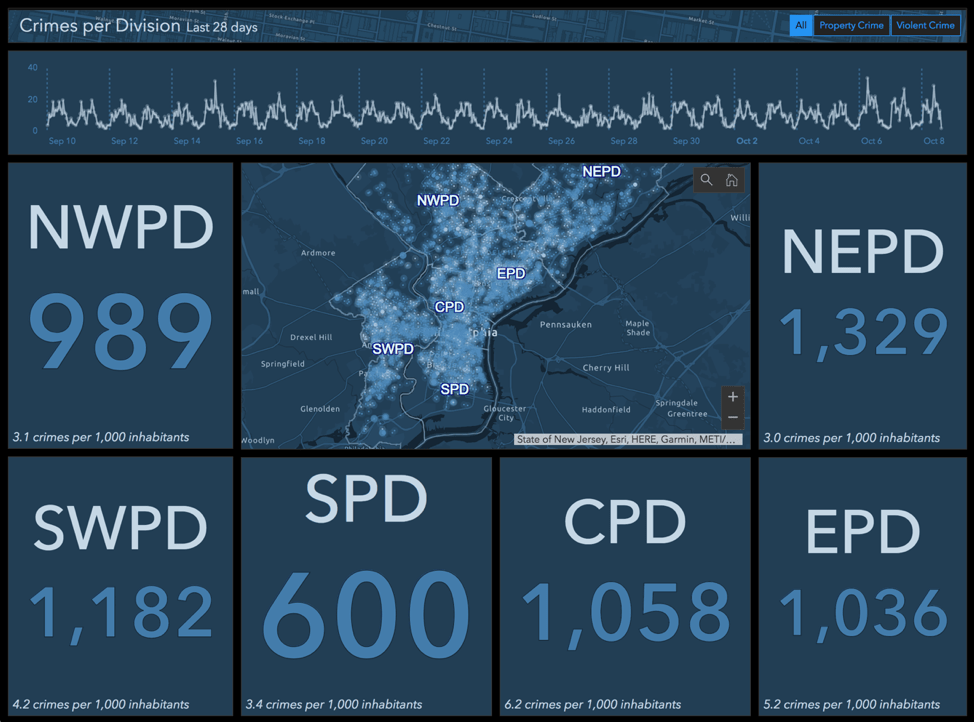
In addition to the 28-day crime counts, the police chief might also want to see crime “rate” (crimes per 1,000 inhabitants). Let’s enhance our indicator to include the rate. This time we will create a statistic-based reference that is based on a different layer—one with population data.
As part of the data set, we have a polygon layer of the police divisions. If we knew the population for each police division, we could sum them to get the total for the city (or even do a break-down per division). We can do this with ArcGIS Online by enriching layers.
Step 1: Enrich Your Data
Let’s open the layer in Map Viewer. Click the Analysis button. Under Data Enrichment choose Enrich Layer. Click Select Variables and choose the Total Population variable for the current year. Uncheck “Use current map extent” to include data for our whole layer, then click Run Analysis.
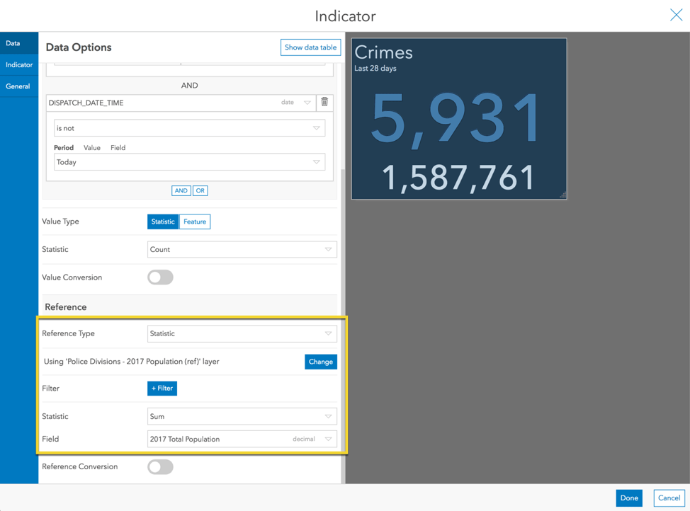
Step 2: Add a Reference
After the population data has been added to our layer, we go back to ArcGIS Dashboards. We’ll start with the same 28-day indicator as before.
For the Reference Type, choose Statistic. Click the Change button to change the source layer. In the upper right, click the Select Layer button and then choose the layer we just created. Choose a Sum statistic on the population field.
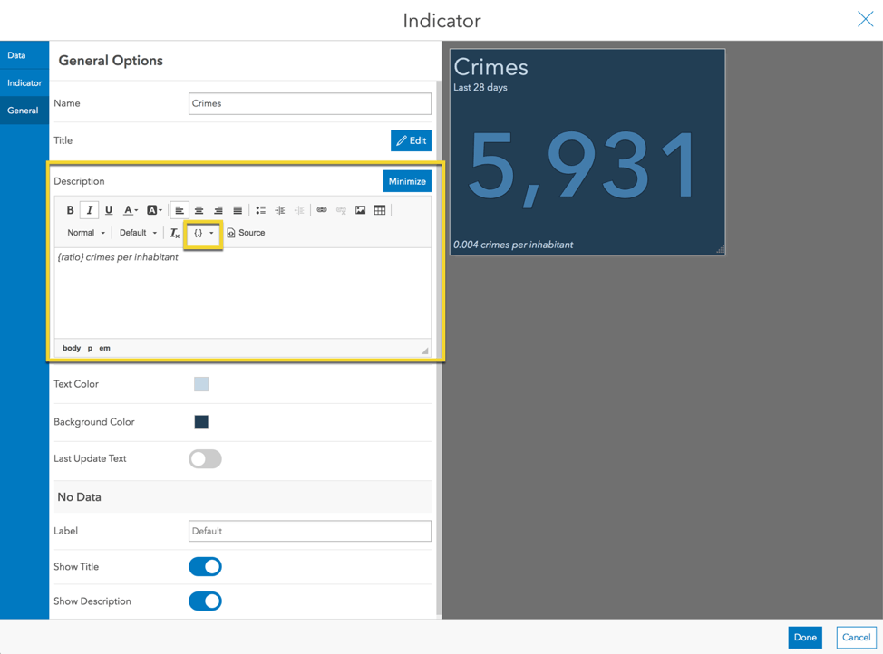
Step 3: Update the Description Text to Include the Ratio
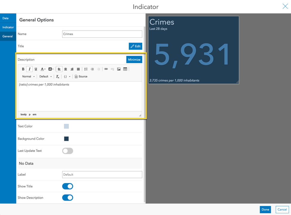
In the Indicator tab, erase the Bottom Text that was added. This time we will add our text in the element’s Description. In the General tab, edit the Description and inject the ratio of the crime count (value) to the population (reference).
{ratio} crimes per inhabitant
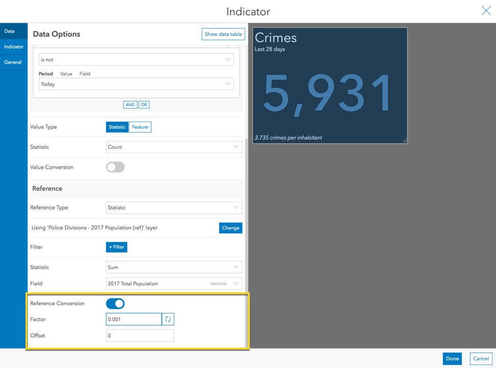
Step 4: Apply a Conversion Factor
Crime rate is often expressed as the number of crimes per 1,000 inhabitants. Thus, we need to divide the population by 1,000. We could create another field in the layer and use a calculation to do this. Or, we can simply apply a conversion factor to the reference statistic. To divide by 1,000, apply a multiplication factor of 0.001.
Step 5: Update the Description Text to Include the Crime Rate
Go back and update the text in the description to include the crime rate per 1,000 inhabitants.
{ratio} crimes per 1,000 inhabitants
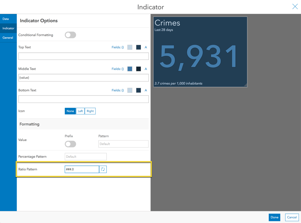
Step 6: Update the Number Formatting
We don’t need this many significant digits though. So, format the number. In the Indicator tab, add a pattern for the ratio to only include one decimal place: ###.0
And there you have it. Now the chief can see the crime rate relative to the population.
Step 7: Create an Indicator for Each Police Division
Before we wrap up, let’s go one step further. Since the crime rate likely varies across police divisions, we can create an indicator for each division. Apply a filter to limit the crime layer (the indicator value) to only the one division, such as the central police division (CPD). Also apply a filter to the police division polygon layer (the indicator reference) to limit it to the same police division.
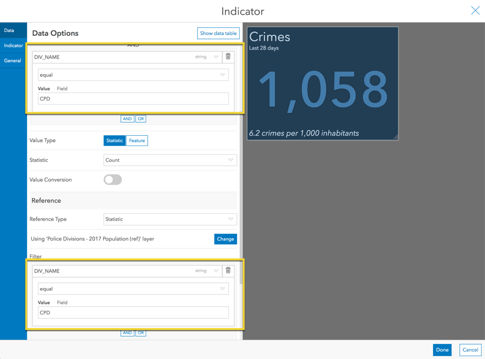
Now we have a geographic-specific crime rate. After pressing Done, we can duplicate the indicator and change the filter for each one to include a different division. With a bit more sprucing up, we can end up with the following dashboard. With it, the chief can easily identify the central police division as having the highest crime rate and compare it to other divisions.
Conclusion
Indicators are great at providing simple metrics to viewers. Sometimes, however, it is important to provide context. In this article we did this by using reference values and conditional formatting in three different ways:
- Apply situation-based styling
- Compare a metric to a baseline
- Normalize a metric
Here is a dashboard with the three indicators we made. You can even copy it to see how they are configured.
I hope these tips help you build stunning, effective indicators. We, the ArcGIS Dashboards team at Esri, love to see what you create and hear how we can continue to improve. If you are able, please share them on Twitter or LinkedIn with #opsdashboard. Post questions and feedback in GeoNet.

Just an FYI – there is a mistake in one of the visuals that caused some confusion in Part 2, Step 1: Add a Reference
The visual shows DISPATCH_DATE_TIME is within the last 393 days.
However the text above says DISPATCH_DATE_TIME is before the last 393 days.