We are now living in an era where half of website traffic is generated by mobile devices and half by desktops. Does your dashboard look good on both?
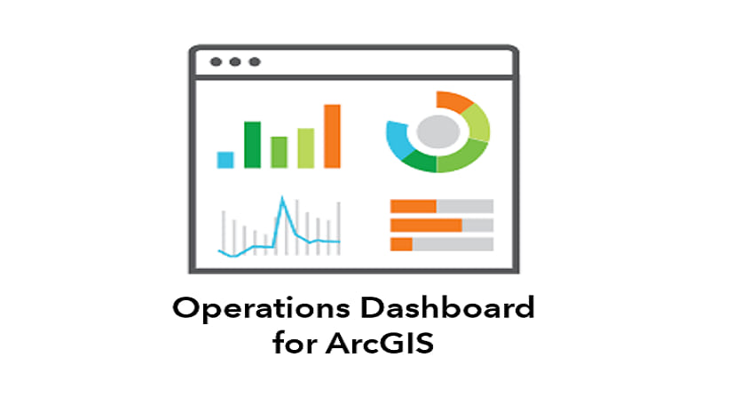
Dashboards made with ArcGIS Dashboards can be a compelling tool for displaying the metrics pulled directly from feeds of data. All too often, we overdo it and pack in too much information into a single screen. For dashboards designed for desktop users with a large landscape screen, this isn’t really a problem—there is plenty of real-estate to work with.

The issue presents itself when the dashboard is opened on a mobile device. While a dashboard made in Operations Dashboard is highly responsive (it will resize to practically any screen), you are best suited to create a separate dashboard that is optimized for mobile viewing. This leaves you with two URLs for two dashboards—one for mobile and one for desktop.
ArcGIS Experience Builder
ArcGIS Experience Builder is a new way of building web apps, providing a drag-and-drop workflow for creating powerful information products. With it, you can add in text, media, multiple maps, surveys, and other types of content, all within one unified web experience. It is adaptable and mobile friendly, where the builder gives you tools to adjust your application for desktop, tablet, and mobile views.
In other words, the app detects if the user is looking at the content on a large or small screen and delivers content specific for that device. This means we can combine a desktop dashboard and a mobile dashboard into a single application that will select the appropriate content for the screen. Two dashboards, one intelligent URL.
Getting Started
The first step is to build two dashboards in the ArcGIS Dashboards application—one for desktop, and one for mobile—following these guidelines for mobile dashboards. Hint: stack everything vertically. This example is a dashboard that looks at candidate locations for a mobile health clinic. We want the analysts in the office to see it on a desktop, and for citizens to be able to view it on their mobile devices.

Once the dashboards are constructed, open ArcGIS Experience Builder. Because this application is fairly simple from the standpoint of Experience Builder, you should select the option to create a Blank Full Screen App.
The next two steps are easy to follow: On the desktop page for large screen devices, add a basic Embed widget by dragging and dropping it into the main workspace. Click on the new frame and select the option to enlarge it to full-screen. Add the URL for the desktop view of the dashboard as the Website address.

For the mobile view we will follow the exact same process, but first toggle to the view for small screen devices and select Custom mode.

Now move the content to the pending list (do not delete it) in the window and add in a new, full-screen embed window. This time, add the mobile view of the dashboard as the Website address.

Once you save and publish the Experience, you now have a single URL that connects to two dashboards, dependent on the users’ screen size!
Try this live example (on mobile and on desktop), and learn more about how ArcGIS Experience Builder can combine multiple apps into one immersive experience for your users.
Note: Microsoft and Esri recommend using Microsoft Edge (instead of IE11) to view Experiences, as it will impact performance.


Good article, this is something we’ve struggled with. Your link to ArcGIS Experience Builder is broken, though.
Thanks for letting us know. Looks like our first link works but the second one fails. We’ll get that updated!
Thanks for checking that out! We’ve updated the link to the new Experience Builder page.
Cannot share to hub gallery.
Thanks for this article, it works great. Unfortunately you cannot add experience builder apps to the hub gallery yet?
An Experience can be embedded now using an iframe, and the typical flow to add it to Hub is coming very soon.
Thanks for this article – Is there a way to force the display on the mobile device to be vertical only when using the mobile view of the dashboard?
Unfortunately, not to my knowledge. That setting is controlled on the device itself. If you are building a dashboard that is going to be displayed on a device that is always horizontal, you should just build a dashboard that has all elements in a single row, rather than stacked on top of each other.
Thanks for the article,
One question, I created a desktop dashboard and it has over 70,000 views, the link is has been shared with many people. If I create a mobile dashboard, will I get a completely different link? Does wich mean I will have to share the new link with everyone? Or the link is going to be the same?
Thanks for your answer,
Edison
If you create a new product using experience builder, yes, it will change your URL. The benefit is that your URL will never have to change again, as you can swap out dashboards behind the scenes.
An option we have seen from other users is to place a link on your old dashboard that says “Our site has moved” with a redirect to the new Experience. While this will reset your view count in ArcGIS Online, you will ultimately be giving your users a better experience, which may generate more views.
Thanks for this article – I’m trying to use the navigation widget with a section widget. It last one has 3 views but for any reason, navigation widget does not recognize it. So I can’t navigate througt my diferent views. I don’t know how it works.
Hi @Mike Schoelen, please help. I have followed this article and managed to make the arcgis responsive dashboard. But when I share it to the public, if the screen is changed to smartpone dashboard mode it cannot be accessed. The warning “Arcgis dashboards requires your credential” appears. My question is how can I make two dashboards in one url publicly accessible without sign in? Thank you in advance.
Tedi,
It sounds like the mobile dashboard (or its components) might not be shared. Verify the dashboard, maps, and all layers are correctly shared.
Then try the following:
1) When you embed the mobile app, remove the organization from the URL. So https://healthgis.maps.arcgis.com/…. becomes https://arcgis.com/….
2) Follow guidance in this blog to search for what might not be shared: https://community.esri.com/thread/219837-arcgis-online-web-app-public-access-asking-for-login
3) You can always reach out to technical support, and they would be glad to walk you through resolving this. 1 (888) 377-4575
OMG, it’s true that I haven’t shared it publicly for the mobile version. thanks
.
n
e
k
o
r
b
e
b
o
t
s
m
e
e
s
e
l
p
m
a
s
e
h
t
o
t
k
n
i
L