ArcGIS Dashboards enables you to convey information by presenting location-based analytics using intuitive and interactive data visualizations on a single screen.
Arcade can be used in multiple ways within a dashboard. You can use Arcade for advanced formatting or for data expressions. This session talks about the differences in detail.
This article will provide a high-level overview of how you can get started using Arcade for advanced formatting in the list element and the indicator element. We also have a blog on tips for advanced formatting in the table element. For more in-depth information, see the documentation. If you are new to Arcade, you can learn about it here.
Arcade in Lists
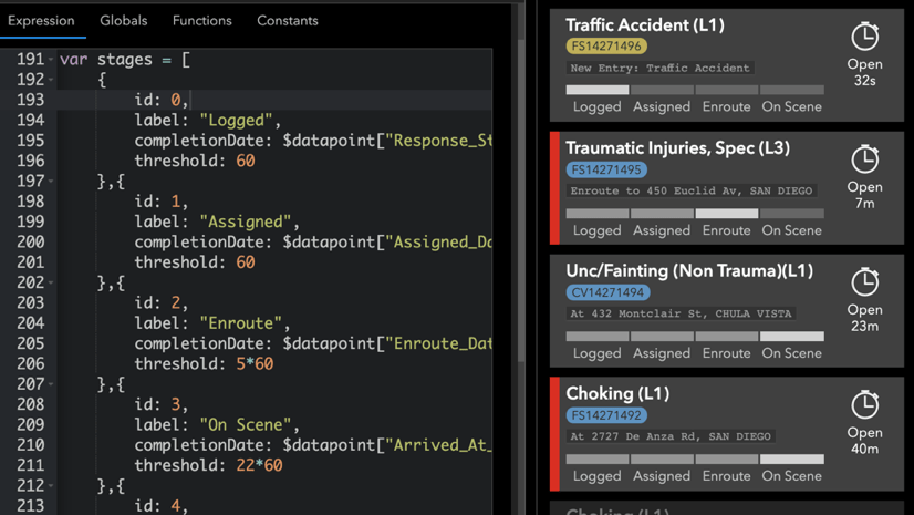
With ArcGIS Dashboards, an Arcade expression can now be used in the list element to reveal more information from your data. In the List tab, you will find an Arcade option – click Enable. The Arcade editor will open.

The Arcade expression will run for each line item (i.e. data point). Attributes can be referenced using the $datapoint global variable in the Arcade editor. From your expression, you will return properties that define how each line item renders. Within the attributes property (a dictionary), you can return key-value pairs to be used in the Line Item Template. Unlike attribute expressions (used in a layer’s popup, styles, and labels), a single Arcade expression can pass out multiple attributes to be used in the template.
Let’s work through an example to illustrate these concepts. If you’d like to follow along, save a copy of this map, then on the ArcGIS Online home page choose Dashboards from the app launcher next to your user name. Create a new dashboard, add your map to it, and create a list based on the Plows layer.
In the List tab, we can display the truck name and the speed in miles per hour (mph) for each snowplow by referencing attributes ({vehiclename} and {speed}) in the line item template. Now, click the Enable button for Arcade and, using an Arcade expression, we can calculate the speed in kilometers per hour (kph).
var speedKph = Floor($datapoint.speed * 1.60934, 0);
Now, let’s declare a kph property in the attributes dictionary and reference our calculated value, speedKph.

The value of kph can now be used in the line item template using the {expression/kph} syntax. The list preview updates immediately, showing speed in both MPH and KPH.

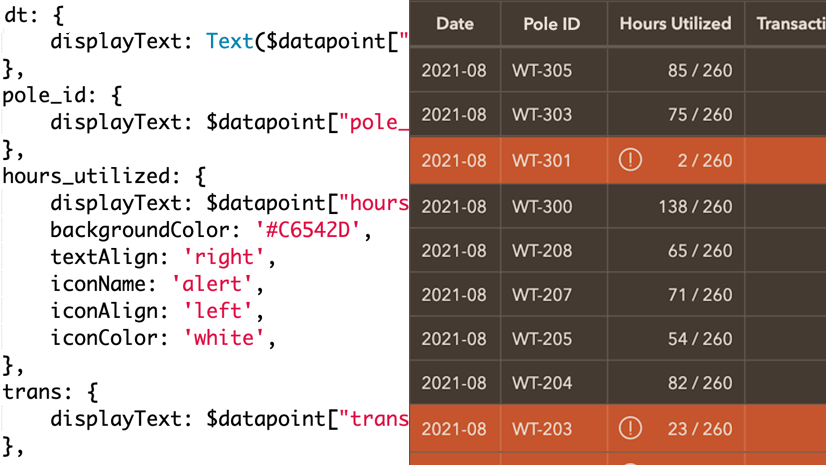
It may also be useful to distinguish stopped vehicles, as it can be an early sign of a problem. In the expression, let’s declare a color variable and, using the IIF() function in Arcade, set it equal to a light red (#F3DED7) when the speed is zero and undefined otherwise. When undefined, the color will inherit from the element’s background color in the General tab.
var color = IIF($datapoint.speed == 0, '#F3DED7','');
Now, let’s return the value of color for the backgroundColor property of the list item. The following image shows the resulting expression and a preview of the list with one truck showing as stopped.

By using Arcade, this list now communicates speed in different measurement systems and helps viewers quickly identify stopped vehicles. See the final dashboard or make a copy to see how it was made.
Arcade in Indicators
Arcade can also be used in the indicator element. In the Indicator tab, you will find an Arcade option – click Enable. The Arcade editor will open.

Similar to the list, attributes can be referenced using the $datapoint global variable in the Arcade editor. From your expression, you will return properties that define how the indicator renders. Within the attributes property (a dictionary), you can return key-value pairs to be used in the Title and Description. As with the list element, a single Arcade expression can pass out multiple attributes.
Let’s work through another example. We are creating a dashboard for monitoring earthquake activity. Let’s use an indicator to display the count of large earthquakes in the last 24 hours. We do this using the following filters and title text shown below.

It is effective in providing information at a glance. However, it would be good to visually elevate the indicator when there have been one or more large earthquakes, a situation that occurs intermittently. Let’s conditionally format the indicator based on this logic.
In the Indicator tab, enable Arcade. By clicking on the Globals tab in the editor, we see that there is only a count attribute since our indicator is based on a summary statistic. As is shown in the following image, only the middleText properties are being returned (the others are commented out). To use other properties, simply uncomment them by removing the // or by pressing ctrl + /.

Like we did in the example for the list element, let’s declare a color variable. Set it to equal ‘white’ by default. This time, create an if statement in the following way to override this color when one or more large earthquakes have occurred.
When the condition is met, color will be overridden to #F3DED7 (light red). In the expression uncomment the backgroundColor property and assign it the value of color. Below, you can see the resulting expression and a preview of the indicator with the condition met.

We can also use the Arcade expression to display an icon on the indicator. In the configuration panel, scroll down to the Icons section and press +Add. After selecting an icon give it a name, such as ‘earthquake’.
To display the icon on the indicator, uncomment the iconName property and set it to equal to the name you chose for the icon (wrapped with quotes). The following image shows the resulting expression and the indicator with the icon visible.
Now we have an indicator that is a subtle white when there have been no recent large earthquakes but dynamically changes to have a red background when one or more have occurred. We could even write another if statement to make the background color a darker shade of red when the count is greater than 5.
If you’d like to see this technique in use, view this dashboard or make a copy of it to play with the Arcade expression.
Arcade in Tables
To learn about how Arcade can be used for a table element, see this blog post.

Unit Prefixing
If you use indicators to display large values, you may have noticed that a nice, condensed “5.2k” value has turned into something like “5209.11294003”. Prior to enabling Arcade you were provided number formatting and unit prefixing options. When using Arcade, number formatting needs to be done in the expression.
Thankfully, you can take advantage of the Text() function. It allows you to specify a pattern for either a number or a date. We can use it in the following way.
Text(5209.11294003, '#,###'); // returns '5,209'
This looks much better. However, you still don’t have the unit prefixing like before. For that, you can include a user-defined function that can be used in the expression elsewhere.
Copy and paste this function in the top part of your expression. Where needed, call it using the function name and pass in your number and the pattern desired. The following line calls this function and is returned a nicely formatted value (string) with a unit prefix.
unitPrefix(5209.11294003, '#.#'); // returns '5.2k'
The image below displays how it can be used in the indicator element.

Now, you can leverage the powers of Arcade and still format your numbers with unit prefixes.
Summary
The goal of a dashboard is to provide information about your data in a quick and easy-to-interpret way. To achieve this, sometimes you need to display attributes in a particular way or visually alert people to a situation through colors and icons. With ArcGIS Dashboards, Arcade can be leveraged to do this for pop-ups, details elements, indicator elements, and list elements.
We on the dashboard team are excited to see the creative ways you put Arcade to use in your dashboards. If able to, please share them with us on Twitter and LinkedIn using #ArcGISDashboards.
Join the ArcGIS Dashboards Esri Community for discussions, updates, and blogs.


When will the FeatureSet functions or any other way to access relationship classes be coming? Thanks
Hi Doug. Those capabilities are geared toward the pop-up profile, which has a different context than the indicator and list elements. If you have particular use cases in mind, please submit them through Support so we can understand your needs. Thank you.
https://developers.arcgis.com/arcade/guide/profiles/
Same here! Would be very useful. To e.g. create unique values of related features in one list item!
I’m really looking forward to these features! However, there is a problem when doing a “Save As” in a Beta Dashboard. It brings up a dialog box to input Title, Tags, Summary and Folder but no submit/ok/save button. I can’t scroll this dialog box down to find this button. I have tried in Chrome and Edge.