By Aileen Buckley, Mapping Center Lead
We got this question the other day on Ask a Cartographer: “I am currently analyzing a potential site with a LIDAR derived DEM. I have the products of the curvature tool. I have tried to examine the relevant web-based help but I am still unclear as how to properly portray this data. Can you direct me to any examples or explain a methodology of how to display the data in a curvature raster in a manner that identifies useful information to the general public?”
To answer this question, I’ve written two blog entries: this first one explains what the various curvature surfaces are, and the second explains how you can use them to enhance the representation of terrain surfaces in ArcMap.
It’s easy to understand how the concept of curvature (and therefore the use of these rasters) can be confusing, especially when you consider its definition: “Curvature is the second derivative of a surface, or the slope of the slope.” (Map Use: Reading, Analysis, Interpretation, Seventh Edition, p. 360.) It’s worthwhile to better understand curvature because you will likely find that it’s helpful in displaying the form of the surface by combining curvature rasters with hillshade rasters.
The advantage of doing this was summarized by Dr. Patrick Kennelly in his article, “Hill-shading Techniques to Enhance Terrain Maps“. As he notes, this technique “…captures local variations in curvature and displays these with hillshading. This is most useful for identifying areas of rapid change in slope or aspect. Geologic examples of such variations would be sedimentary strata of variable erosion rate and surface drainages, respectively. These edges are highlighted as more continuous and discernible features, allowing improved visualization of such geologic features.”
The Curvature tool in either the Spatial Analyst or 3D Analyst toolbox can be used to create three different curvature rasters – an output curvature raster, an optional profile curve raster, and an optional plan curve raster.
Let’s explore the differences between the three output raster surfaces through illustrations and excerpts from Map Use: Reading, Analysis, Interpretation, Seventh Edition. The maps shown below were compiled to illustrate the use of these types of rasters in mapping.
We’ll start with the two optional curve rasters and end with the curvature raster.
From Map Use: Reading, Analysis, Interpretation, Seventh Edition (p. 360):
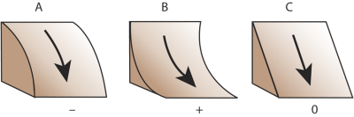
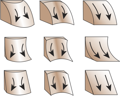
Profile Curvature: Profile curvature is parallel to the direction of the maximum slope. A negative value (figure 16.20A) indicates that the surface is upwardly convex at that cell. A positive profile (figure 16.20B) indicates that the surface is upwardly concave at that cell. A value of zero indicates that the surface is linear (figure 16.20C.) Profile curvature affects the acceleration or deceleration of flow across the surface. Note that this is the same as the linear, convex, and concave slopes shown in figure 16.22.
Figure 16.20 Profile curvature is parallel to the slope and indicates the direction of maximum slope. It affects the acceleration and deceleration of flow across the surface.
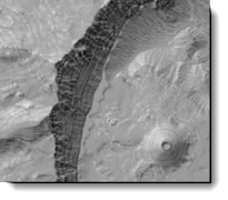
To illustrate, here is the optional output profile curvature raster from the Curvature tool symbolized using a simple black to white color ramp (figure 1). Notice on the map that this raster emphasizes any terracing in the surface.
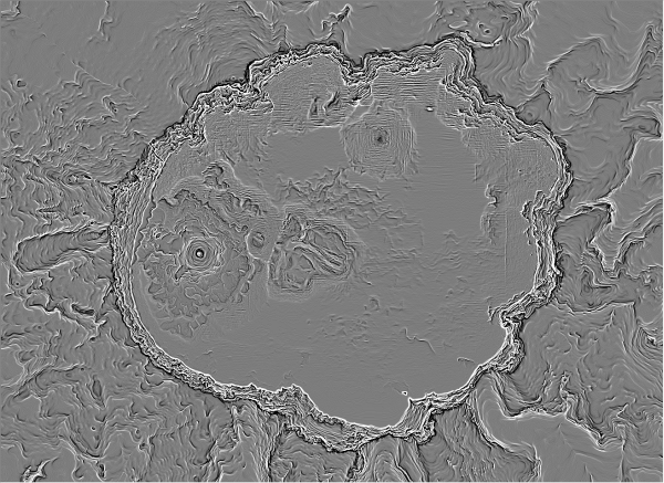
Figure 1. The output profile curvature raster from the Curvature tool
From Map Use: Reading, Analysis, Interpretation, Seventh Edition (p. 360):
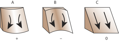
Planform Curvature: Planform curvature (commonly called plan curvature) is perpendicular to the direction of the maximum slope. A positive value (figure 16.21A) indicates the surface is sidewardly convex at that cell. A negative plan (figure 16.21B) indicates the surface is sidewardly concave at that cell. A value of zero indicates the surface is linear (figure 16.21C.) Profile curvature relates to the convergence and divergence of flow across a surface.
Figure 16.21 Plan curvature is perpendicular to the slope and affects the convergence and divergence of flow across the surface.
To illustrate, here is the optional output plan curvature raster from the Curvature tool symbolized using a simple black to white color ramp (figure 2). Notice on the map that this raster emphasizes the ridges and valleys on the surface.
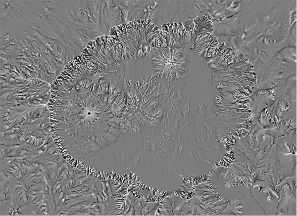
Figure 2. The output plan curvature raster from the Curvature tool
From Map Use: Reading, Analysis, Interpretation, Seventh Edition (p. 360):
Combinations of Curvature: Understanding the combinations of plan and profile curvature is important (figure 16.22.) The slope affects the overall rate of movement downslope. Aspect defines the direction of flow. The profile curvature affects the acceleration and deceleration of flow and, therefore, influences erosion and deposition. The plan curvature influences convergence and divergence of flow. Considering both plan and profile curvature together allows us to understand more accurately the flow across a surface.
Figure 16.22 Combinations of profile and plan curvatures helps us understand flow across a surface.
To illustrate, here is the output curvature raster from the Curvature tool symbolized using a simple black to white color ramp (figure 3). Notice on the map that this surface emphasizes both the ridges and valleys and the terraces in the surface, but both are slightly compromised in the interest of showing them together.
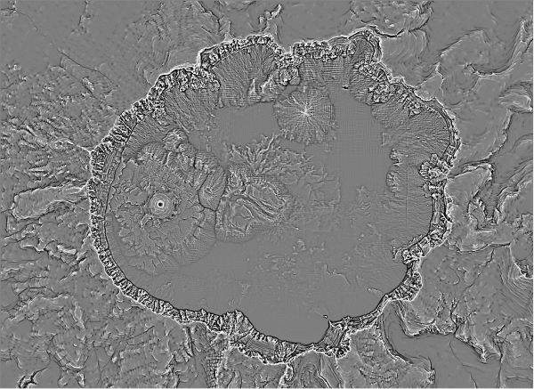
Figure 3. The output curvature raster from the Curvature tool combines both the profile and plan curcatures
Figure 4 from the ArcGIS online help illustrates how all surrounding pixels are used to calculate the curvature of each cell in the raster.
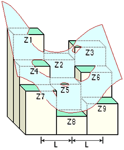
Figure 4. The relationships between the coefficients and the nine values of elevation for every cell numbered
Now that you know what the curvature rasters represent, and how easy they are to create, look for my blog entry tomorrow on how they can be used to enhance the symbolization of surfaces in ArcMap.


Article Discussion: