By Aileen Buckley, Mapping Center Lead

When you compile a map for print, you have to figure out a few things, like, “What size will it be?”; “What geographic extent will I show?”; given those, “What will the map scale be?”; “What map projection should I use?”; “Should it be in color?”; “What fonts should I use?”, “What print resolution should I use?”; etc…
Making Web maps is no different – you still have to ask the same questions; however, the answers might be different. As we take a look at each of these questions, we will give you some general guidelines for designing maps for the Web. This is not an exhaustive set of guidelines, but it should at least help you to get started!
What size will it be?
In terms of size, we usually design for a 17 or 19 inch LCD monitor since that is what most people have on their desktops (figure 1).

Figure 1. The size of monitors is measured on the diagonal
What geographic extent will I show?
In terms of geographic extent, Web maps do not have the same restrictions as print maps. Because users can pan and zoom, the map extent can be larger than what you see on the screen (figure 2).
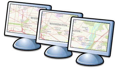
Figure 2. Panning (shown here) and zooming allow users to see more than just the geographic extent within the current screen
What will the map scale(s) be?
Given the size of the screen and the geographic extent you want to show, what will the map scale be? If your readers can zoom in and out to see your map, then the map scale will be variable (figure 3). This means that you should compile a separate map for each map scale to assure that the zooming experience appears “seamless”. We talked about this in our last blog entry Creating a Web Map Service. We also wrote about how to set up your ArcMap document to support compilation of a multi-scale map in an earlier blog entry, Working with Layers and Scale Ranges: Tips for Organizing the Table of Contents.
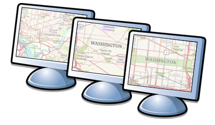
Figure 3. Zooming allows users to see more than a single map scale
What map projection should I use?
The question about which map projection to use is answered for you if you want to mash up with other maps. For example, if you want your map to overlay with others on ArcGIS Online or with Bing Maps or Google Maps, then the projection you’ll use is Web Mercator (figure 4).
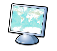
Figure 4. Web Mercator is the industry standard for mashups
If you are thinking of using a different projection, realize that others will also have to use the same projection if they want to use your map in a mash up. If you do not anticipate anyone using your map for mashups, you can consider alternate projections like we did when we used the Winkle Triple projection for our Super Bowl map.
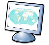
Figure 4. Other projections could also be used, e.g., Winkle Triple
Should it be in color?
When you ask, “Should it be in color?”, remember that computers today are capable of displaying millions of colors, so the issue of Web-safe colors is moot and almost every Web map you see will be in color (figure 5).
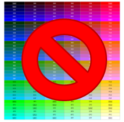
Figure 5. Most monitors support 24-bit color resulting in millions of colors, so Web-safe colors are no longer a critical issue
However, color on the Web is different from color for print, and this will hve an impact on the appearance of your map. For printed maps, the colors and shapes are comprised of pigments in the ink. Using the subtractive color system, these colors are perceived by the absorption and reflection of light from their surfaces (figure 6). When you look at a computer screen, you see colors and shapes that are made up of light. Using the additive color system, colors are built up by combining red, green, and blue light in different mixtures and intensities. The color white is produced by mixing red, green and blue at full intensity.
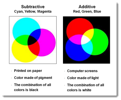
Figure 6. The subtractive and additive color models
So one result is that light colors on the Web are overly luminous and too harsh on the eye for extended viewing. In addition, the intensity of the light radiating from a screen when it displays pure white can affect the clarity of fine detail in type, point symbols, line symbols, as well as intricate patterns, such as rasters displayed as hillshades and elevation tints.
To increase legibility, a symbol has to be distinguishable from its background – this is the basis for seeing! A good guide to color selection is the following table of visual efficiencies – look for combinations of symbols on backgrounds that have high visual efficiency (figure 7).
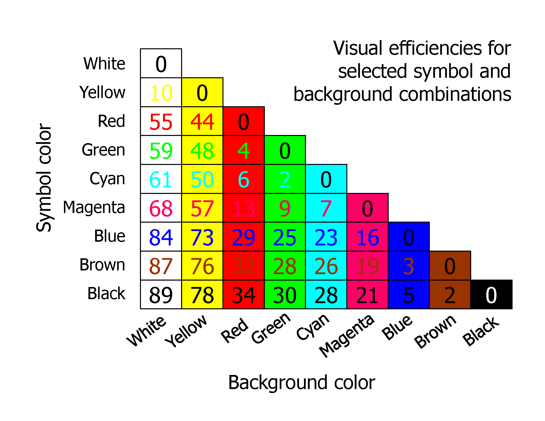
Figure 7. A table of visual efficiencies for combinations of colors for symbols and their backgrounds. Higher values result in better legibility
What fonts should I use?
If you can, use fonts that were designed for the Web. A recent study identified these fonts as the most popular for web design: Arial (or Helvetica on Macs), Verdana, Georgia, Trebuchet, and Century Gothic (which are installed on all Windows systems), in addition to Lucinda Grande and Palatino (which are installed on most systems) (figure 8).
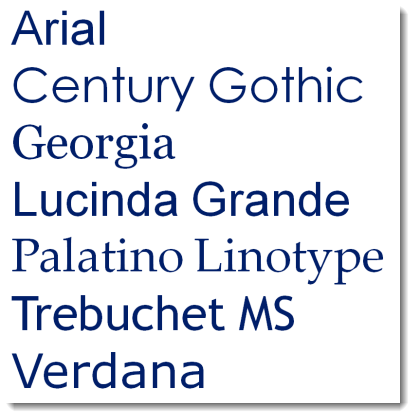
Figure 8. A table to help you choose color combinations that have high visual efficiency
Good Web fonts have a generous amount of space between characters, as well as a generous amount of space within the characters themselves (figure 9). A tall x-height also opens up the space within a character. These properties are what make these fonts so legible on screen, given what you now know about the light from the monitor affecting the clarity of symbols (including text) on screen.
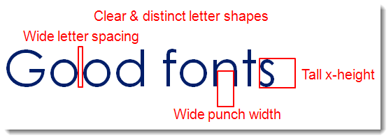
Figure 9. Characteristics of good Web fonts
All of the fonts shown here are sans-serif fonts, except Georgia and Palatino. Serifs are the extra lines or small decorations added to the ends of the main strokes of the type (figure 10).
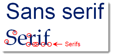
Figure 10. Serif and sans serif fonts
The theory behind these serifs is that they help the letters flow and lead the eye across the text during reading. Serif fonts are very popular in print, but many designers and cartographers believe that sans-serif fonts are a more suitable option for Web design as the serifs compromise the space between characters. This holds for small blocks of text (like labels on maps, titles, legend text, etc…), but large blocks of text are still easier to read with serif fonts, whether on paper of on screen.
The variable boldness and fine extra strokes of the serif fonts, particularly at smaller sizes, often appear pixilated and untidy. This is still the case even with the most modern anti-aliasing techniques. With anti-aliasing enabled, the serif fonts look blurred (which is what they are really) around their curves and ends of the strokes in the characters. On the other hand, the straight, open strokes of a sans-serif font leaves a good impression on-screen.
What resolution should it be?
Since the map is on-screen, the safe resolution to design for is 96 dpi or dots per inch, as all LCDs support this resolution. Newer LCD monitors typically have a native pixel density of 120 DPI and 144 DPI. You should choose the resolution based on the type of computer your target audience will mostly likely have.
In any case, this is still low resolution when compared to print maps. This low resolution, coupled with the color projection issue described above, will likely have the greatest impact on the cartographic design of your map.
Luckily, there are some tricks you can use, such as anti-aliasing, which fools the eye into see a jagged edge as a smooth edge. Because screen displays are pixels, non-orthogonal lines and sharp edges appear jagged. These jagged edges are softened by adding pixels of intermediate color between the object and the background.
Further Reading
See our previous blog entry, Creating a Web Map Service, to read more about some of the tricks you can use when creating map services with ArcGIS Server. And read a previous blog entry, Designing Operational Overlays for the ArcMap and ArcGIS Online Basemaps, for more tips on designing maps for the Web.

Article Discussion: